Markets
How Global Central Banks are Responding to COVID-19, in One Chart
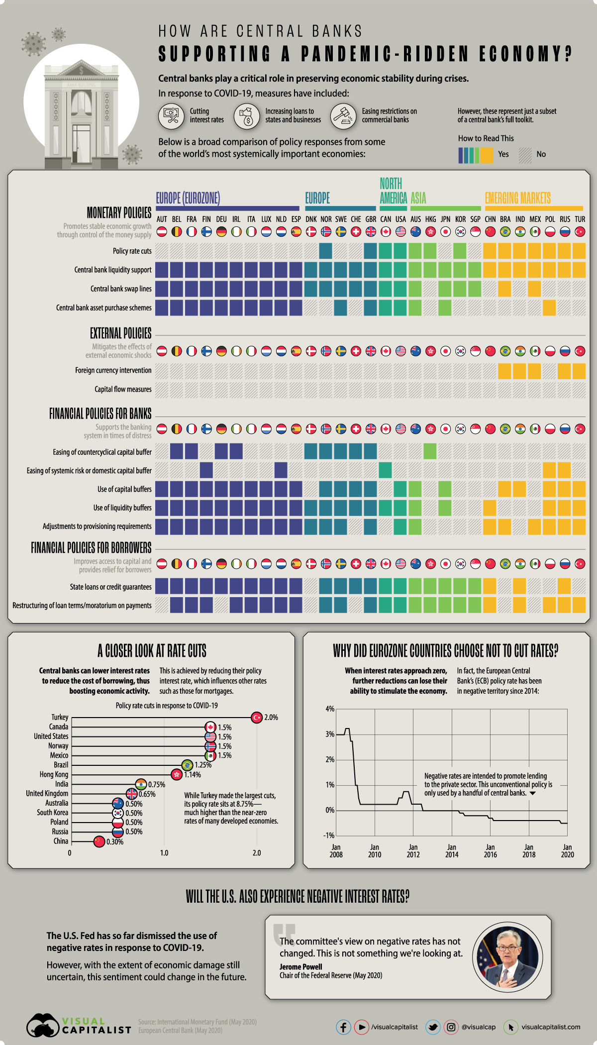


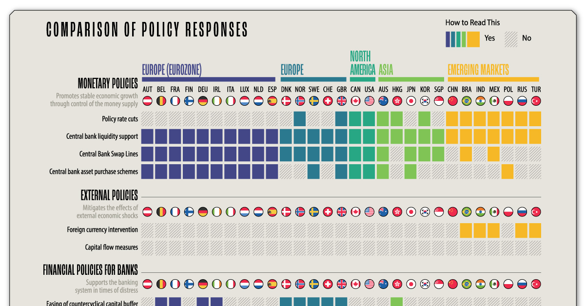
How Global Central Banks are Responding to COVID-19
When times get tough, central banks typically act as the first line of defense.
However, modern economies are incredibly complex—and calamities like the 2008 financial crisis have already pushed traditional policy tools to their limits. In response, some central banks have turned to newer, more unconventional strategies such as quantitative easing and negative interest rates to do their work.
In response to the COVID-19 pandemic, central banks are once again taking decisive action. To help us understand what’s being done, today’s infographic uses data from the International Monetary Fund (IMF) to compare the policy responses of 29 systemically important economies.
The Central Bank Toolkit
To begin, here are brief descriptions of each policy, which the IMF sorts into four categories:
1. Monetary Policies
Policies designed to control the money supply and promote stable economic growth.
| Policy Name | Intended Effect |
|---|---|
| Policy rate cuts | Stimulates economic activity by decreasing the cost of borrowing |
| Central bank liquidity support | Provides distressed markets with additional liquidity, often in the form of loans |
| Central bank swap lines | Agreements between the U.S. Fed and foreign central banks to enhance the provision of U.S. dollar liquidity |
| Central bank asset purchase schemes | Uses newly-created currency to buy large quantities of financial assets, such as government bonds. This increases the money supply and decreases longer-term rates |
2. External Policies
Policies designed to mitigate the effects of external economic shocks.
| Policy Name | Intended Effect |
|---|---|
| Foreign currency intervention | Stabilizes the national currency by intervening in the foreign exchange market |
| Capital flow measures | Restrictions, such as tariffs and volume limits, on the flow of foreign capital in and out of a country |
3. Financial Policies for Banks
Policies designed to support the banking system in times of distress.
| Policy Name | Intended Effect |
|---|---|
| Easing of the countercyclical capital buffer | A reduction in the amount of liquid assets required to protect banks against cyclical risks |
| Easing of systemic risk or domestic capital buffer | A reduction in the amount of liquid assets required to protect banks against unforeseen risks |
| Use of capital buffers | Allows banks to use their capital buffers to enhance relief measures |
| Use of liquidity buffers | Allows banks to use their liquidity buffers to meet unexpected cash flow needs |
| Adjustments to loan loss provision requirements | The level of provisions required to protect banks against borrower defaults are eased |
4. Financial Policies for Borrowers
Policies designed to improve access to capital as well as provide relief for borrowers.
| Policy Name | Intended Effect |
|---|---|
| State loans or credit guarantees | Ensures businesses of all sizes have adequate access to capital |
| Restructuring of loan terms or moratorium on payments | Provides borrowers with financial assistance by altering terms or deferring payments |
Putting Policies Into Practice
Let’s take a closer look at how these policy tools are being applied in the real world, particularly in the context of how central banks are battling the effects of the COVID-19 pandemic.
1. Monetary Policies
So far, many central banks have enacted expansionary monetary policies to boost slowing economies throughout the pandemic.
One widely used tool has been policy rate cuts, or cuts to interest rates. The theory behind rate cuts is relatively straightforward—a central bank places downward pressure on short-term interest rates, decreasing the overall cost of borrowing. This ideally stimulates business investment and consumer spending.
If short-term rates are already near zero, reducing them further may have little to no effect. For this reason, central banks have leaned on asset purchase schemes (quantitative easing) to place downward pressure on longer-term rates. This policy has been a cornerstone of the U.S. Federal Reserve’s (Fed) COVID-19 response, in which newly-created currency is used to buy hundreds of billions of dollars of assets such as government bonds.
When the media says the Fed is “printing money”, this is what they’re actually referring to.
2. External Policies
External policies were less relied upon by the systemically important central banks covered in today’s graphic.
That’s because foreign currency interventions, central bank operations designed to influence exchange rates, are typically used by developing economies only. This is likely due to the higher exchange rate volatility experienced by these types of economies.
For example, as investors flee emerging markets, Brazil has seen its exchange rate (BRL/USD) tumble 30% this year.
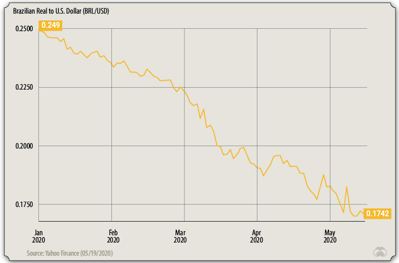
In an attempt to prevent further depreciation, the Central Bank of Brazil has used its foreign currency reserves to increase the supply of USD in the open market. These measures include purchases of $8.8B in USD-denominated Brazilian government bonds.
3. Financial Policies for Banks
Central banks are often tasked with regulating the commercial banking industry, meaning they have the authority to ease restrictions during economic crises.
One option is to ease the countercyclical capital buffer. During periods of economic growth (and increased lending), banks must accumulate reserves as a safety net for when the economy eventually contracts. Easing this restriction can allow them to increase their lending capacity.
Banks need to be in a position to continue financing households and corporates experiencing temporary difficulties.
—Andrea Enria, Chair of the ECB Supervisory Board
The European Central Bank (ECB) is a large proponent of these policies. In March, it also allowed its supervised banks to make use of their liquidity buffers—liquid assets held by a bank to protect against unexpected cash flow needs.
4. Financial Policies for Borrowers
Borrowers have also received significant support. In the U.S., government-sponsored mortgage companies Fannie Mae and Freddie Mac have announced several COVID-19 relief measures:
- Deferred payments for 12 months
- Late fees waived
- Suspended foreclosures and evictions for 60 days
The U.S. Fed has also created a number of facilities to support the flow of credit, including:
- Primary Market Corporate Credit Facility: Purchasing bonds directly from highly-rated corporations to help them sustain their operations.
- Main Street Lending: Purchasing new or expanded loans from small and mid-sized businesses. Businesses with up to 15,000 employees or up to $5B in annual revenue are eligible.
- Municipal Liquidity Facility: Purchasing short-term debt directly from state and municipal governments. Counties with at least 500,000 residents and cities with at least 250,000 residents are eligible.
Longer-term Implications
Central bank responses to COVID-19 have been wide-reaching, to say the least. Yet, some of these policies come at the cost of burgeoning debt-levels, and critics are alarmed.
In Europe, the ECB has come under scrutiny for its asset purchases since 2015. A ruling from Germany’s highest court labeled the program illegal, claiming it disadvantages German taxpayers (Germany makes larger contributions to the ECB than other member states). This ruling is not concerned with pandemic-related asset purchases, but it does present implications for future use.
The U.S. Fed, which runs a similar program, has seen its balance sheet swell to nearly $7 trillion since the outbreak. Implications include a growing reliance on the Fed to fund government programs, and the high difficulty associated with safely reducing these holdings.


Markets
The European Stock Market: Attractive Valuations Offer Opportunities
On average, the European stock market has valuations that are nearly 50% lower than U.S. valuations. But how can you access the market?

European Stock Market: Attractive Valuations Offer Opportunities
Europe is known for some established brands, from L’Oréal to Louis Vuitton. However, the European stock market offers additional opportunities that may be lesser known.
The above infographic, sponsored by STOXX, outlines why investors may want to consider European stocks.
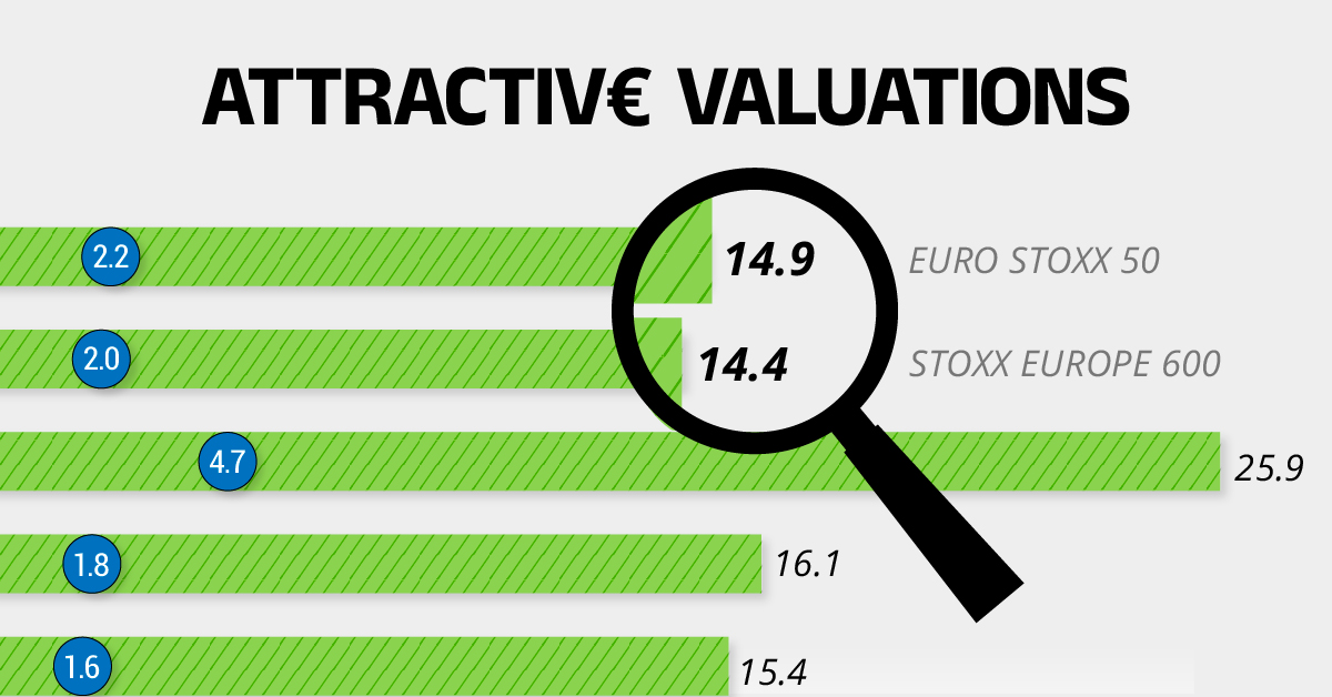
Attractive Valuations
Compared to most North American and Asian markets, European stocks offer lower or comparable valuations.
| Index | Price-to-Earnings Ratio | Price-to-Book Ratio |
|---|---|---|
| EURO STOXX 50 | 14.9 | 2.2 |
| STOXX Europe 600 | 14.4 | 2 |
| U.S. | 25.9 | 4.7 |
| Canada | 16.1 | 1.8 |
| Japan | 15.4 | 1.6 |
| Asia Pacific ex. China | 17.1 | 1.8 |
Data as of February 29, 2024. See graphic for full index names. Ratios based on trailing 12 month financials. The price to earnings ratio excludes companies with negative earnings.
On average, European valuations are nearly 50% lower than U.S. valuations, potentially offering an affordable entry point for investors.
Research also shows that lower price ratios have historically led to higher long-term returns.
Market Movements Not Closely Connected
Over the last decade, the European stock market had low-to-moderate correlation with North American and Asian equities.
The below chart shows correlations from February 2014 to February 2024. A value closer to zero indicates low correlation, while a value of one would indicate that two regions are moving in perfect unison.
| EURO STOXX 50 | STOXX EUROPE 600 | U.S. | Canada | Japan | Asia Pacific ex. China |
|
|---|---|---|---|---|---|---|
| EURO STOXX 50 | 1.00 | 0.97 | 0.55 | 0.67 | 0.24 | 0.43 |
| STOXX EUROPE 600 | 1.00 | 0.56 | 0.71 | 0.28 | 0.48 | |
| U.S. | 1.00 | 0.73 | 0.12 | 0.25 | ||
| Canada | 1.00 | 0.22 | 0.40 | |||
| Japan | 1.00 | 0.88 | ||||
| Asia Pacific ex. China | 1.00 |
Data is based on daily USD returns.
European equities had relatively independent market movements from North American and Asian markets. One contributing factor could be the differing sector weights in each market. For instance, technology makes up a quarter of the U.S. market, but health care and industrials dominate the broader European market.
Ultimately, European equities can enhance portfolio diversification and have the potential to mitigate risk for investors.
Tracking the Market
For investors interested in European equities, STOXX offers a variety of flagship indices:
| Index | Description | Market Cap |
|---|---|---|
| STOXX Europe 600 | Pan-regional, broad market | €10.5T |
| STOXX Developed Europe | Pan-regional, broad-market | €9.9T |
| STOXX Europe 600 ESG-X | Pan-regional, broad market, sustainability focus | €9.7T |
| STOXX Europe 50 | Pan-regional, blue-chip | €5.1T |
| EURO STOXX 50 | Eurozone, blue-chip | €3.5T |
Data is as of February 29, 2024. Market cap is free float, which represents the shares that are readily available for public trading on stock exchanges.
The EURO STOXX 50 tracks the Eurozone’s biggest and most traded companies. It also underlies one of the world’s largest ranges of ETFs and mutual funds. As of November 2023, there were €27.3 billion in ETFs and €23.5B in mutual fund assets under management tracking the index.
“For the past 25 years, the EURO STOXX 50 has served as an accurate, reliable and tradable representation of the Eurozone equity market.”
— Axel Lomholt, General Manager at STOXX
Partnering with STOXX to Track the European Stock Market
Are you interested in European equities? STOXX can be a valuable partner:
- Comprehensive, liquid and investable ecosystem
- European heritage, global reach
- Highly sophisticated customization capabilities
- Open architecture approach to using data
- Close partnerships with clients
- Part of ISS STOXX and Deutsche Börse Group
With a full suite of indices, STOXX can help you benchmark against the European stock market.
Learn how STOXX’s European indices offer liquid and effective market access.

-

 Economy2 days ago
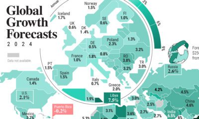
Economic Growth Forecasts for G7 and BRICS Countries in 2024
The IMF has released its economic growth forecasts for 2024. How do the G7 and BRICS countries compare?
-

 Markets2 weeks ago
U.S. Debt Interest Payments Reach $1 Trillion
U.S. debt interest payments have surged past the $1 trillion dollar mark, amid high interest rates and an ever-expanding debt burden.
-

 United States2 weeks ago
Ranked: The Largest U.S. Corporations by Number of Employees
We visualized the top U.S. companies by employees, revealing the massive scale of retailers like Walmart, Target, and Home Depot.
-

 Markets2 weeks ago
The Top 10 States by Real GDP Growth in 2023
This graphic shows the states with the highest real GDP growth rate in 2023, largely propelled by the oil and gas boom.
-

 Markets2 weeks ago
Ranked: The World’s Top Flight Routes, by Revenue
In this graphic, we show the highest earning flight routes globally as air travel continued to rebound in 2023.
-

 Markets3 weeks ago
Ranked: The Most Valuable Housing Markets in America
The U.S. residential real estate market is worth a staggering $47.5 trillion. Here are the most valuable housing markets in the country.


-

 Debt1 week ago
How Debt-to-GDP Ratios Have Changed Since 2000
-
Markets2 weeks ago
Ranked: The World’s Top Flight Routes, by Revenue
-

 Countries2 weeks ago
Population Projections: The World’s 6 Largest Countries in 2075
-
Markets2 weeks ago
The Top 10 States by Real GDP Growth in 2023
-

 Demographics2 weeks ago
The Smallest Gender Wage Gaps in OECD Countries
-

 United States2 weeks ago
Where U.S. Inflation Hit the Hardest in March 2024
-

 Green2 weeks ago
Top Countries By Forest Growth Since 2001
-
United States2 weeks ago
Ranked: The Largest U.S. Corporations by Number of Employees