Central Banks
The Fed’s Balance Sheet: The Other Exponential Curve


The Fed’s Balance Sheet: The Other Exponential Curve
As the threat of COVID-19 keeps millions of Americans locked down at home, businesses and financial markets are suffering.
For example, a survey of small-business owners found that 51% did not believe they could survive the pandemic for longer than three months. At the same time, the S&P 500 posted its worst first-quarter on record.
In response to this havoc, the U.S. Federal Reserve (the Fed) is taking unprecedented steps to try and stabilize the economy. This includes a return to quantitative easing (QE), a controversial policy which involves adding more money into the banking system. To help us understand the implications of these actions, today’s chart illustrates the swelling balance sheet of the Fed.
How Does Quantitative Easing Work?
Expansionary monetary policies are used by central banks to foster economic growth by increasing the money supply and lowering interest rates. These mechanisms will, in theory, stimulate business investment as well as consumer spending.
However, in the current low interest-rate environment, the effectiveness of such policies is diminished. When short-term rates are already so close to zero, reducing them further will have little impact. To overcome this dilemma in 2008, central banks began experimenting with the unconventional monetary policy of QE to inject new money into the system by purchasing massive quantities of longer-term assets such as Treasury bonds.
These purchases are intended to increase the money supply while decreasing the supply of the longer-term assets. In theory, this should put upward pressure on these assets’ prices (due to less supply) and decrease their yield (interest rates have an inverse relationship with bond prices).
Navigating Uncharted Waters
QE falls under intense scrutiny due to a lack of empirical evidence so far.
Japan, known for its willingness to try unconventional monetary policies, was the first to try QE. Used to combat deflation in the early 2000s, Japan’s QE program was relatively small in scale, and saw mediocre results.
Fast forward to today, and QE is quickly becoming a cornerstone of the Fed’s policy toolkit. Over a span of just 12 years, QE programs have led to a Fed balance sheet of over $6 trillion, leaving some people with more questions than answers.
This is a big experiment. It’s something that’s never been done before.
Kevin Logan, Chief Economist at HSBC
Critics of QE cite several dangers associated with “printing” trillions of dollars. Increasing the money supply can drive high inflation (though this has yet to be seen), while exceedingly low interest rates can encourage abnormal levels of consumer and business debt.
On the other hand, proponents will maintain that QE1 was successful in mitigating the fallout of the 2008 financial crisis. Some studies have also concluded that QE programs have reduced the 10-year yield in the U.S. by roughly 1.2 percentage points, thus serving their intended purpose.
Central banks … have little doubt that QE does operate in many ways like conventional monetary policy.
Joseph E. Gagnon, Senior Fellow at the Peterson Institute for International Economics
Regardless of which side one takes, it’s clear there’s much more to learn about QE, especially in times of economic stress.
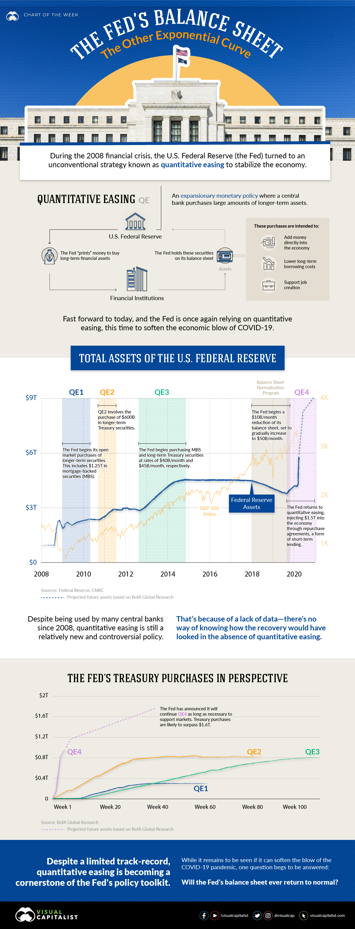
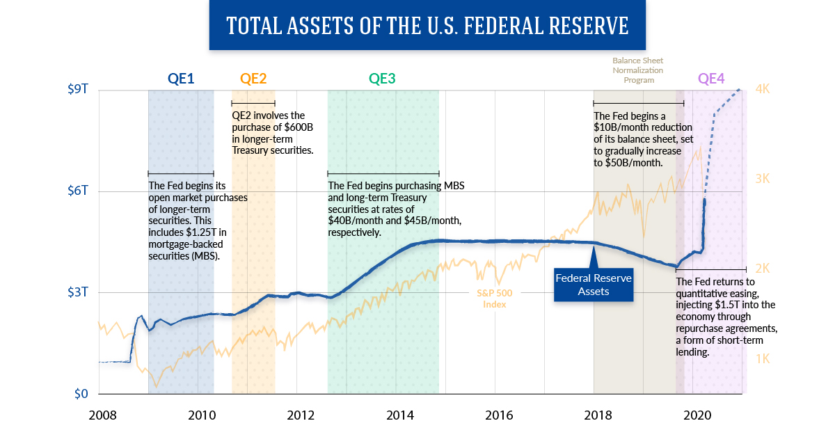
The Other Exponential Curve
When conducting QE, the securities the Fed buys make their way onto its balance sheet. Below we’ll look at how the Fed’s balance sheet has grown cumulatively with each iteration of QE:
- QE1: $2.3 Trillion in Assets
The Fed’s first QE program ran from January 2009 to August 2010. The cornerstone of this program was the purchase of $1.25 trillion in mortgage-backed securities (MBS). - QE2: $2.9 Trillion in Assets
The second QE program ran from November 2010 to June 2011, and included purchases of $600B in longer-term Treasury securities. - Operation Twist (Maturity Extension Program)
To further decrease long-term rates, the Fed used the proceeds from its maturing short-term Treasury bills to purchase longer-term assets. These purchases, known as Operation Twist, did not expand the Fed’s balance sheet, and were concluded in December 2012. - QE3: $4.5 Trillion in Assets
Beginning in September 2012, the Fed began purchasing MBS at a rate of $40B/month. In January 2013, this was supplemented with the purchase of long-term Treasury securities at a rate of $45B/month. Both programs were concluded in October 2014. - Balance Sheet Normalization Program: $3.7 Trillion in Assets
The Fed began to wind-down its balance sheet in October 2017. Starting at an initial rate of $10B/month, the program called for a $10B/month increase every quarter, until a final reduction rate of $50B/month was reached. - QE4: $6 Trillion and Counting
In October 2019, the Fed began purchasing Treasury bills at a rate of $60B/month to ease liquidity issues in overnight lending markets. While not officially a QE program, these purchases still affect the Fed’s balance sheet.
After the COVID-19 pandemic hit U.S. shores, however, the Fed pulled out all the stops. It cut its target interest rate to zero for the first time ever, injected $1.5 trillion into the economy (with more stimulus to come), and reduced the overnight reserve requirement to zero.
Despite receiving little attention in the media, this third measure may be the most significant. For protection against bank runs, U.S. banks have historically been required to hold 10% of their liabilities in cash reserves. Under QE4, this requirement no longer stands.
No End in Sight
Now that the Fed is undertaking its most aggressive QE program yet, it’s a tough guess as to when equilibrium will return, if ever.
After nearly two years of draw-downs, Fed assets fell by just $0.7 trillion—in a matter of weeks, however, this progress was completely retraced.
QE4 is showing that what goes up, may not necessarily come down.


Markets
Charted: IMF Forecasts for International Interest Rates
Which economies are expected to see interest rates rise, or fall? We highlight IMF forecasts for international interest rates through 2028.
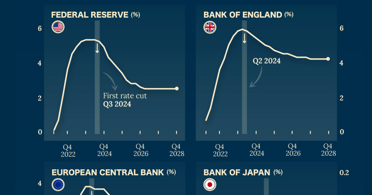
Charted: IMF Forecasts for International Interest Rates
With inflation impacting markets and international interest rates for more than a year, how are different central banks expected to act in the future?
Although the outlook on inflation remains uncertain, the International Monetary Fund (IMF) expects most advanced economies to begin gradually easing interest rates by mid-2024.
These charts show the IMF’s projected central bank policy rates for four major economies through 2028, using the World Economic Outlook forecast data as of October 2023.
Interest Rates Forecasts for 4 Major Economies (2024‒2028)
Since 2022, interest rates have climbed in the EU, the UK, and the U.S. by at least 4 percentage points.
In 2023, rates have continued to climb at a slower pace and are expected to peak at the start of 2024. The U.S. Federal Reserve, for example, is expected to see interest rates peak around 5.4% before beginning to implement rate cuts in Q3 2024.
| Fiscal Quarter | 🇺🇸 U.S. | 🇪🇺 EU | 🇯🇵 Japan | 🇬🇧 UK |
|---|---|---|---|---|
| 2022Q1 | 0.2% | -0.6% | 0.0% | 0.8% |
| 2022Q2 | 0.8% | -0.6% | 0.0% | 1.5% |
| 2022Q3 | 2.2% | -0.1% | 0.0% | 2.6% |
| 2022Q4 | 3.7% | 1.2% | -0.1% | 3.7% |
| 2023Q1 | 4.6% | 2.2% | 0.0% | 4.3% |
| 2023Q2 | 5.0% | 3.1% | 0.0% | 5.1% |
| 2023Q3 | 5.3% | 3.6% | -0.1% | 5.6% |
| 2023Q4 | 5.4% | 3.9% | -0.1% | 5.9% |
| 2024Q1 | 5.4% | 3.9% | -0.1% | 6.0% |
| 2024Q2 | 5.4% | 3.8% | -0.1% | 5.9% |
| 2024Q3 | 5.3% | 3.8% | -0.1% | 5.7% |
| 2024Q4 | 5.0% | 3.8% | -0.1% | 5.5% |
| 2025Q1 | 4.4% | 3.6% | -0.1% | 5.3% |
| 2025Q2 | 4.1% | 3.4% | -0.1% | 5.1% |
| 2025Q3 | 3.8% | 3.1% | 0.0% | 5.0% |
| 2025Q4 | 3.5% | 3.0% | 0.0% | 4.8% |
| 2026Q1 | 3.1% | 2.8% | 0.1% | 4.7% |
| 2026Q2 | 2.9% | 2.7% | 0.1% | 4.6% |
| 2026Q3 | 2.9% | 2.7% | 0.1% | 4.6% |
| 2026Q4 | 2.7% | 2.7% | 0.1% | 4.5% |
| 2027Q1 | 2.6% | 2.7% | 0.1% | 4.4% |
| 2027Q2 | 2.6% | 2.7% | 0.1% | 4.4% |
| 2027Q3 | 2.6% | 2.6% | 0.1% | 4.4% |
| 2027Q4 | 2.6% | 2.6% | 0.1% | 4.3% |
| 2028Q1 | 2.6% | 2.6% | 0.1% | 4.3% |
| 2028Q2 | 2.6% | 2.6% | 0.1% | 4.3% |
| 2028Q3 | 2.6% | 2.6% | 0.1% | 4.3% |
| 2028Q4 | 2.6% | 2.5% | 0.1% | 4.3% |
On the other hand, Japan has held interest rates at 0% or slightly lower since 2016.
Despite the Japanese yen falling and inflation (and prices) in the country continuing to climb, the Japanese economy as a whole has struggled over the past few decades with weak consumer demand. There are worries that raising interest rates will make economic recovery tougher in the long run.
And as other central banks plan to start cutting rates, Japan is poised to do the opposite. In 2025, the country is forecasted by the IMF to see its first positive interest rates in nine years.
It’s important to remember that future rate cuts will largely depend on whether inflation in countries continues to decelerate. Major developments, such as the Israel-Hamas war, can also disrupt global markets and force central banks to change course.

-

 Debt1 week ago
How Debt-to-GDP Ratios Have Changed Since 2000
-

 Markets2 weeks ago
Ranked: The World’s Top Flight Routes, by Revenue
-

 Demographics2 weeks ago
Population Projections: The World’s 6 Largest Countries in 2075
-

 Markets2 weeks ago
The Top 10 States by Real GDP Growth in 2023
-

 Demographics2 weeks ago
The Smallest Gender Wage Gaps in OECD Countries
-

 Economy2 weeks ago
Where U.S. Inflation Hit the Hardest in March 2024
-

 Green2 weeks ago
Top Countries By Forest Growth Since 2001
-

 United States2 weeks ago
Ranked: The Largest U.S. Corporations by Number of Employees