Money
Comparing the Speed of Interest Rate Hikes (1988-2023)


Comparing the Speed of U.S. Interest Rate Hikes
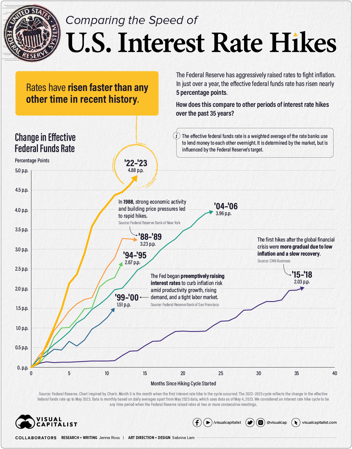
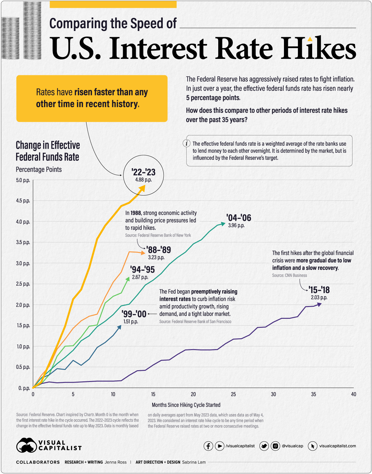
After the latest rate hike on May 3rd, U.S. interest rates have reached levels not seen since 2007. The Federal Reserve has been aggressive with its interest rate hikes as it tries to combat sticky inflation. In fact, rates have risen nearly five percentage points (p.p.) in just 14 months.
In this graphic—inspired by a chart from Chartr—we compare both the speed and severity of current interest rate hikes to other periods of monetary tightening over the past 35 years.
Measuring Periods of Interest Rate Hikes
We measured rate hike cycles with the effective federal funds rate (EFFR), which calculates the weighted average of the rates that banks use to lend to each other overnight. It is determined by the market but influenced by the Fed’s target range. We considered the starting point for each cycle to be the EFFR during the month when the first rate hike took place.
Here is the duration and severity of each interest rate hike cycle since 1988.
| Time Period | Duration (Months) | Total Change in EFFR (Percentage Points) |
|---|---|---|
| Mar 1988 - May 1989 | 14 | +3.23 |
| Feb 1994 - Feb 1995 | 12 | +2.67 |
| Jun 1999 - May 2000 | 11 | +1.51 |
| Jun 2004 - Jun 2006 | 24 | +3.96 |
| Dec 2015 - Dec 2018 | 36 | +2.03 |
| Mar 2022 - May 2023* | 14 | +4.88 |
*We considered a rate hike cycle to be any time period when the Federal Reserve raised rates at two or more consecutive meetings. The 2022-2023 rate hike cycle is ongoing, with the latest hike made on May 4, 2023.
When we last compared the speed of interest rate hikes in September 2022, the current cycle was the fastest but not the most severe. In the months since, the total rate change of 4.88 p.p. has surpassed that of the ‘04-‘06 rate hike cycle. During the ‘04-‘06 cycle, the Federal Reserve eventually decided to pause hikes due to moderate economic growth and contained inflation expectations.
On the other end of the scale, the slowest rate hike cycle occurred in ‘15-‘18 after the Global Financial Crisis. Inflation, as measured by the Personal Consumption Expenditures (PCE) Index, was a mere 0.30% when the first hike occurred. Meeting transcripts reveal that Federal Reserve officials were concerned they may be raising rates too early. However, they agreed to the small quarter percentage point increase to show unity with Fed Chair Janet Yellen, who believed rising oil prices would eventually lead to higher inflation.
End of a Cycle?
The Federal Reserve’s small quarter-point rate hike on May 3 was influenced by a variety of factors. Below is a look at how select indicators have shifted since the first hike occurred in March 2022.
| March 2022 | March 2023 | |
|---|---|---|
| Year-Over-Year Inflation | 6.8% | 4.2% |
| Annual Growth in Labor Costs | 4.5% | 4.8% |
| Inflation-Adjusted Growth in Labor Costs | -3.7% | -0.2% |
| Annualized GDP Growth | 7.0% | 1.1% |
| Unemployment Rate | 3.6% | 3.5% |
| Over-the-Month Change in Employment (Revised data post-rate hike decision in brackets) | +414,000 | +236,000 (+165,000) |
Source: Bureau of Labor Statistics, Bureau of Economic Analysis. Inflation is measured by the Personal Consumption Expenditures (PCE) Index. GDP growth for March 2022 is for Q4 2021, which is the data the Fed would have had access to when making its first rate hike decision. Employment has since grown by 253,000 in April 2023.
The unemployment rate remains low and job growth remains positive. Labor costs, in terms of wages and benefits, continue to grow. However, they are essentially flat on an inflation-adjusted basis. Inflation is still above the Federal Reserve’s 2% target, but it has slowed over the past year.
There are also reasons to be cautious. Economic growth has slowed considerably, and the Federal Reserve predicted in March of this year that a “mild recession” would begin later in 2023. Turbulence in the banking sector is also cause for concern, as tighter credit conditions will likely weigh on economic activity.
For now, it seems the Fed may have pressed pause on future interest rate hikes. Its latest statement said it would “determine the extent to which additional policy firming may be appropriate” rather than previous statements which anticipated future hikes.


Money
Charted: Which City Has the Most Billionaires in 2024?
Just two countries account for half of the top 20 cities with the most billionaires. And the majority of the other half are found in Asia.


Charted: Which Country Has the Most Billionaires in 2024?
This was originally posted on our Voronoi app. Download the app for free on iOS or Android and discover incredible data-driven charts from a variety of trusted sources.
Some cities seem to attract the rich. Take New York City for example, which has 340,000 high-net-worth residents with investable assets of more than $1 million.
But there’s a vast difference between being a millionaire and a billionaire. So where do the richest of them all live?
Using data from the Hurun Global Rich List 2024, we rank the top 20 cities with the highest number of billionaires in 2024.
A caveat to these rich lists: sources often vary on figures and exact rankings. For example, in last year’s reports, Forbes had New York as the city with the most billionaires, while the Hurun Global Rich List placed Beijing at the top spot.
Ranked: Top 20 Cities with the Most Billionaires in 2024
The Chinese economy’s doldrums over the course of the past year have affected its ultra-wealthy residents in key cities.
Beijing, the city with the most billionaires in 2023, has not only ceded its spot to New York, but has dropped to #4, overtaken by London and Mumbai.
| Rank | City | Billionaires | Rank Change YoY |
|---|---|---|---|
| 1 | 🇺🇸 New York | 119 | +1 |
| 2 | 🇬🇧 London | 97 | +3 |
| 3 | 🇮🇳 Mumbai | 92 | +4 |
| 4 | 🇨🇳 Beijing | 91 | -3 |
| 5 | 🇨🇳 Shanghai | 87 | -2 |
| 6 | 🇨🇳 Shenzhen | 84 | -2 |
| 7 | 🇭🇰 Hong Kong | 65 | -1 |
| 8 | 🇷🇺 Moscow | 59 | No Change |
| 9 | 🇮🇳 New Delhi | 57 | +6 |
| 10 | 🇺🇸 San Francisco | 52 | No Change |
| 11 | 🇹🇭 Bangkok | 49 | +2 |
| 12 | 🇹🇼 Taipei | 45 | +2 |
| 13 | 🇫🇷 Paris | 44 | -2 |
| 14 | 🇨🇳 Hangzhou | 43 | -5 |
| 15 | 🇸🇬 Singapore | 42 | New to Top 20 |
| 16 | 🇨🇳 Guangzhou | 39 | -4 |
| 17T | 🇮🇩 Jakarta | 37 | +1 |
| 17T | 🇧🇷 Sao Paulo | 37 | No Change |
| 19T | 🇺🇸 Los Angeles | 31 | No Change |
| 19T | 🇰🇷 Seoul | 31 | -3 |
In fact all Chinese cities on the top 20 list have lost billionaires between 2023–24. Consequently, they’ve all lost ranking spots as well, with Hangzhou seeing the biggest slide (-5) in the top 20.
Where China lost, all other Asian cities—except Seoul—in the top 20 have gained ranks. Indian cities lead the way, with New Delhi (+6) and Mumbai (+3) having climbed the most.
At a country level, China and the U.S combine to make up half of the cities in the top 20. They are also home to about half of the world’s 3,200 billionaire population.
In other news of note: Hurun officially counts Taylor Swift as a billionaire, estimating her net worth at $1.2 billion.

-

 Debt1 week ago
How Debt-to-GDP Ratios Have Changed Since 2000
-

 Markets2 weeks ago
Ranked: The World’s Top Flight Routes, by Revenue
-

 Demographics2 weeks ago
Population Projections: The World’s 6 Largest Countries in 2075
-

 Markets2 weeks ago
The Top 10 States by Real GDP Growth in 2023
-

 Demographics2 weeks ago
The Smallest Gender Wage Gaps in OECD Countries
-

 United States2 weeks ago
Where U.S. Inflation Hit the Hardest in March 2024
-

 Green2 weeks ago
Top Countries By Forest Growth Since 2001
-

 United States2 weeks ago
Ranked: The Largest U.S. Corporations by Number of Employees