

Older, better-educated adults are winning the savings game, reveals a January survey by the National Opinion Research Center at the University of Chicago.


A sneak preview of the exclusive VC+ Special Dispatch—your shortcut to understanding IMF's World Economic Outlook report.


We visualized product categories that saw the highest % increase in price due to U.S. inflation as of March 2024.


Here's where workers earn the highest minimum wage in America as 22 states implement wage increases in 2024.
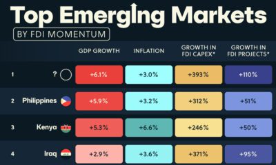

In this graphic, we illustrate the top ten emerging markets according to their foreign direct investment (FDI) momentum in 2024.


We visualize inflation rates across G20 countries as of Feb 2024, in the context of their COVID-19 pandemic peak.


This graphic compares the nominal vs. inflation-adjusted value of the U.S. minimum wage, from 1940 to 2023.
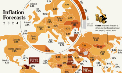

Global inflation projections look optimistic in 2024, but risks of a second wave of price pressures remain due to geopolitical shocks.
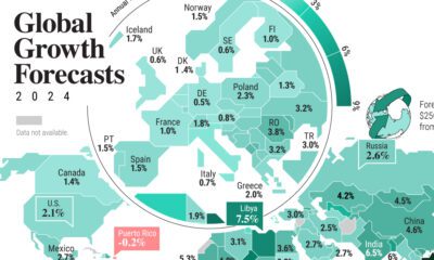

Will global GDP growth continue to be resilient in 2024? This graphic shows the economic outlook for 191 economies around the world.
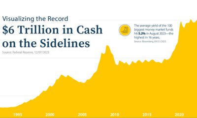

Assets in money market funds are at all-time highs. But as investors stockpile cash, are they missing out on today's stock market rally?


