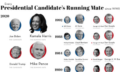

Picking the right VP makes all the difference to a President's success. We look at running mates of all Presidential hopefuls since 1940.
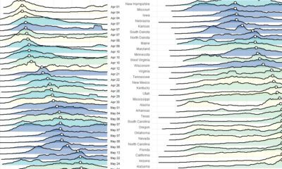

These charts and maps show the evolution of COVID-19's spread in the United States, by organizing data based on peak case and death dates.
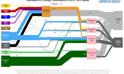

This incredible flow diagram shows how U.S. energy use broke down in 2019, including by source and end sector.
Which apps have been the winners and losers of the COVID-19 lockdown? See how consumer behavior and app popularity has shifted in recent months.
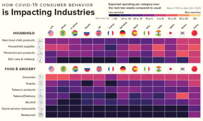

This infographic showcases the industries that will benefit from COVID-19 consumer spending, and the industries that have a very uncertain future.
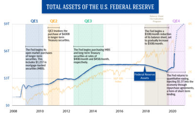

Quantitative easing has led to an unprecedented expansion of the Fed's balance sheet, leaving some economists with more questions than answers.
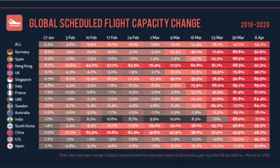

The COVID-19 pandemic is throwing everything up in the air—including the fate of airline companies. See how global flight capacity has gone into a tailspin.
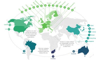

In the race towards a greener future, many corporations are playing an active role. Where are the world's most sustainable companies located?
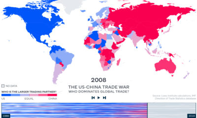

China has become the world's major trading partner – and now, 128 of 190 countries trade more with China than they do with the United States.
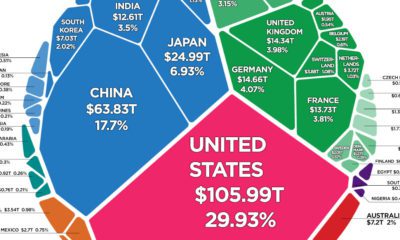

There is $360.6 trillion of wealth globally. This graphic shows how it breaks down by country, to show who owns all of the world's wealth.


