This interactive graphic shows the poverty rate of every state, and also how poverty levels have changed over time according to the U.S. Census Bureau.
In countries where energy is plentiful, we often take the grid for granted. But do you know where your power comes from, and how green it...
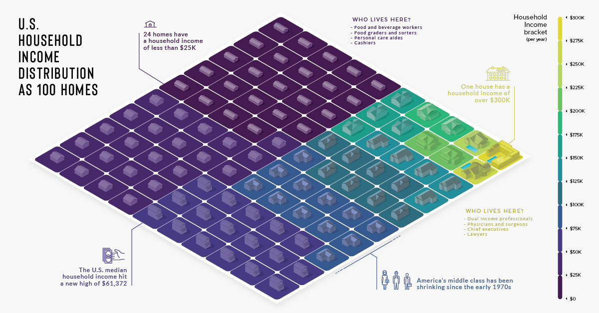
There are over 125 million households in the U.S., each with varying incomes. He's how they look distilled down into a visualization of 100 homes.
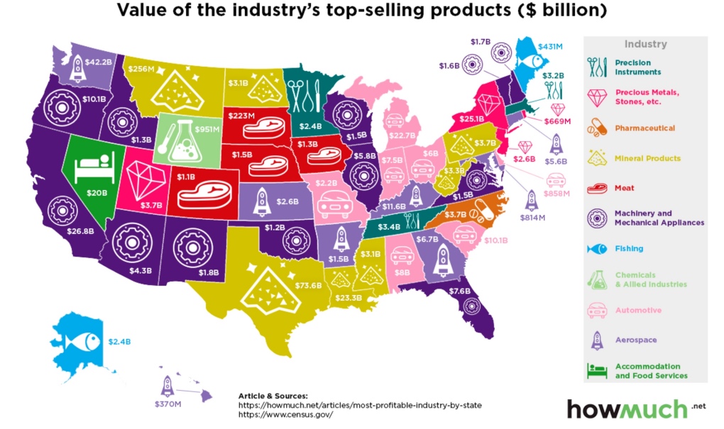
Which industries reign supreme in the United States? This map breaks down the most profitable industry, state by state.
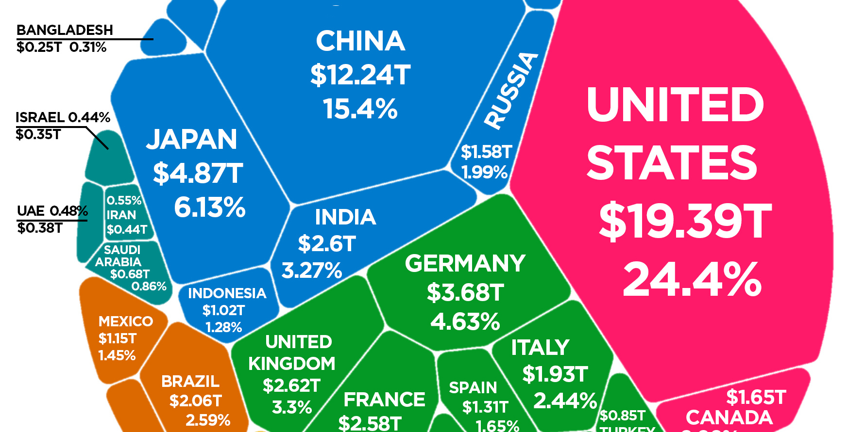
Latest estimates put the world economy at about $80 trillion in nominal GDP. Here is how each individual country stacks up in terms of size.
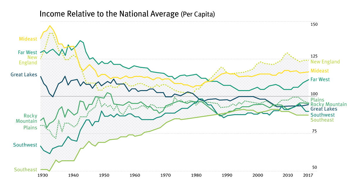
For most of the century, the geographical difference in per capita incomes has been narrowing - but it appears this trend has now reversed in the...
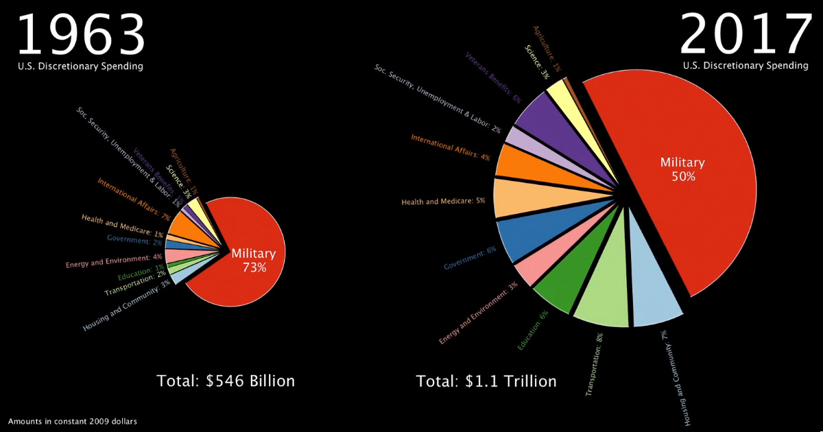
This stunning one minute animation breaks down U.S. government discretionary spending from 1963 all the way until today.
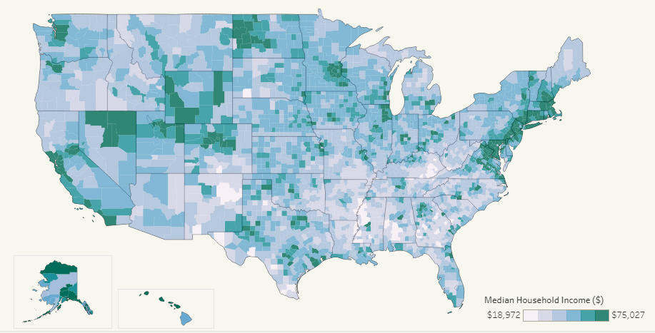
This interactive map allows you to pull data on median household income for all 3,000+ U.S. counties in existence, allowing for some interesting insights.
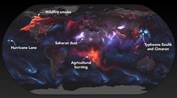
These stunning images from NASA give a whole new perspective on the massive wildfires engulfing the west coast of North America.
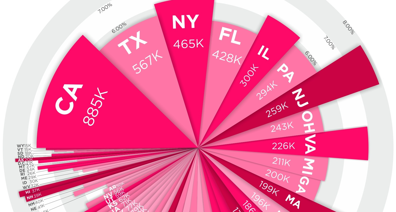
Where do millionaires live in the country? See millionaires by state - in terms of absolute numbers and percentage concentration - in this compelling visual.


