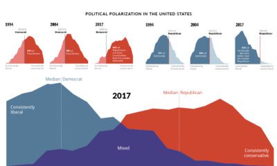

Since 1994, the political divide in the United States has only become more extreme. How have American feelings across major issues evolved over time?
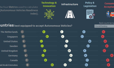

This interactive visual shows the countries best prepared for the shift to autonomous vehicles, as well as the associated societal and economic impacts.
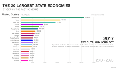

This animation shows how the largest state economies by GDP have changed over the last five decades of time, and what such a ranking looks like...
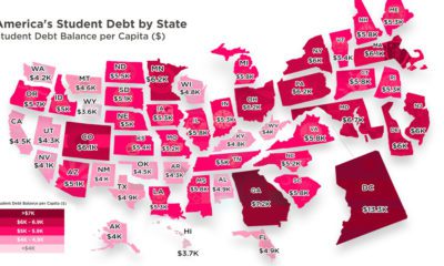

Crippling student debt in the U.S. has reached a record high of $1.5 trillion nationwide. Today’s map breaks down which states bear the highest burden.
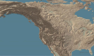

This stunning set of 3d maps purposefully exaggerate the elevation scale to show you the mountains of both the United States and North America.
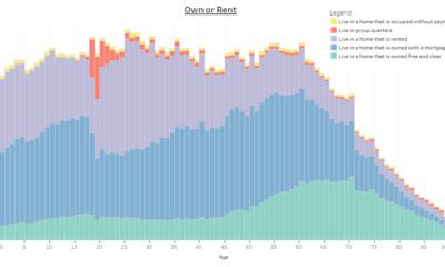

This interactive infographic allows you sort data on the U.S. population using a variety of topics, to see how Americans differ by age.
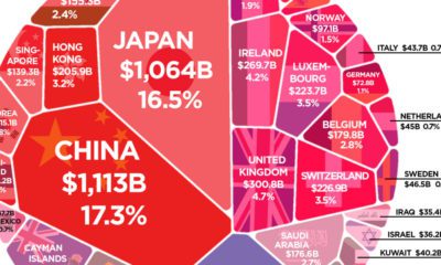

More than $6 trillion of U.S. debt is owned by foreign governments such as China or Japan. See how it all breaks down, and what it...
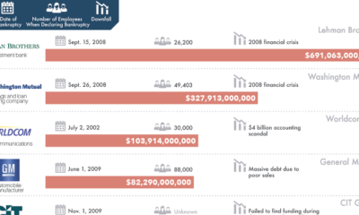

There is always risk in business - but for these 20 companies, which caused the biggest bankruptcies in history, those risks didn't quite pan out.
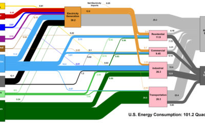

This interesting diagram breaks down all U.S. energy use by both source and industry, and everything that happens in between.
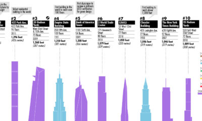

This visualization plots out the tallest buildings in New York City, as well as a few in the pipeline that will change the Big Apple's skyline...


