
Compound interest is a powerful force in building wealth. Here's how it impacts even the most modest portfolio over the...


click for more →


Scan with your phone's camera or QR code app to view
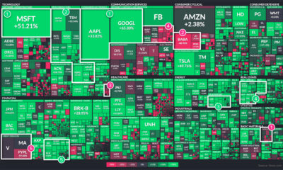

2021 was yet another tumultuous year. Which stock market sectors thrived during the twists and turns of the last 12 months, and which faltered?
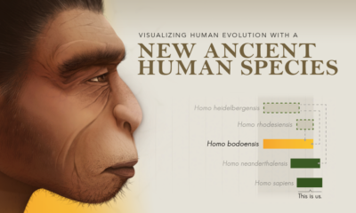

We visualize changes to our understanding of human evolution with the introduction of a new ancient human species, Homo bodoensis.
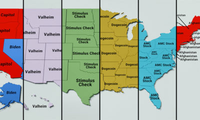

From presidential elections, to cryptocurrencies and billionaires, here are the trending searches in every U.S. state in 2021.
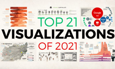

In this eighth edition of our yearly round-up, we highlight visualizations that broke new ground in design and data-driven reporting.
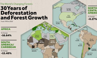

Where are the world's forests still shrinking, and where are they seeing net gains? We map deforestation by country between 1990-2020.
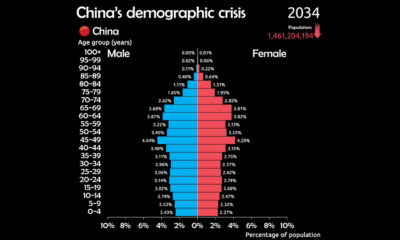

See why China is facing a demographic crisis in this animated chart.
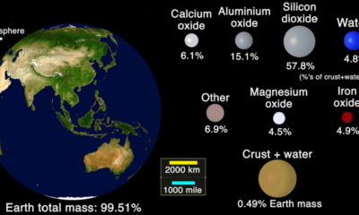

This animation shows the handful of minerals and elements that constitute the Earth's crust.
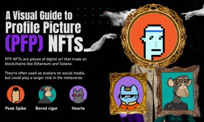

Feeling bored on social media? Consider investing in profile picture NFTs, one of the most popular digital assets being traded today.
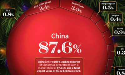

Billions of dollars worth of Christmas decorations are exported around the world each year. Here are the countries that exports the most.
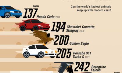

Ever wondered if an animal could outrun a modern car? This infographic puts the top speed of the world's fastest animals into context.
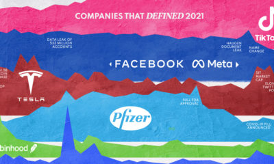

In 2021, a handful of companies dominated the conversation and influenced society in both positive and negative ways.
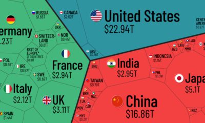

Which countries and regions contribute the most to the world economy? In this infographic, we break down all $94 trillion of global GDP by country.
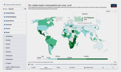

Where does your favorite food come from? Here's an interactive look at global food production.
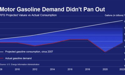

Biofuel mandates were passed in 2005, this graphic shows why they've become out of touch with modern transportation and are costing billions.
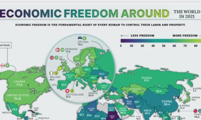

The global average economic freedom score is at the highest its been in 27 years. Here we map the economic freedom score of nearly every country.
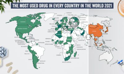

What are the most commonly used illicit drugs around the world?
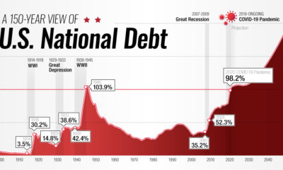

This interactive visual shows how the U.S. national debt has fluctuated since 1900, as well as projections all the way to 2050.


 Creator Program