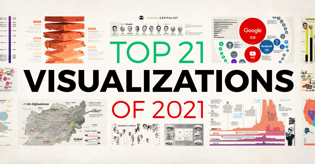
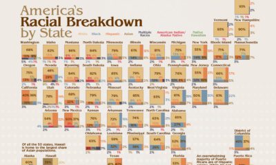
Best of
Our Top 21 Visualizations of 2021
Another tumultuous year is coming to a close. While volatility can be stressful at times, it does provide fertile ground for the Visual Capitalist team to explain what’s happening using a mix of art, data, and storytelling.
In this eighth edition of our yearly round-up, we’ve curated a small selection of our most noteworthy work. Visualizations are highlighted because they reached a wide audience, sparked lively conversations, or broke new ground in design and data-driven reporting.
Let’s dive in to our countdown of the top 21 visualizations of 2021.
Editor’s note: Click on any preview below to see the full-sized version of a visualization.
#21
The World Leaders In Positions of Power (1970-Today)
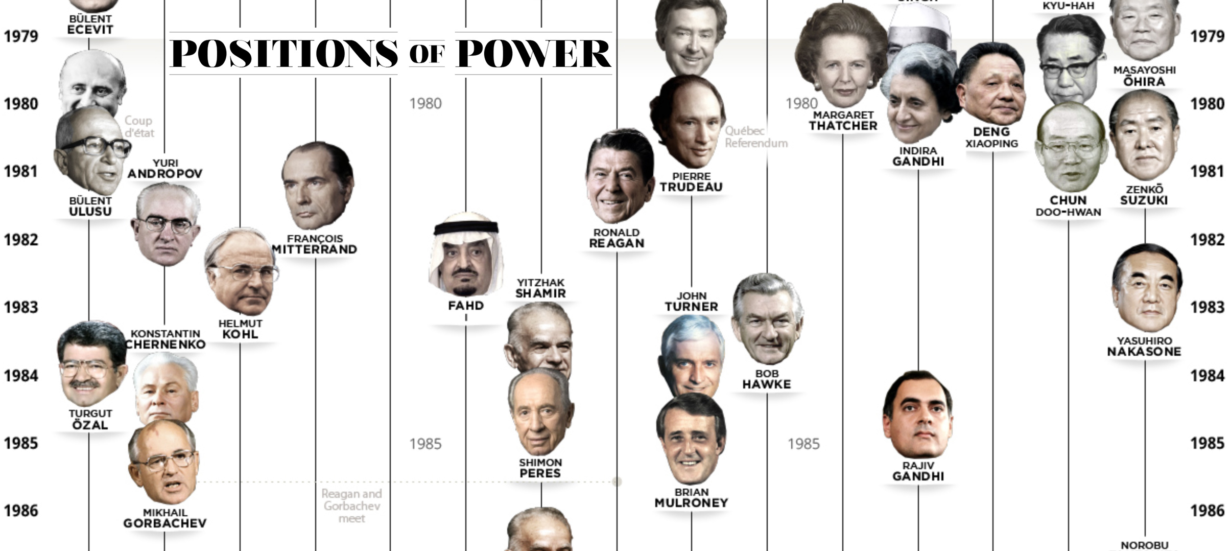
Who were the world leaders when the Berlin Wall fell? How many women have been heads of state in prominent governments? And who are the newest additions to the list of world leaders?
The world’s superpowers have had a myriad of leaders over the years, but at the same time, it’s clear that some leaders have been able to stay in power longer than others.
For example, since 1970, Japan has had 25 different heads of state, while the U.A.E has had only two in the same period.
#20
Ranked: The World’s Fastest Growing Cities
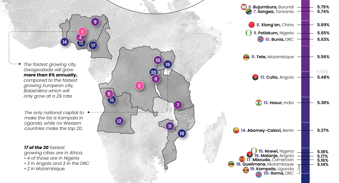
Urbanization is one of the megatrends shaping the future of the global economy. With the world’s population expected to exceed 8 billion in the next 12 months or so, many cities, especially in Africa and Asia, are still growing rapidly.
This visualization looks at the 20 fastest-growing cities worldwide based on population growth.
#19
Visualized: Comparing the Titanic to a Modern Cruise Ship

It’s been over 100 years since the sinking of the Titanic, but its tragic story continues to live on.
In this infographic, we compare the famous ship with Royal Caribbean’s Symphony of the Seas, which is currently the world’s largest cruise ship.
#18
The 50 Richest Women in the World in 2021
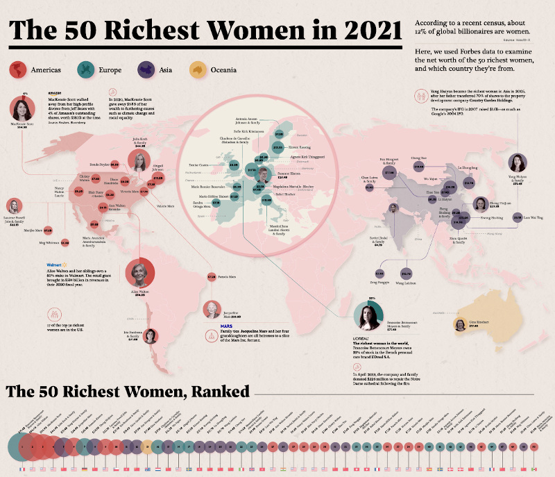
From L’Oréal S.A’s Francoise Bettencourt Meyers and family (#1) to MacKenzie Scott (#3), we look at the fortunes of the wealthiest women, and where they are from.
Using data from Forbes in early January, we found that 17 of the richest women were from America, followed by 12 from China, and three from France.
As was the case with Bettencourt Meyers, many of the women on this list derived their wealth from a family business or inheritance.
For example, the richest woman in China, Yang Huiyan (#5) controls a 57% stake in a real estate development company founded by her father. Alice Walton (#2) is part of the Walton family of Walmart fame—the richest family in the world, while Australia’s Gina Reinhart (#13) helped turn around her father’s fledgling iron ore company.
#17
Razor Thin: A New Perspective on Earth’s Atmosphere
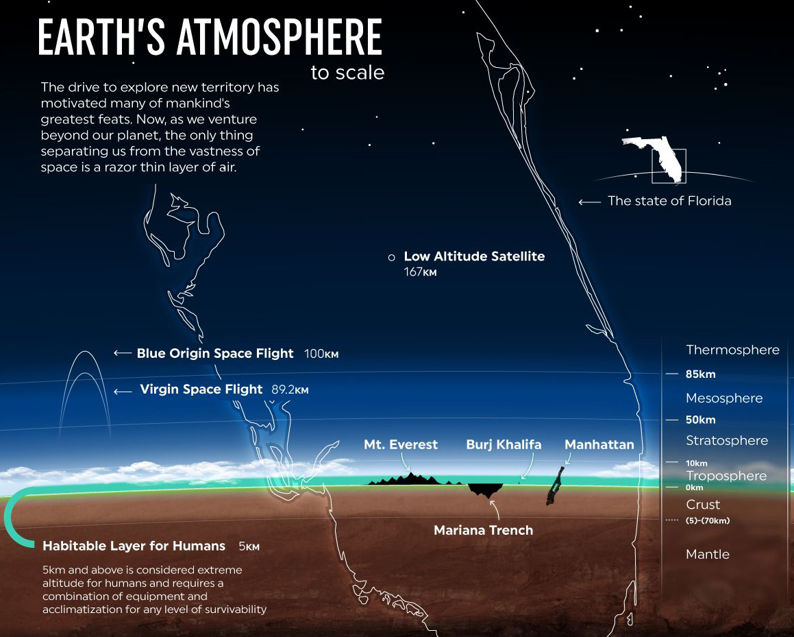
The Earth’s atmosphere extends 6,200 miles (10,000 km) past its surface, but less than one percent of that is habitable.
Inspired by Andrew Winter, this visual compares the Earth’s atmosphere to the size of the state of Florida, illustrating how razor thin the “habitable zone” truly is.
As one example, Mount Everest stretches past this habitable region all the way up to the “death zone”, which often requires humans to use bottled oxygen for survival.
#16
Map Explainer: Key Facts About Afghanistan
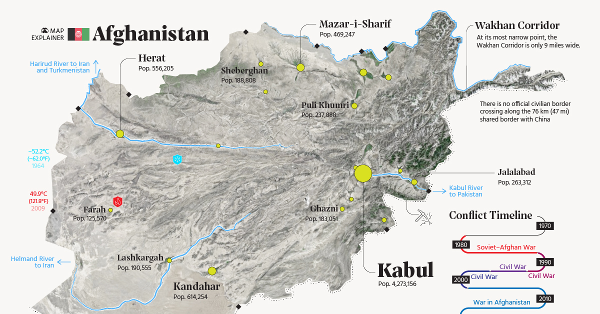
As the situation in Afghanistan grew more tense in the summer of 2021, people were looking for ways to understand what was happening in that part of the world.
While Afghanistan is oft-covered in headlines and news stories, the lion’s share of this coverage is directly related to the decades of conflict that have occurred in the region. In this map explainer, we step back and examine Afghanistan from a structural point of view, taking a closer look at the geographic and population patterns that define the country.
#15
The 50 Most Visited Websites in the World
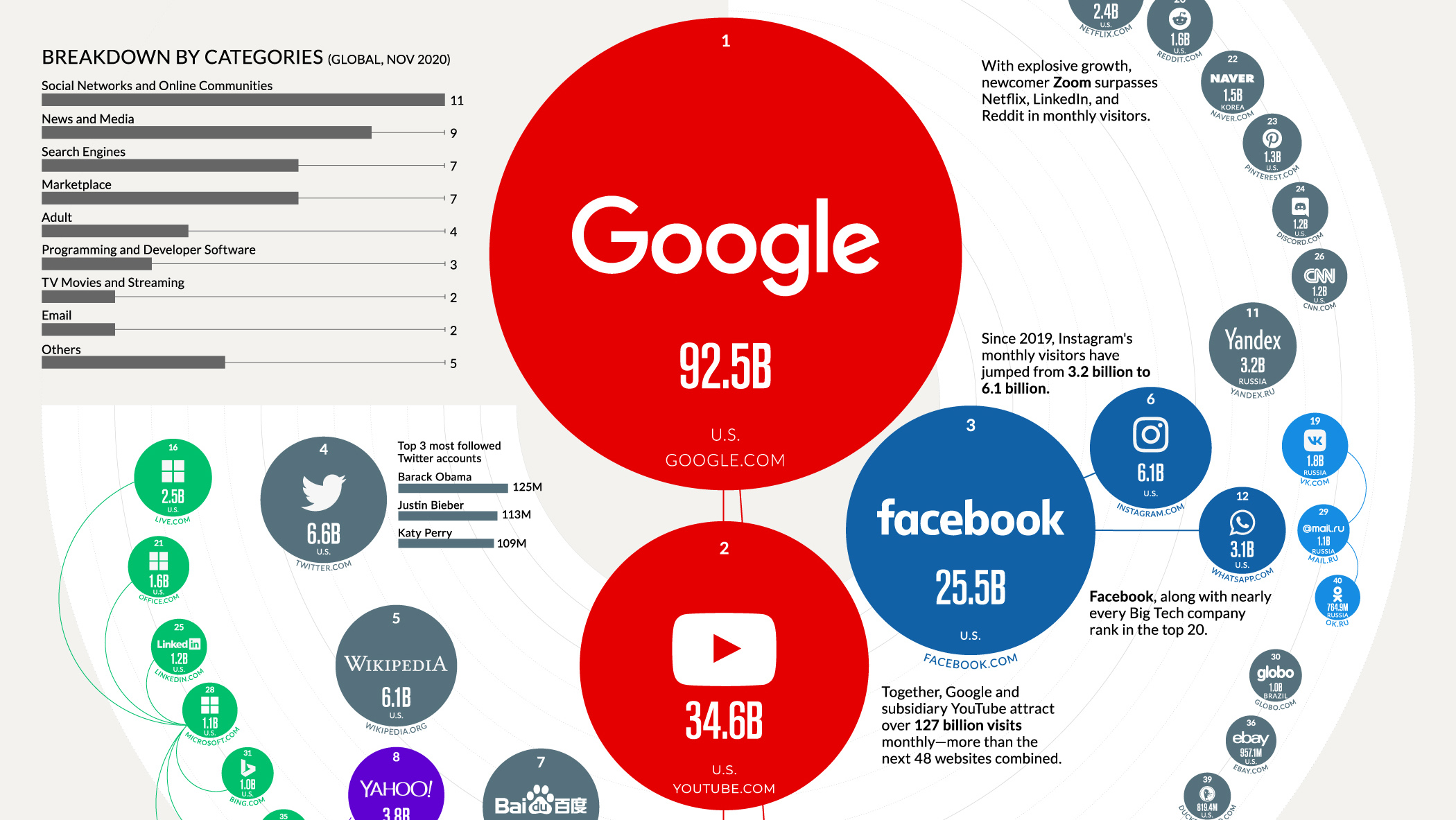
Over 2 trillion annual search queries drive Google’s web traffic. It comes as no surprise that the search engine is the most visited website worldwide, with 92.5 billion monthly visitors.
But the big question is how does the rest of the internet compare?
In this piece, we looked at how social networks, search engines, and news sites dominate the internet, and how the pandemic has shifted web traffic patterns—from Zoom to Twitch.
#14
Timeline: 150 Years of U.S. National Debt
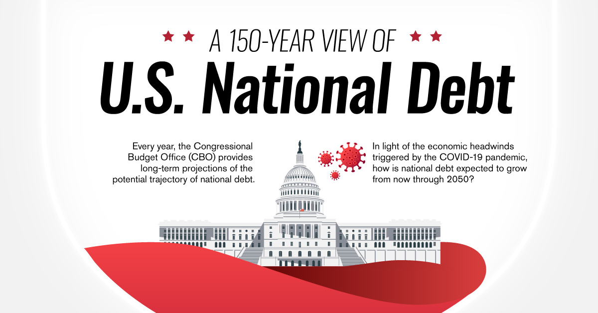
The U.S. has a lot of debt—$29 trillion as of Dec. 28, 2021. That’s well over 100% of annual GDP, a level not seen since World War II.
The national debt quickly shrank after the war, but circumstances this time around are different. The COVID-19 pandemic is dragging on longer than most would have predicted, and the federal government is content with running massive deficits year over year.
Get the full history of U.S. debt (as well as predictions to 2050) in this interactive timeline.
#13
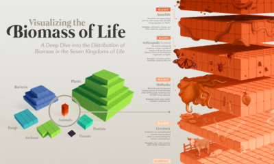
All the Biomass of Earth, in One Graphic
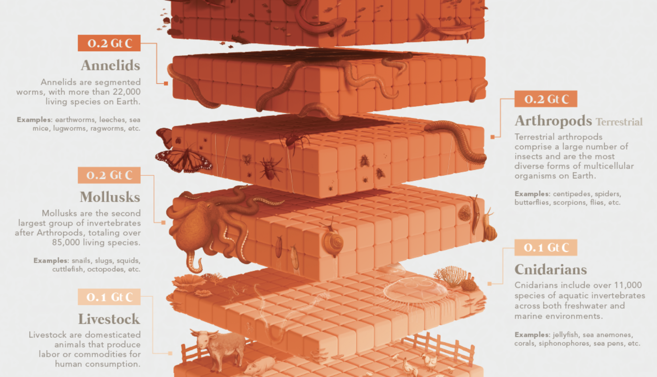
The human species’ contribution to the total weight of living things on Earth is approximately 0.01%. Within the animal kingdom, we are outweighed by other animal groups such as arthropods (insects), fishes, mollusks, and livestock, to name a few.
Compared to the global biosphere, humans and the animal kingdom are greatly overshadowed by fungi and microbial organisms (bacteria, protists, and archaea). And by mass, plants are by far the most dominant lifeform on our planet.
#12
Mapped: Countries by Alcohol Consumption Per Capita
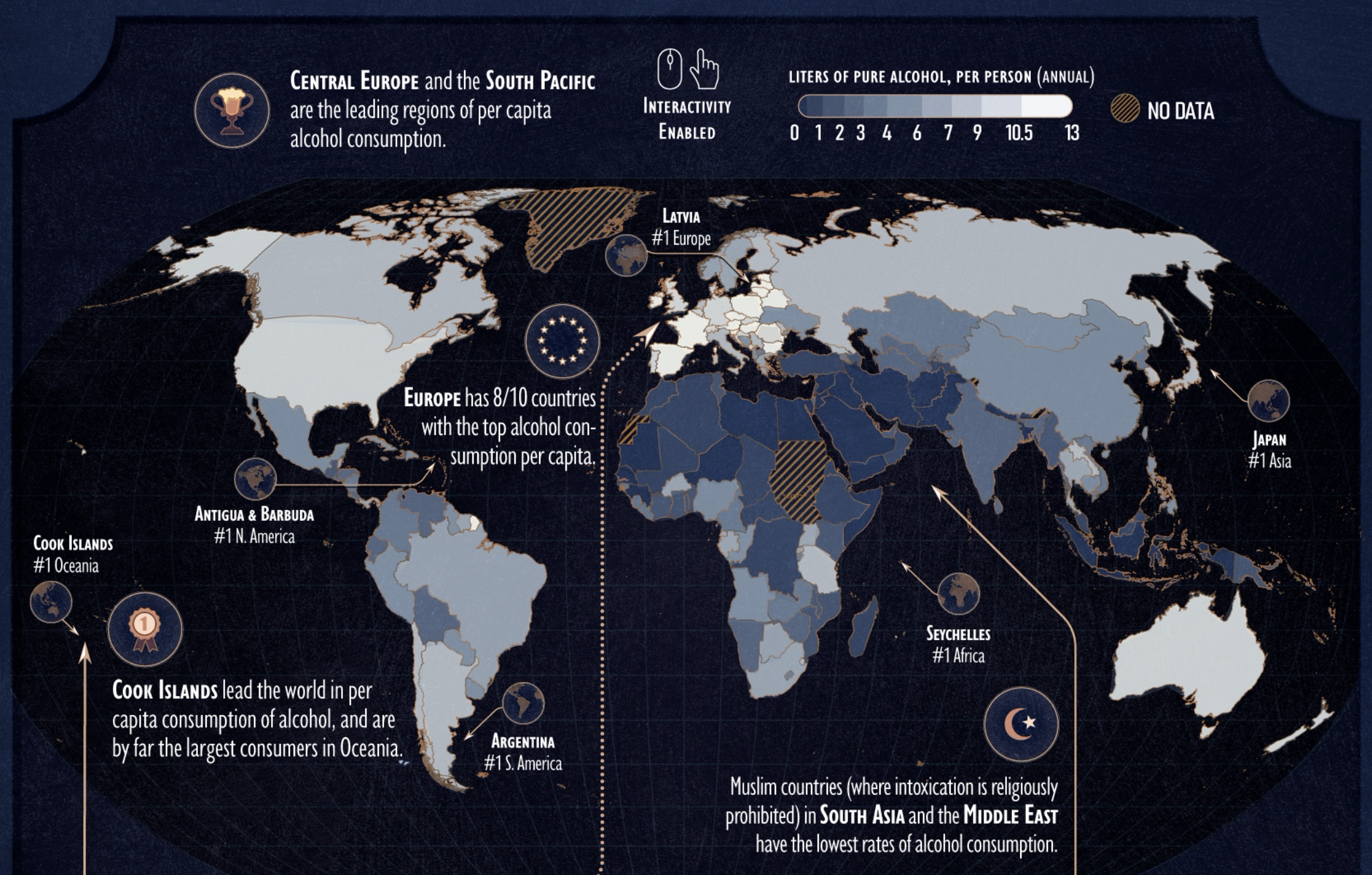
Alcohol might be one of the oldest and most frequently used recreational substances in the world, but examining countries by alcohol consumption shows that usage is not equal.
This unique interactive visualization breaks down per capita alcohol consumption into categories like beer, wine, or spirits, and then regenerates the map based on each country’s total.
#11
Most Common Language in U.S. States (Excl. English or Spanish)
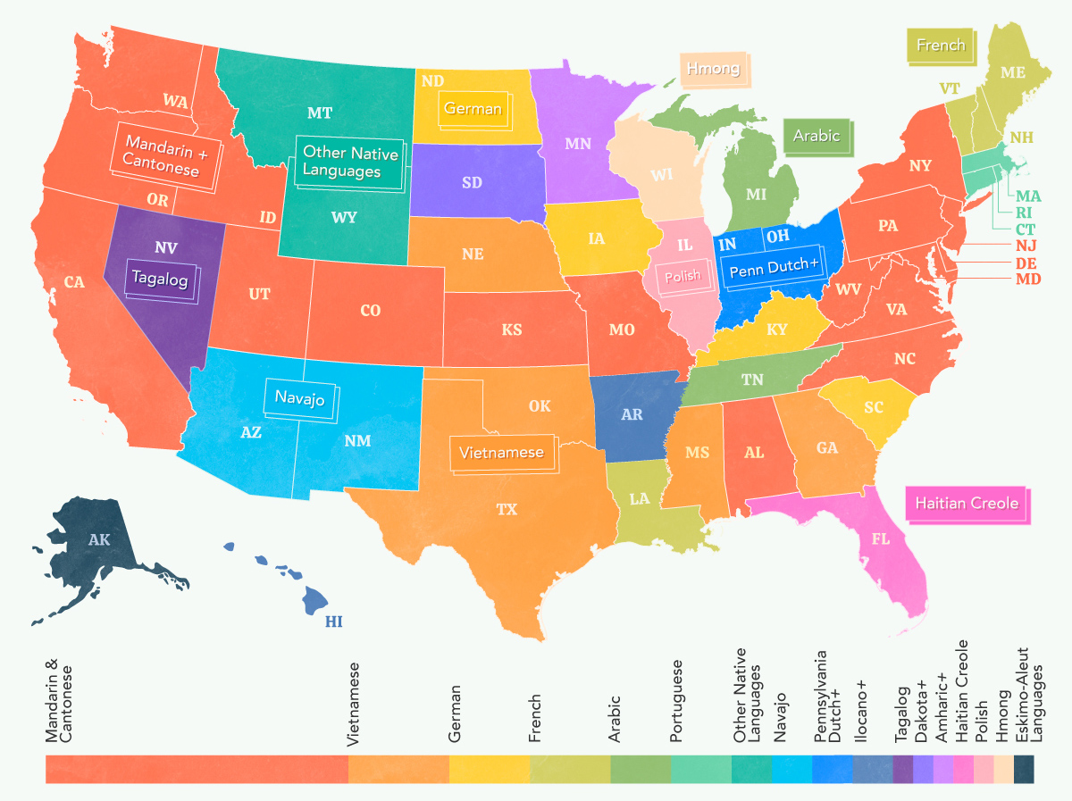
We typically operate under the assumption that Americans largely speak either English or Spanish. But the truth is, this culturally diverse country is home to a whole plethora of languages— more than you might expect.
In this map, we explore the most common language apart from English and Spanish that is spoken in every U.S state. From Mandarin and Cantonese being popular languages spoken across the country to Indigenous languages making a steady comeback, you’ll learn something from this visualization.
#10
Tesla’s R&D and Marketing Per Car vs. Other Automakers
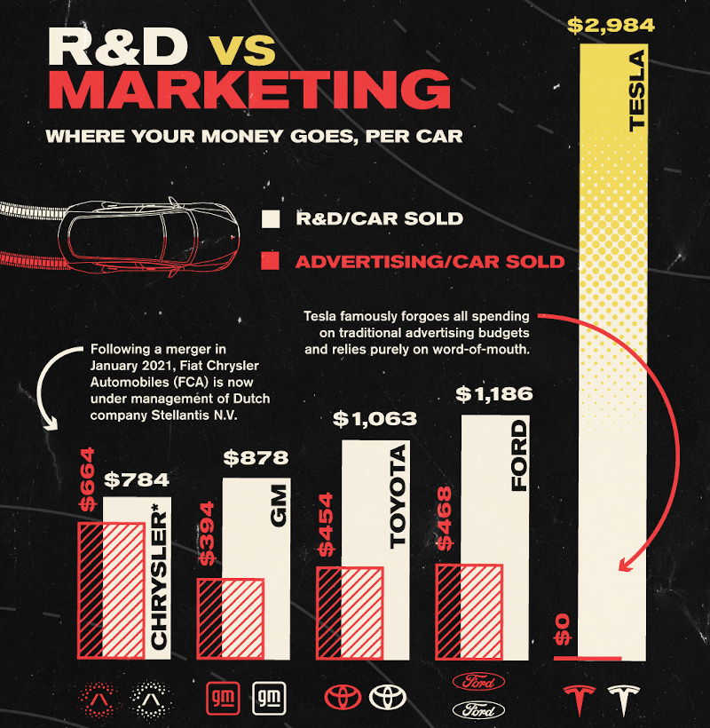
Tesla was the world’s fastest growing brand in 2021, despite spending $0 on conventional advertising. On average, traditional automakers spend about $495 on advertising per vehicle sold. Tesla, on the other hand, invests heavily in research and development, allowing for innovation and the development of cutting-edge technologies.
This chart compares Tesla’s spending on marketing and R&D compares to giant automakers like Ford, Toyota, and General Motors.
#9 and #8
World’s Richest Person: Elon Musk & Bernard Arnault
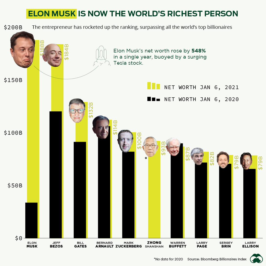
Since 2017, Jeff Bezos has been a fixture at the top of the global wealth leaderboard, but the first week of January in 2021 marked a change.
For the first time ever, Elon Musk took the top spot on the billionaire list after seeing Tesla’s stock skyrocket 1,030% since the beginning of the pandemic.
However, this lead would not hold for long…
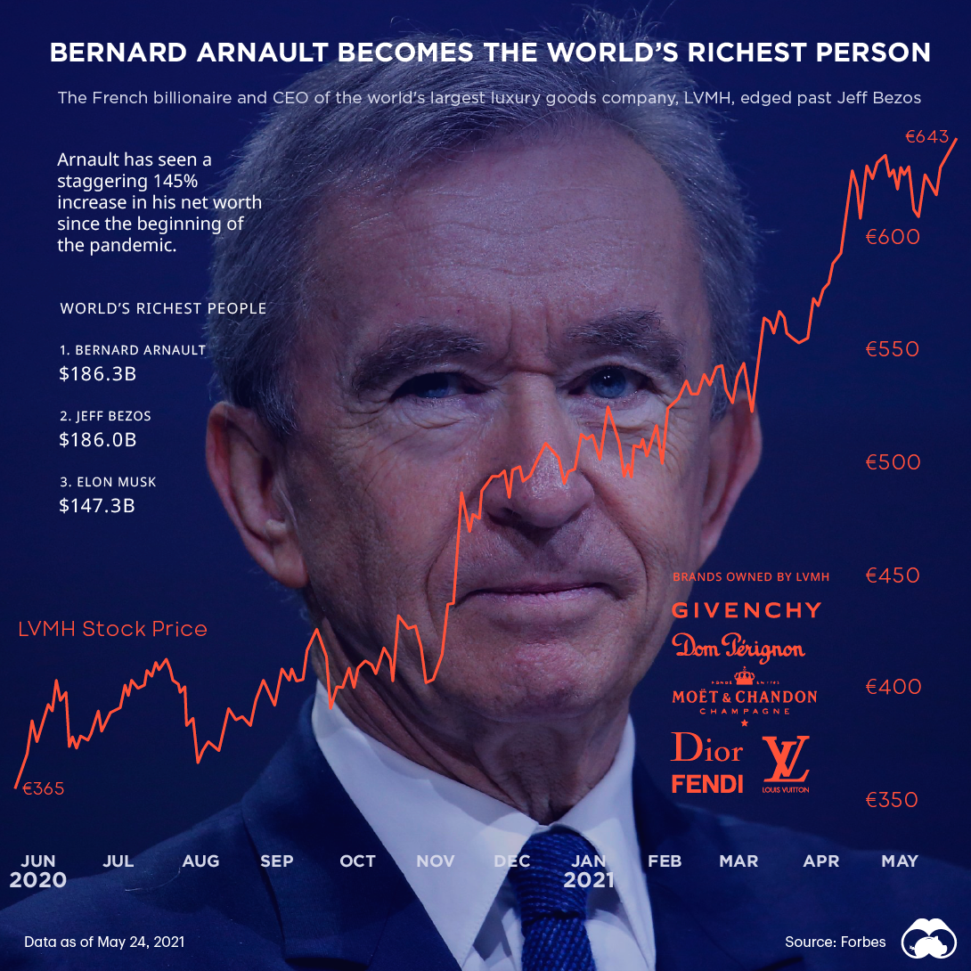
In May 2021, French billionaire Bernard Arnault briefly became the world’s richest person with a net worth surpassing $186 billion. At this point in time, Arnault’s fortune (largely tied to luxury conglomerate LVMH) had seen a staggering 145% increase since the beginning of the pandemic.
However, the luxury titan’s lead over global billionaire rankings was short-lived, as Amazon stock would tick up just hours later, catapulting Bezos back on top of the leaderboard.
A seemingly more permanent shift would happen later in the year: as of time of publishing, Elon Musk is the world’s richest person with a commanding lead of almost $80 billion over Jeff Bezos.
#7
Visualizing Countries by Share of Earth’s Surface
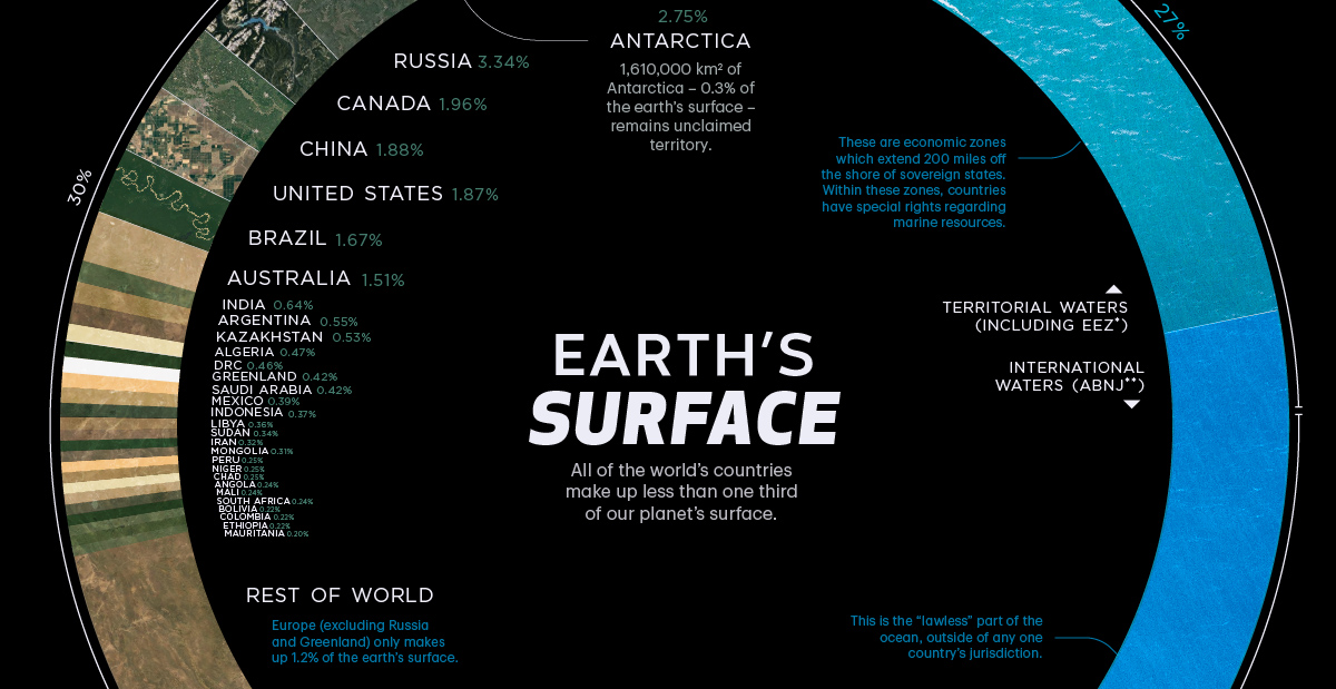
We’re used to seeing Earth in map form, but the continents and oceans as they’re currently arranged make it difficult to gauge how much land and ocean there actually is on the planet’s surface. Further complicating matters is the fact that distortions in common maps can skew our perceptions of how big certain countries are in relation to one another.
This visualization simplifies the world into a donut chart, so we can see the components of the Earth’s surface in a more manageable format.
#6
The Richest People in the World in 2021
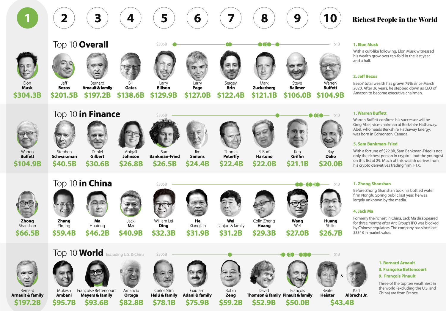
Who is the richest person in 2021?
That’s a tough question, because this year was a dynamic one at the top of the leaderboard of the world’s wealthiest. As noted above, Elon Musk, Bernard Arnault, and Jeff Bezos have all held the top spot at various points in time.
The above graphic, updated in November 2021, gives the most recent data on the topic. This includes highlighting newcomer Sam Bankman-Fried, founder of crypto derivatives trading company FTX, who is now the richest person in crypto, and one of the youngest billionaires globally at 29 years old.
#5
The Crazy World of Stonks Explained
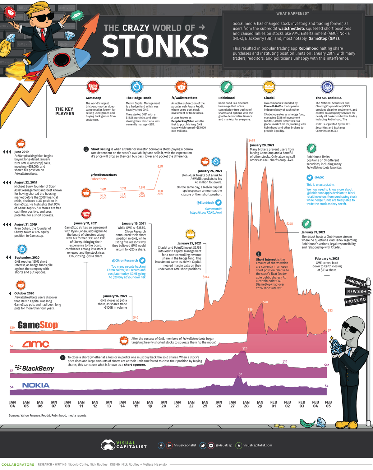
At the end of January this year, electronic retail company Gamestop went on a wild roller coaster ride, seeing its share price rise by roughly 640% in just a few days.
The story involves frenzied posts on the Reddit community r/wallstreetbets, stock prices rising “to the moon”, an epic short squeeze, hedge funds almost going bust, stock halts, and much more.
We highlight the crazy world of stonks in this graphic, showing that the rise of information sharing related to stock trading over the past year has undoubtedly changed how financial markets will be traded forever.
#4
Ranked: The Top 10 EV Battery Manufacturers
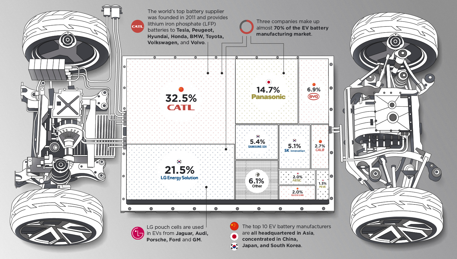
“In an electric future, batteries are as essential to transport as oil is today,” tweeted Tesla founder Elon Musk when he saw this graphic about the top 10 EV battery manufacturers.
With an increasing interest in electric cars, the battery market is now a $27 billion per year business that could grow to $127 billion by 2027 as the world moves away from fossil fuels. This graphic breaks down the growing industry, totally dominated by Asian companies.
#3
All the Metals We Mined in One Visualization
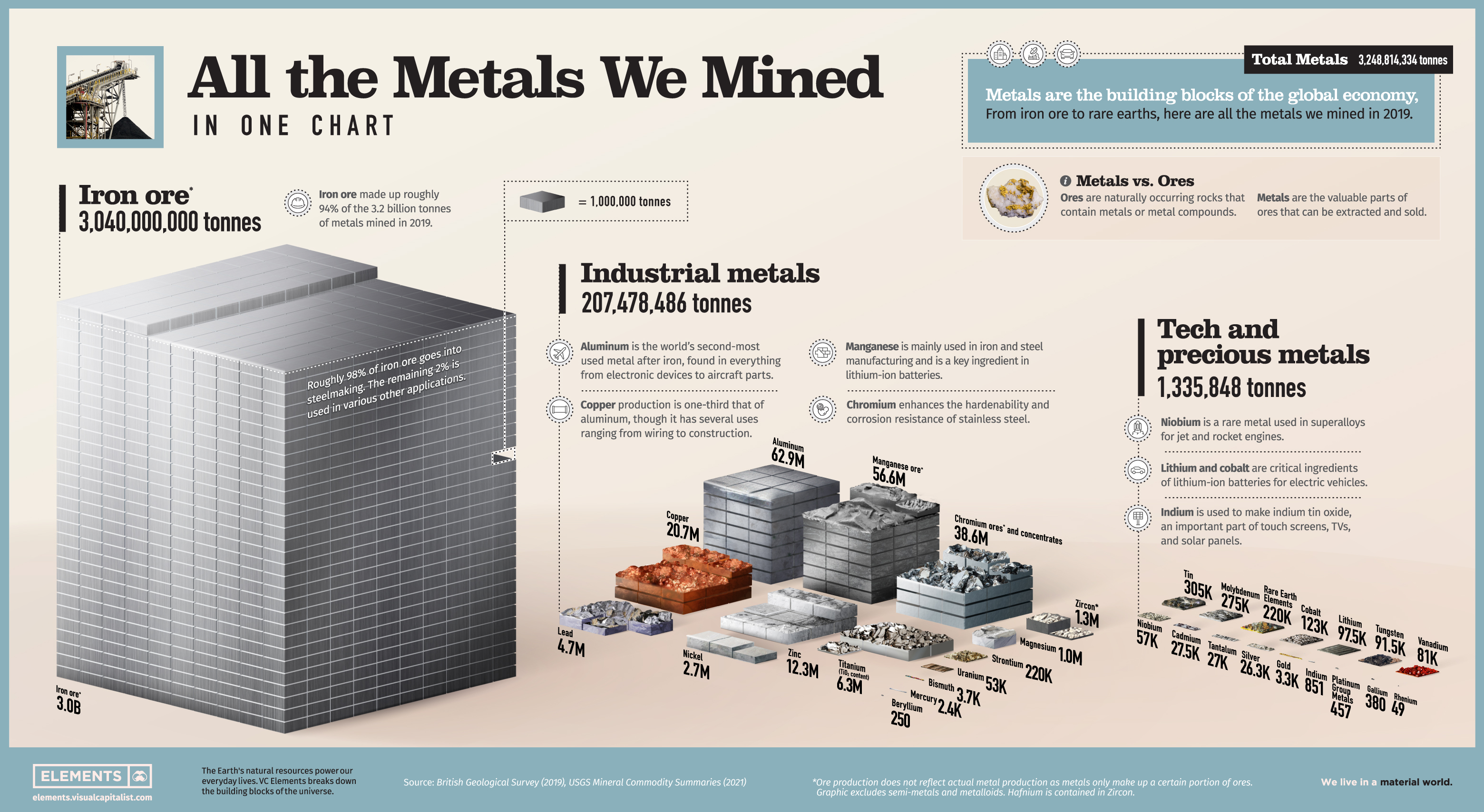
The world’s material appetite is growing with its population, and metals are an important part of it. While some metals are essential for infrastructure, others help power our phones and computers.
This chart shows the 3 billion tonnes of metals mined annually on a relative scale.
#2
The 20 Fastest Growing Jobs in the Next Decade
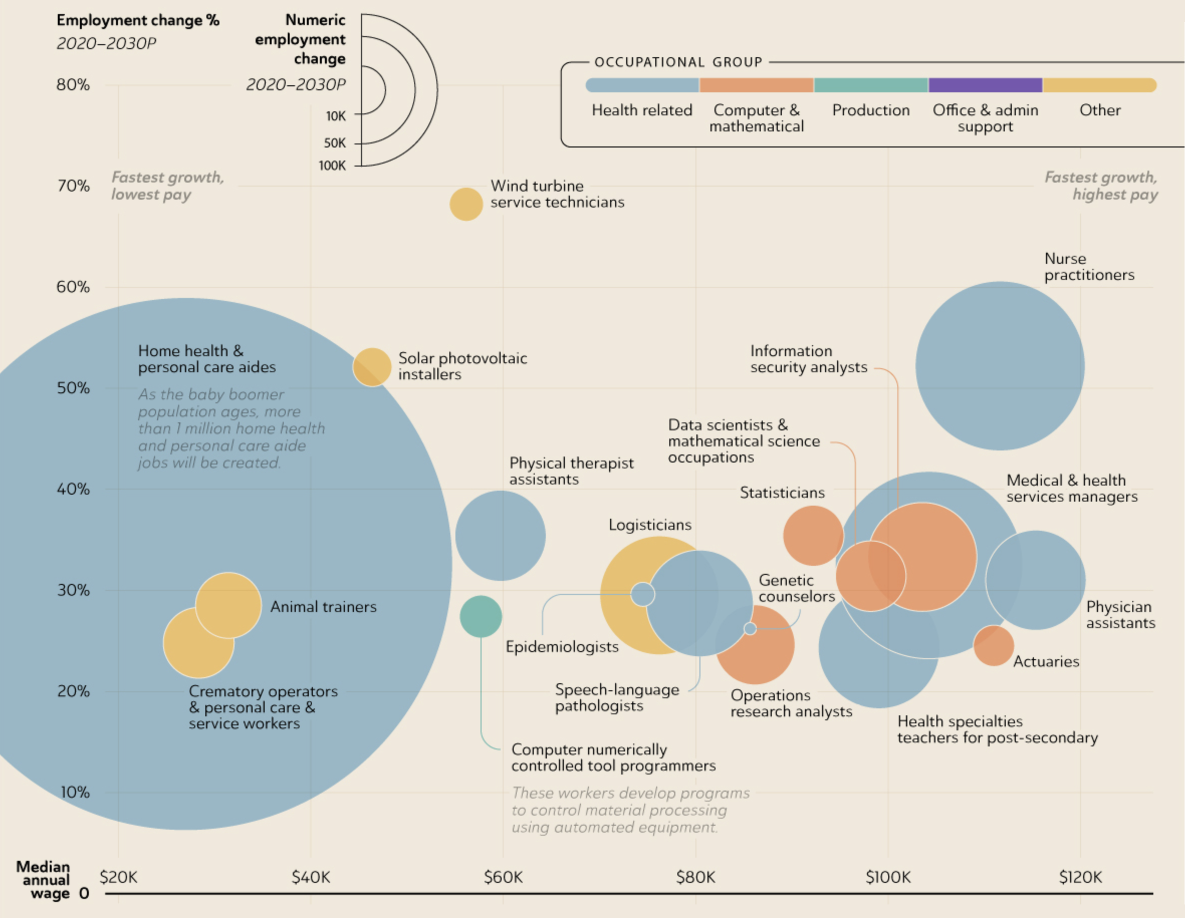
The employment landscape is constantly shifting. Some industries spring up seemingly out of nowhere, and new roles are created to help fuel the disruption. On the flip side, relentless automation and economic factors can result in widespread job cuts as factories close and roles are rendered obsolete.
This visualization looks at the fastest growing jobs from 2020 to 2030, as predicted by the U.S. Bureau of Labor Statistics.
#1
Visualizing the $94 Trillion World Economy in One Chart
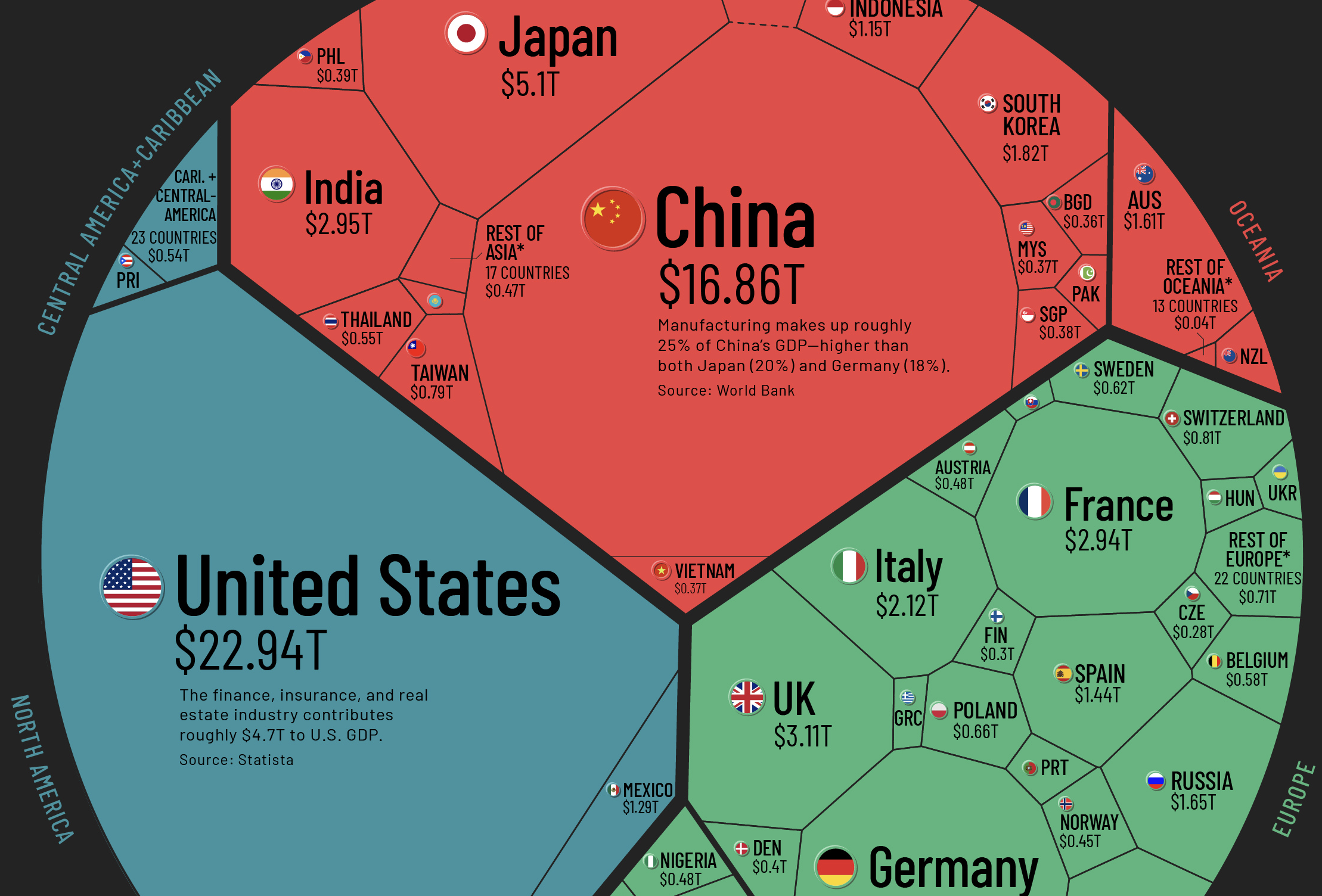
What did the global economy look like in year two of the pandemic?
With a nominal GDP of $22.9 trillion, the U.S. made up roughly a quarter of global output based on estimates from the IMF. Following the U.S. is China, at $16.9 trillion and Japan at $5.4 trillion.
This Voronoi-style visualization, which has received millions of views on Visual Capitalist in the last couple of weeks, breaks down the global economy in a way that is digestible for anyone.
—
With 2021 now a wrap, what’s in store for 2022? Join us as we dive into our 2022 Global Forecast, your cheat sheet for the coming year.


Best of
Best Visualizations of March on the Voronoi App
We round up the most popular, most discussed, and most liked visualizations of the month on Voronoi, our new data storytelling platform.
At the end of 2023, we publicly launched Voronoi, our free new data discovery app!
The initial response from both users and creators has been incredible. We now have millions of in-app views, and there are already more than 700 interesting visualizations to discover, many of which will never be published on Visual Capitalist.
For that reason, we’ve chosen to highlight some of the most popular visualizations and creators from March in this roundup. To see them and many others, make sure to download the app!
Let’s take a look at a popular creator worth highlighting, as well as the most viewed, most discussed, and most liked posts of the month.
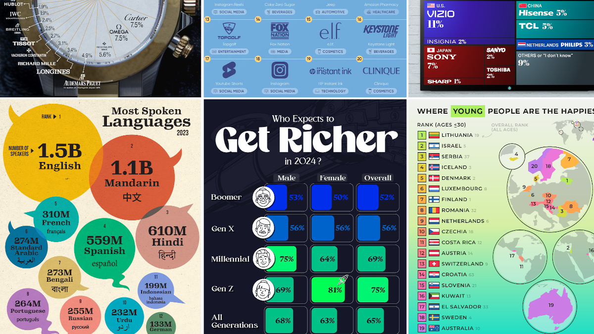
POPULAR CREATOR
Ehsan Soltani
Visual Capitalist isn’t the only creator on the Voronoi app.
Instead, it features incredible data-driven charts and stories from many of the world’s best creators, like Ehsan Soltani.
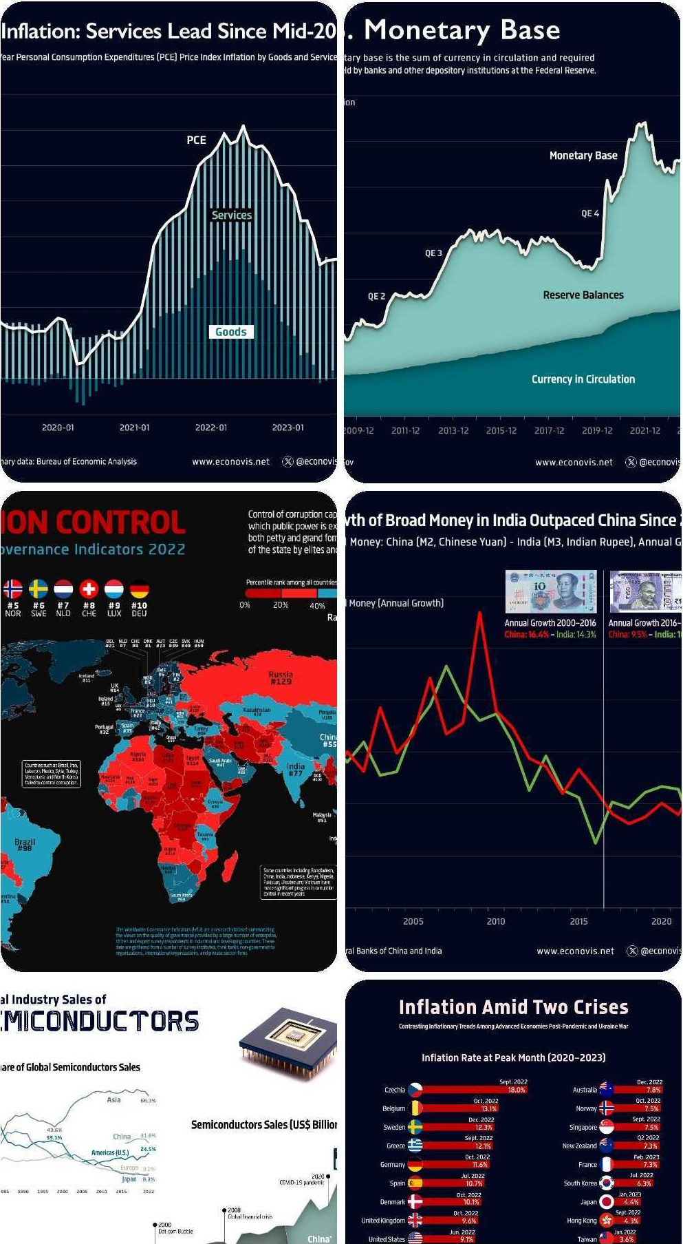
Ehsan is an economist, and one of the most prolific creators on Voronoi so far. He’s published 41 visualizations on wide-ranging subjects such as:
- The world’s biggest “money printer” economies
- Global commodity returns
- Corruption by country
- Inflation rates in advanced economies
For those interested in what’s happening with the global economy, Ehsan Soltani is definitely worth a follow!
![]() View all of Ehsan’s visuals on Voronoi today.
View all of Ehsan’s visuals on Voronoi today.
MOST VIEWED
The 12 Most Spoken Languages in 2023
Which languages are most commonly spoken around the world by native speakers?
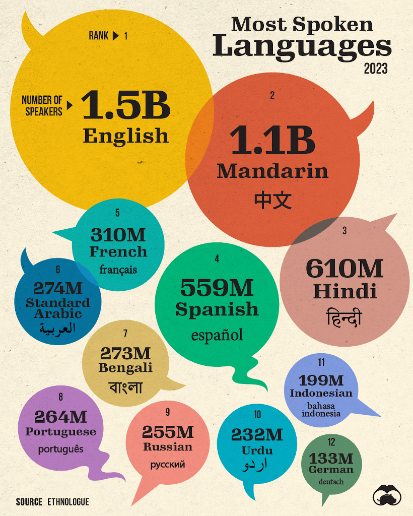
This visualization from Visual Capitalist was one of the most viewed by users, and it highlights the top languages spoken around the world.
Data here comes from the Ethnologue database, the most rigorous and comprehensive language database globally. It’s worth noting that it highlights languages spoken by native speakers only, so second languages are not counted here.
![]() Get the data behind this visual on Voronoi today.
Get the data behind this visual on Voronoi today.
MOST DISCUSSED
Where Young People are Happiest
The most commented on visualization from Visual Capitalist showed the countries with the happiest young people (under 30 years old).
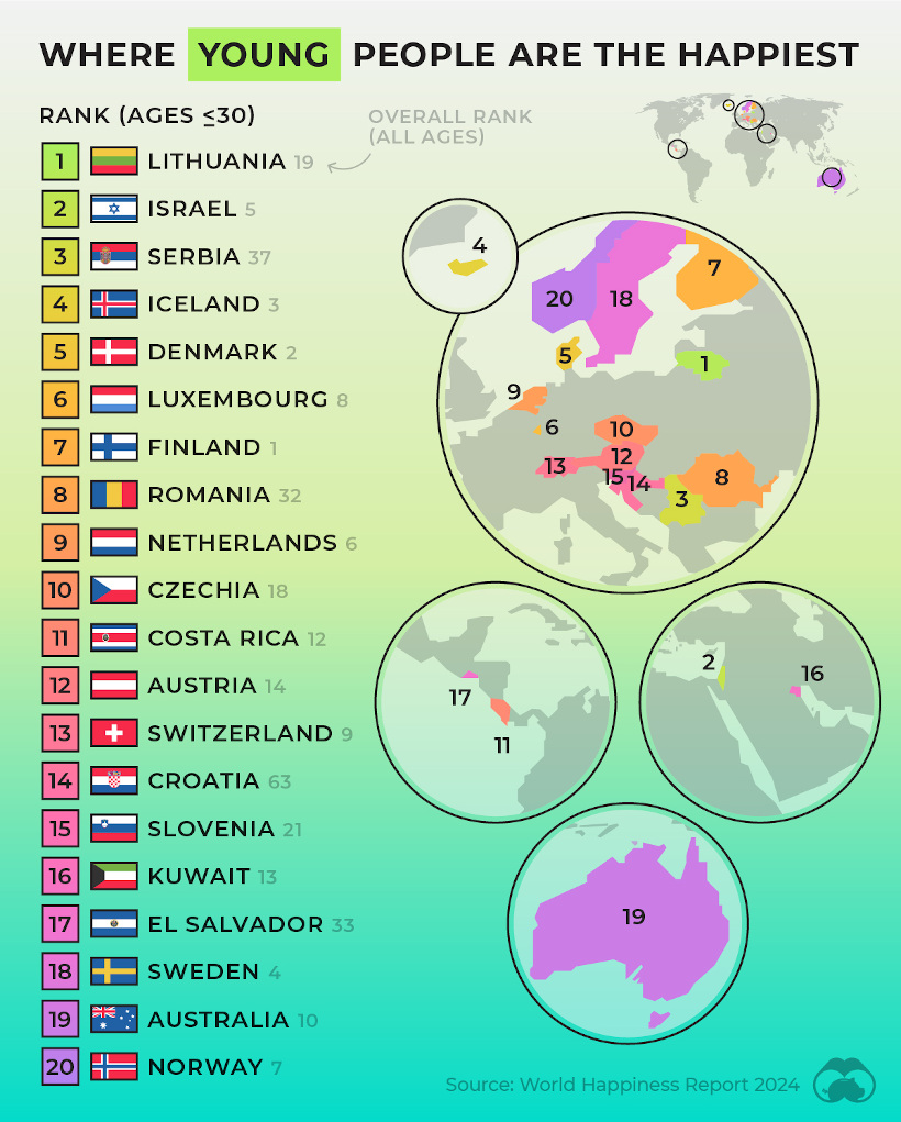
This comes from the World Happiness Report, which Visual Capitalist covers extensively every year.
In this year’s edition, one particularly interesting feature focused on happiness discrepancies between age groups. For example, in some countries, younger people were much happier than the average population—in others, older populations were far happier.
![]() To join the conversation, download Voronoi today.
To join the conversation, download Voronoi today.
MOST LIKED
The Fastest Growing Brands in the U.S.
The most liked visual on Voronoi in March came from Visual Capitalist, showing the brands that are growing the fastest in the United States.
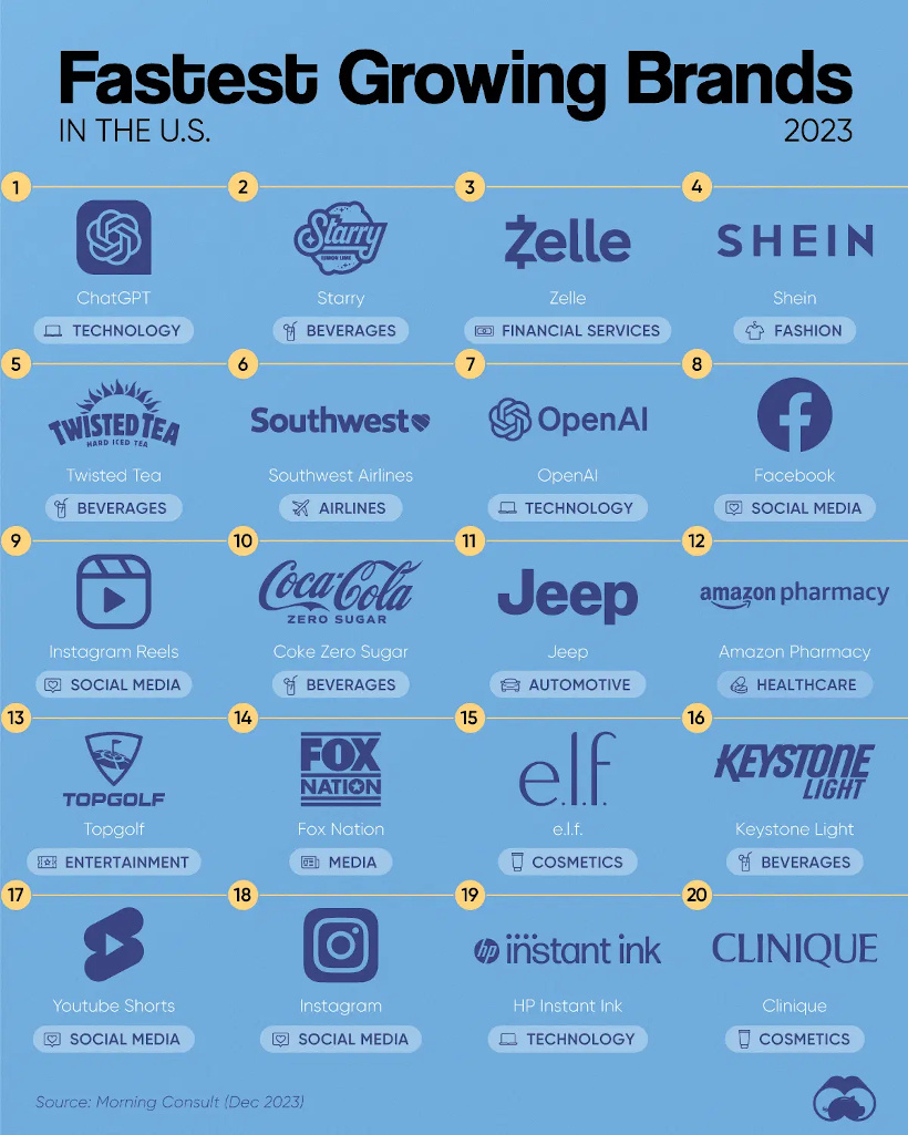
The data here comes from Morning Consult, and shows the share of customers that were considering purchasing a brand in October 1-24, 2023, and subtracted the share of those who said the same between Jan 1-31, 2023.
![]() Get the data behind this visual on Voronoi today.
Get the data behind this visual on Voronoi today.

-

 Markets1 week ago
U.S. Debt Interest Payments Reach $1 Trillion
-

 Markets2 weeks ago
Ranked: The Most Valuable Housing Markets in America
-

 Money2 weeks ago
Which States Have the Highest Minimum Wage in America?
-

 AI2 weeks ago
Ranked: Semiconductor Companies by Industry Revenue Share
-

 Markets2 weeks ago
Ranked: The World’s Top Flight Routes, by Revenue
-

 Countries2 weeks ago
Population Projections: The World’s 6 Largest Countries in 2075
-

 Markets2 weeks ago
The Top 10 States by Real GDP Growth in 2023
-

 Money2 weeks ago
The Smallest Gender Wage Gaps in OECD Countries