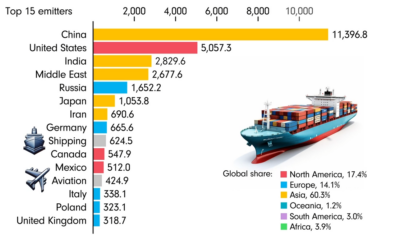
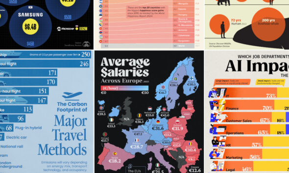
This animated chart by James Eagle uses data from Our World in Data to show the 15 largest carbon emitters...


click for more →


Scan with your phone's camera or QR code app to view
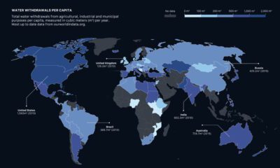

How much water do we have, and which countries use the most? This visual breaks down global water distribution and withdrawals by countries.


Singers, athletes, actors and Kardashians—here are the most followed Instagram accounts and their estimated earnings per sponsored post.
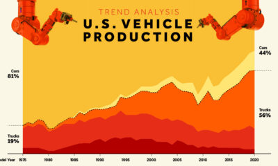

Visualize how U.S. vehicle production has shifted dramatically from cars to trucks, and especially to SUVs, since 1975.
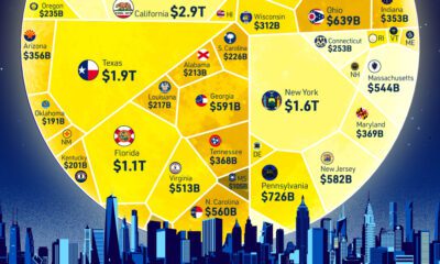

How does each state contribute to America's overall GDP? This visualization breaks down the U.S. economy by state.
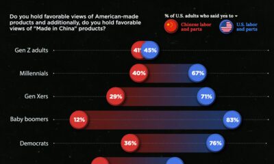

Around 70% of U.S. adults claim to prefer 'made in America' products. This chart breaks down the demographics of patriotic purchases.
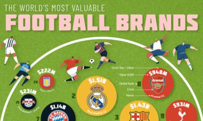

Which clubs, aside from competing on the pitch, also compete as football brands? How much are the most valuable club brands worth?
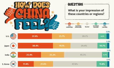

What is the Chinese public's view of world powers? This visual breaks down Chinese sentiment towards other countries.
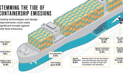

The shipping industry is responsible for 2.89% of all carbon emissions. Here are three ways it could evolve to address climate change.


This month's VC+ special dispatches feature an exploration of five historical maps and an exclusive Q&A with the VC Team on our upcoming app.
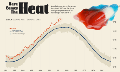

Four days straight in July 2023 set or equaled global temperature records on average.
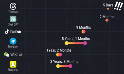

Threads reached 100 million users in just five days. Here is a timeline of how long other popular platforms took to reach the milestone.
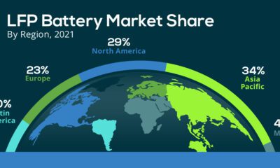

In 2022, the EV sector's market share of the LFP battery rose from just 6% in 2020 to 30%, highlighting its growing popularity.
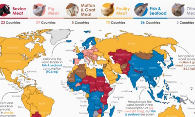

By examining meat consumption by country, we uncover regional differences in how much, and what type of meat people around the world prefer.
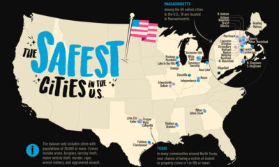

How safe is small town America? This map reveals the safest cities in the U.S. in terms of the total crime rate per every 1,000 residents.
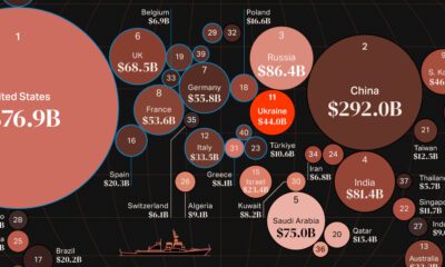

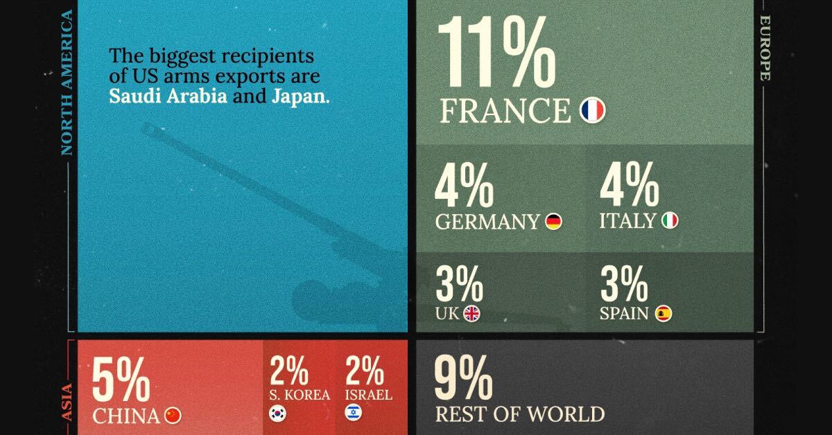
War in Europe has caused Ukraine's military spend to jump up by 640%. How do the world's largest military budgets compare?
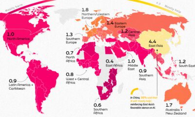

This infographic shows public perception of AI all over the globe and how this sentiment is affected by where you live.
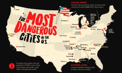

This map shows the most dangerous cities in the U.S. in terms of the violent crime rate per 1,000 residents.


 Creator Program