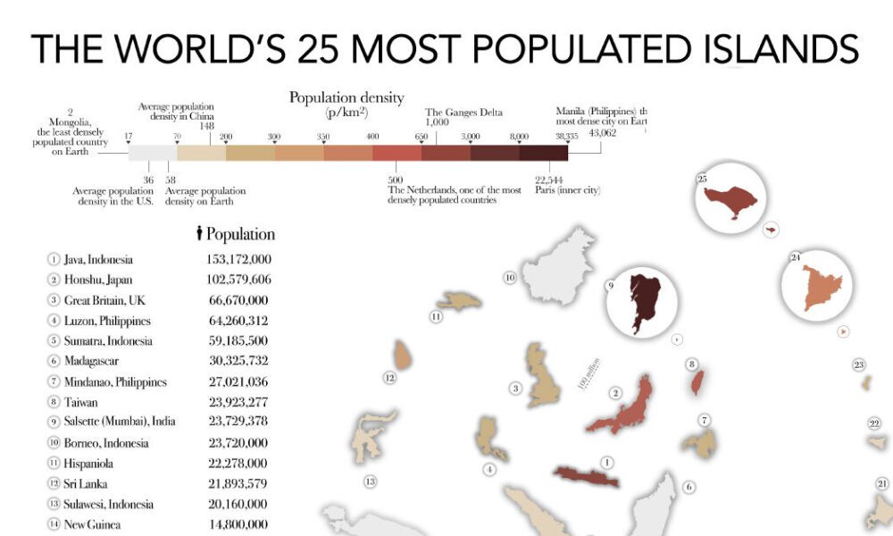
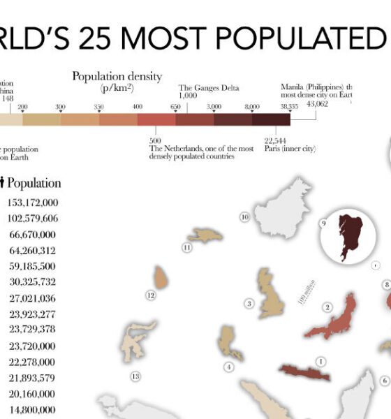

The most populated islands of the earth are teeming hubs of human activity, a far cry from the remote paradises...
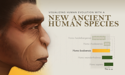

We visualize changes to our understanding of human evolution with the introduction of a new ancient human species, Homo bodoensis.
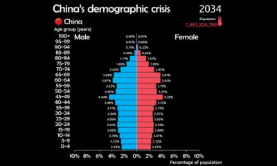

See why China is facing a demographic crisis in this animated chart.
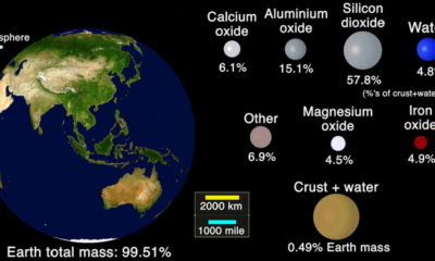

This animation shows the handful of minerals and elements that constitute the Earth's crust.
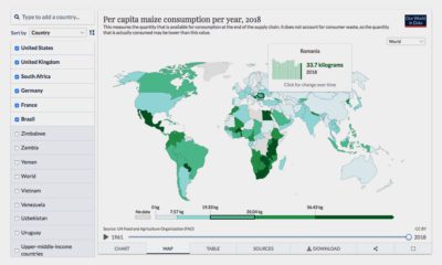

Where does your favorite food come from? Here's an interactive look at global food production.
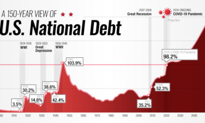

This interactive visual shows how the U.S. national debt has fluctuated since 1900, as well as projections all the way to 2050.
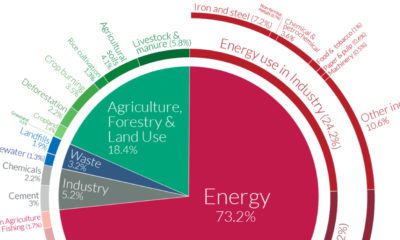

A Global Breakdown of Greenhouse Gas Emissions by Sector In a few decades, greenhouse gases (GHGs)—chiefly in the form of CO₂ emissions—have risen at unprecedented rates...
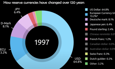

Today, the U.S. dollar makes up 60% of held reserve currency. See how global preferences have shifted since 1900.
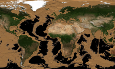

More than two-thirds of Earth’s surface is covered by water and hidden from sight. This animation drains the world’s oceans to reveal the ocean floor.
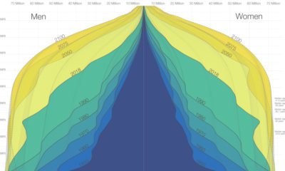

The world is in the midst of a notable demographic transition. Here's how the world population pyramid will change as we close in on the year...
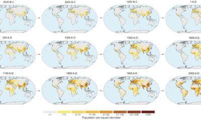

In the next year or so, humanity is expected to pass the 8 billion person milestone. These charts and maps put global population growth into context.