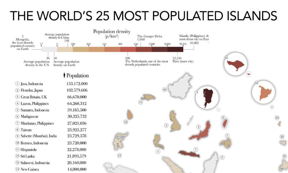
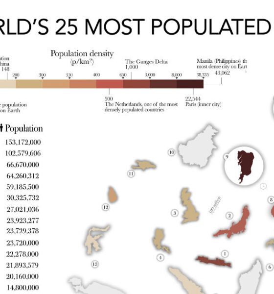

The most populated islands of the earth are teeming hubs of human activity, a far cry from the remote paradises...
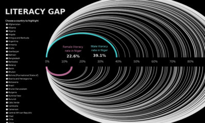

Global literacy rates have increased in the last few decades, but some countries are still lagging behind, especially in Sub-Saharan Africa.
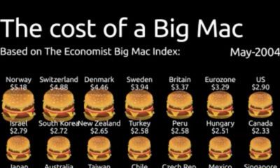

Spanning from 2004-2022, this animation of the Big Mac Index shows the rise in burger prices, and which currencies may be under or overvalued.
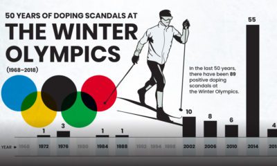

Since 1968, there have been 89 positive doping cases at the Winter Olympics. Here we visualize the 50 years of doping scandals at the Games.
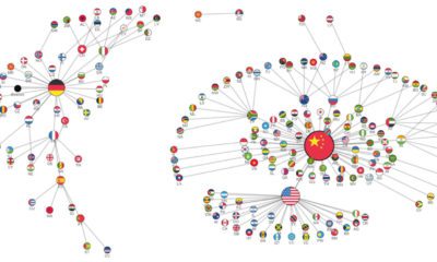

International trade has evolved drastically over the years. While China dominates now, the landscape was much different a few decades ago.


This video offers a new perspective on objects in our solar system, comparing them by their size, rotational speed, and tilt.
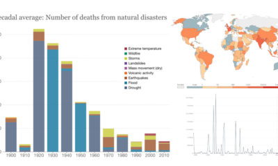

This interactive dashboard, which covers over a century of data on natural disasters, shows a declining global death toll over time.
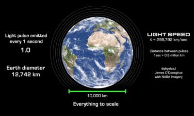

Light speed is often known as the speed limit of the universe. But in the vastness of space, even the speed of light seems slow.


This map visualizes Earth’s seasons, showing how our planet’s Arctic sea ice and vegetation changes throughout the year.
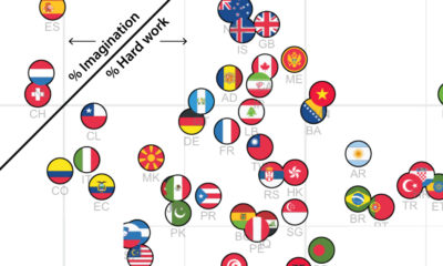

Which qualities do people think are most important for children to learn? The answer differs from country to country.
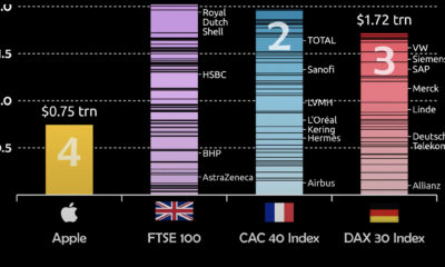

Apple's market cap recently hit $3 trillion. To put that scale into context, this visualization compares Apple to European indexes.