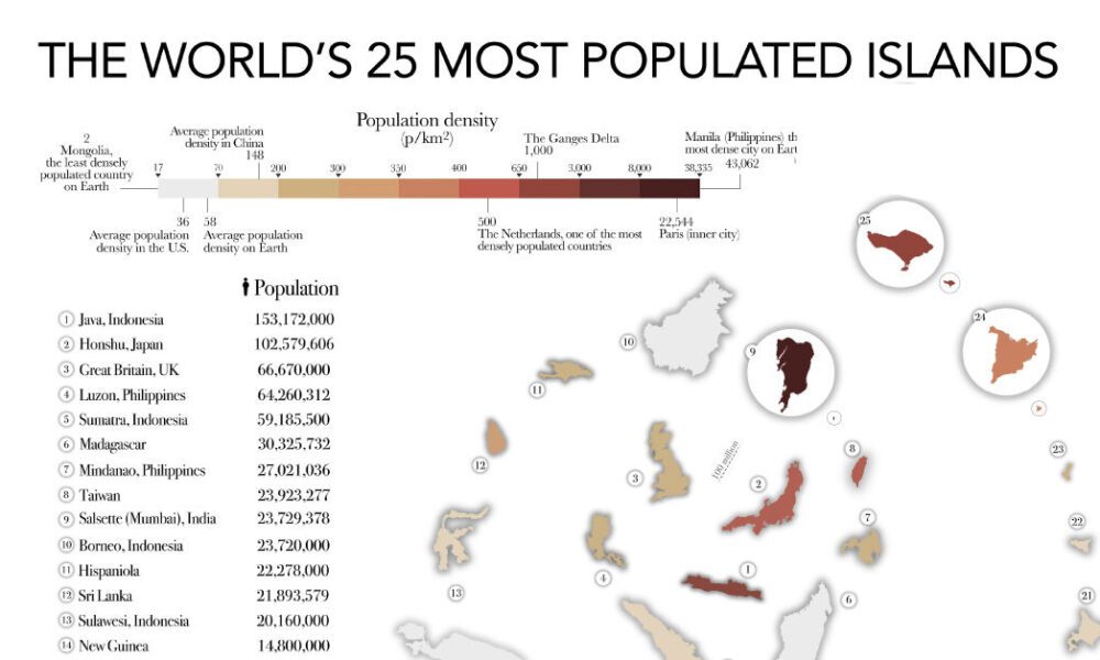
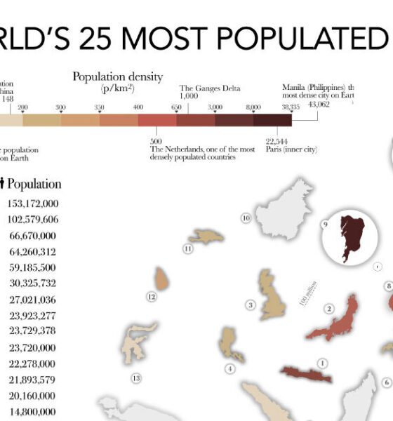

The most populated islands of the earth are teeming hubs of human activity, a far cry from the remote paradises...
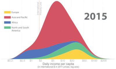

How has global income distribution changed over history? Below, we show three distinct periods since the Industrial Revolution.
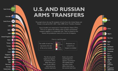

The U.S. and Russia combined for 57% of all global arms transfers in the last decade. This graphic highlights their 50 biggest trade partners.
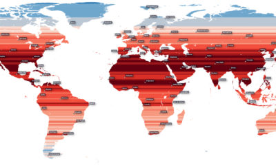

How much of the Earth’s population is located near the equator? This map visualizes the world’s population density by latitude.
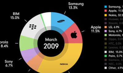

This animation chronicles the evolution of the mobile phone market, showing the rise and fall of various mobile phone manufacturers.
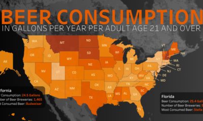

Which U.S. states consume the most beer per capita, and what beers do people prefer?
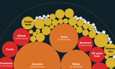

From wheat to cassavas, also known as yuca, here are the top cash crops in Africa and their share of global production.
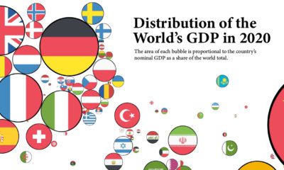

How have the world's largest economies changed over time? These graphics show countries sized by their GDP, as a share of the global total.
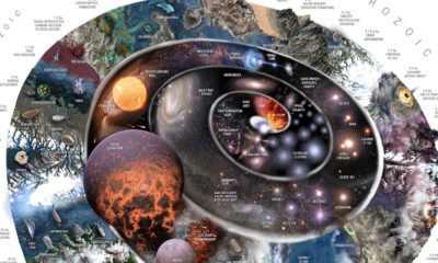

This spiral timeline shows the events that led us to our modern world, from the Big Bang to the present.
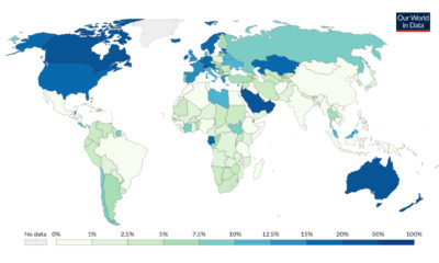

Immigrants account for 3.5% of the global population, but where are they more or less prevalent? This map shows immigration by country.
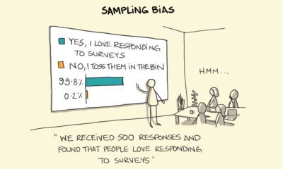

We fall victim to cognitive biases in our daily lives, far more often than we realize.