Misc
Cognitive Biases: Three Common Types Illustrated
Article/Editing:
In a world of information overload, we can fall victim to all sorts of cognitive biases. Since they can lead us to generate false conclusions, it’s particularly important to understand what these biases are and how they work, as the consequences can become quite drastic.
Confirmation bias, sampling bias, and brilliance bias are three examples that can affect our ability to critically engage with information. Jono Hey of Sketchplanations walks us through these cognitive bias examples, to help us better understand how they influence our day-to-day lives.
Confirmation Bias
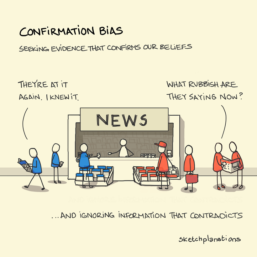
One of the most-commonly encountered and understood, you’re likely to have already heard about confirmation bias. This cognitive bias affects the way we test and evaluate hypotheses every day.
In simple terms, confirmation bias is the tendency to seek out or interpret evidence in such a way that supports our own strongly-held beliefs or expectations. This means that, given access to the same set of data and information, different people can come to wildly differing conclusions.
Feeding into confirmation bias can lead us to make ill-informed choices or even reinforce negative stereotypes. For this reason, it is important to remember to seek out information that both confirms and contradicts your presumptions about a certain topic.
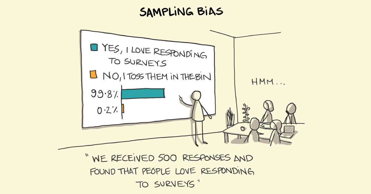
Sampling Bias
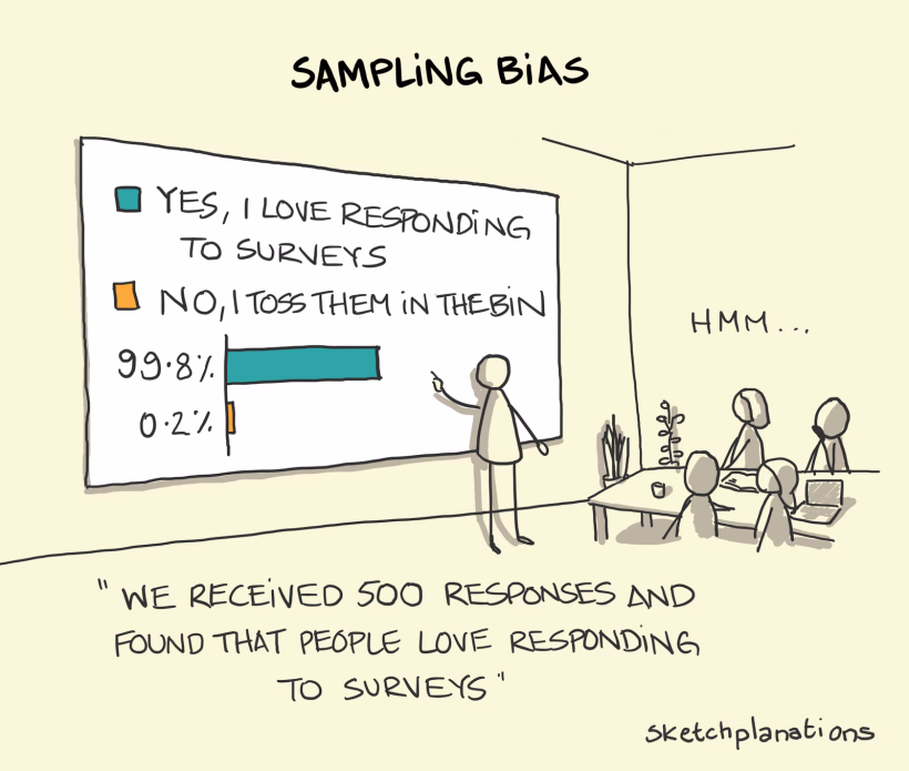
Sampling bias is a kind of bias that allows us to come to faulty conclusions based on inaccurate sample groups or data. Generally, the cause of sample bias is in poor study design and data collection.
When polling individuals for survey questions, it is important to get a representative picture of an entire population. But this can prove surprisingly difficult when the people generating the study are also prone to human flaws, including cognitive biases.
A common example involves conducting a survey on which political party is likely to win an election. If the study is run by a professor who only polls college students, since they are around and therefore easier to collect information from, the poll will not accurately reflect the opinions of the general population.
To avoid sampling bias, it is important to randomize data collection to ensure responses are not skewed towards individuals with similar characteristics.
Brilliance Bias
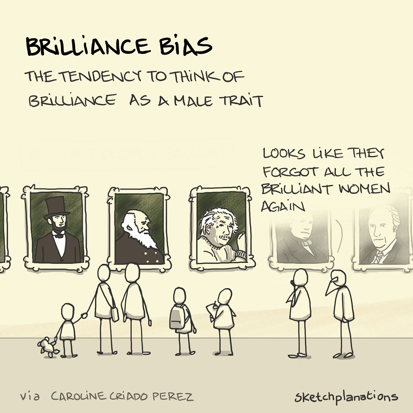
Brilliance bias is another common cognitive bias that makes us more likely to think of genius as a masculine trait. This is in part due to the lack of female representation in both traditional academic and executive positions.
In fact, The Journal of Experimental Social Psychology published an in-depth study on brilliance bias in 2020. It suggests that a likely source of this bias is in the uneven distribution of men and women across careers typically associated with higher level intelligence.
While this distribution is a remnant of historical factors that limited access to education and career choices for women in the past, its presence has made us (wrongly) conclude that women are less brilliant instead. Naturally, as the cycle perpetuates the uneven distribution of women in these careers, it only reinforces this bias.
Other Cognitive Bias Examples
These few examples from Jono Hey give a good overview of some of the biases we face when trying to understand the data given to us, but they are just the tip of the iceberg.
It is important to be cognizant of these biases in an era where we are constantly engaging with information, especially if we want to combat some of the harmful consequences they entail.

This article was published as a part of Visual Capitalist's Creator Program, which features data-driven visuals from some of our favorite Creators around the world.


VC+
VC+: Get Our Key Takeaways From the IMF’s World Economic Outlook
A sneak preview of the exclusive VC+ Special Dispatch—your shortcut to understanding IMF’s World Economic Outlook report.

Have you read IMF’s latest World Economic Outlook yet? At a daunting 202 pages, we don’t blame you if it’s still on your to-do list.
But don’t worry, you don’t need to read the whole April release, because we’ve already done the hard work for you.
To save you time and effort, the Visual Capitalist team has compiled a visual analysis of everything you need to know from the report—and our VC+ Special Dispatch is available exclusively to VC+ members. All you need to do is log into the VC+ Archive.
If you’re not already subscribed to VC+, make sure you sign up now to access the full analysis of the IMF report, and more (we release similar deep dives every week).
For now, here’s what VC+ members get to see.
Your Shortcut to Understanding IMF’s World Economic Outlook
With long and short-term growth prospects declining for many countries around the world, this Special Dispatch offers a visual analysis of the key figures and takeaways from the IMF’s report including:
- The global decline in economic growth forecasts
- Real GDP growth and inflation forecasts for major nations in 2024
- When interest rate cuts will happen and interest rate forecasts
- How debt-to-GDP ratios have changed since 2000
- And much more!

Get the Full Breakdown in the Next VC+ Special Dispatch
VC+ members can access the full Special Dispatch by logging into the VC+ Archive, where you can also check out previous releases.
Make sure you join VC+ now to see exclusive charts and the full analysis of key takeaways from IMF’s World Economic Outlook.
Don’t miss out. Become a VC+ member today.
What You Get When You Become a VC+ Member
VC+ is Visual Capitalist’s premium subscription. As a member, you’ll get the following:
- Special Dispatches: Deep dive visual briefings on crucial reports and global trends
- Markets This Month: A snappy summary of the state of the markets and what to look out for
- The Trendline: Weekly curation of the best visualizations from across the globe
- Global Forecast Series: Our flagship annual report that covers everything you need to know related to the economy, markets, geopolitics, and the latest tech trends
- VC+ Archive: Hundreds of previously released VC+ briefings and reports that you’ve been missing out on, all in one dedicated hub
You can get all of the above, and more, by joining VC+ today.

-

 Debt1 week ago
How Debt-to-GDP Ratios Have Changed Since 2000
-

 Markets2 weeks ago
Ranked: The World’s Top Flight Routes, by Revenue
-

 Countries2 weeks ago
Population Projections: The World’s 6 Largest Countries in 2075
-

 Markets2 weeks ago
The Top 10 States by Real GDP Growth in 2023
-

 Demographics2 weeks ago
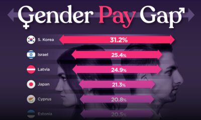
The Smallest Gender Wage Gaps in OECD Countries
-

 United States2 weeks ago
Where U.S. Inflation Hit the Hardest in March 2024
-

 Green2 weeks ago
Top Countries By Forest Growth Since 2001
-

 United States2 weeks ago
Ranked: The Largest U.S. Corporations by Number of Employees