Green
Visualizing the Sustainable ETF Universe
Visualizing the Sustainable ETF Universe
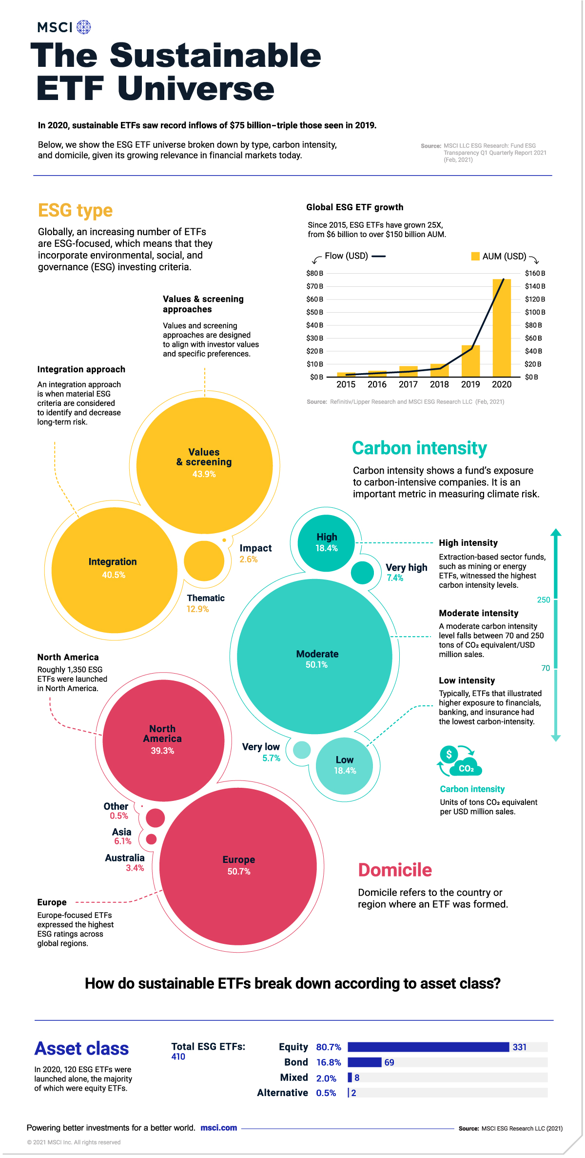
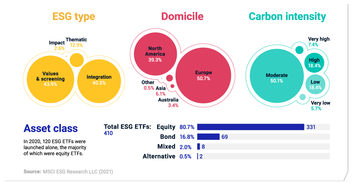
Globally, sustainable exchange-traded fund (ETF) assets hit $150 billion last year, vaulting 25 times higher than in 2015.
Yet despite this growth, sustainable ETFs—baskets of investments that focus on environmental, social and governance issues—account for roughly 5% of the entire ETF universe. What makes up this rapidly growing market? Where are the most common areas for investment?
To answer this question, this infographic from MSCI breaks down the sustainable ETF universe.
Sustainable ETFs: An Overview
By and large, the scope of sustainable ETFs can vary. One sustainable ETF may consist of clean tech companies, and another could focus on sustainable leaders in the S&P 500. Like the broader ETF market, they typically offer low fees.
Overall, the sustainable ETF universe can be broken down into four types of assets.
| ETF Asset Class | Global Number of ETFs | Share of Total |
|---|---|---|
| Equity | 331 | 80.7% |
| Bond | 69 | 16.8% |
| Mixed Assets | 8 | 2.0% |
| Alternative | 2 | 0.5% |
As of Dec. 31, 2020
Source: MSCI LLC ESG Research (Feb, 2021)
Unsurprisingly, the majority of sustainable ETFs are equity ETFs, comprising 81% of the market as of Dec. 31, 2020.
Following equity ETFs are bond ETFs, at nearly 17% of the total universe. One growing subset, known as green bonds, are typically used to fund environmental projects such as water management and green buildings. Here, debt issuers generate fixed income for investors that target climate objectives.
Meanwhile, there are just eight funds globally, or about 2% of sustainable ETFs, that combine more than one type of asset. Alternative ETFs, which are assets outside of stocks and bonds, are the smallest part of the universe at 0.5%.
Sustainable ETFs by Approach
Next, let’s take a look at different sustainable investing styles. Generally speaking, there are four main approaches: integration, values & screening, thematic, and impact.
| ESG ETF by Type | Share of Total | Europe | North America | Asia | Australia |
|---|---|---|---|---|---|
| Integration | 40.5% | 30.8% | 50.1% | 57.7% | 28.6% |
| Values & screening | 43.9% | 60.6% | 22.5% | 34.6% | 71.4% |
| Thematic | 12.9% | 8.7% | 20.7% | 3.8% | 0.0% |
| Impact | 2.6% | 0.0% | 5.9% | 3.8% | 0.0% |
As of Dec. 31, 2020
Source: MSCI LLC ESG Research (Feb, 2021)
Integration approaches, which make up 41% of the universe, are when investors use ESG factors to identify risks and opportunities that may enhance long-term performance. A best-in-class method, which invests in leaders in a given sector, is one form of an ESG integration approach.
In the U.S., the 24 largest equity ETFs following this approach hold roughly $25 billion in assets.
At the lower end of the spectrum, 3% of all sustainable ETFs follow impact approaches, which cover investments that provide solutions to environmental and social issues. Investments that fall under this approach may have frameworks that target the UN Sustainable Development Goals.
Sustainable ETFs by Domicile
Where are the biggest markets for launching sustainable ETFs?
When it comes to the prevalence of sustainable ETFs around the world, Europe leads the way. With over half of all sustainable ETFs, Europe surpasses North America by a significant margin. Of the 40 ETFs with over $1 billion in assets, 26 are domiciled in Europe.
| ETF by Domicile | Number of ETFs | Share of Total |
|---|---|---|
| Europe | 208 | 50.7% |
| North America | 161 | 39.3% |
| Asia | 25 | 6.1% |
| Australia | 14 | 3.4% |
| Other | 2 | 0.5% |
As of Dec. 31, 2020
Source: MSCI LLC ESG Research (Feb, 2021)
Despite covering about 6% of the total number of ESG ETFs, interest in sustainability investing is strong in Asia. Notably, one study found that 79% of institutional investors in Asia-Pacific “significantly” or “moderately” increased investment in ESG-linked assets.
Understanding the Carbon Intensity of Sustainable ETFs
Finally, let’s examine how the carbon intensity of sustainable ETFs breaks down. Carbon intensity measures the amount of carbon dioxide equivalent emitted relative to a company’s revenue.
| ETF Carbon Intensity | Share of Total | Average Carbon Intensity, Tons of CO2 Equivalent/USD Million Sales |
|---|---|---|
| Very Low | 5.7% | 0 to <15 |
| Low | 18.4% | 15 to <70 |
| Moderate | 50.1% | 70 to <250 |
| High | 18.4% | 250 to <525 |
| Very High | 7.4% | 525 to <2000 |
As of Dec. 31, 2020
Source: MSCI LLC ESG Research (Feb, 2021)
The carbon intensity of the average company varies significantly across sectors.
Interestingly, under 6% of sustainable ETFs exhibited the lowest carbon intensity levels of 0 to 15 weighted average tons of CO2 equivalent (WACI). Among the lowest carbon-intensive ETFs was one with a greater focus on banking, insurance and financials.
By contrast, sustainable ETFs with the highest carbon intensity levels accounted for over 7% of the total universe, with these funds holding higher shares of mining and utilities companies.
Across all sustainable ETFs, 58% fell within the moderate range of 70 to 250 WACI.
At the Crossroads
Sustainable investing may be one of the most critical movements over the last decade for the financial industry.
But at the same time, greenwashing concerns are rising. To offset this trend, the European Union has set in place new rules on what constitutes a sustainable fund. Here, investments will essentially be labeled as sustainable or not. This could become a global standard.
For investors who wish to invest in sustainable ETFs, the importance of research and data providers will play a more concrete role, especially as the universe continues to expand.


Green
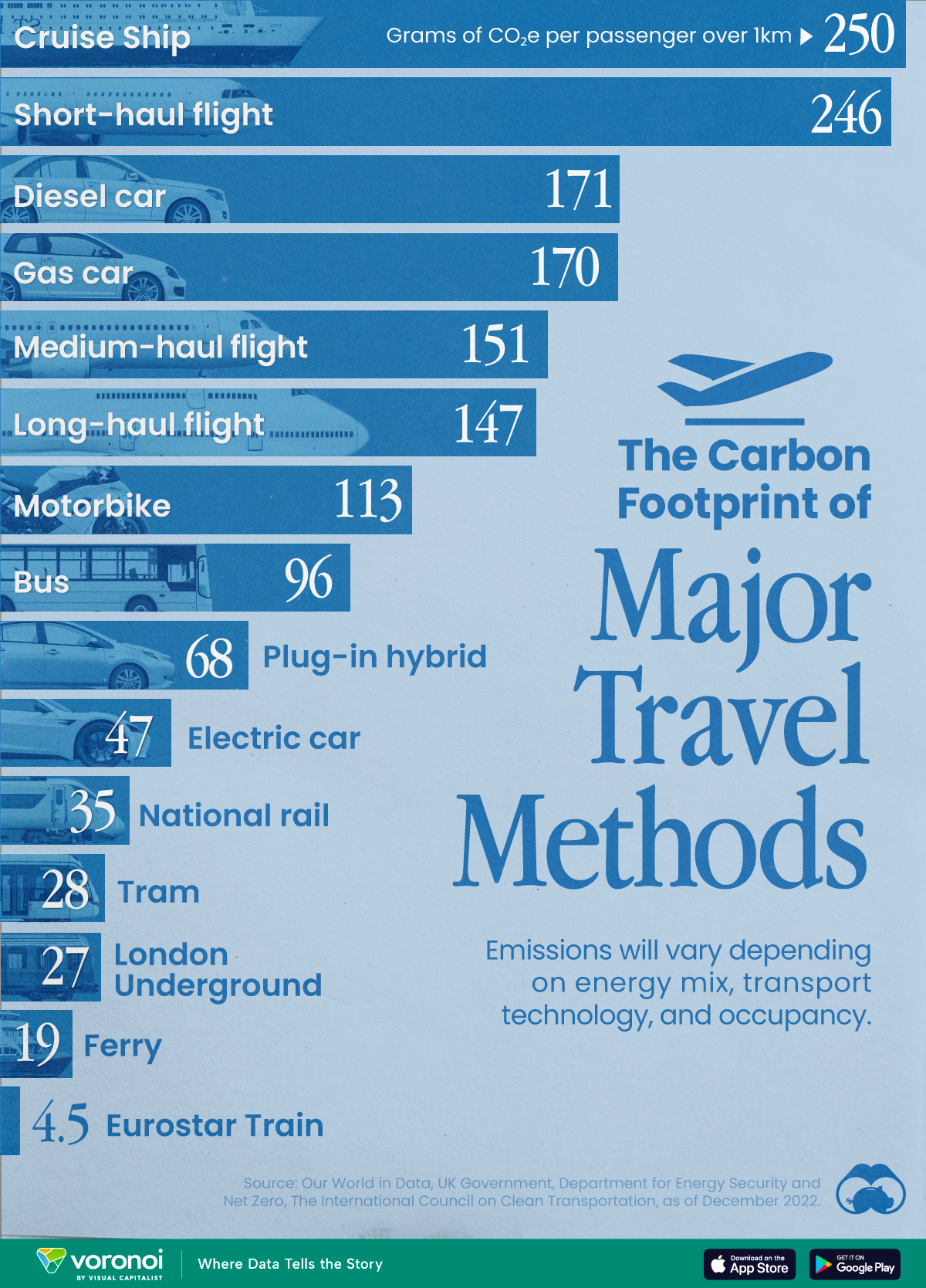
The Carbon Footprint of Major Travel Methods
Going on a cruise ship and flying domestically are the most carbon-intensive travel methods.

The Carbon Footprint of Major Travel Methods
This was originally posted on our Voronoi app. Download the app for free on iOS or Android and discover incredible data-driven charts from a variety of trusted sources.
Did you know that transport accounts for nearly one-quarter of global energy-related carbon dioxide (CO₂) emissions?
This graphic illustrates the carbon footprints of major travel methods measured in grams of carbon dioxide equivalent (CO₂e) emitted per person to travel one kilometer. This includes both CO₂ and other greenhouse gases.
Data is sourced from Our World in Data, the UK Government’s Department for Energy Security and Net Zero, and The International Council on Clean Transportation, as of December 2022.
These figures should be interpreted as approximations, rather than exact numbers. There are many variables at play that determine the actual carbon footprint in any individual case, including vehicle type or model, occupancy, energy mix, and even weather.
Cruise Ships are the Most Carbon-Intensive Travel Method
According to these estimates, taking a cruise ship, flying domestically, and driving alone are some of the most carbon-intensive travel methods.
Cruise ships typically use heavy fuel oil, which is high in carbon content. The average cruise ship weighs between 70,000 to 180,000 metric tons, meaning they require large engines to get moving.
These massive vessels must also generate power for onboard amenities such as lighting, air conditioning, and entertainment systems.
Short-haul flights are also considered carbon-intensive due to the significant amount of fuel consumed during initial takeoff and climbing altitude, relative to a lower amount of cruising.
| Transportation method | CO₂ equivalent emissions per passenger km |
|---|---|
| Cruise Ship | 250 |
| Short-haul flight (i.e. within a U.S. state or European country) | 246 |
| Diesel car | 171 |
| Gas car | 170 |
| Medium-haul flight (i.e. international travel within Europe, or between U.S. states) | 151 |
| Long-haul flight (over 3,700 km, about the distance from LA to NY) | 147 |
| Motorbike | 113 |
| Bus (average) | 96 |
| Plug-in hybrid | 68 |
| Electric car | 47 |
| National rail | 35 |
| Tram | 28 |
| London Underground | 27 |
| Ferry (foot passenger) | 19 |
| Eurostar (International rail) | 4.5 |
Are EVs Greener?
Many experts agree that EVs produce a lower carbon footprint over time versus traditional internal combustion engine (ICE) vehicles.
However, the batteries in electric vehicles charge on the power that comes straight off the electrical grid—which in many places may be powered by fossil fuels. For that reason, the carbon footprint of an EV will depend largely on the blend of electricity sources used for charging.
There are also questions about how energy-intensive it is to build EVs compared to a comparable ICE vehicle.

-

 Science7 days ago
Visualizing the Average Lifespans of Mammals
-

 Markets2 weeks ago
The Top 10 States by Real GDP Growth in 2023
-

 Demographics2 weeks ago
The Smallest Gender Wage Gaps in OECD Countries
-

 United States2 weeks ago
Where U.S. Inflation Hit the Hardest in March 2024
-

 Green2 weeks ago
Top Countries By Forest Growth Since 2001
-

 United States2 weeks ago
Ranked: The Largest U.S. Corporations by Number of Employees
-

 Maps2 weeks ago
The Largest Earthquakes in the New York Area (1970-2024)
-

 Green2 weeks ago
Ranked: The Countries With the Most Air Pollution in 2023