Politics
Charts: America’s Political Divide, 1994–2017
Original animation from Pew Research Center, Washington, D.C. (October 2017).
Charts: America’s Political Divide, From 1994–2017
Politics can be a hot button topic in America. With rising tensions on both sides of the political spectrum, some claim that bipartisanship is dead. Recent research shows that may well be true.
Today’s charts come from a report by the independent think tank Pew Research on the partisan divide between the two major U.S. political parties, Democrats and Republicans.
The data is based on surveys of over 5,000 adults to gauge public sentiment, tracking the dramatic shifts in political polarization in the U.S. from 1994 to 2017. The results are a fascinating deep dive into America’s shifting political sentiment.
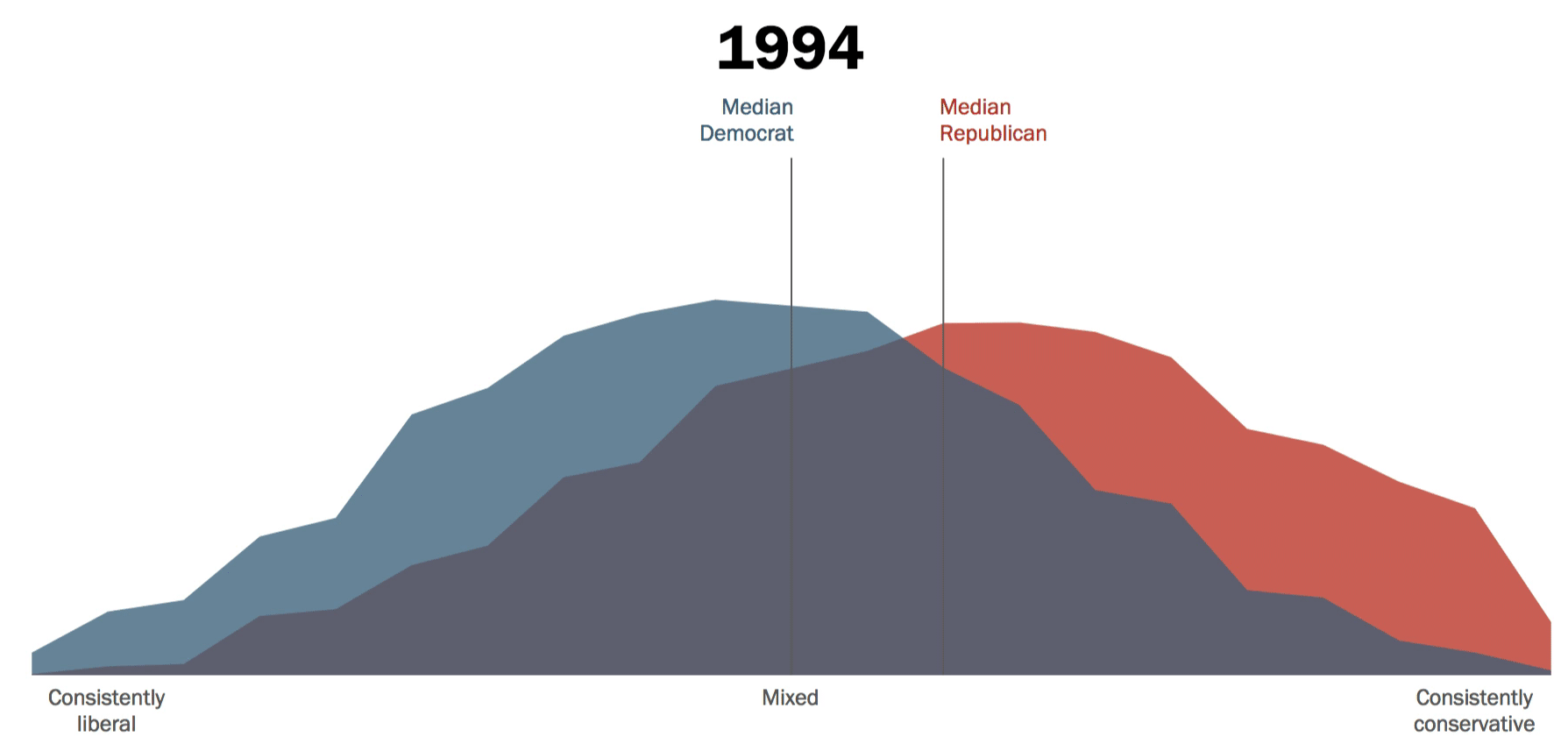
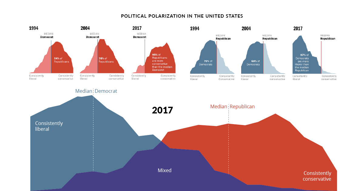
Over Two Decades of Differences
The animation above demonstrates how the political divide by party has grown significantly and consistently over 23 years. In 1994, the general public was more mixed in their allegiances, but a significant divergence started to occur from 2011 onward.
By 2017, the divide had significantly shifted towards the two extremes of the consistently liberal/conservative scale. Median Democrat and Republican sentiment also moved further apart, especially for politically engaged Americans.
How have Americans’ feelings across major issues evolved over time?
NOTE: For brevity, any mention of Democrats and Republicans in the post below will also refer to survey respondents who “lean Democratic/ lean Republican”.
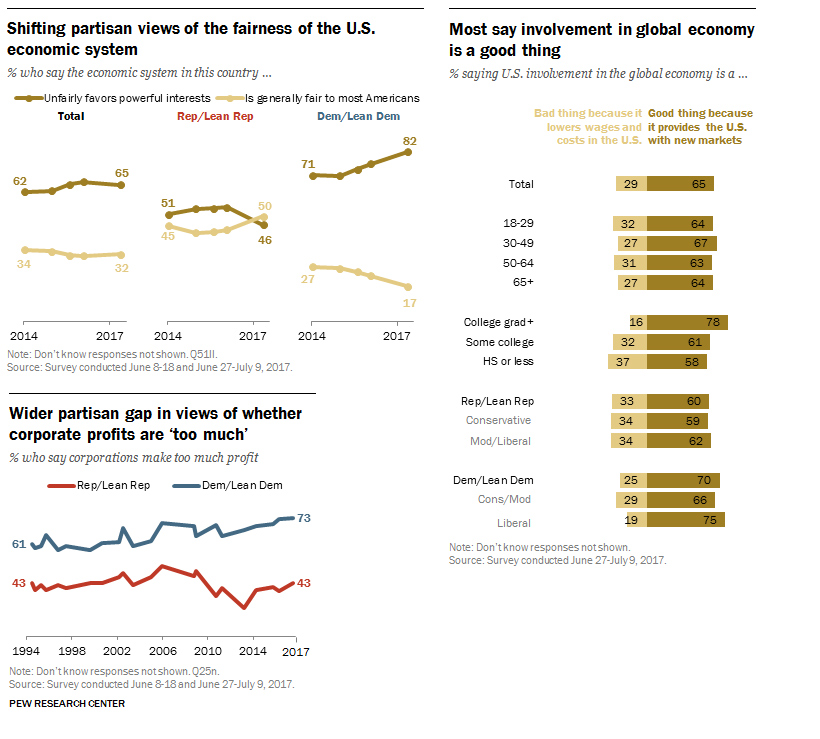
Americans on the Economy
Original charts from Pew Research Center, Washington, D.C. (October 2017).
Several survey questions were designed to assess Americans’ perceptions of the economy. Surprisingly, between 60–70% of Democrats and Republicans agree that U.S. involvement in the global economy is positive, because it provides the country with access to new markets.
However, they diverge when asked about the fairness of the economic system itself. 50% of Republicans think it is fair to most Americans, but 82% of Democrats think it unfairly favors powerful interests.
Finally, 73% of Democrats think corporations make ‘too much’ profit, while only 43% of Republicans think so. Since 1994, Democrats have become more convinced of this point, gaining 10 percentage points (p.p.), while Republican impressions have fluctuated marginally.
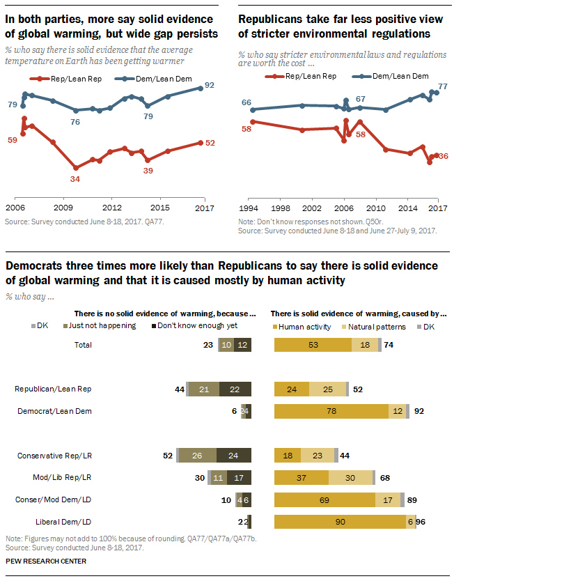
Americans on the Environment
Original charts from Pew Research Center, Washington, D.C. (October 2017).
When it comes to climate change, both Democrats and Republicans see that there is growing evidence for global warming, but they are not sold on the reasons why. 78% of Democrats see human activity as the cause, while only 24% of Republicans agree.
Americans also disagree on whether stricter sustainability laws are worth the cost—77% of Democrats think so, but only 36% of Republicans are on the same page. The position of Democrats on this issue has increased by 11 p.p. since 1994, but dropped by double (22 p.p.) for Republicans during this time.
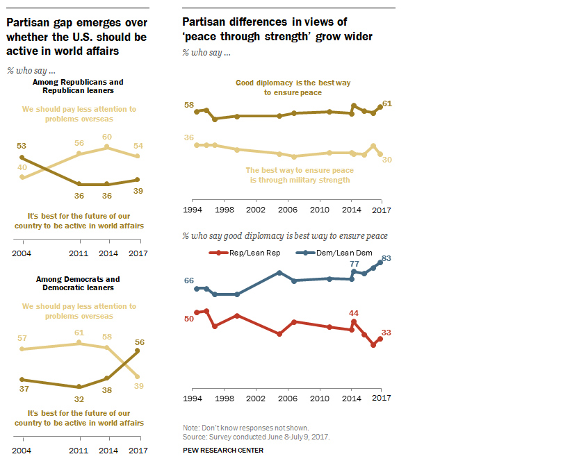
Americans on the Government
Original charts from Pew Research Center, Washington, D.C. (October 2017).
Americans are highly concerned about the U.S. presence on the global stage. Over half (56%) of Democrats think the U.S. should be active in world affairs, while 54% of Republicans think such attention should be focused inward instead of overseas.
This filters into what they consider the best strategy for peace—83% of Democrats believe in democracy to achieve this, while only 33% of Republicans agree, preferring military strength instead. Democrats have cemented their position on diplomacy by 17 p.p. since 1994, growing the political divide.
Americans on Their Society
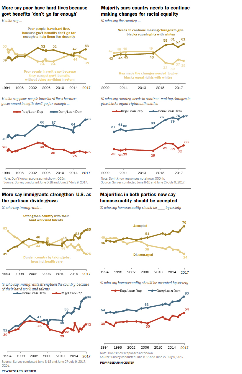
Original charts from Pew Research Center, Washington, D.C. (October 2017).
On several social issues, both parties have become more liberal in their opinions over the decades, especially on immigration and homosexuality. Democrats have seen the biggest advancement on their views of immigration, from 32% in favor in 1994, to 84% in 2017.
However, there’s still a wide partisan divide between Democrats and Republicans on their ideas of government aid (51 p.p. gap), racial equality (45 p.p. gap), immigration (42 p.p. gap), and homosexuality (29 p.p. gap).
Americans on Each Other
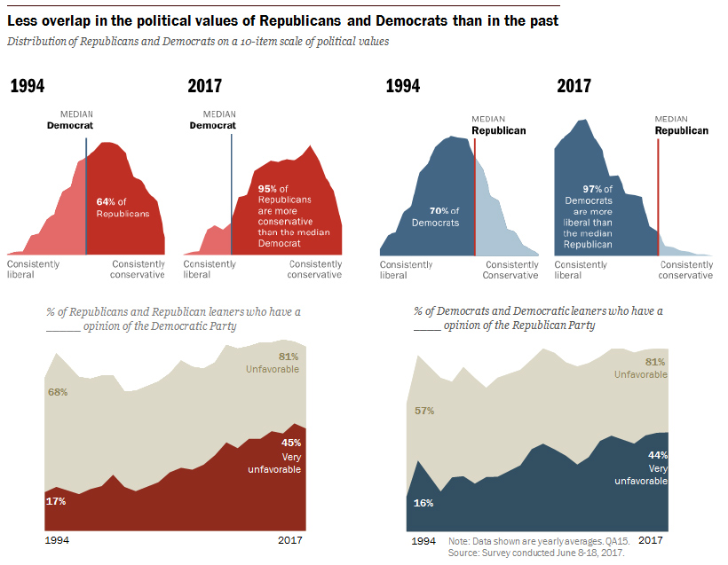
Original charts from Pew Research Center, Washington, D.C. (October 2017).
It’s evident that not only does the American public hold less of a mix of liberal and conservative values, but the center of this political divide has also moved dramatically on both ends of the spectrum. In simple terms, it means that Americans are less willing to consider the other side of debates, preferring to stay entrenched in the group think of their political affiliation.
Not only this, but partisan animosity is on the rise—81% of Republicans and Democrats find those belonging to the other party equally unfavorable. In fact, both parties have seen a 28 p.p. increase in ‘very unfavorable’ views of people in the other party, compared to 1994.
Can the Rift be Repaired?
While the above data on group polarization ends in 2017, it’s clear that the repercussions continue to have ripple effects into today and the future. These differences mean there is no consensus on the nation’s key priorities.
In 2019, Republicans believe that terrorism, the economy, social security, immigration, and the military should be top of mind, while Democrats refer to healthcare, education, environment, Medicare, and the poor and needy as their leads.
With Trump’s presidential term up for contest in 2020, the lack of common ground on pressing issues will continue to cause a stir among both Democratic and Republican bases. Is there anything Americans will be willing to cross the aisle for?


Economy
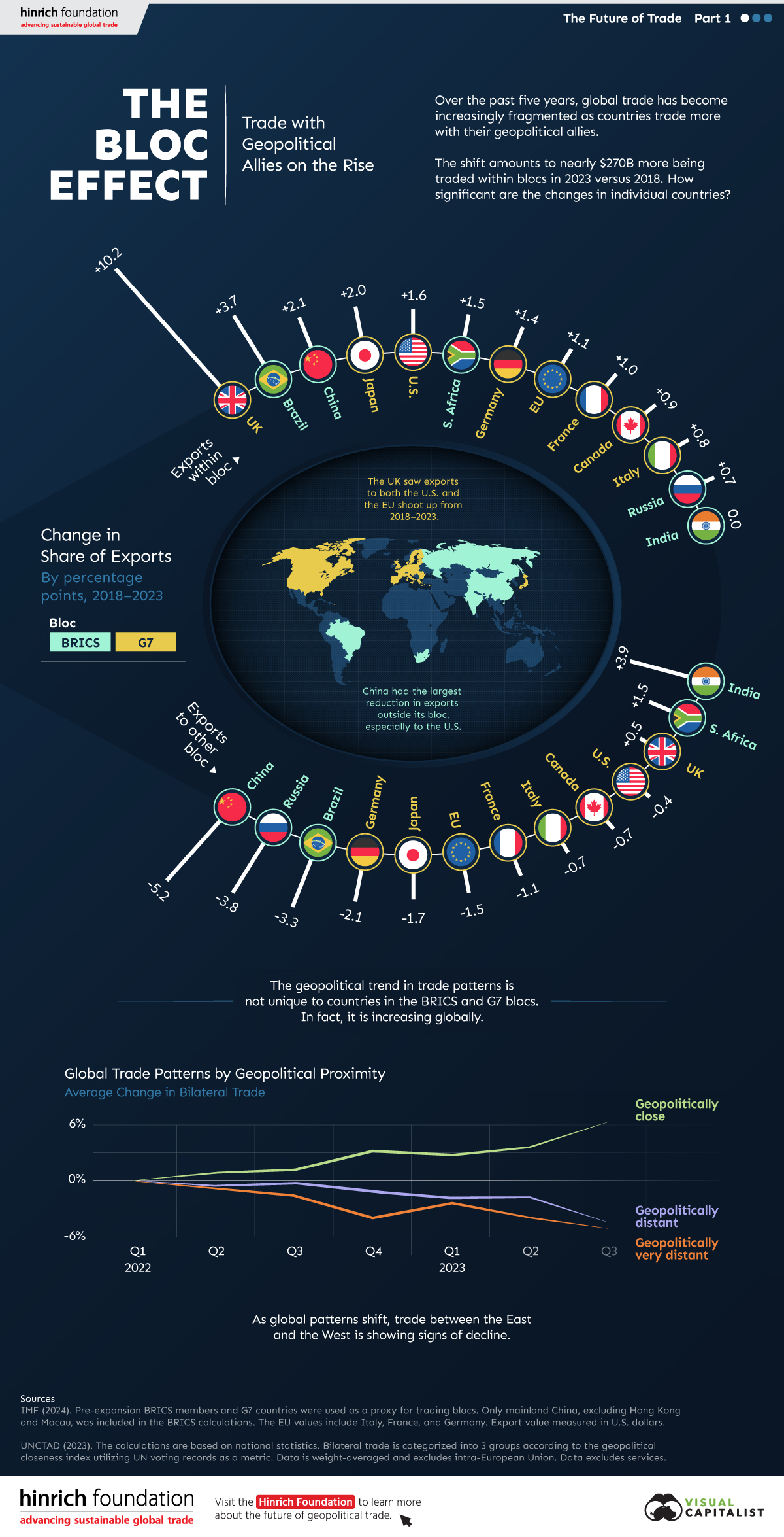
The Bloc Effect: International Trade with Geopolitical Allies on the Rise
Rising geopolitical tensions are shaping the future of international trade, but what is the effect on trading among G7 and BRICS countries?


The Bloc Effect: International Trade with Allies on the Rise
International trade has become increasingly fragmented over the last five years as countries have shifted to trading more with their geopolitical allies.
This graphic from The Hinrich Foundation, the first in a three-part series covering the future of trade, provides visual context to the growing divide in trade in G7 and pre-expansion BRICS countries, which are used as proxies for geopolitical blocs.
Trade Shifts in G7 and BRICS Countries
This analysis uses IMF data to examine differences in shares of exports within and between trading blocs from 2018 to 2023. For example, we looked at the percentage of China’s exports with other BRICS members as well as with G7 members to see how these proportions shifted in percentage points (pp) over time.
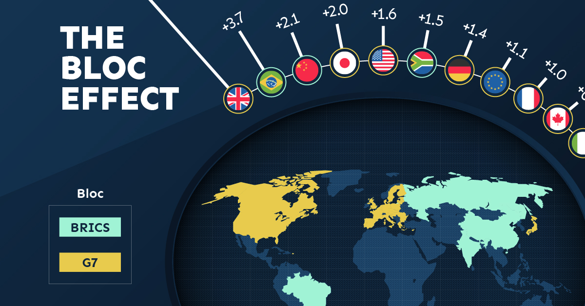
Countries traded nearly $270 billion more with allies in 2023 compared to 2018. This shift came at the expense of trade with rival blocs, which saw a decline of $314 billion.
Country Change in Exports Within Bloc (pp) Change in Exports With Other Bloc (pp)
🇮🇳 India 0.0 3.9
🇷🇺 Russia 0.7 -3.8
🇮🇹 Italy 0.8 -0.7
🇨🇦 Canada 0.9 -0.7
🇫🇷 France 1.0 -1.1
🇪🇺 EU 1.1 -1.5
🇩🇪 Germany 1.4 -2.1
🇿🇦 South Africa 1.5 1.5
🇺🇸 U.S. 1.6 -0.4
🇯🇵 Japan 2.0 -1.7
🇨🇳 China 2.1 -5.2
🇧🇷 Brazil 3.7 -3.3
🇬🇧 UK 10.2 0.5
All shifts reported are in percentage points. For example, the EU saw its share of exports to G7 countries rise from 74.3% in 2018 to 75.4% in 2023, which equates to a 1.1 percentage point increase.
The UK saw the largest uptick in trading with other countries within the G7 (+10.2 percentage points), namely the EU, as the post-Brexit trade slump to the region recovered.
Meanwhile, the U.S.-China trade dispute caused China’s share of exports to the G7 to fall by 5.2 percentage points from 2018 to 2023, the largest decline in our sample set. In fact, partly as a result of the conflict, the U.S. has by far the highest number of harmful tariffs in place.
The Russia-Ukraine War and ensuing sanctions by the West contributed to Russia’s share of exports to the G7 falling by 3.8 percentage points over the same timeframe.
India, South Africa, and the UK bucked the trend and continued to witness advances in exports with the opposing bloc.
Average Trade Shifts of G7 and BRICS Blocs
Though results varied significantly on a country-by-country basis, the broader trend towards favoring geopolitical allies in international trade is clear.
Bloc Change in Exports Within Bloc (pp) Change in Exports With Other Bloc (pp)
Average 2.1 -1.1
BRICS 1.6 -1.4
G7 incl. EU 2.4 -1.0
Overall, BRICS countries saw a larger shift away from exports with the other bloc, while for G7 countries the shift within their own bloc was more pronounced. This implies that though BRICS countries are trading less with the G7, they are relying more on trade partners outside their bloc to make up for the lost G7 share.
A Global Shift in International Trade and Geopolitical Proximity
The movement towards strengthening trade relations based on geopolitical proximity is a global trend.
The United Nations categorizes countries along a scale of geopolitical proximity based on UN voting records.
According to the organization’s analysis, international trade between geopolitically close countries rose from the first quarter of 2022 (when Russia first invaded Ukraine) to the third quarter of 2023 by over 6%. Conversely, trade with geopolitically distant countries declined.
The second piece in this series will explore China’s gradual move away from using the U.S. dollar in trade settlements.
Visit the Hinrich Foundation to learn more about the future of geopolitical trade

-

 Economy2 days ago
Economic Growth Forecasts for G7 and BRICS Countries in 2024
The IMF has released its economic growth forecasts for 2024. How do the G7 and BRICS countries compare?
-

 United States2 weeks ago
Ranked: The Largest U.S. Corporations by Number of Employees
We visualized the top U.S. companies by employees, revealing the massive scale of retailers like Walmart, Target, and Home Depot.
-

 Economy2 weeks ago
Where U.S. Inflation Hit the Hardest in March 2024
We visualized product categories that saw the highest % increase in price due to U.S. inflation as of March 2024.
-

 Economy1 month ago
G20 Inflation Rates: Feb 2024 vs COVID Peak
We visualize inflation rates across G20 countries as of Feb 2024, in the context of their COVID-19 pandemic peak.
-

 Economy1 month ago
Mapped: Unemployment Claims by State
This visual heatmap of unemployment claims by state highlights New York, California, and Alaska leading the country by a wide margin.
-

 Markets2 months ago
Confidence in the Global Economy, by Country
Will the global economy be stronger in 2024 than in 2023?

-

 Misc1 week ago
How Hard Is It to Get Into an Ivy League School?
-

 Technology2 weeks ago
Ranked: Semiconductor Companies by Industry Revenue Share
-

 Markets2 weeks ago
Ranked: The World’s Top Flight Routes, by Revenue
-

 Demographics2 weeks ago
Population Projections: The World’s 6 Largest Countries in 2075
-

 Markets2 weeks ago
The Top 10 States by Real GDP Growth in 2023
-

 Demographics2 weeks ago
The Smallest Gender Wage Gaps in OECD Countries
-
Economy2 weeks ago
Where U.S. Inflation Hit the Hardest in March 2024
-

 Green2 weeks ago
Top Countries By Forest Growth Since 2001