

How much do you trust the government and its various institutions? We look at data for G7 countries for the...
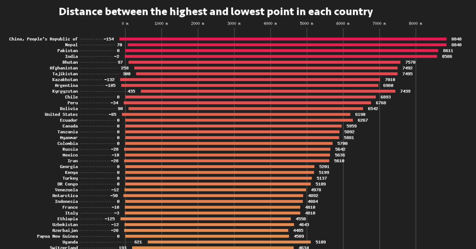
This data visualization compares the elevation span of every country, ranging from the mountain peaks of Bhutan, to the Dead Sea depression.
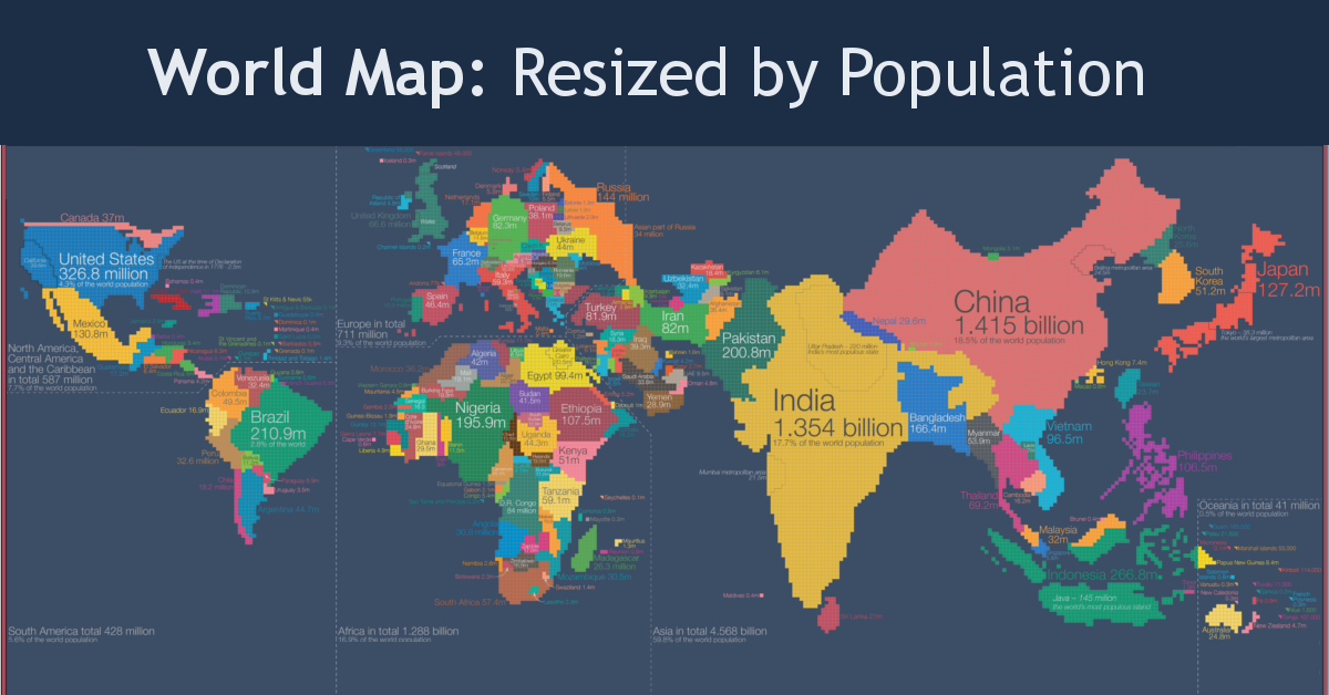
Look at global population in a whole new light, when countries on the world map are drawn based on population numbers instead of their usual borders.
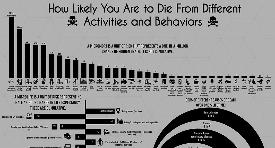
Science has given us insight into which behaviors may prolong or shorten life, but is there a universal, data-driven way to quantify death?
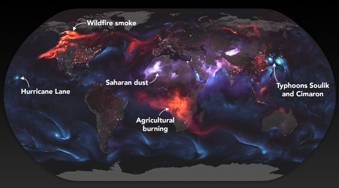
These stunning images from NASA give a whole new perspective on the massive wildfires engulfing the west coast of North America.
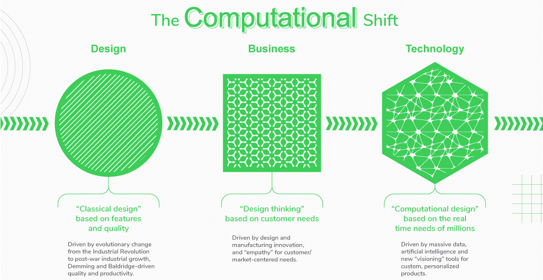
New tech is enabling an exciting but uncertain future for the design industry. See the forces shaping the future of design, and how these teams work...
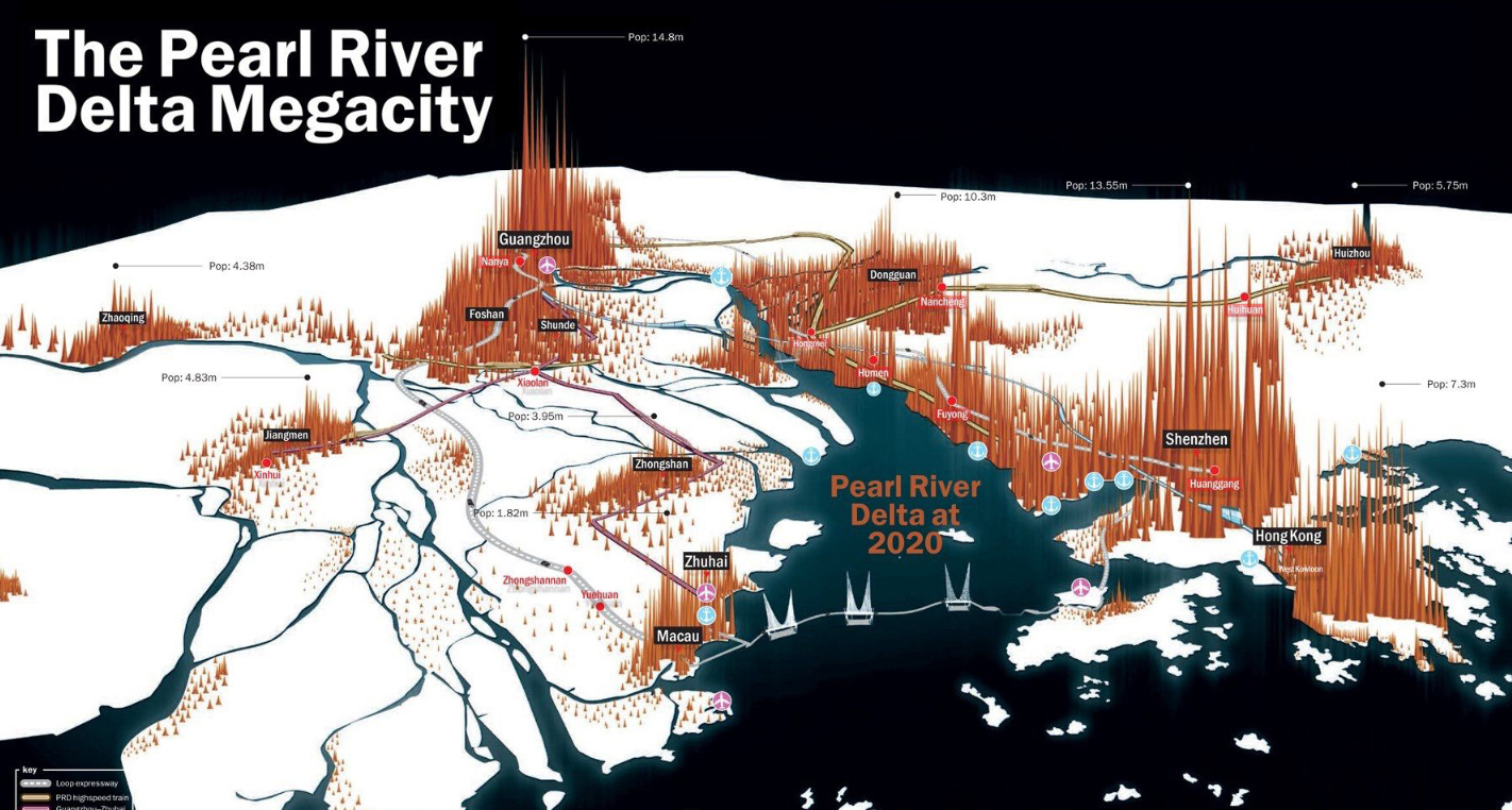
China's Pearl River Delta, in an unprecedented growth spurt, has seen cities expand and merge to become the largest contiguous urban region in the world.
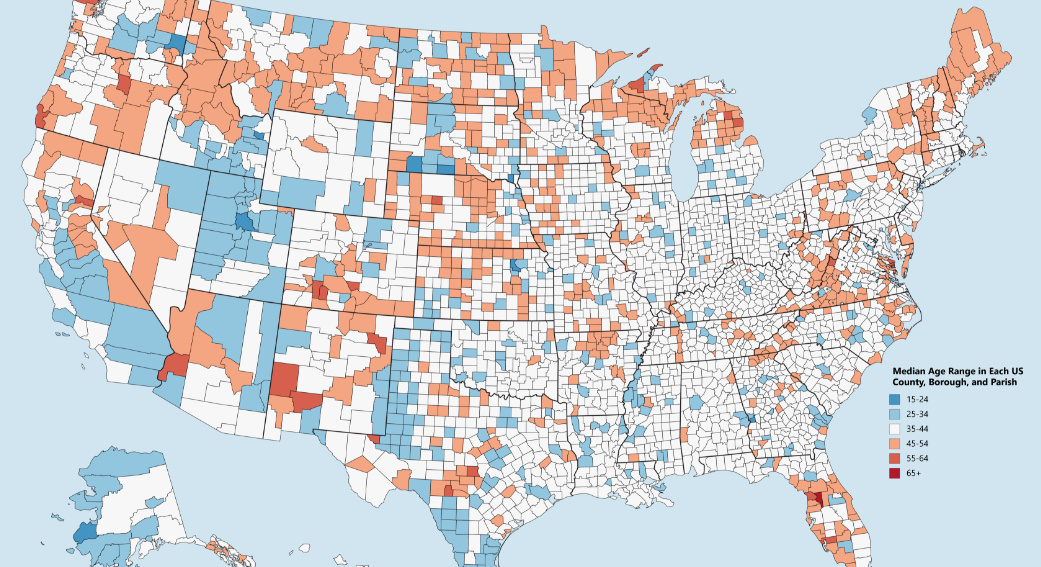
Which counties have the youngest populations, and which are meccas for aging retirees? This map shows the median age of every county in the United States.
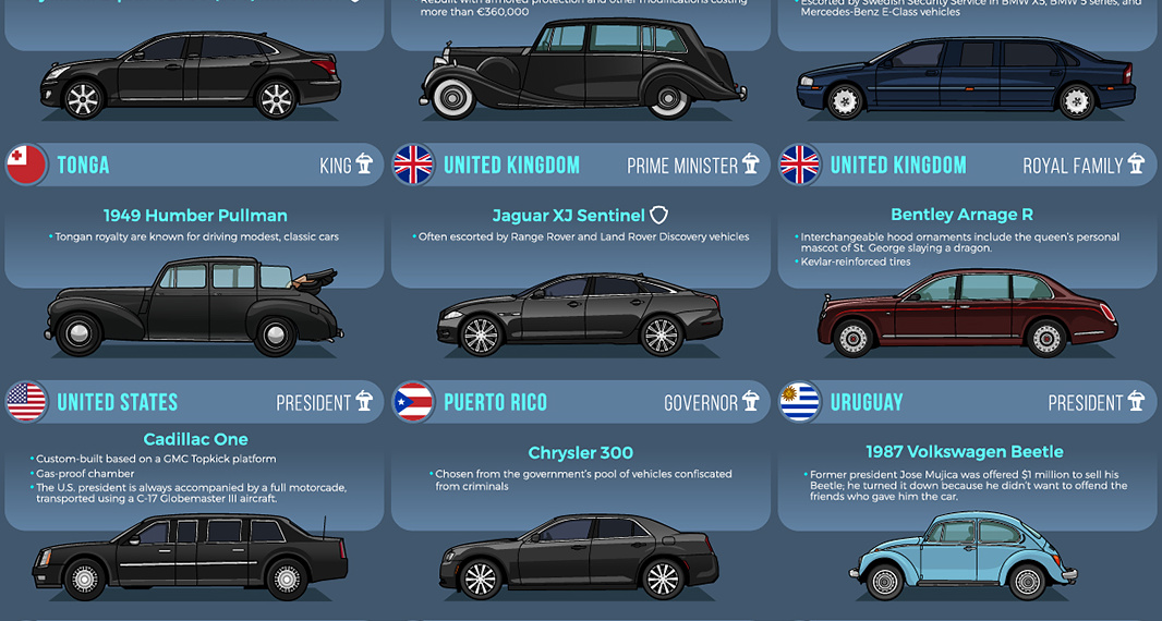
From bombproof luxury to vintage style, heads of state choose a wide variety of vehicles to get around.
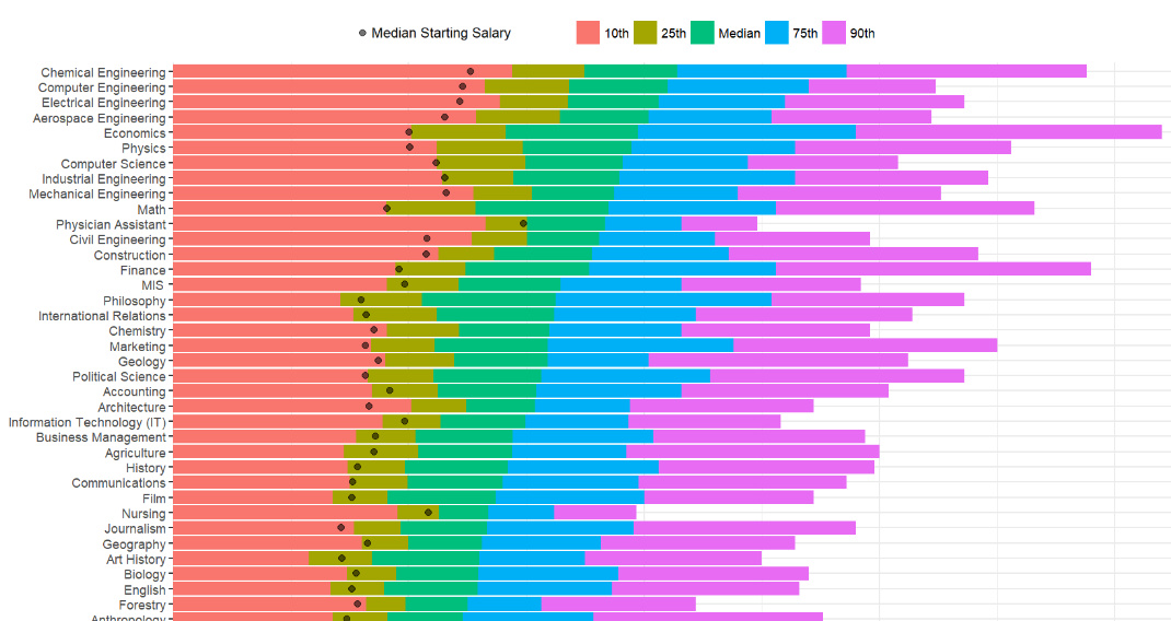
How do different college degrees compare for earning potential? This chart uses a data set from 1.2 million past students to compare 50 different majors.
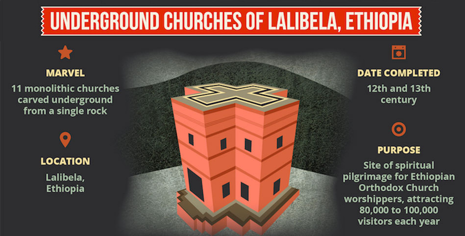
Check out these seven engineering wonders that were created by ancient civilizations without the use of modern technology.


