
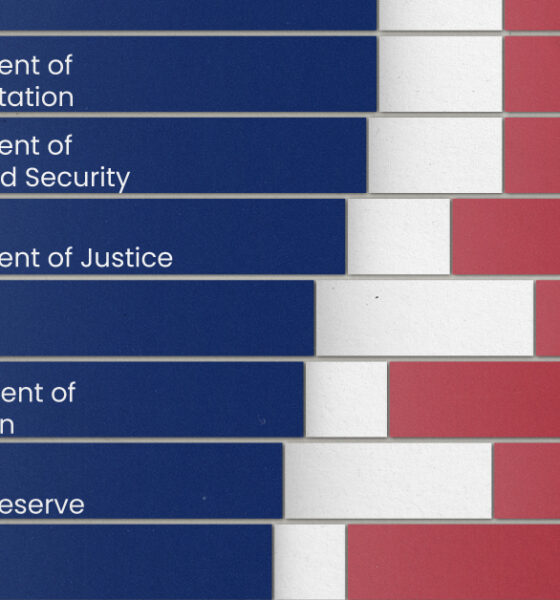
Fourteen of 16 federal government agencies garnered more favorable responses than unfavorable ones. But what were the outliers?

In just a half-century, Dubai has gone from a fishing village to a global real estate hub. Today's video and graphic track the city's stunning transformation.

The third infographic in our Rise of Tesla Series showcases Musk's ambitious vision for the future of Tesla, along with the products that will make it...
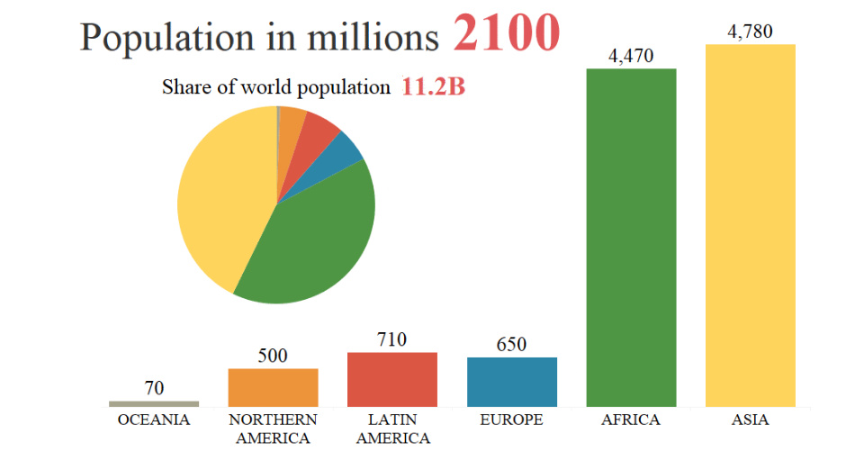
By 2100, the global population is projected to rise from 7.6 billion to 11.2 billion people. This animation shows how that growth will occur by region.
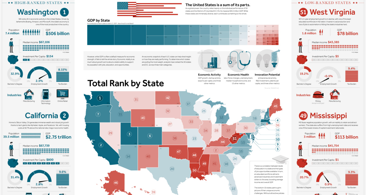
This giant infographic has state economies ranked from best to worst, based on an overall score comprised of 27 different metrics.

How a devastating series of cholera outbreaks in the 19th century inadvertently spurred innovation in the field of data visualization.
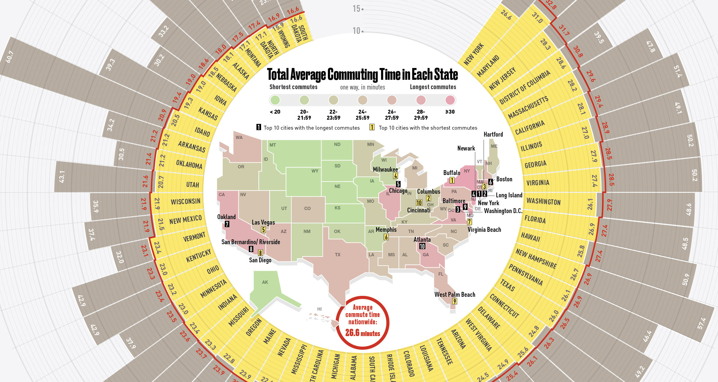
This infographic compares all U.S. states by average commute time, while also listing the top 10 cities with the longest and shortest commutes in the country.
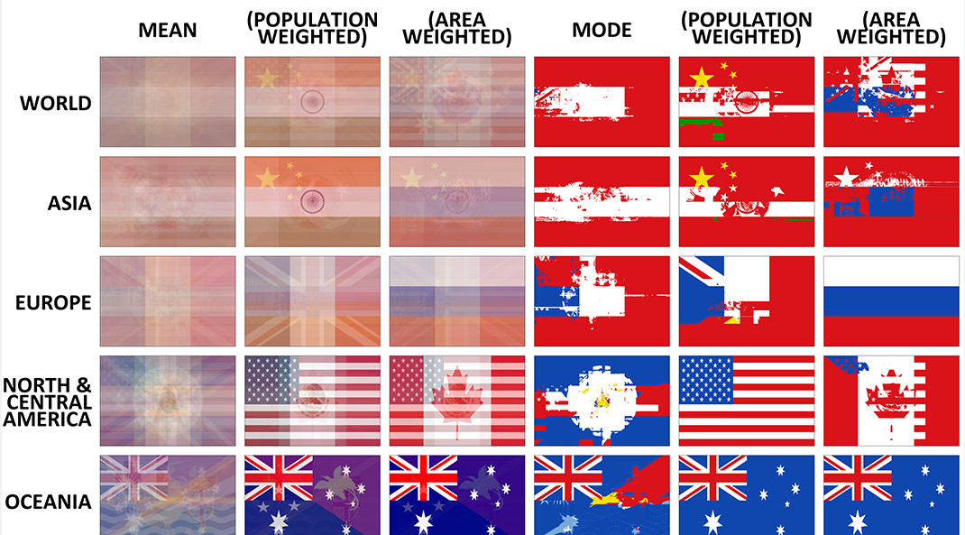
The average flag of the world, as well as different continents, if every flag were combined together. Also, a look at the building blocks of flag...
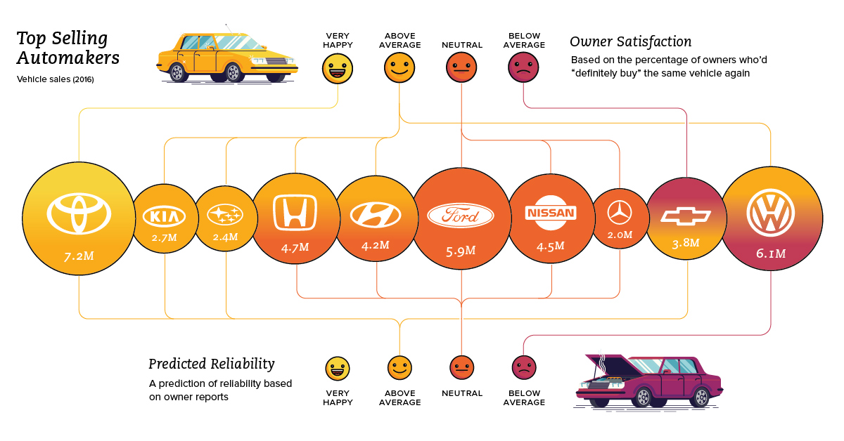
What car brands are rated the best in terms of reliability, owner satisfaction, and road tests? This series of charts shows you how auto brands perform.
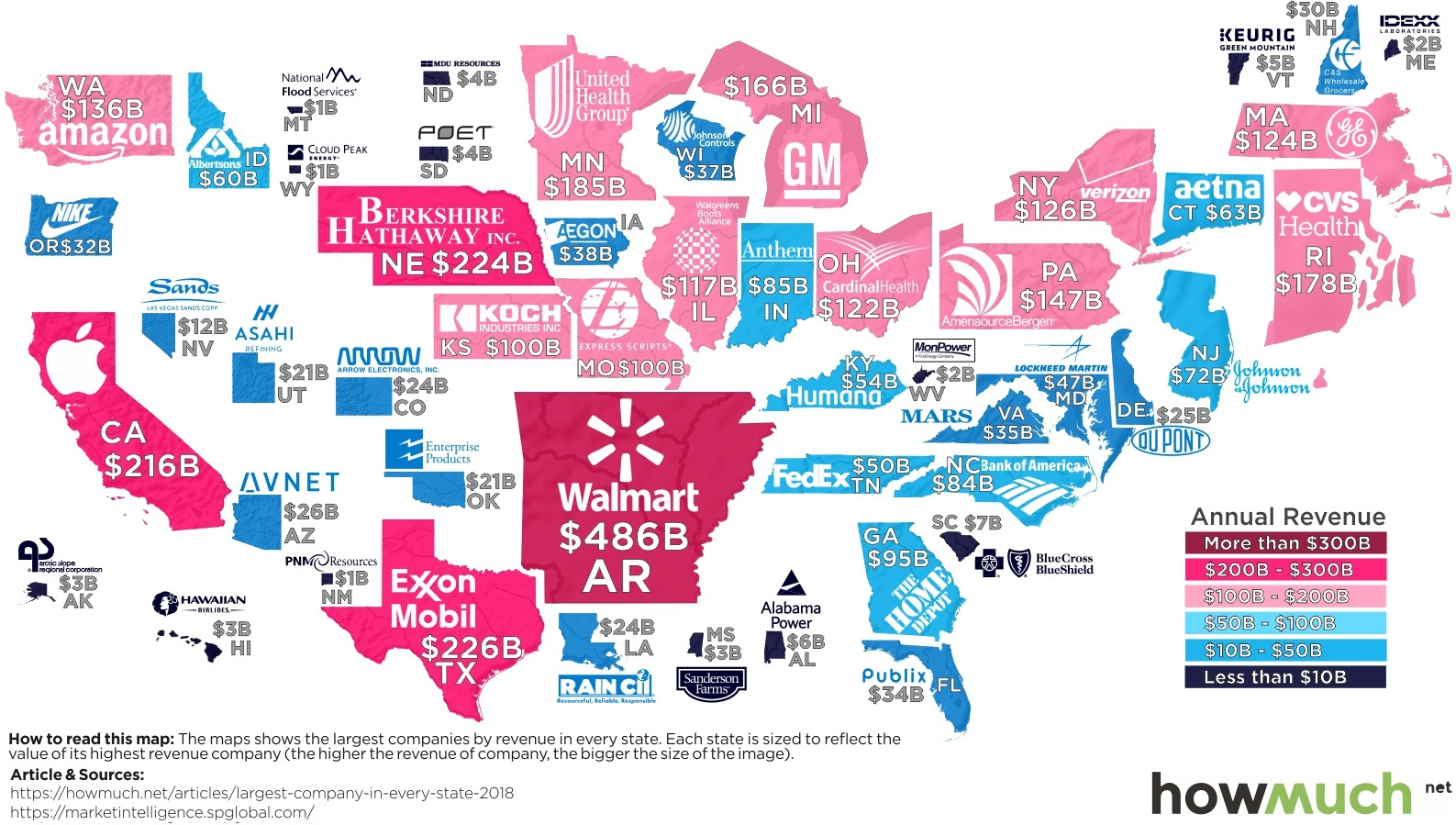
From Walmart ($486B) to companies a tiny fraction of the size, here is a map showing the largest company in every state by revenue.

Every company wants to have a strong culture, but achieving this culture change is much more difficult than it first appears.


