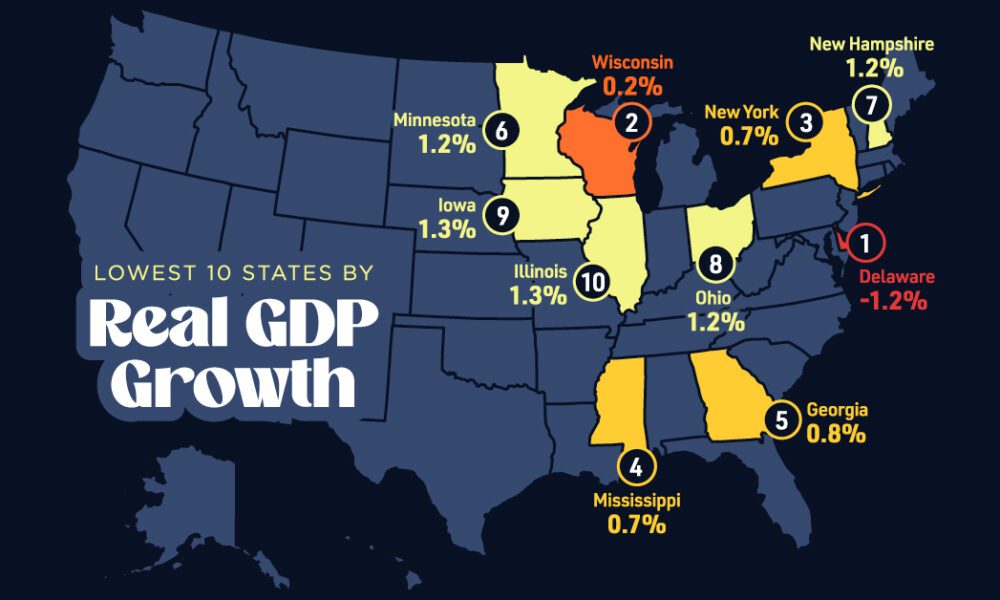

In this graphic, we show where real GDP lagged the most across America in 2023 as high interest rates weighed...
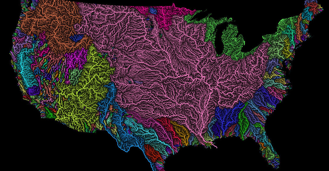
Nothing is more fundamental to life than water - so see the world's watersheds like never before with these colorful and absolutely stunning maps.
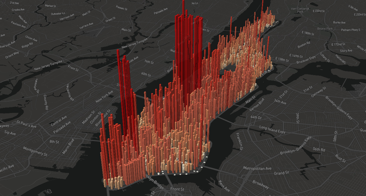
An eye-opening look at the population 'heartbeat' of Manhattan, which swells to an incredible four million people during an average workday.
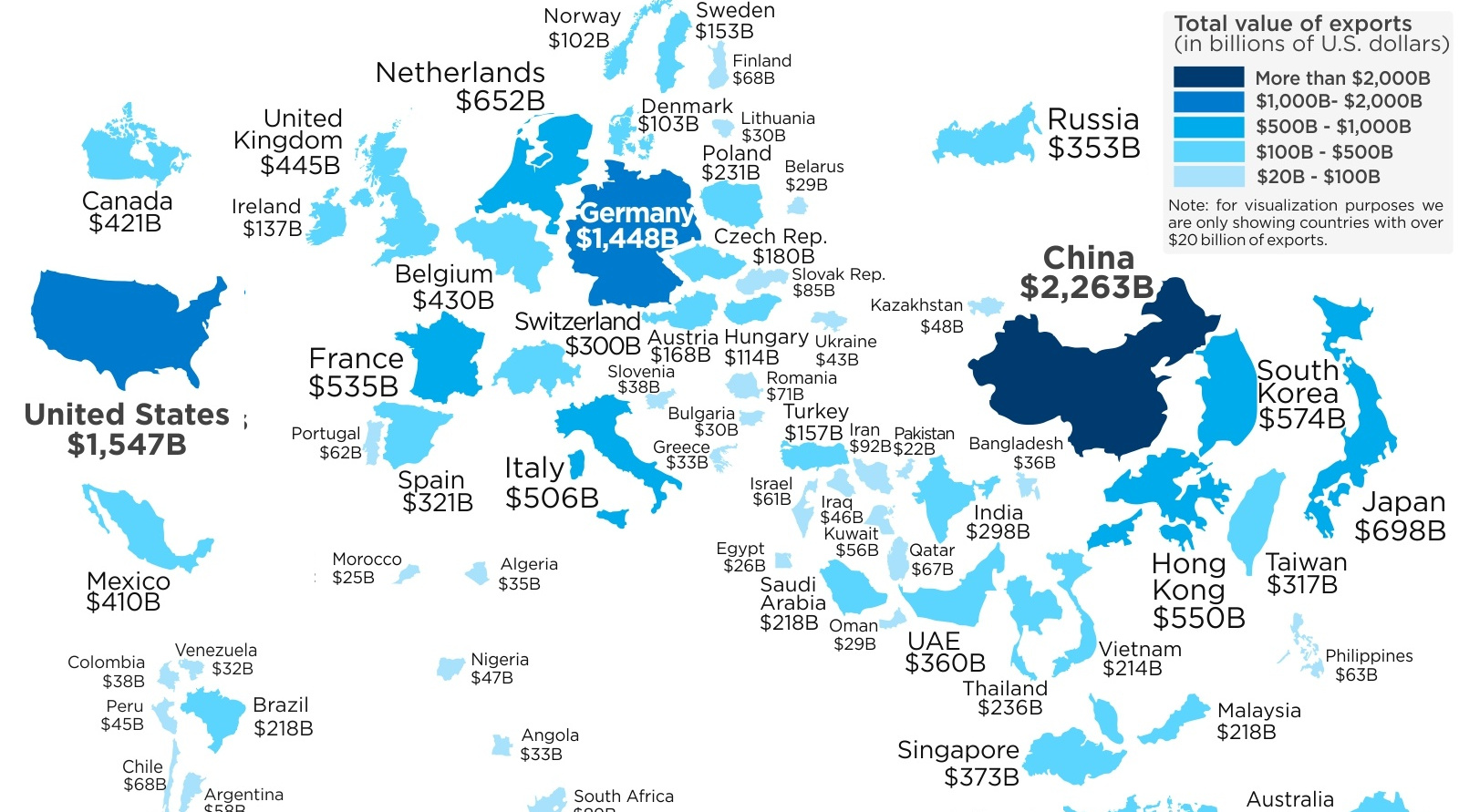
This map re-sizes countries based on the amount of goods they export abroad, giving a clear look at the world's biggest exporters of 2017.
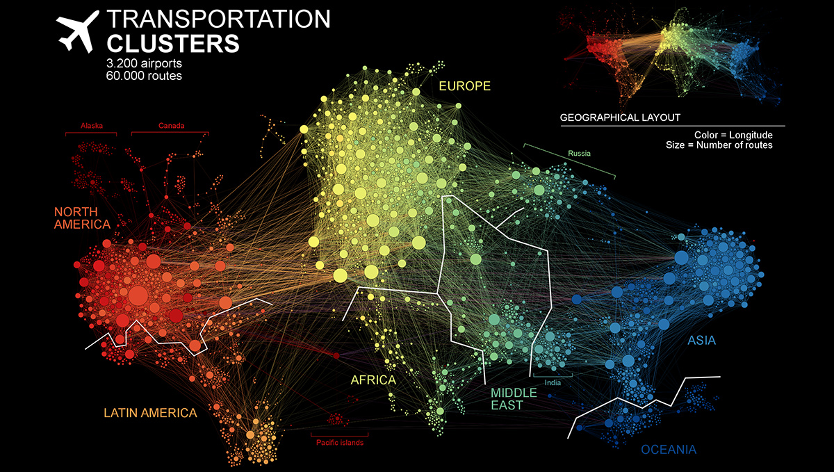
This unique network map of 3,200 air traffic hubs is a new way to visualize connectivity between the world's population centers.
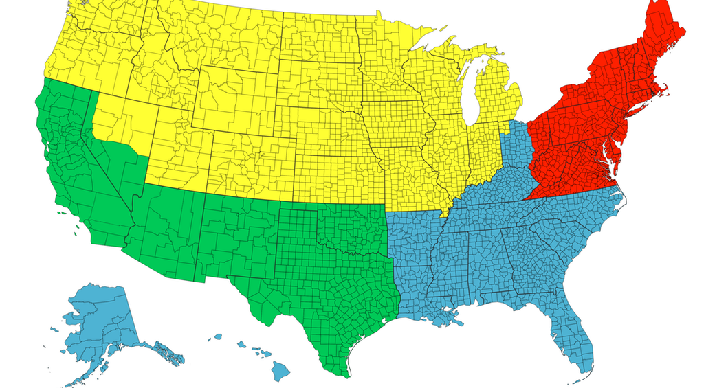
Each of the four colors is equal to 25% of the country's total population - and things get interesting when looking at Canada, Chile, or California.
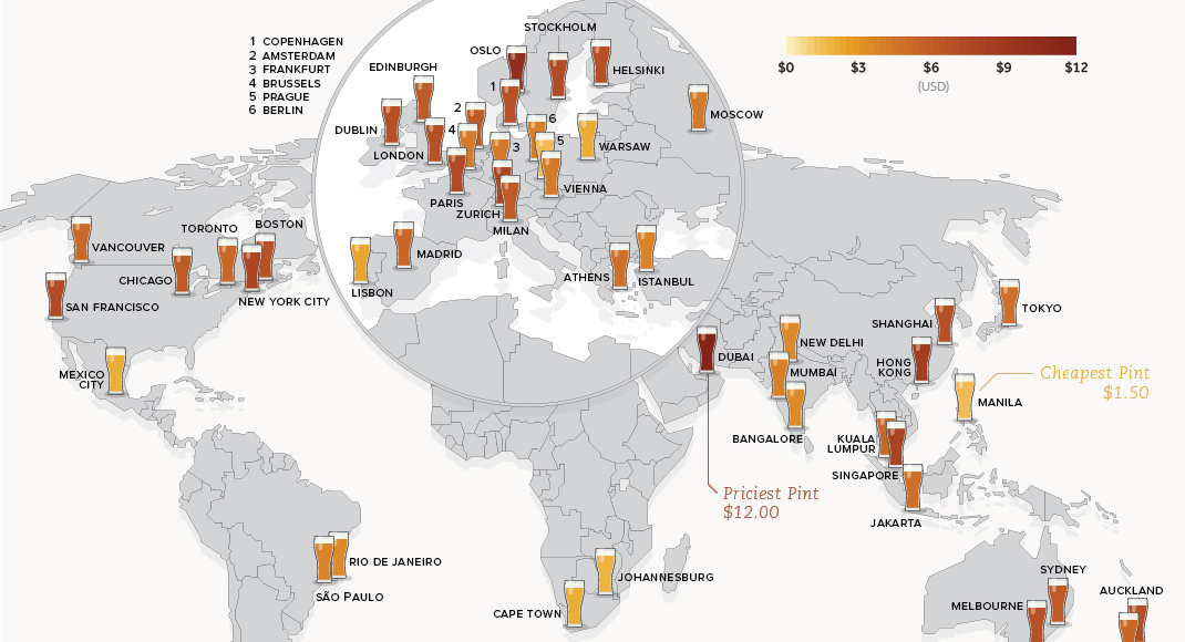
This data on the price of beer is fresh from the tap. See how much a pint of beer costs in 48 different major cities around...
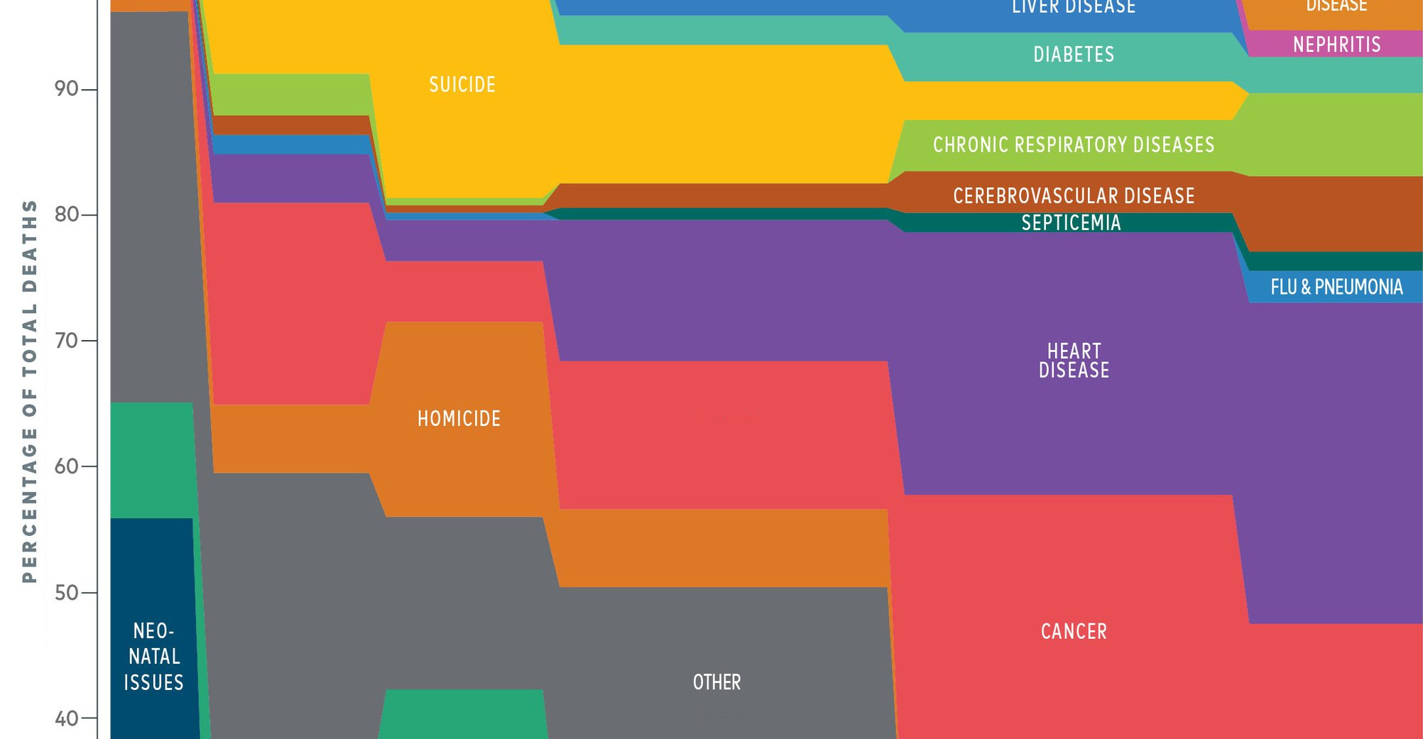
What causes of death do people worry the most about, and what types of death does media report on? It turns out both are very disproportionate...
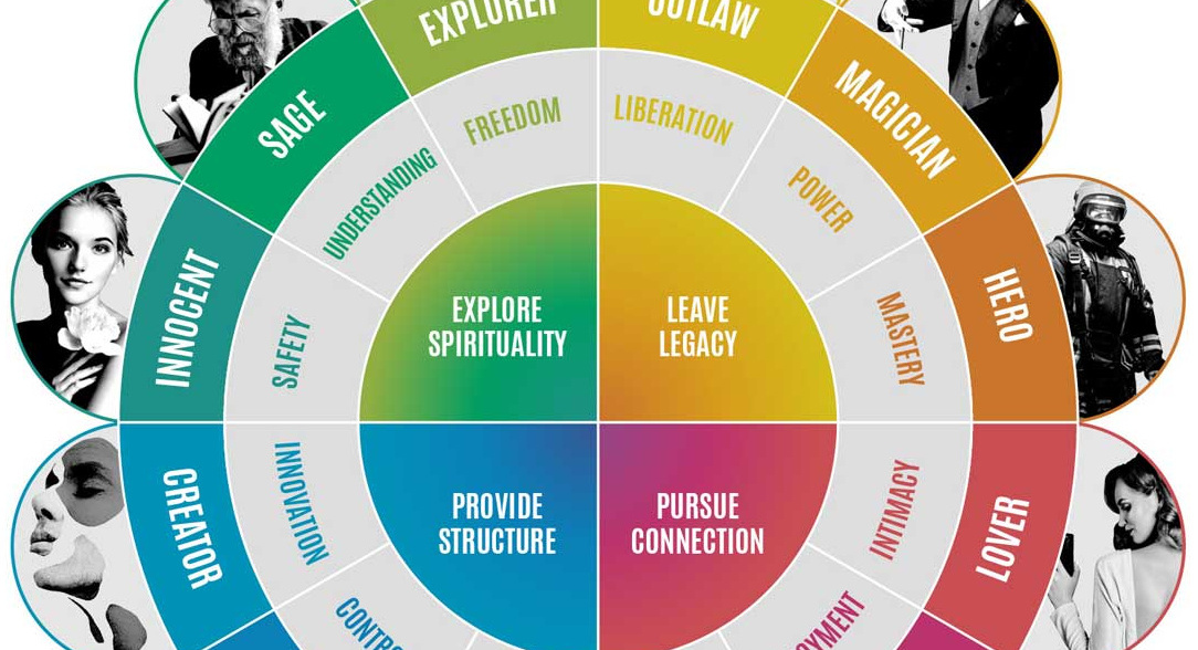
We're bombarded with 5,000+ ads per day, but we don't ignore all of them. Here are the brand archetypes marketers use to communicate their stories to...
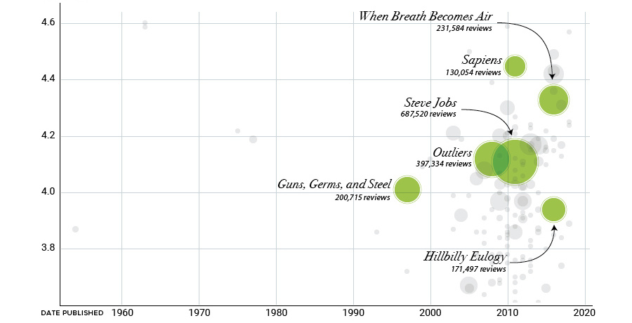
Bill Gates has amassed over 150 nonfiction book recommendations on his blog. We've visualized and analyzed that list through this set of graphics.
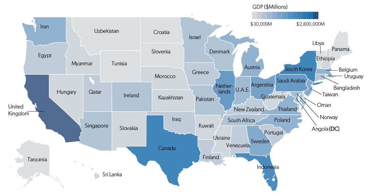
Each state has a GDP that is comparable in size to that of an actual country. This map shows it all, plus a full list of...


