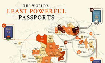
Misc
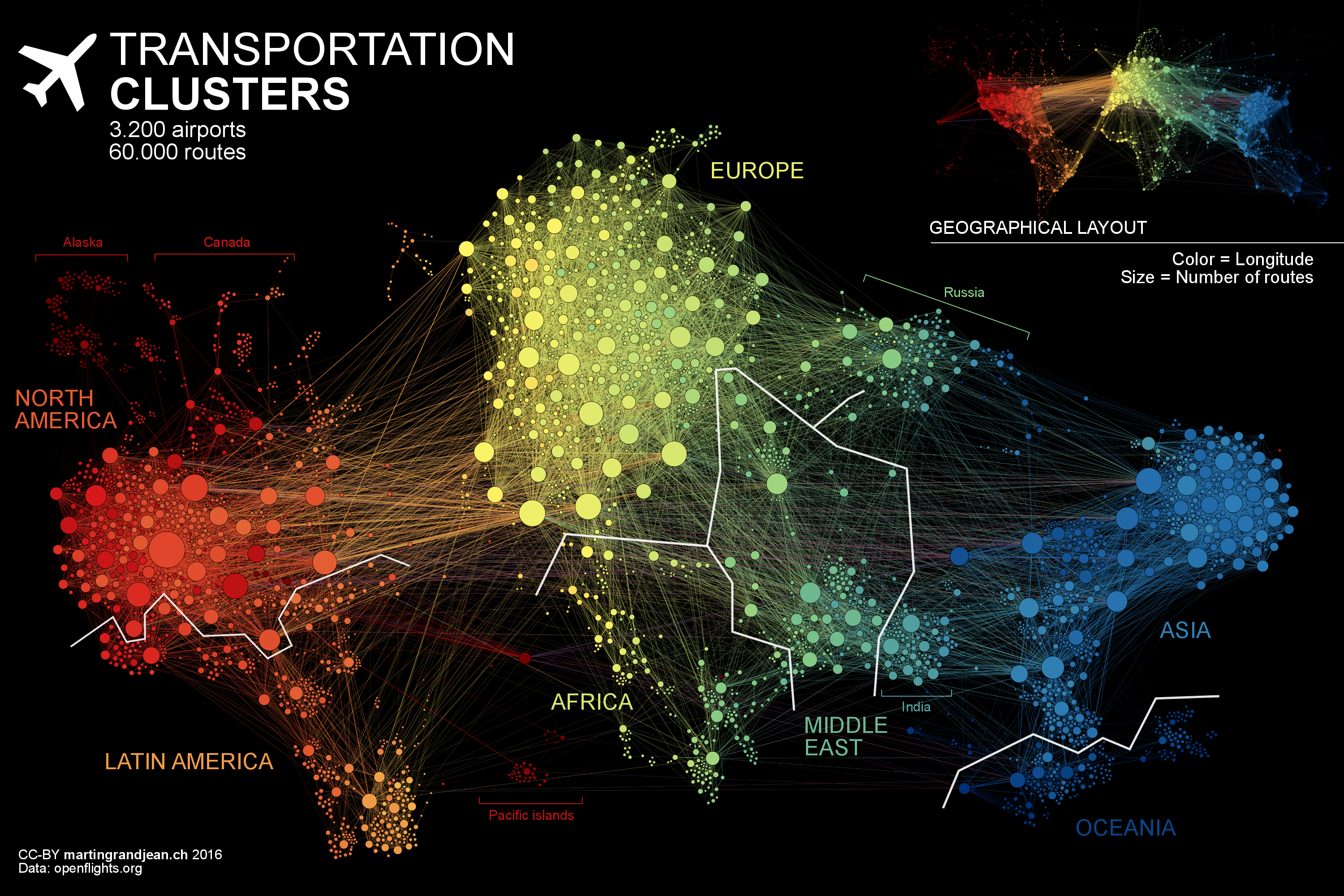
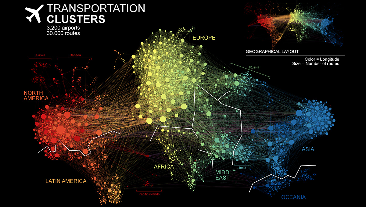
A Network Map of the World’s Air Traffic Connections
View a high resolution version of this graphic
A Network Map of the World’s Air Traffic Connections
View the high resolution version of today’s graphic by clicking here.
In 2017, airlines moved over four billion passengers, a number that continues to grow each year.
As more and more people around the world can afford to scratch their travel itch, new connections and airports will be created to meet that demand. Remarkably, the world’s air transport network doubles in size every 15 years, and the International Civil Aviation Organisation (ICAO) estimates that it will do so again by the year 2030.
Today’s data visualization – created by researcher, Martin Grandjean – is a dramatic look at over 3,200 air traffic hubs that connect our world’s population centers. The unique, force-directed layout allows us to see relationships beyond geographical location.
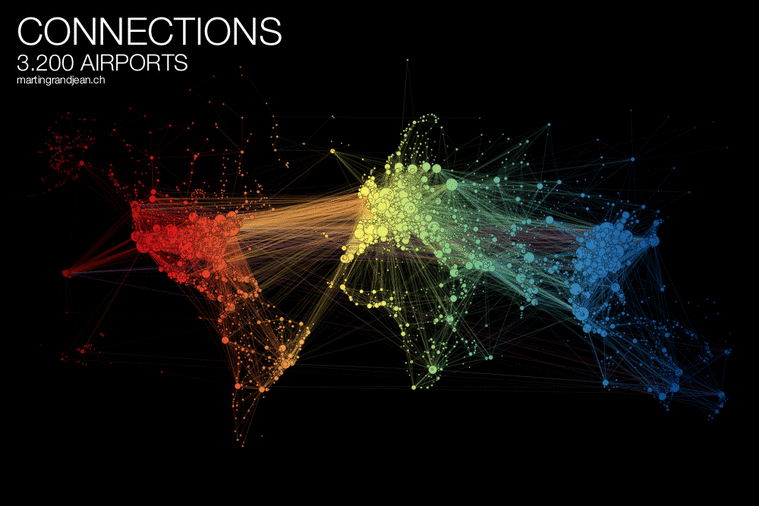
As the GIF above reveals, Europe remains an important linchpin in international travel, and cities on North America’s West Coast – such as Vancouver and San Francisco – swing in response to Asia’s gravitational pull.
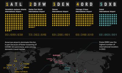
The World’s Most Connected Airports
While all airports are effective at moving passengers from point A to B, particular locations play a crucial role in the global network. To help put this connectivity between airports into perspective, OAG created the Megahubs International Index.
Below are the top 50 internationally connected airports:
| Rank | Airport | Airport Name | Country | Connectivity Index |
|---|---|---|---|---|
| 1 | LHR | Heathrow | United Kingdom | 379 |
| 2 | FRA | Frankfurt | Germany | 307 |
| 3 | AMS | Amsterdam Schiphol | Netherlands | 299 |
| 4 | ORD | O'Hare | United States | 295 |
| 5 | YYZ | Toronto Pearson | Canada | 271 |
| 6 | SIN | Singapore Changi | Singapore | 257 |
| 7 | CGK | Soekarno–Hatta | Indonesia | 256 |
| 8 | ATL | Hartsfield–Jackson | United States | 256 |
| 9 | KUL | Kuala Lumpur | Malaysia | 242 |
| 10 | CDG | Charles de Gaulle | France | 242 |
| 11 | LAX | Los Angeles | United States | 235 |
| 12 | HKG | Hong Kong | Hong Kong | 233 |
| 13 | BKK | Suvarnabhumi | Thailand | 226 |
| 14 | MUC | Munich | Germany | 221 |
| 15 | IST | Istanbul Atatürk | Turkey | 219 |
| 16 | MIA | Miami | United States | 204 |
| 17 | ICN | Incheon | South Korea | 196 |
| 18 | JFK | John F. Kennedy | United States | 195 |
| 19 | IAH | George Bush | United States | 184 |
| 20 | DXB | Dubai | United Arab Emirates | 183 |
| 21 | MEX | Mexico City | Mexico | 176 |
| 22 | EWR | Newark Liberty | United States | 170 |
| 23 | PVG | Shanghai Pudong | China | 167 |
| 24 | SYD | Sydney | Australia | 167 |
| 25 | DEL | Indira Gandhi | India | 166 |
| 26 | YVR | Vancouver | Canada | 165 |
| 27 | DFW | Dallas/Fort Worth | United States | 164 |
| 28 | HND | Haneda | Japan | 163 |
| 29 | SFO | San Francisco | United States | 153 |
| 30 | FCO | Rome Fiumicino | Italy | 145 |
| 31 | PEK | Beijing Capital | China | 142 |
| 32 | CAN | Guangzhou Baiyun | China | 141 |
| 33 | BOM | Chhatrapati Shivaji | India | 140 |
| 34 | MAD | Madrid–Barajas | Spain | 138 |
| 35 | NCE | Nice Côte d'Azur | France | 133 |
| 36 | JNB | O. R. Tambo | South Africa | 133 |
| 37 | NRT | Narita | Japan | 132 |
| 38 | MNL | Ninoy Aquino | Philippines | 131 |
| 39 | SEA | Seattle–Tacoma | United States | 130 |
| 40 | BOS | Logan | United States | 128 |
| 41 | BOG | El Dorado | Colombia | 127 |
| 42 | GRU | São Paulo–Guarulhos | Brazil | 120 |
| 43 | YUL | Montréal–Trudeau | Canada | 118 |
| 44 | ZRH | Zurich | Switzerland | 115 |
| 45 | SVO | Sheremetyevo | Russian Fed. | 114 |
| 46 | SJU | Luis Muñoz Marín | Puerto Rico | 114 |
| 47 | PTY | Tocumen | Panama | 108 |
| 48 | VIE | Vienna | Austria | 107 |
| 49 | MCO | Orlando | United States | 107 |
| 50 | AKL | Auckland | New Zealand | 106 |
The heavyweight airport leading the world in international connectivity is London Heathrow. This busy air traffic hub recently had a mind-blowing 72,000 possible international connections within a 6-hour window of arriving and departing flights. Heathrow moved over 78 million passengers and 1.70 million metric tonnes of cargo in 2017.
According to OAG, Singapore Changi and El Dorado International Airport in Colombia were the most connected airports in Asia–Pacific and South America, respectively. O. R. Tambo International Airport near Johannesburg was the sole African airport to crack the top 50.
America’s Most Connected Airports
Below are the top 25 most connected airports in the United States:
| Rank | Airport | Airport Name | City | Connectivity Index |
|---|---|---|---|---|
| 1 | ORD | O'Hare | Chicago | 455 |
| 2 | ATL | Hartsfield–Jackson Atlanta | Atlanta | 390 |
| 3 | CLT | Charlotte Douglas | Charlotte | 238 |
| 4 | DFW | Dallas/Fort Worth | Dallas | 207 |
| 5 | DEN | Denver | Denver | 186 |
| 6 | DTW | Detroit Metro. Wayne County | Detroit | 139 |
| 7 | MSP | Minneapolis–Saint Paul | Minneapolis–St. Paul | 126 |
| 8 | LAX | Los Angeles | Los Angeles | 114 |
| 9 | HNL | Daniel K. Inouye | Honolulu | 104 |
| 10 | PHX | Phoenix Sky Harbor | Phoenix | 103 |
| 11 | IAH | George Bush | Houston | 102 |
| 12 | BOS | Boston Logan | Boston | 95 |
| 13 | SEA | Seattle–Tacoma | Seattle | 87 |
| 14 | PHL | Philadelphia | Philadelphia | 85 |
| 15 | SFO | San Francisco | San Francisco | 84 |
| 16 | SLC | Salt Lake City | Salt Lake City | 79 |
| 17 | MDW | Chicago Midway | Chicago | 75 |
| 18 | DCA | Ronald Reagan Washington | Washington | 65 |
| 19 | IAD | Washington Dulles | Washington | 57 |
| 20 | DAL | Dallas Love Field | Dallas | 56 |
| 21 | EWR | Newark Liberty | Newark | 54 |
| 22 | LAS | McCarran | Las Vegas | 54 |
| 23 | BWI | Baltimore–Washington | Baltimore | 53 |
| 24 | LGA | LaGuardia | New York | 51 |
| 25 | STL | St. Louis Lambert | St. Louis | 43 |
While Atlanta Airport, the second most connected hub, has more scheduled domestic capacity, O’Hare’s scheduling offered more connection possibilities for passengers. Both these powerhouse transport nodes show up very clearly on the network map above.
No Fly Zones
There is a grand total of five countries in the world that have no airport and, interestingly, they’re all in Europe. Vatican City and Monaco are simply too small to accommodate an airport.
The remaining three – Andorra, San Marino, and Liechtenstein – rely on neighboring countries and/or helicopter pads for their air travel needs.


VC+
VC+: Get Our Key Takeaways From the IMF’s World Economic Outlook
A sneak preview of the exclusive VC+ Special Dispatch—your shortcut to understanding IMF’s World Economic Outlook report.

Have you read IMF’s latest World Economic Outlook yet? At a daunting 202 pages, we don’t blame you if it’s still on your to-do list.
But don’t worry, you don’t need to read the whole April release, because we’ve already done the hard work for you.
To save you time and effort, the Visual Capitalist team has compiled a visual analysis of everything you need to know from the report—and our VC+ Special Dispatch is available exclusively to VC+ members. All you need to do is log into the VC+ Archive.
If you’re not already subscribed to VC+, make sure you sign up now to access the full analysis of the IMF report, and more (we release similar deep dives every week).
For now, here’s what VC+ members get to see.
Your Shortcut to Understanding IMF’s World Economic Outlook
With long and short-term growth prospects declining for many countries around the world, this Special Dispatch offers a visual analysis of the key figures and takeaways from the IMF’s report including:
- The global decline in economic growth forecasts
- Real GDP growth and inflation forecasts for major nations in 2024
- When interest rate cuts will happen and interest rate forecasts
- How debt-to-GDP ratios have changed since 2000
- And much more!

Get the Full Breakdown in the Next VC+ Special Dispatch
VC+ members can access the full Special Dispatch by logging into the VC+ Archive, where you can also check out previous releases.
Make sure you join VC+ now to see exclusive charts and the full analysis of key takeaways from IMF’s World Economic Outlook.
Don’t miss out. Become a VC+ member today.
What You Get When You Become a VC+ Member
VC+ is Visual Capitalist’s premium subscription. As a member, you’ll get the following:
- Special Dispatches: Deep dive visual briefings on crucial reports and global trends
- Markets This Month: A snappy summary of the state of the markets and what to look out for
- The Trendline: Weekly curation of the best visualizations from across the globe
- Global Forecast Series: Our flagship annual report that covers everything you need to know related to the economy, markets, geopolitics, and the latest tech trends
- VC+ Archive: Hundreds of previously released VC+ briefings and reports that you’ve been missing out on, all in one dedicated hub
You can get all of the above, and more, by joining VC+ today.

-

 Education1 week ago
How Hard Is It to Get Into an Ivy League School?
-

 Technology2 weeks ago
Ranked: Semiconductor Companies by Industry Revenue Share
-

 Markets2 weeks ago
Ranked: The World’s Top Flight Routes, by Revenue
-

 Demographics2 weeks ago
Population Projections: The World’s 6 Largest Countries in 2075
-

 Markets2 weeks ago
The Top 10 States by Real GDP Growth in 2023
-

 Demographics2 weeks ago
The Smallest Gender Wage Gaps in OECD Countries
-

 Economy2 weeks ago
Where U.S. Inflation Hit the Hardest in March 2024
-

 Green2 weeks ago
Top Countries By Forest Growth Since 2001