Demographics
These 5 Maps Visualize Population Distribution in a Unique Way
Every once in a while, a data visualization trend organically sweeps through Reddit, the popular social news aggregation site, leading to some eye-catching and interesting user-generated results.
We’ve seen users visualize how they spend their disposable income, how they spend their time, and even details of their relationships. Sometimes these charts are fairly personal and uninteresting to the outside world – but other times, they can be quite compelling to a wider audience.
Population in Fourths
Most recently, in the Data is Beautiful subreddit, the trend has been to use data visualization techniques to split up the maps of countries into four evenly populated areas.
There are hundreds of maps to be found using this technique, but here are just five examples that we thought were particularly interesting. Each one reveals certain things about the population distribution, geography, and urban/rural split in their respective jurisdictions.
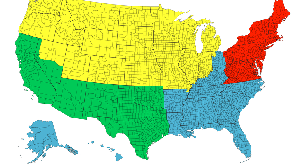
The United States
The first map is the least striking, but it creates an interesting baseline – it shows the U.S. divided into four equal sections of population, with no single area standing out as being incredibly dense or sparse:
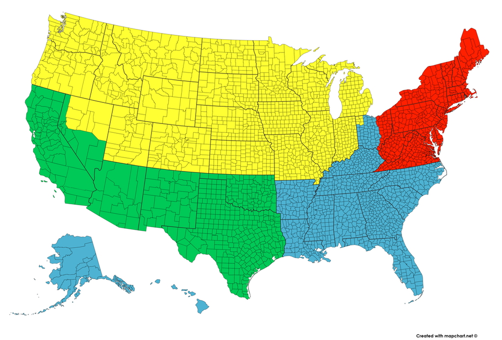
With over 300 million people spread throughout the country and big population centers in each region, it’s no surprise that this split into fourths is quite even.
However, that will not be the case for the remaining maps.
California
For example, when we go to the state level the distributions can be more easily impacted by big cities:
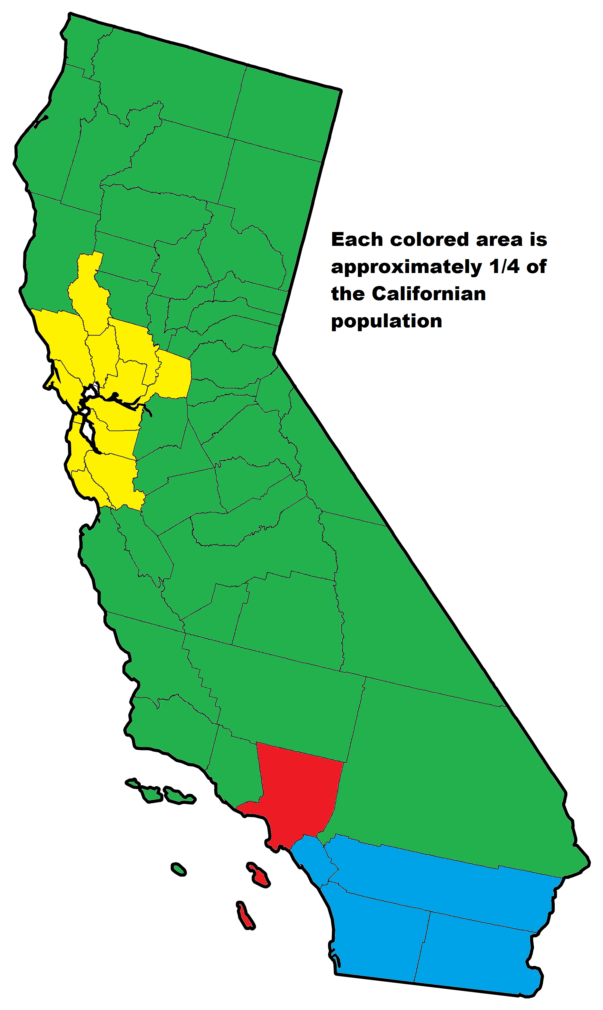
This map of California by old_gold_mountain is a great example of this – with three major urban areas (Los Angeles, Bay Area, and San Diego) all holding large amounts of the state’s population, the composition looks quite uneven when it gets divvied up in this way.
Canada
But Canada’s sparseness in the north goes to an even greater extreme:
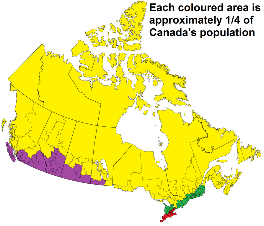
It’s said that 90% of the Canadian population lives within 100km of the U.S. border – and this map by repliers_beware makes it clear that any further north can get pretty remote.
Australia
Australia is another country with geographical diversity. Some regions are conducive to civilization and growing great wine, but few species (including humans) find the Outback very hospitable.
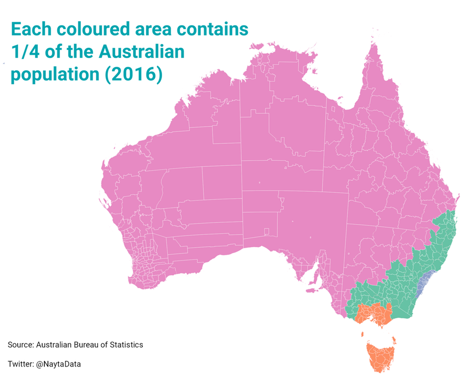
In this case, user NaytaData lumps in the Outback with cities like Adelaide and Perth to get this colored area up to the required 25% population mark.
Chile
For a very long and narrow finale, here is the country of Chile.
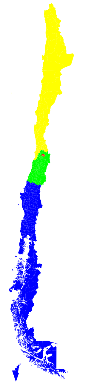
This map by QuietlyEcstatic shows that the capital Santiago and its surrounding area is roughly equal to three other very large sections of the country – including the sparse but beautiful Chilean piece of Patagonia.


Demographics
The Countries That Have Become Sadder Since 2010
Tracking Gallup survey data for more than a decade reveals some countries are witnessing big happiness declines, reflecting their shifting socio-economic conditions.


The Countries That Have Become Sadder Since 2010
This was originally posted on our Voronoi app. Download the app for free on iOS or Android and discover incredible data-driven charts from a variety of trusted sources.
Can happiness be quantified?
Some approaches that try to answer this question make a distinction between two differing components of happiness: a daily experience part, and a more general life evaluation (which includes how people think about their life as a whole).
The World Happiness Report—first launched in 2012—has been making a serious go at quantifying happiness, by examining Gallup poll data that asks respondents in nearly every country to evaluate their life on a 0–10 scale. From this they extrapolate a single “happiness score” out of 10 to compare how happy (or unhappy) countries are.
More than a decade later, the 2024 World Happiness Report continues the mission. Its latest findings also include how some countries have become sadder in the intervening years.
Which Countries Have Become Unhappier Since 2010?
Afghanistan is the unhappiest country in the world right now, and is also 60% unhappier than over a decade ago, indicating how much life has worsened since 2010.
In 2021, the Taliban officially returned to power in Afghanistan, after nearly two decades of American occupation in the country. The Islamic fundamentalist group has made life harder, especially for women, who are restricted from pursuing higher education, travel, and work.
On a broader scale, the Afghan economy has suffered post-Taliban takeover, with various consequent effects: mass unemployment, a drop in income, malnutrition, and a crumbling healthcare system.
| Rank | Country | Happiness Score Loss (2010–24) | 2024 Happiness Score (out of 10) |
|---|---|---|---|
| 1 | 🇦🇫 Afghanistan | -2.6 | 1.7 |
| 2 | 🇱🇧 Lebanon | -2.3 | 2.7 |
| 3 | 🇯🇴 Jordan | -1.5 | 4.2 |
| 4 | 🇻🇪 Venezuela | -1.3 | 5.6 |
| 5 | 🇲🇼 Malawi | -1.2 | 3.4 |
| 6 | 🇿🇲 Zambia | -1.2 | 3.5 |
| 7 | 🇧🇼 Botswana | -1.2 | 3.4 |
| 8 | 🇾🇪 Yemen | -1.0 | 3.6 |
| 9 | 🇪🇬 Egypt | -1.0 | 4.0 |
| 10 | 🇮🇳 India | -0.9 | 4.1 |
| 11 | 🇧🇩 Bangladesh | -0.9 | 3.9 |
| 12 | 🇨🇩 DRC | -0.7 | 3.3 |
| 13 | 🇹🇳 Tunisia | -0.7 | 4.4 |
| 14 | 🇨🇦 Canada | -0.6 | 6.9 |
| 15 | 🇺🇸 U.S. | -0.6 | 6.7 |
| 16 | 🇨🇴 Colombia | -0.5 | 5.7 |
| 17 | 🇵🇦 Panama | -0.5 | 6.4 |
| 18 | 🇵🇰 Pakistan | -0.5 | 4.7 |
| 19 | 🇿🇼 Zimbabwe | -0.5 | 3.3 |
| 20 | 🇮🇪 Ireland | -0.5 | 6.8 |
| N/A | 🌍 World | +0.1 | 5.5 |
Nine countries in total saw their happiness score drop by a full point or more, on the 0–10 scale.
Noticeably, many of them have seen years of social and economic upheaval. Lebanon, for example, has been grappling with decades of corruption, and a severe liquidity crisis since 2019 that has resulted in a banking system collapse, sending poverty levels skyrocketing.
In Jordan, unprecedented population growth—from refugees leaving Iraq and Syria—has aggravated unemployment rates. A somewhat abrupt change in the line of succession has also raised concerns about political stability in the country.

-

 Mining1 week ago
Gold vs. S&P 500: Which Has Grown More Over Five Years?
-

 Markets2 weeks ago
Ranked: The Most Valuable Housing Markets in America
-

 Money2 weeks ago
Which States Have the Highest Minimum Wage in America?
-

 AI2 weeks ago
Ranked: Semiconductor Companies by Industry Revenue Share
-

 Markets2 weeks ago
Ranked: The World’s Top Flight Routes, by Revenue
-

 Demographics2 weeks ago
Population Projections: The World’s 6 Largest Countries in 2075
-

 Markets2 weeks ago
The Top 10 States by Real GDP Growth in 2023
-

 Demographics2 weeks ago
The Smallest Gender Wage Gaps in OECD Countries