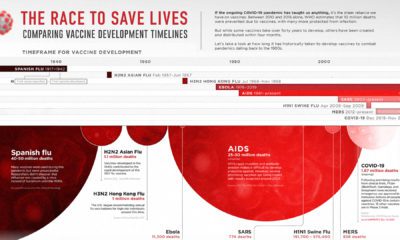

This graphic looks at how long vaccine development has historically taken for pandemics dating back to the 1900s.
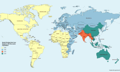

This simple map visualization will change how you think about global population, and how people are distributed throughout the planet.
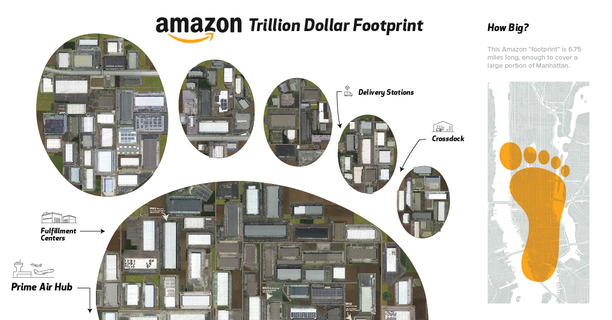
This visualization shows satellite imagery of all of Amazon's warehouses in the U.S. to put the size of its physical distribution network in perspective.
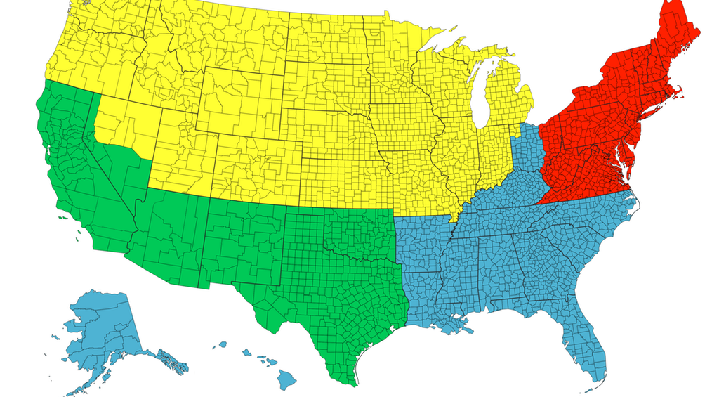
Each of the four colors is equal to 25% of the country's total population - and things get interesting when looking at Canada, Chile, or California.
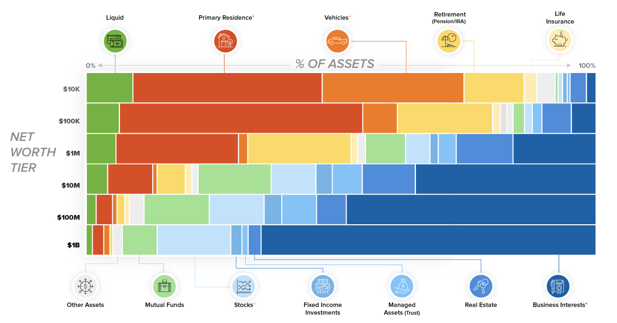
This chart breaks down the composition of assets for each tier of wealth. See what assets make up a regular person's net worth, versus that of...
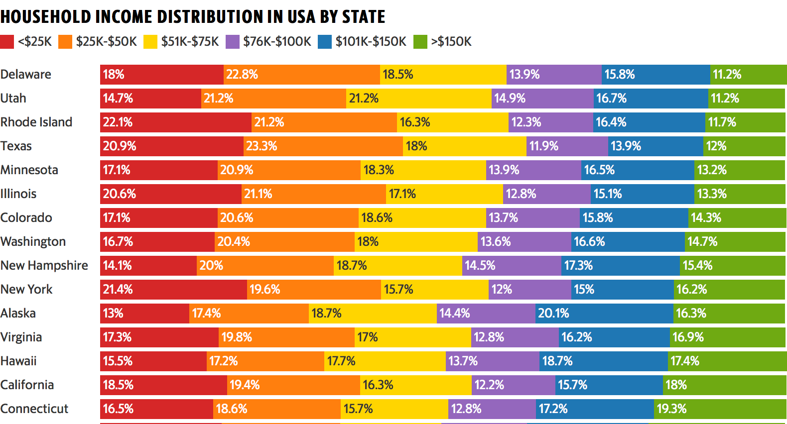
This colorful data visualization breaks down the household income of each U.S. state into six income brackets.
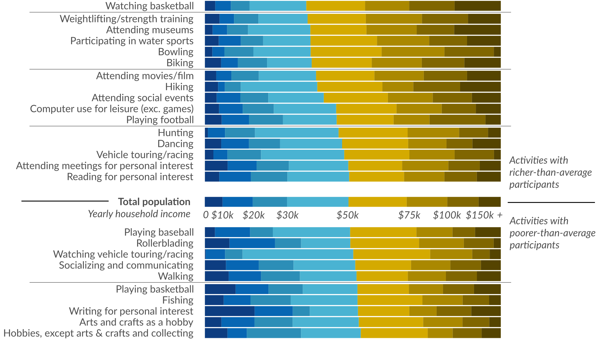
Ever wonder how people spend time? This data visualization shows favorite American past-times like playing baseball or watching TV by using income brackets.
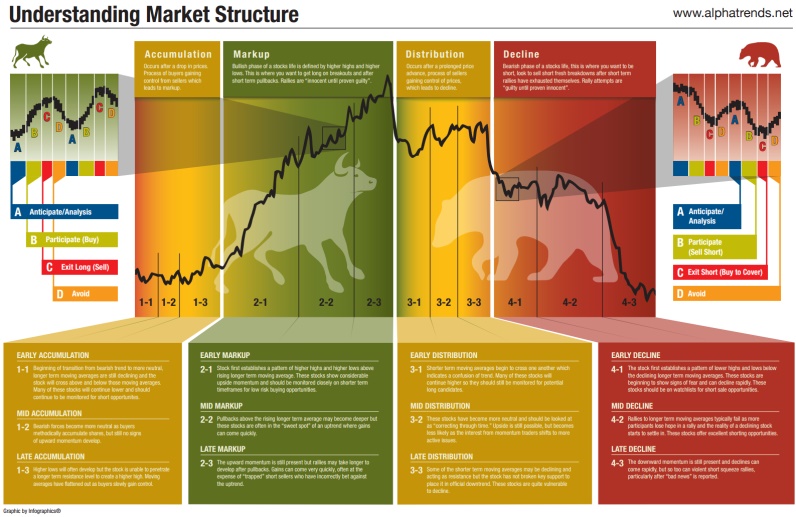

Understanding these different phases of the market cycle will help give you conviction on stock buying opportunities.