

How much do you trust the government and its various institutions? We look at data for G7 countries for the...
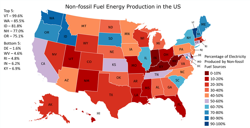
In countries where energy is plentiful, we often take the grid for granted. But do you know where your power comes from, and how green it...
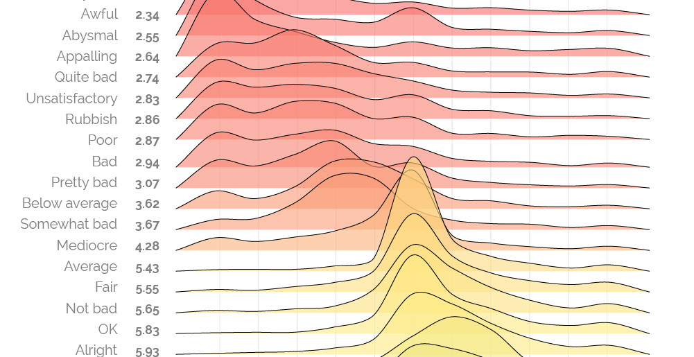
The words 'bad' and 'awful' may not appear very different, but as this sentiment scale reveals, some words and phrases are more potent than others.
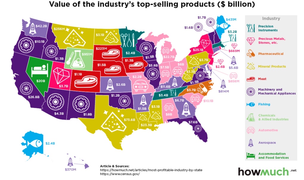
Which industries reign supreme in the United States? This map breaks down the most profitable industry, state by state.
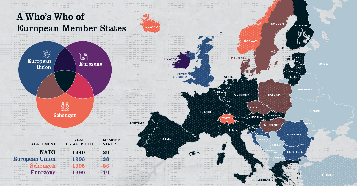
Europe has members in at least four major treaty groups. This map shows how these groups fit into the big picture of Europe's member states.
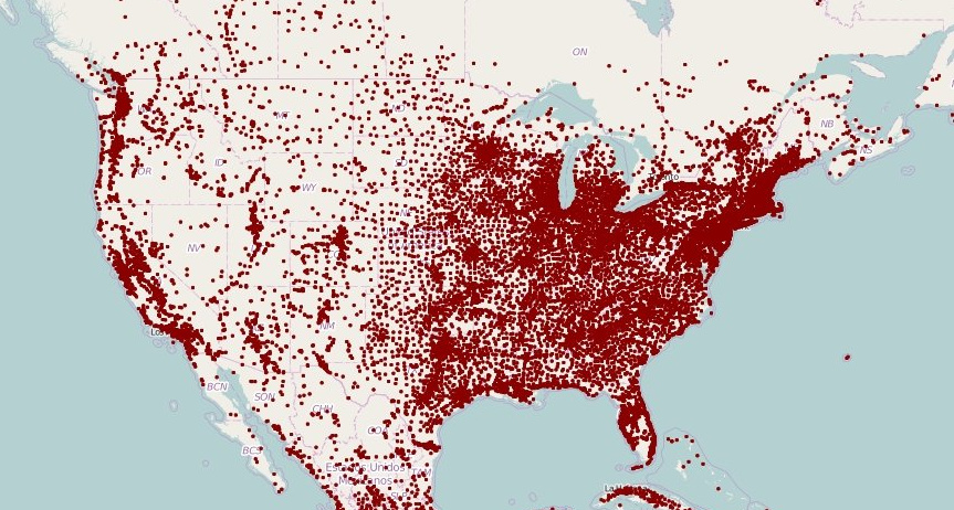
These maps of North America and Europe use a deceivingly simple method to plot population density: replacing each town with a single dot.
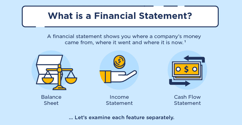
Fewer entrepreneurs today have formal business training. While the financial statement is not a glorified part of the startup dream, it's essential learning.
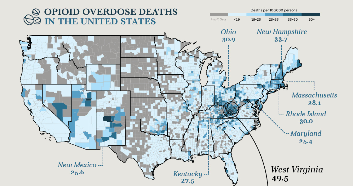
Drug overdoses are the leading cause of death for Americans under the age of 50. A hard look at the numbers behind this unparalleled public health...
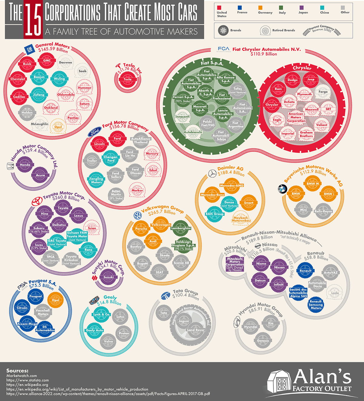
This massive infographic shows the 15 corporations that make the most cars, their annual revenues, and the brands owned by each automaker.
Which countries receive the most money from international tourism? Each country is resized on this map based on dollars coming in from travelers.
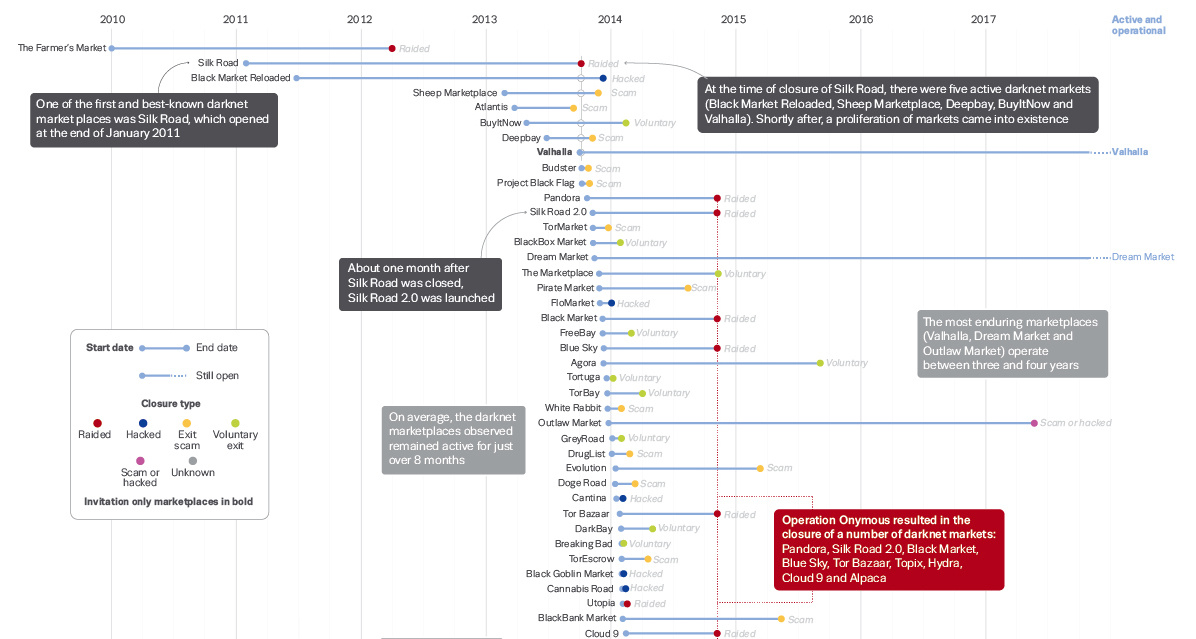
How often does a dark web marketplace last, on average? This data visualization offers a data-driven look at the survival rate of underground marketplaces.


