Demographics
Mapped: Population Density With a Dot For Each Town
There are many different ways to show population density on a map.
One method, for example, would be to color regions based on people per unit of land. This could be done at the county, state, or national levels with varying results. Alternatively, you could show density more abstractly, such as in this compelling map of the Pearl River Delta in China.
But one surprisingly insightful method for looking at population density is deceivingly simple: just put a dot on the map for every town with 1,000 people or more, and the results will give you a sense of where people live on a macro scale.
Replacing Towns With Dots
Using the dot methodology, it means New York City is the same size as Anytown, USA. This seems crazy, right?
Although this is surely a drawback, the results are still pretty interesting. After all, hubs like New York City are centers of commerce and culture, and they are surrounded by hundreds of other nearby towns.
Let’s take a look at (most of) North America:
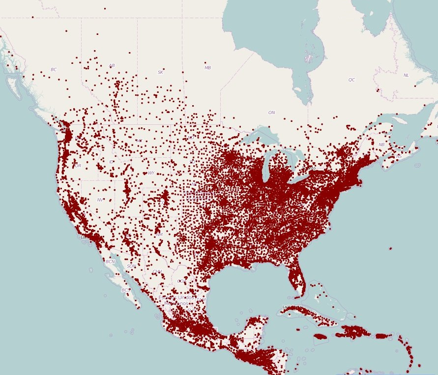
A few things that are noticeable right away?
You can see the difference in topography between the plains and the more mountainous part of the continent. In flatter places like Nebraska or Saskatchewan, the towns are evenly spread out – and in regions with uneven geography, such as Colorado or British Columbia, towns are typically located in the valleys.
Further, the density in the Northeastern part of the United States and surrounding the Great Lakes work to provide quite a contrast to the emptier parts of the continent.
Natural features like the Everglades are also quite easy to spot on the map – it’s one of the only non-populated areas in an otherwise dense Florida. If you look at the northwestern tip of Wyoming, you’ll also see a lack of dots in the 2 million acres of Yellowstone National Park.
Europe and MENA
Now let’s go across the Atlantic – here’s a map of Europe, North Africa, and most of the Middle East.
(Click to open a larger version)
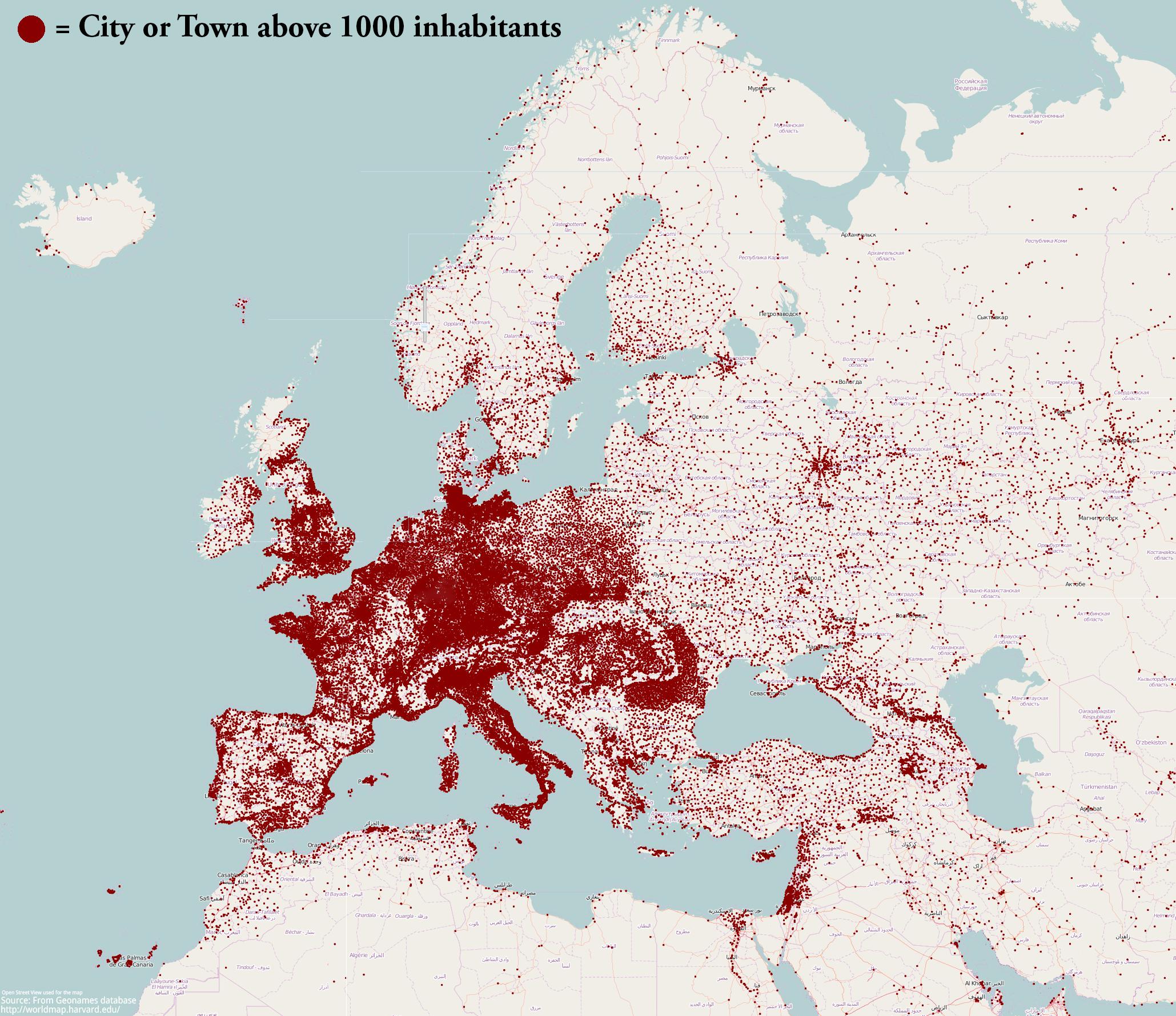
This map is also pretty spectacular – you can see the cities along the Nile, the “eye” of Moscow, and impressive amounts of population density in places like Belgium, Holland, Germany and Switzerland.
World View
While we haven’t seen a world map using this method, it’s not hard to imagine what places like India, China, Japan, or Bangladesh could look like with dots replacing each town within their borders.
These are the densest parts of the world – to even more extreme levels than the denser parts of Europe shown above.
Here’s a more standard population density map, using people per square kilometer, to give you an idea:
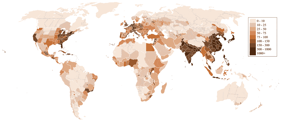
If you’re looking for more perspective on global population density, this unique map is worth a look. It shows how dense the aforementioned Asian region above is in a very compelling and simple way.


Demographics
The Countries That Have Become Sadder Since 2010
Tracking Gallup survey data for more than a decade reveals some countries are witnessing big happiness declines, reflecting their shifting socio-economic conditions.


The Countries That Have Become Sadder Since 2010
This was originally posted on our Voronoi app. Download the app for free on iOS or Android and discover incredible data-driven charts from a variety of trusted sources.
Can happiness be quantified?
Some approaches that try to answer this question make a distinction between two differing components of happiness: a daily experience part, and a more general life evaluation (which includes how people think about their life as a whole).
The World Happiness Report—first launched in 2012—has been making a serious go at quantifying happiness, by examining Gallup poll data that asks respondents in nearly every country to evaluate their life on a 0–10 scale. From this they extrapolate a single “happiness score” out of 10 to compare how happy (or unhappy) countries are.
More than a decade later, the 2024 World Happiness Report continues the mission. Its latest findings also include how some countries have become sadder in the intervening years.
Which Countries Have Become Unhappier Since 2010?
Afghanistan is the unhappiest country in the world right now, and is also 60% unhappier than over a decade ago, indicating how much life has worsened since 2010.
In 2021, the Taliban officially returned to power in Afghanistan, after nearly two decades of American occupation in the country. The Islamic fundamentalist group has made life harder, especially for women, who are restricted from pursuing higher education, travel, and work.
On a broader scale, the Afghan economy has suffered post-Taliban takeover, with various consequent effects: mass unemployment, a drop in income, malnutrition, and a crumbling healthcare system.
| Rank | Country | Happiness Score Loss (2010–24) | 2024 Happiness Score (out of 10) |
|---|---|---|---|
| 1 | 🇦🇫 Afghanistan | -2.6 | 1.7 |
| 2 | 🇱🇧 Lebanon | -2.3 | 2.7 |
| 3 | 🇯🇴 Jordan | -1.5 | 4.2 |
| 4 | 🇻🇪 Venezuela | -1.3 | 5.6 |
| 5 | 🇲🇼 Malawi | -1.2 | 3.4 |
| 6 | 🇿🇲 Zambia | -1.2 | 3.5 |
| 7 | 🇧🇼 Botswana | -1.2 | 3.4 |
| 8 | 🇾🇪 Yemen | -1.0 | 3.6 |
| 9 | 🇪🇬 Egypt | -1.0 | 4.0 |
| 10 | 🇮🇳 India | -0.9 | 4.1 |
| 11 | 🇧🇩 Bangladesh | -0.9 | 3.9 |
| 12 | 🇨🇩 DRC | -0.7 | 3.3 |
| 13 | 🇹🇳 Tunisia | -0.7 | 4.4 |
| 14 | 🇨🇦 Canada | -0.6 | 6.9 |
| 15 | 🇺🇸 U.S. | -0.6 | 6.7 |
| 16 | 🇨🇴 Colombia | -0.5 | 5.7 |
| 17 | 🇵🇦 Panama | -0.5 | 6.4 |
| 18 | 🇵🇰 Pakistan | -0.5 | 4.7 |
| 19 | 🇿🇼 Zimbabwe | -0.5 | 3.3 |
| 20 | 🇮🇪 Ireland | -0.5 | 6.8 |
| N/A | 🌍 World | +0.1 | 5.5 |
Nine countries in total saw their happiness score drop by a full point or more, on the 0–10 scale.
Noticeably, many of them have seen years of social and economic upheaval. Lebanon, for example, has been grappling with decades of corruption, and a severe liquidity crisis since 2019 that has resulted in a banking system collapse, sending poverty levels skyrocketing.
In Jordan, unprecedented population growth—from refugees leaving Iraq and Syria—has aggravated unemployment rates. A somewhat abrupt change in the line of succession has also raised concerns about political stability in the country.

-

 Markets1 week ago
U.S. Debt Interest Payments Reach $1 Trillion
-

 Business2 weeks ago
Charted: Big Four Market Share by S&P 500 Audits
-

 Markets2 weeks ago
Ranked: The Most Valuable Housing Markets in America
-

 Money2 weeks ago
Which States Have the Highest Minimum Wage in America?
-

 AI2 weeks ago
Ranked: Semiconductor Companies by Industry Revenue Share
-

 Markets2 weeks ago
Ranked: The World’s Top Flight Routes, by Revenue
-

 Countries2 weeks ago
Population Projections: The World’s 6 Largest Countries in 2075
-

 Markets2 weeks ago
The Top 10 States by Real GDP Growth in 2023