Misc
Sentiment Scale Reveals Which Words Pack the Most Punch
For world leaders, journalists, CEOs, or anyone who has ever had to explain a dicey report card, word selection can have an enormous impact on how a message is perceived.
Does it make any difference whether a presentation went quite good versus pretty good, or if an earnings report is described as awful versus poor? According to a new survey from YouGov, word sentiment isn’t as cut-and-dry as one would expect.
The United States of Sentiment
Certain words more precisely communicate positive and negative feelings.
Interestingly, very bad edges out words like abysmal and dreadful as the most conclusively negative phrase for those survey respondents based in the United States.
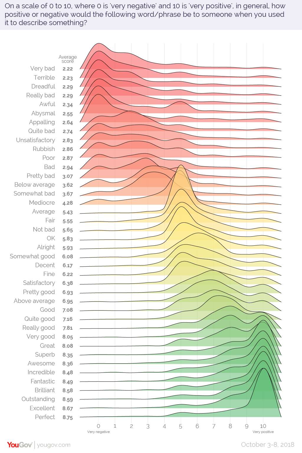
On the positive end of the spectrum, perfect was most conclusively positive term.
Effective Words: U.K. Edition
The version of the survey conducted in the United Kingdom reveals interesting differences in how words are perceived.
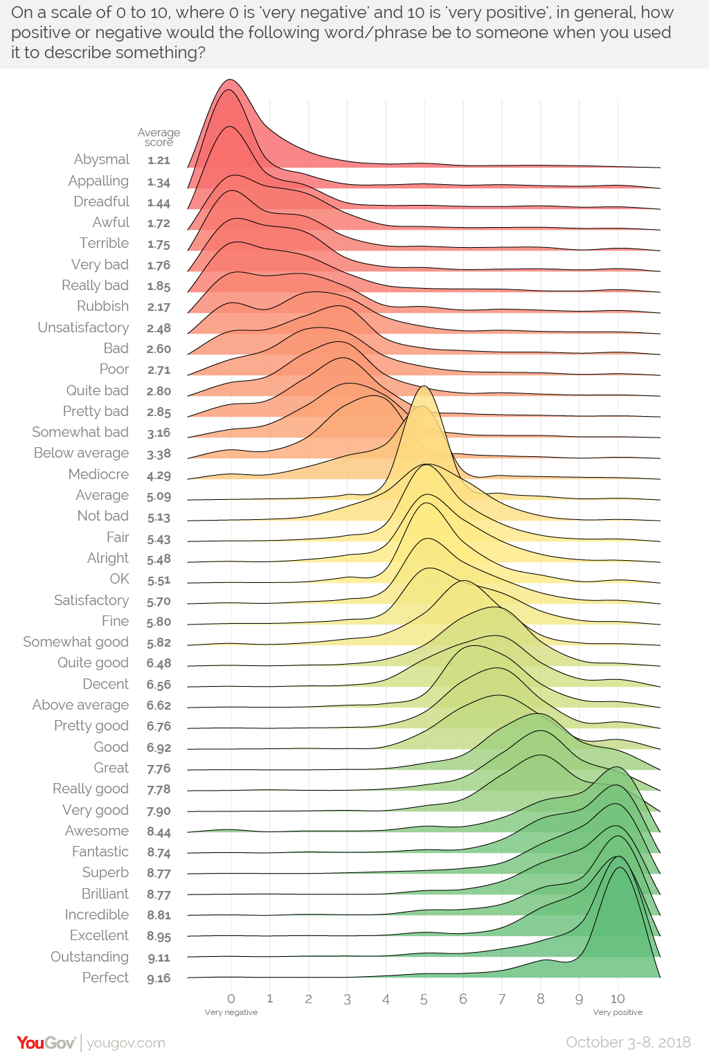
In the U.K. visualization, words have a more defined “hump”, meaning that people tended to agreed on where each word fell on the 10-point scale. As well, there appears to be more mutually agreed upon nuance. The U.S. results showed less agreement on words that weren’t on the extreme ends of the sentiment spectrum.
In both regions, the word average was nearly dead-center on the graph and had the highest percentage of people agreeing on its score.
Quantifying Language
It’s human nature to attempt to tame complexity and bring order to chaos. Language, with its fluidity and openness to interpretation, has always presented a tempting challenge.
To this end, researchers have developed lists that ascribe a sentiment score to specific words. Using data mining techniques, it’s possible to gauge the tone of a piece of writing.
One compelling example of this is a project by data analyst, Susan Li, who ran a sentiment analysis on Warren Buffett’s annual shareholder letters, and found that the majority of the letters had a positive tone.
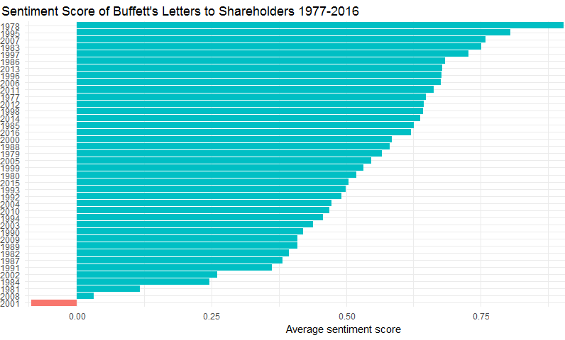
The one outlier? 2001, which was a challenging year for a number of reasons.
As these techniques continue to evolve, we are likely to better understand why one person’s abysmal is another person’s very bad.


Politics
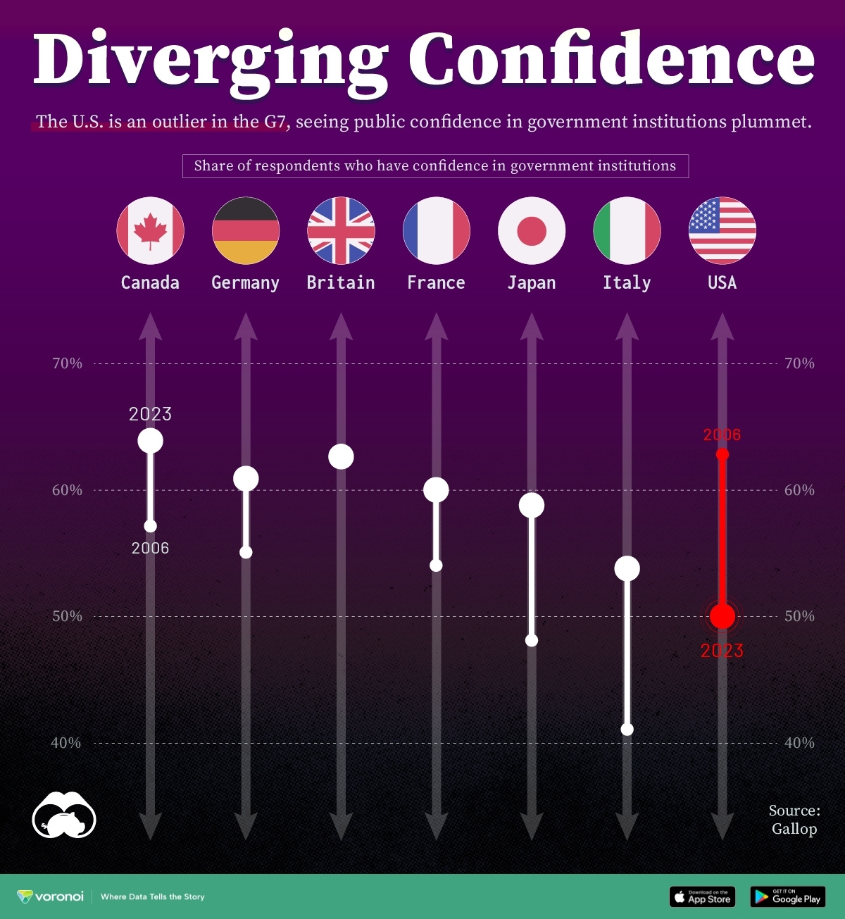
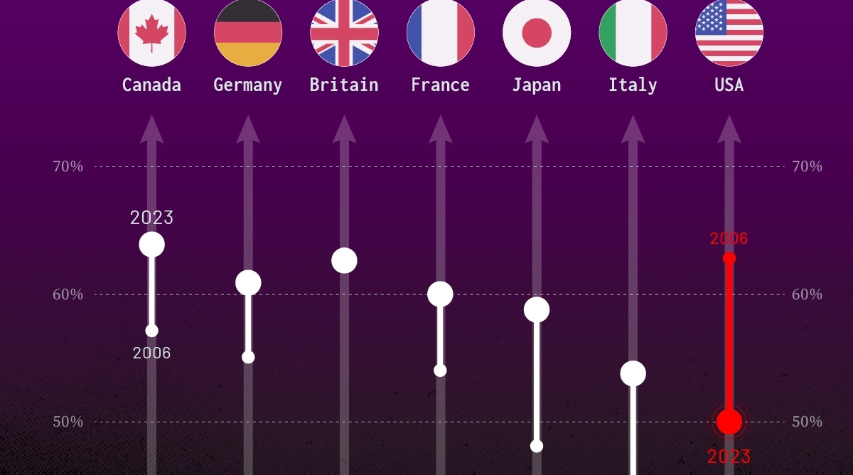
Charted: Trust in Government Institutions by G7 Countries
How much do you trust the government and its various institutions? We look at data for G7 countries for the time period of 2006-2023.
Trust in Government Institutions by G7 Countries
This was originally posted on our Voronoi app. Download the app for free on iOS or Android and discover incredible data-driven charts from a variety of trusted sources.
How much do you trust the government, and its various institutions?
It’s likely that your level of confidence probably depends on a wide range of factors, such as perceived competency, historical context, economic performance, accountability, social cohesion, and transparency.
And for these same reasons, trust levels in government institutions also change all the time, even in the world’s most developed countries: the G7.
Confidence in Government by G7 Countries (2006-2023)
This chart looks at the changes in trust in government institutions between the years 2006 and 2023, based on data from a multi-country Gallup poll.
Specifically, this dataset aggregates confidence in multiple national institutions, including the military, the judicial system, the national government, and the integrity of the electoral system.
| Country | Confidence (2006) | Confidence (2023) | Change (p.p.) |
|---|---|---|---|
| Canada | 57% | 64% | +7 |
| Britain | 63% | 63% | +0 |
| Germany | 55% | 61% | +6 |
| France | 54% | 60% | +6 |
| Japan | 48% | 59% | +11 |
| Italy | 41% | 54% | +13 |
| United States | 63% | 50% | -13 |
What’s interesting here is that in the G7, a group of the world’s most developed economies, there is only one country bucking the general trend: the United States.
Across most G7 countries, confidence in institutions has either improved or stayed the same between 2006 and 2023. The largest percentage point (p.p.) increases occur in Italy and Japan, which saw +13 p.p. and +11 p.p. increases in trust over the time period.
In the U.S., however, confidence in government institutions has fallen by 13 p.p. over the years. What happened?
Key Figures on U.S. Trust in Institutions
In 2006, the U.S. was tied with the UK as having the highest confidence in government institutions, at 63%.
But here’s where the scores stand in 2023, across various institutions:
| 🇺🇸 Institutions | Confidence (2023) |
|---|---|
| Military | 81% |
| Judiciary | 42% |
| National Government | 30% |
| Elections | 44% |
| Overall | 49% |
Based on this data, it’s clear that the U.S. lags behind in three key indicators: confidence in the national government, confidence in the justice system, and confidence in fair elections. It ranked in last place for each indicator in the G7.
One other data point that stands out: despite leading the world in military spending, the U.S. is only the third most confident in its military in the G7. It lags behind France (86%) and the United Kingdom (83%).

-

 Wealth6 days ago
Charted: Which City Has the Most Billionaires in 2024?
-

 Mining2 weeks ago
Gold vs. S&P 500: Which Has Grown More Over Five Years?
-

 Uranium2 weeks ago
The World’s Biggest Nuclear Energy Producers
-

 Education2 weeks ago
How Hard Is It to Get Into an Ivy League School?
-

 Debt2 weeks ago
How Debt-to-GDP Ratios Have Changed Since 2000
-
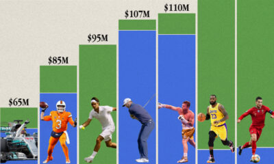
 Sports2 weeks ago
The Highest Earning Athletes in Seven Professional Sports
-

 Science2 weeks ago
Visualizing the Average Lifespans of Mammals
-

 Brands1 week ago
How Tech Logos Have Evolved Over Time