Maps
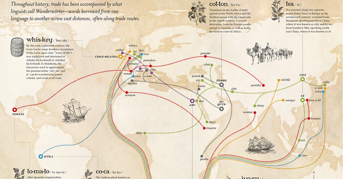
Mapping the Spread of Words Along Trade Routes
View the full-size version of this infographic
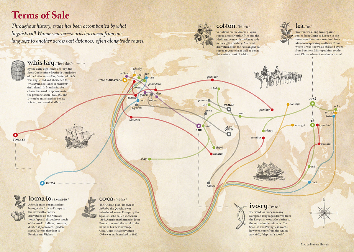
Mapping the Spread of Words Along Trade Routes
In the early history of international trade, when exotic goods traveled to new regions, their native names sometimes hitchhiked along with them.
Naturally, the Germans have a term – Wanderwörter – for these extraordinary loanwords that journey around the globe, mutating subtly along the way.
Today’s map, produced by Haisam Hussein for Lapham’s Quarterly, charts the flow of Wanderwörter along global trade routes.
Tea
China’s export dominance over tea influenced how people around the world refer to their steeped beverages.
The spread of tea along the Silk Road from Mandarin-speaking Northern China resulted in much of Asia and Africa having similar sounding words for tea. Chá evolved into the chai widely consumed in India and surrounding areas today.
Tea’s other major trade route, through Min-speaking Southern China, spread the pronunciation that became the standard around Europe. This is why we see such striking similarities between thé (French), thee (Dutch), tee (German), té (Spanish), and tè (Italian).
Tomatoes
Sometimes, a word’s journey isn’t completely linear.
In the case of tomatoes, the Italians’ decision to dub the red fruit pomodoro, or golden apple, led to a linguistic fork in the road. This is the reason the English name for tomatoes is still similar to the Aztec term tomatl, but in Russian, pomidor can be traced back to Italian.
Cotton
Many people in North America would be surprised to learn that “cotton” is a direct link to the Arabic word al-qutn.
Coca
When the Spanish brought coca from South America and spread it into the global market, its easy-to-pronounce name tagged along for the entire journey. Though its spelling may differ across cultures, say the word “coca” in many countries and people will likely know what you’re referring to.
A Small World After All
Most of us are vaguely aware that parts of our langauge consist of loanwords from other regions and cultures, but seeing the spread of language in map form is a powerful reminder that the globalization as we know it is a continuation of centuries of commercial and cultural exchange.


Maps
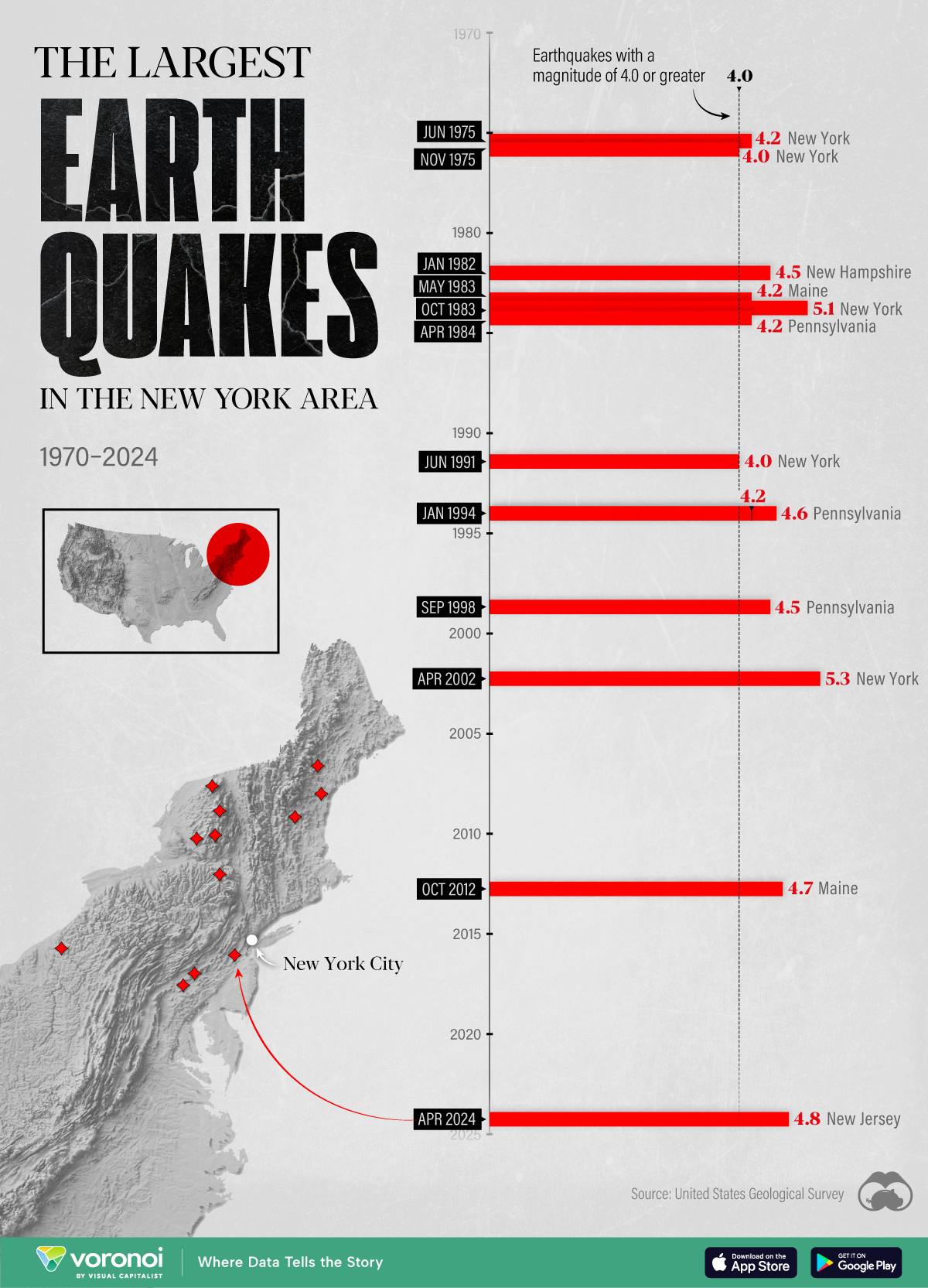
The Largest Earthquakes in the New York Area (1970-2024)
The earthquake that shook buildings across New York in April 2024 was the third-largest quake in the Northeast U.S. over the past 50 years.
The Largest Earthquakes in the New York Area
This was originally posted on our Voronoi app. Download the app for free on Apple or Android and discover incredible data-driven charts from a variety of trusted sources.
The 4.8 magnitude earthquake that shook buildings across New York on Friday, April 5th, 2024 was the third-largest quake in the U.S. Northeast area over the past 50 years.
In this map, we illustrate earthquakes with a magnitude of 4.0 or greater recorded in the Northeastern U.S. since 1970, according to the United States Geological Survey (USGS).
Shallow Quakes and Older Buildings
The earthquake that struck the U.S. Northeast in April 2024 was felt by millions of people from Washington, D.C., to north of Boston. It even caused a full ground stop at Newark Airport.
The quake, occurring just 5 km beneath the Earth’s surface, was considered shallow, which is what contributed to more intense shaking at the surface.
According to the USGS, rocks in the eastern U.S. are significantly older, denser, and harder than those on the western side, compressed by time. This makes them more efficient conduits for seismic energy. Additionally, buildings in the Northeast tend to be older and may not adhere to the latest earthquake codes.
Despite disrupting work and school life, the earthquake was considered minor, according to the Michigan Technological University magnitude scale:
| Magnitude | Earthquake Effects | Estimated Number Each Year |
|---|---|---|
| 2.5 or less | Usually not felt, but can be recorded by seismograph. | Millions |
| 2.5 to 5.4 | Often felt, but only causes minor damage. | 500,000 |
| 5.5 to 6.0 | Slight damage to buildings and other structures. | 350 |
| 6.1 to 6.9 | May cause a lot of damage in very populated areas. | 100 |
| 7.0 to 7.9 | Major earthquake. Serious damage. | 10-15 |
| 8.0 or greater | Great earthquake. Can totally destroy communities near the epicenter. | One every year or two |
The largest earthquake felt in the area over the past 50 years was a 5.3 magnitude quake that occurred in Au Sable Forks, New York, in 2002. It damaged houses and cracked roads in a remote corner of the Adirondack Mountains, but caused no injuries.
| Date | Magnitude | Location | State |
|---|---|---|---|
| April 20, 2002 | 5.3 | Au Sable Forks | New York |
| October 7, 1983 | 5.1 | Newcomb | New York |
| April 5, 2024 | 4.8 | Whitehouse Station | New Jersey |
| October 16, 2012 | 4.7 | Hollis Center | Maine |
| January 16, 1994 | 4.6 | Sinking Spring | Pennsylvania |
| January 19, 1982 | 4.5 | Sanbornton | New Hampshire |
| September 25, 1998 | 4.5 | Adamsville | Pennsylvania |
| June 9, 1975 | 4.2 | Altona | New York |
| May 29, 1983 | 4.2 | Peru | Maine |
| April 23, 1984 | 4.2 | Conestoga | Pennsylvania |
| January 16, 1994 | 4.2 | Sinking Spring | Pennsylvania |
| November 3, 1975 | 4 | Long Lake | New York |
| June 17, 1991 | 4 | Worcester | New York |
The largest earthquake in U.S. history, however, was the 1964 Good Friday quake in Alaska, measuring 9.2 magnitude and killing 131 people.

-

 Debt1 week ago
How Debt-to-GDP Ratios Have Changed Since 2000
-

 Markets2 weeks ago
Ranked: The World’s Top Flight Routes, by Revenue
-

 Countries2 weeks ago
Population Projections: The World’s 6 Largest Countries in 2075
-

 Markets2 weeks ago
The Top 10 States by Real GDP Growth in 2023
-

 Demographics2 weeks ago
The Smallest Gender Wage Gaps in OECD Countries
-

 United States2 weeks ago
Where U.S. Inflation Hit the Hardest in March 2024
-

 Green2 weeks ago
Top Countries By Forest Growth Since 2001
-

 United States2 weeks ago
Ranked: The Largest U.S. Corporations by Number of Employees