Misc
A Visual Guide to Understanding Your Financial Statement
In the startup era, it’s easier than ever to launch a new business.
With barriers to entry for new ventures at historic lows, it’s now extremely common to see aspiring entrepreneurs from all walks of life – including many without any type of formal business training.
Financial Statement Basics
Accounting may not be a glorified part of the modern hustle, but today’s infographic from The Business Backer shows why understanding and interpreting financial statements is important for any founder.
Whether you have the next big idea or find yourself grinding away at a side hustle, understanding the basics of business accounting will help you prepare for the next step of entrepreneurial success.
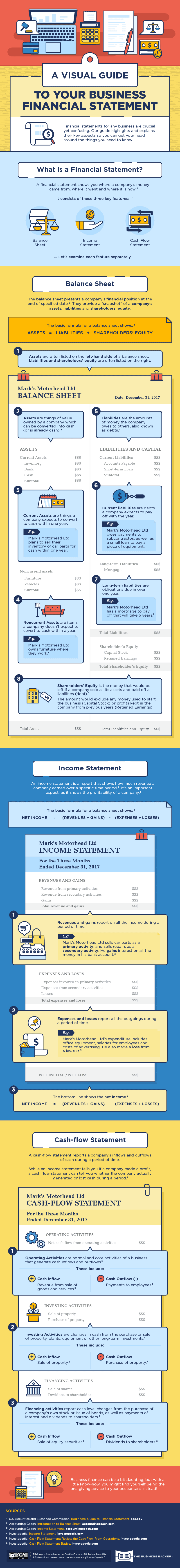
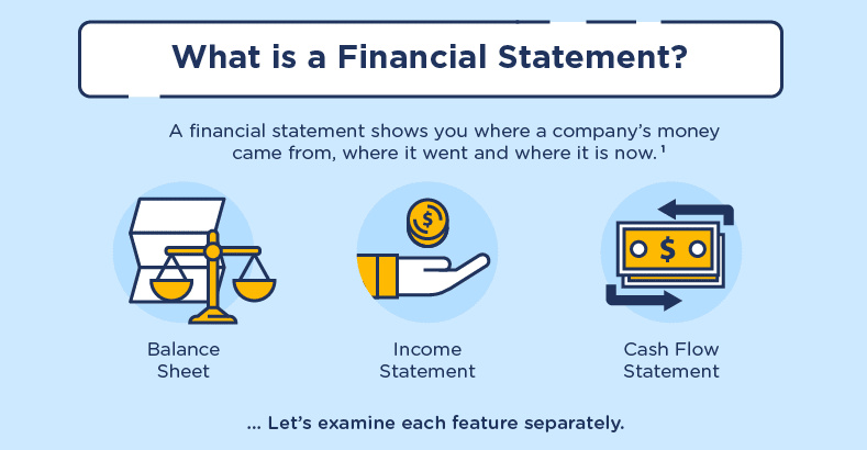
A financial statement has three main parts: the balance sheet, the income statement, and the cash flow statement.
It’s worth noting that 82% of small businesses fail because they experience cash flow problems, so the latter statement is of particular importance.
What They Do
Here are the basics on each type of statement, and why they are important:
1. Balance Sheet
The balance sheet presents a company’s financial position at the end of a specified date. It provides a snapshot of a company’s assets, liabilities, and shareholders’ equity. This statement essentially shows what a company owns and owes.
2. Income Statement
An income statement is a report that shows how much revenue a company earned over a specific time period. This is perhaps the most intuitive financial statement, as it ultimately shows the company’s profitability – a metric that even the most accounting-allergic business owner would watch quite closely!
3. Cash Flow Statement
A cash flow statement reports the company’s inflows and outflows of cash during a period of time. A company can be profitable, but still be experiencing cash flow difficulties. If not enough money is coming in the door, or if there is a significant lead time to receive revenue, then it’s possible for a company to not meet its short-term liabilities.


VC+
VC+: Get Our Key Takeaways From the IMF’s World Economic Outlook
A sneak preview of the exclusive VC+ Special Dispatch—your shortcut to understanding IMF’s World Economic Outlook report.

Have you read IMF’s latest World Economic Outlook yet? At a daunting 202 pages, we don’t blame you if it’s still on your to-do list.
But don’t worry, you don’t need to read the whole April release, because we’ve already done the hard work for you.
To save you time and effort, the Visual Capitalist team has compiled a visual analysis of everything you need to know from the report—and our upcoming VC+ Special Dispatch will be available exclusively to VC+ members on Thursday, April 25th.
If you’re not already subscribed to VC+, make sure you sign up now to receive the full analysis of the IMF report, and more (we release similar deep dives every week).
For now, here’s what VC+ members can expect to receive.
Your Shortcut to Understanding IMF’s World Economic Outlook
With long and short-term growth prospects declining for many countries around the world, this Special Dispatch offers a visual analysis of the key figures and takeaways from the IMF’s report including:
- The global decline in economic growth forecasts
- Real GDP growth and inflation forecasts for major nations in 2024
- When interest rate cuts will happen and interest rate forecasts
- How debt-to-GDP ratios have changed since 2000
- And much more!

Get the Full Breakdown in the Next VC+ Special Dispatch
VC+ members will receive the full Special Dispatch on Thursday, April 25th.
Make sure you join VC+ now to receive exclusive charts and the full analysis of key takeaways from IMF’s World Economic Outlook.
Don’t miss out. Become a VC+ member today.
What You Get When You Become a VC+ Member
VC+ is Visual Capitalist’s premium subscription. As a member, you’ll get the following:
- Special Dispatches: Deep dive visual briefings on crucial reports and global trends
- Markets This Month: A snappy summary of the state of the markets and what to look out for
- The Trendline: Weekly curation of the best visualizations from across the globe
- Global Forecast Series: Our flagship annual report that covers everything you need to know related to the economy, markets, geopolitics, and the latest tech trends
- VC+ Archive: Hundreds of previously released VC+ briefings and reports that you’ve been missing out on, all in one dedicated hub
You can get all of the above, and more, by joining VC+ today.

-

 Markets1 week ago
U.S. Debt Interest Payments Reach $1 Trillion
-

 Business2 weeks ago
Charted: Big Four Market Share by S&P 500 Audits
-

 Real Estate2 weeks ago
Ranked: The Most Valuable Housing Markets in America
-

 Money2 weeks ago
Which States Have the Highest Minimum Wage in America?
-

 AI2 weeks ago
Ranked: Semiconductor Companies by Industry Revenue Share
-

 Markets2 weeks ago
Ranked: The World’s Top Flight Routes, by Revenue
-

 Demographics2 weeks ago
Population Projections: The World’s 6 Largest Countries in 2075
-

 Markets2 weeks ago
The Top 10 States by Real GDP Growth in 2023