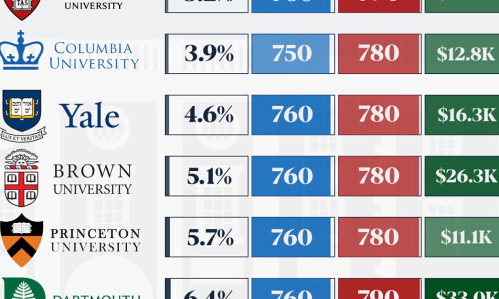

We detail the admission rates and average annual cost for Ivy League schools, as well as the median SAT scores...

Cities are constantly evolving over time. These 3d graphics visualize both growth and decline with a focus on North American cities from 1990-2015.

Just four countries (U.S., China, Japan, and Germany) account for nearly two-thirds of global expenditures on R&D. Here's global data on R&D visualized.
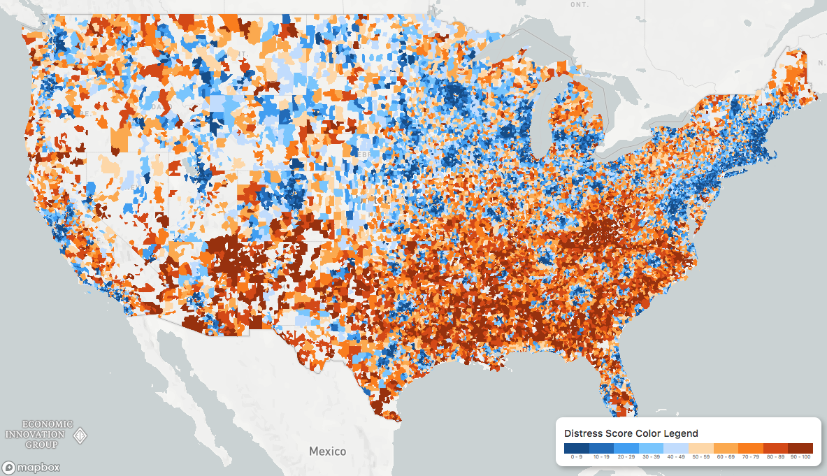
While the U.S. economic picture remains quite rosy, things change quickly when you zoom to the local level. This map shows the country's distressed communities.
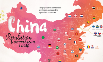

With 1.4 billion people living in the country's 33 distinct regions, each of China's provinces has a population that is equal to that of a major...
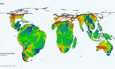

This cartogram animation shows the cycle of nature's productivity - which resembles a rhythmic heartbeat over the course of a year.
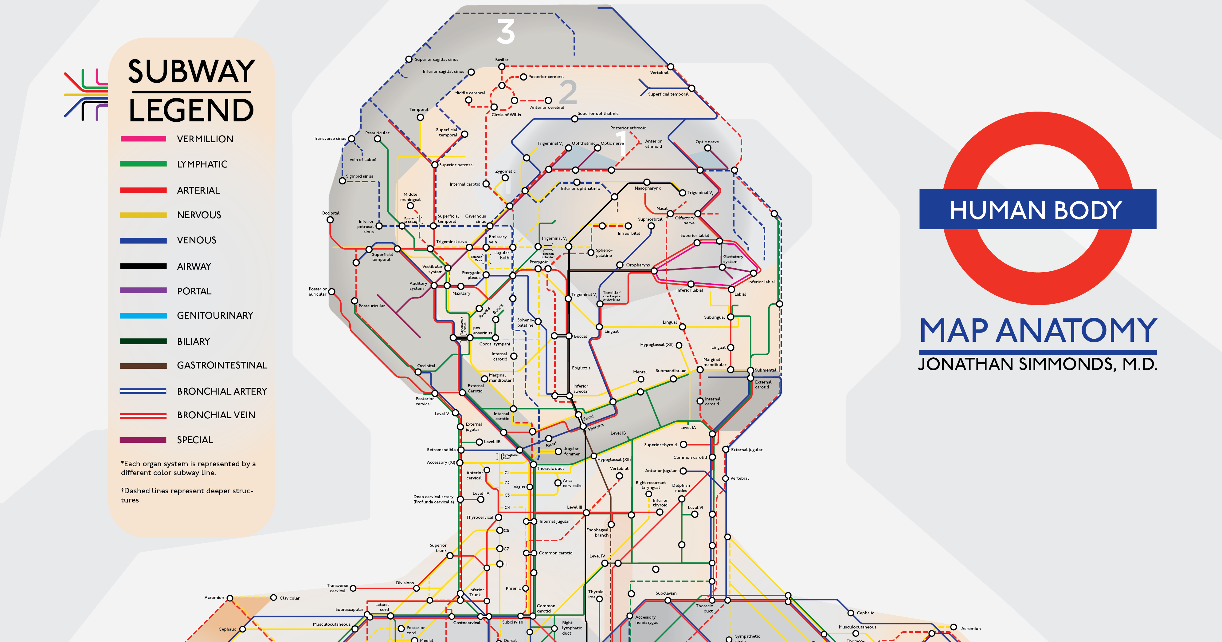
Embark on a visual tour of the human body, where each and every part of the human anatomy is re-imagined as a subway stop.
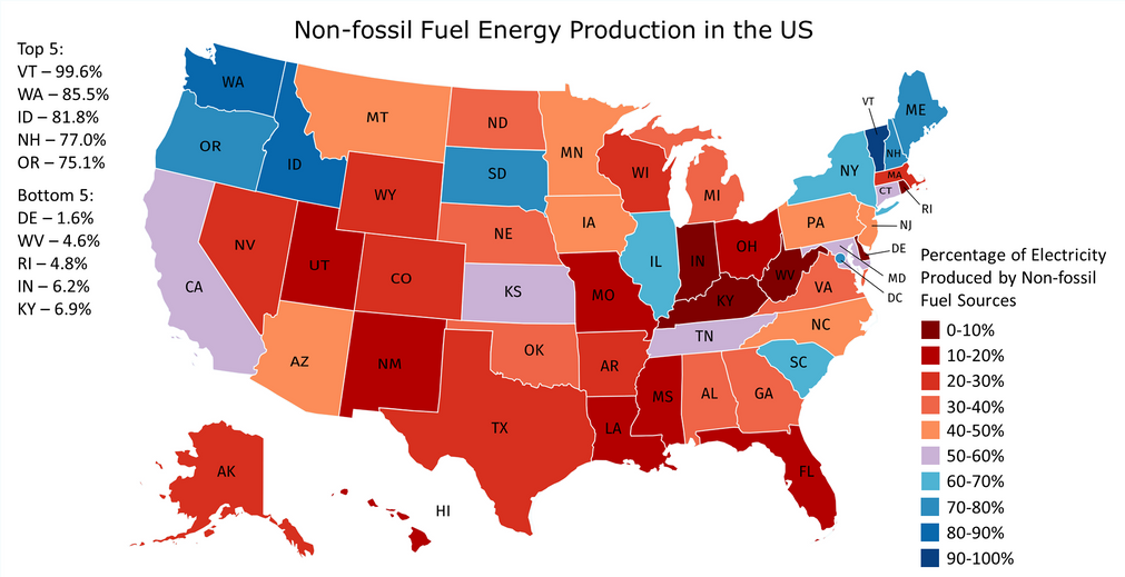
In countries where energy is plentiful, we often take the grid for granted. But do you know where your power comes from, and how green it...
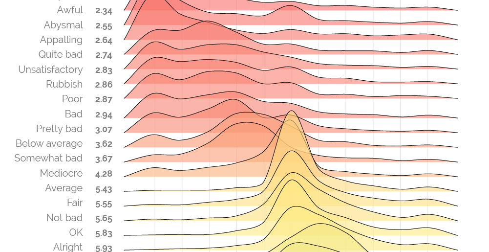
The words 'bad' and 'awful' may not appear very different, but as this sentiment scale reveals, some words and phrases are more potent than others.
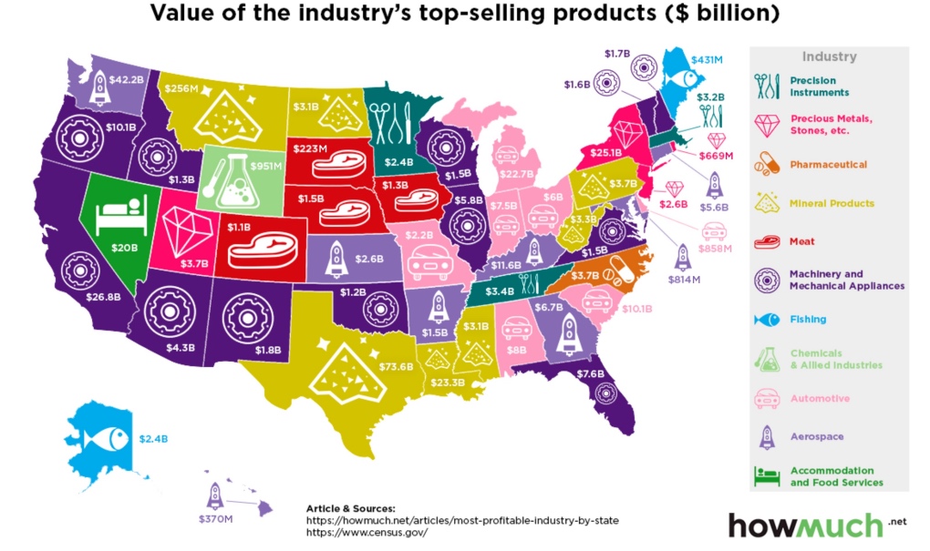
Which industries reign supreme in the United States? This map breaks down the most profitable industry, state by state.
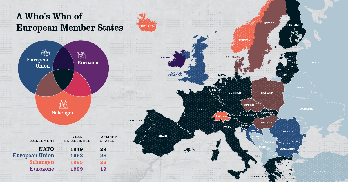
Europe has members in at least four major treaty groups. This map shows how these groups fit into the big picture of Europe's member states.


