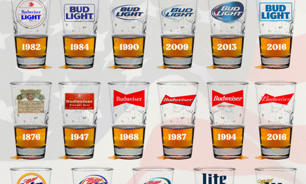
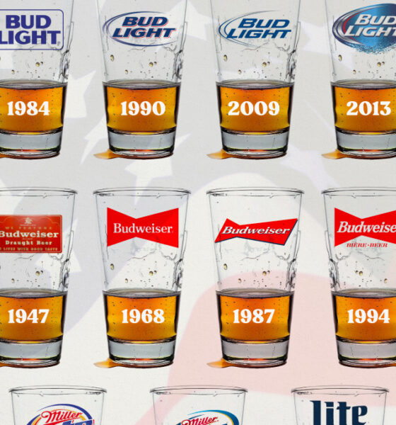
In this graphic, we analyze the evolution of popular U.S. beer logos like Budweiser, Coors Light, Bud Light, and more.
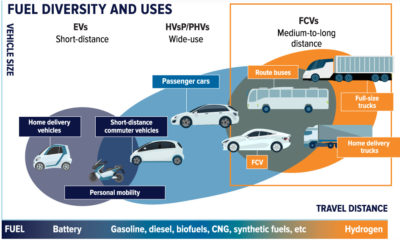

Hydrogen and fuel cell technology harnesses the power of the universe to bring clean energy on Earth. Here is its potential.
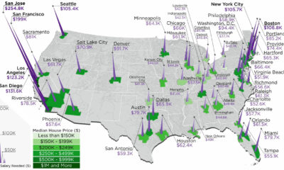

The annual salary needed to buy a home in the U.S. ranges from $38k to $255k, depending on the metropolitan area you are looking in.
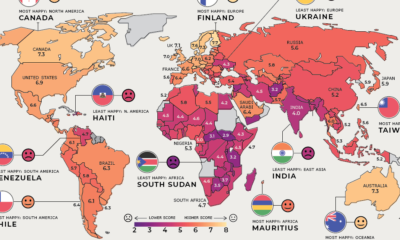

Where are the happiest, least happy, and fastest improving countries worldwide? We've broken down this annual ranking by region to answer that question.

How do countries around the world compare in terms of age? This compelling visualization shows the median age for every country in the world.
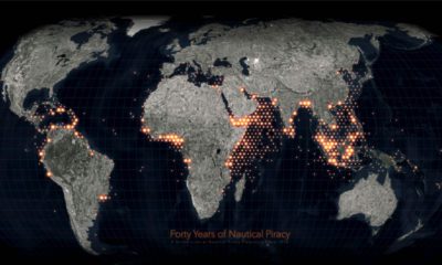

Ever since humans first sailed the high seas, piracy has been a dangerous risk. See instances of modern piracy on this detailed map.
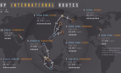

Flying can get you almost anywhere, but often people are journeying between two popular destinations. Here we map the busiest air routes globally.
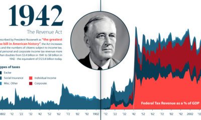

U.S. taxation has undergone massive changes over the last 250 years. From the American Revolution to modern reform, we explore its long history.
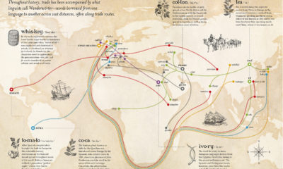

When goods traveled to new regions, their native names sometimes hitchhiked along with them. This map shows the spread of loanwords around the world.
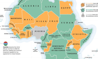

The Gambia recently became the latest country to ratify the African Continental Free Trade Area (AfCFTA), helping the landmark agreement reach critical mass to move forward.
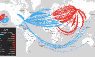

This intense animation plots data on nearly 70 years of arms sales, to compare the influence of the two superpowers from the Cold War to modern...


