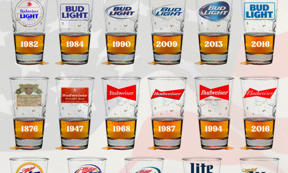
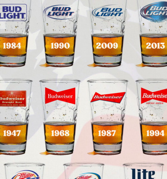
In this graphic, we analyze the evolution of popular U.S. beer logos like Budweiser, Coors Light, Bud Light, and more.
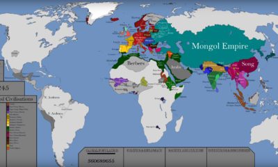

This epic attempt to condense the history of the world — including the rise and fall of empires — fits into a single video.
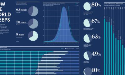

Humans need to restore and repair each night through sleep—but we never seem to get enough. Here are the stats on sleeping habits, from around the...
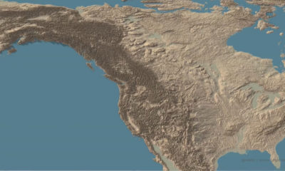

This stunning set of 3d maps purposefully exaggerate the elevation scale to show you the mountains of both the United States and North America.
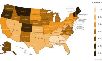

This infographic takes a closer look at the craft beer revolution sweeping across the U.S,. and its far reaching economic impact.
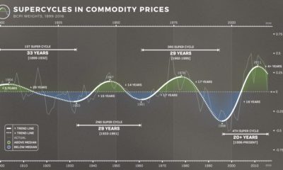

The prices of energy, agriculture, livestock and metals tell the story of human development. Learn about the commodity super cycle in this infographic.
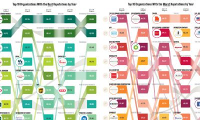

According to a representational poll of 18,228 Americans, these are the organizations considered to have the best and worst reputations.


Machine learning technology is allowing researchers at Facebook to map the world population in unprecedented detail.
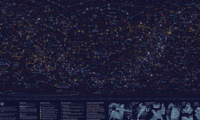

This striking map depicts all the stars and celestial bodies that are visible in the night sky, all on one giant backdrop.
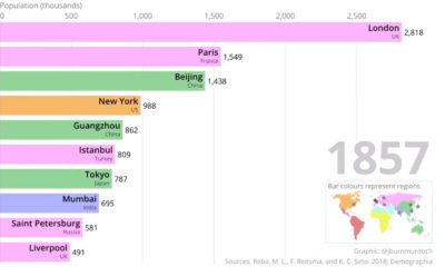

This two-minute animation shows changes in the last 500 years of historical rankings for the world's 10 most populous cities.
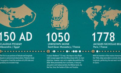

What did ancient maps look like, before we had access to airplanes and satellites? See the evolution of the world map in this nifty infographic.


