
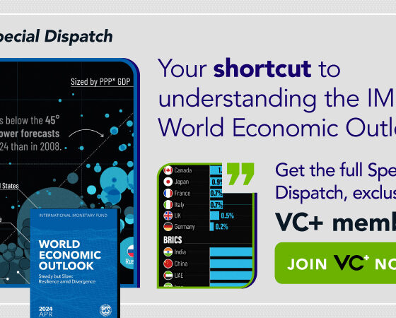
A sneak preview of the exclusive VC+ Special Dispatch—your shortcut to understanding IMF's World Economic Outlook report.
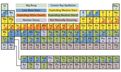

You're likely familiar with the periodic table, but do you know the origin of elements? This graphic shows where our solar system's elements come from.
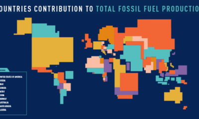

These four animated cartograms show the nations leading the world in fossil fuel production, in terms of oil, gas, coal, and total hydrocarbons.
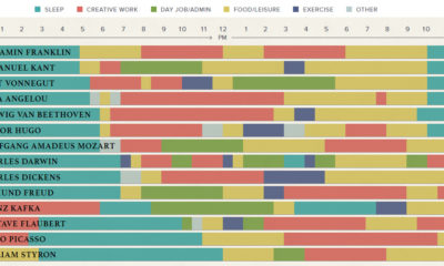

The eclectic daily routines that inspired the world's most famous creative people to produce their best and most original work.
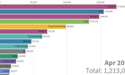

This stunning animation visualizes the last nine years of U.S. electric vehicle sales. We also look at who will lead the race in the coming years.


Here are 11 common phrases that managers should avoid saying to their teams, and what they should replace them with to get a better result.
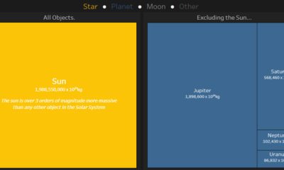

This interactive data visualization illustrates how the different planetary objects in our solar system compare based on their individual masses.
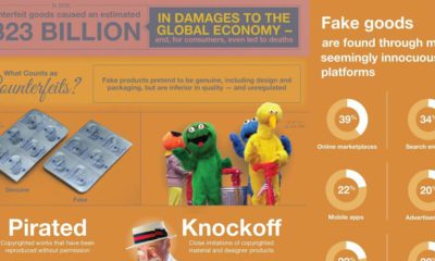

Every year, the global economy loses over $300 billion from the sale of counterfeit goods. Here are the problems created by this, and why they matter.
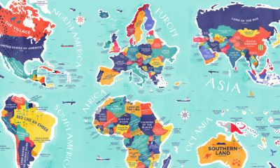

From Colombia to China, explore this map to uncover the diverse histories and cultures represented in the literal translation of each country's name.
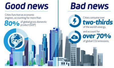

Cities are drivers of growth and prosperity, but also the main contributors of pollution. Can hydrogen fuel the growth of cities with clean power?
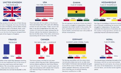

Many world flags are instantly recognizable, but there's more to it than meets the eye. What are the stories behind some of the world's most iconic...


