Misc
Mapped: The Median Age in Every U.S. County
See the full-size version of this map
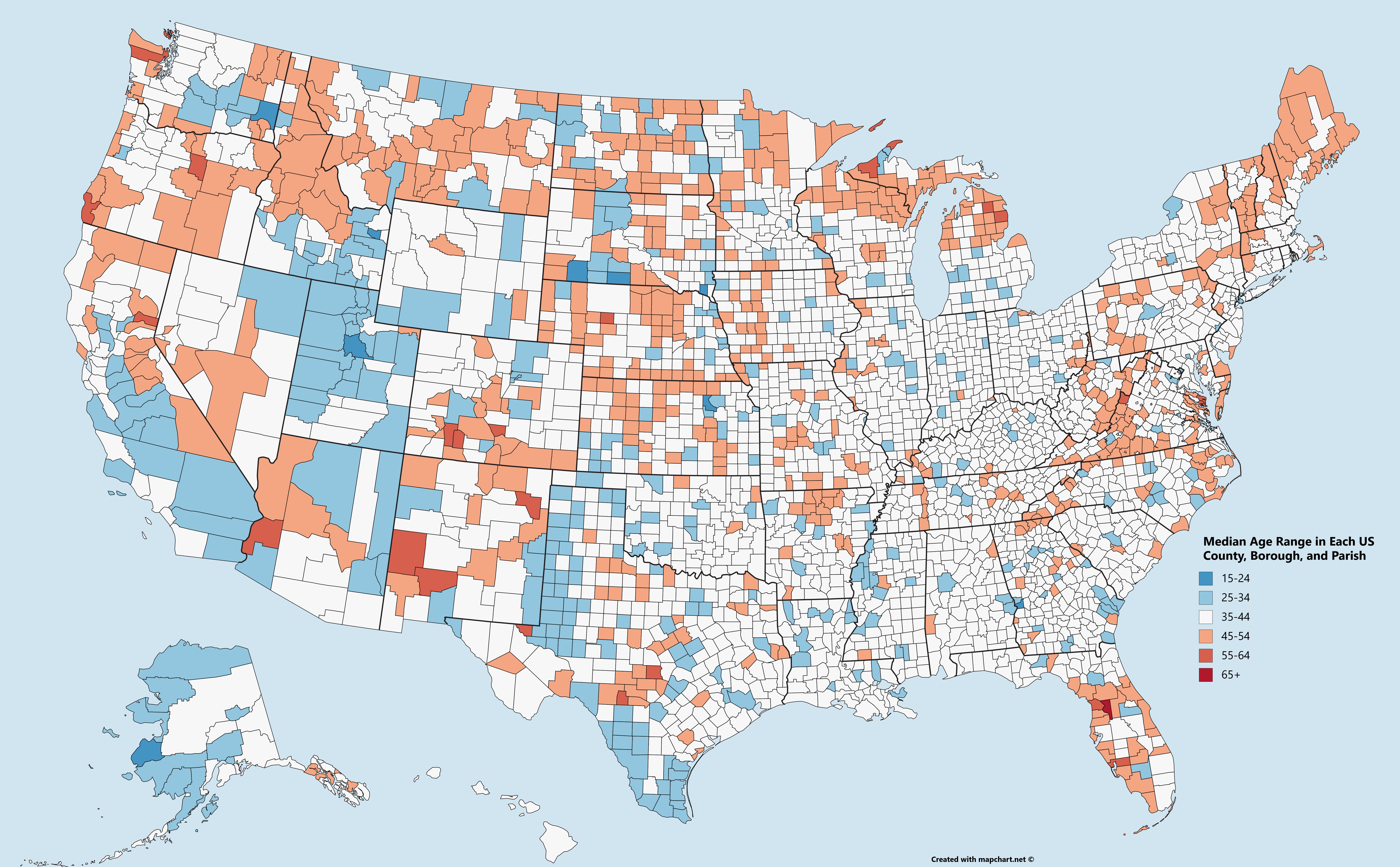
Mapped: The Median Age in Every U.S. County
To see the high resolution version of this map, go here.
The United States is a vast place, and every region is markedly different.
Usually we look at these differences through lenses like geography, population density, preferences, wealth, and culture – but age is another interesting one to think about, and age is a significant factor in predicting future economic health and growth for almost any society.
The Age Factor
As the French philosopher Auguste Comte wrote, “Demography is destiny”.
If you know a person’s age, you’re usually able to guess other things about them. For example, younger people are usually more motivated and inclined to launch careers, start families, and seek economic security. Not all young people are this way of course – but in aggregate, this is generally true.
Today’s map comes to us from Reddit user /r/JFBoyy and it charts median age by every U.S. county, parish, borough, and Census Area.
Counties by Age
Which states and counties stand out on the map?
Utah is an interesting place to start – it’s the youngest state with a median age of 29.9, and this is extremely clear when looking at the county level. The state has only one county (Daggett) with a median age range above 35-44 years.
Florida and Maine are two other states that stand out. Florida is the stereotypical “old” state, and there is some truth to that based on the numbers. It’s the only state that has a county (Sumter) with a median age range over 65 years. Meanwhile, Maine has only five counties that are not “old” counties – and the majority of counties have median ages that fall in the 45-54 range.
The Midwest and Southeast seem to have a higher distribution of counties with median ages in the “middle ground” 35-44 median age range. Alabama has 67 counties, and all but five of them are in that bracket.
Meanwhile, the West seems to have an interesting dichotomy in many of its states. Washington State, for example, has many counties with old populations (San Juan, Jefferson, and others) but also counties with younger populations (Whitman, Yakima, Kittitas).
Idaho is the most potent example of this tendency: all of the old people seem to live in the north of the state, and all of the young people in the south.
A Look to the Future
Here is how median age projects out to 2040, but on a state level.
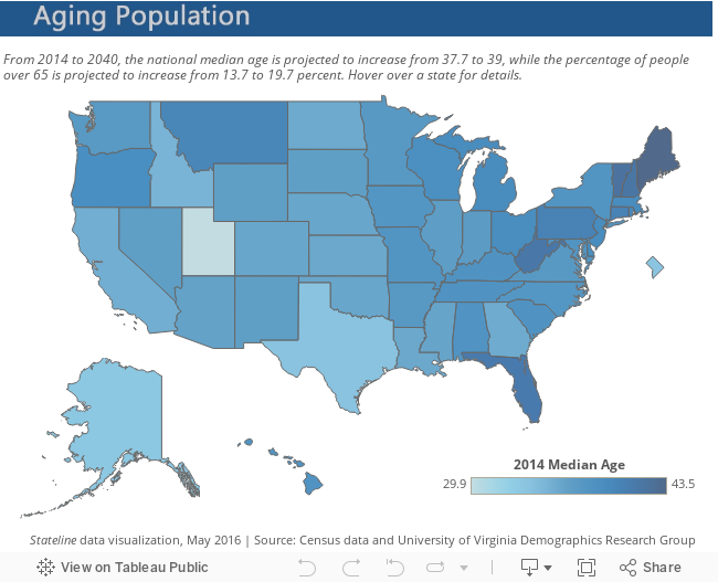
Overall the national median age is projected to go from 37.7 to 39 years.
Interestingly, while aging in the United States is expected to cause some demographic issues in the long run, the country’s challenges pale in comparison to other rapidly-aging countries in the Western world.


VC+
VC+: Get Our Key Takeaways From the IMF’s World Economic Outlook
A sneak preview of the exclusive VC+ Special Dispatch—your shortcut to understanding IMF’s World Economic Outlook report.

Have you read IMF’s latest World Economic Outlook yet? At a daunting 202 pages, we don’t blame you if it’s still on your to-do list.
But don’t worry, you don’t need to read the whole April release, because we’ve already done the hard work for you.
To save you time and effort, the Visual Capitalist team has compiled a visual analysis of everything you need to know from the report—and our upcoming VC+ Special Dispatch will be available exclusively to VC+ members on Thursday, April 25th.
If you’re not already subscribed to VC+, make sure you sign up now to receive the full analysis of the IMF report, and more (we release similar deep dives every week).
For now, here’s what VC+ members can expect to receive.
Your Shortcut to Understanding IMF’s World Economic Outlook
With long and short-term growth prospects declining for many countries around the world, this Special Dispatch offers a visual analysis of the key figures and takeaways from the IMF’s report including:
- The global decline in economic growth forecasts
- Real GDP growth and inflation forecasts for major nations in 2024
- When interest rate cuts will happen and interest rate forecasts
- How debt-to-GDP ratios have changed since 2000
- And much more!

Get the Full Breakdown in the Next VC+ Special Dispatch
VC+ members will receive the full Special Dispatch on Thursday, April 25th.
Make sure you join VC+ now to receive exclusive charts and the full analysis of key takeaways from IMF’s World Economic Outlook.
Don’t miss out. Become a VC+ member today.
What You Get When You Become a VC+ Member
VC+ is Visual Capitalist’s premium subscription. As a member, you’ll get the following:
- Special Dispatches: Deep dive visual briefings on crucial reports and global trends
- Markets This Month: A snappy summary of the state of the markets and what to look out for
- The Trendline: Weekly curation of the best visualizations from across the globe
- Global Forecast Series: Our flagship annual report that covers everything you need to know related to the economy, markets, geopolitics, and the latest tech trends
- VC+ Archive: Hundreds of previously released VC+ briefings and reports that you’ve been missing out on, all in one dedicated hub
You can get all of the above, and more, by joining VC+ today.

-

 Markets1 week ago
U.S. Debt Interest Payments Reach $1 Trillion
-

 Business2 weeks ago
Charted: Big Four Market Share by S&P 500 Audits
-

 Markets2 weeks ago
Ranked: The Most Valuable Housing Markets in America
-

 Money2 weeks ago
Which States Have the Highest Minimum Wage in America?
-

 AI2 weeks ago
Ranked: Semiconductor Companies by Industry Revenue Share
-

 Markets2 weeks ago
Ranked: The World’s Top Flight Routes, by Revenue
-

 Demographics2 weeks ago
Population Projections: The World’s 6 Largest Countries in 2075
-

 Markets2 weeks ago
The Top 10 States by Real GDP Growth in 2023