Misc
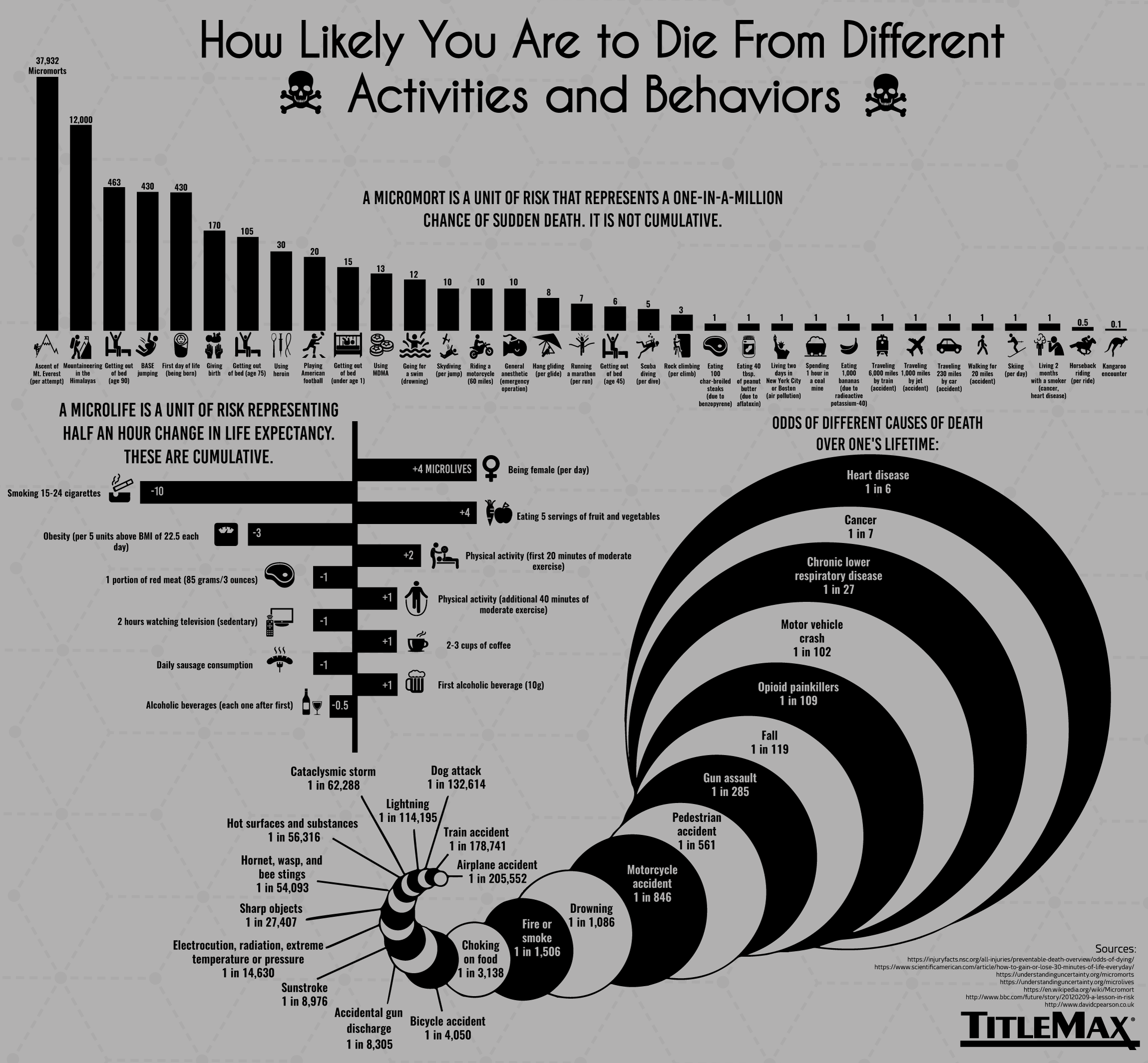
Crunching the Numbers on Mortality
View a high resolution version of this graphic.
Crunching the Numbers on Mortality
View the high resolution version of today’s graphic by clicking here.
One of the key traits that make human beings unique on planet Earth is that we’re aware of our own mortality.
Scientific advances have given us insight into which behaviors may prolong life, and which activities carry the greatest risk of death. Naturally, there have been some unique attempts to create a unified structure around risk and benefit, and to quantify every aspect of the human lifespan.
As today’s graphic from TitleMax demonstrates, even when we’re thinking about death, the human desire to codify the world around us is alive and well.
Mortality Units
Certain events – such as a parachute failing to open or being hit by a meteor – have an easily quantifiable effect on life, but how do we measure the riskiness of day-to-day habits and situations? This is where a unique unit of measurement, micromorts, comes into play.
This concept, invented by renowned decision analyst Ronald A. Howard, helps compare any number of potentially lethal risks. One micromort equals a one in a million chance of sudden death. Here’s the riskiness of various activities measured in micromorts:
| Activity | Micromorts |
|---|---|
| Ascending Mount Everest | 37,932 |
| Getting out of bed (Age 90) | 463 |
| Being born (first day of life) | 430 |
| Giving birth | 170 |
| Playing Football | 20 |
| Riding a motorcycle | 10 |
| Running a marathon | 7 |
| Rock climbing | 3 |
| Travelling 6,000 miles by train | 1 |
| Travelling 230 miles by car | 1 |
Life Units
The average person, by the time they reach adulthood, will live approximately one million half-hours. Those 30 minute units are known as microlives.
The microlife concept was invented by professor David Spiegelhalter as a way to measure the consequences of various behaviors. For example, 20 minutes of physical activity earns us two microlives, while watching TV for two hours subtracts one microlife.
This measurement extends beyond nutrition and eating habits. Simply living in a modern era earns us an additional 15 microlives per day compared to those who lived a century earlier.
Casting the die on how we’ll die
How will the estimated 353,000 humans that will be born today eventually meet their end? This was the thought experiment conducted by Reddit user, Presneeze.
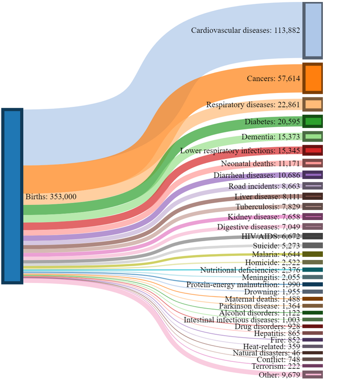
While our focus is often drawn to people who meet their end in spectacular and tragic ways, the vast majority of humanity will succumb to conditions such as heart disease and cancer.
Geography can play a big role in shifting these odds:
- In the United States, which is grappling with an opioid addiction crisis, there is a 1-in-96 chance of dying from a drug overdose.
- Diarrheal diseases may not be on the radar of most people living in first world countries, but in developing regions, they remain a leading cause of preventable death – particularly for children.
- In Russia, the odds are 1-in-4 that a man will not live beyond 55 years. The main culprit? Vodka.
On a long enough time line, the survival rate for everyone drops to zero.
–Chuck Palahniuk


Misc
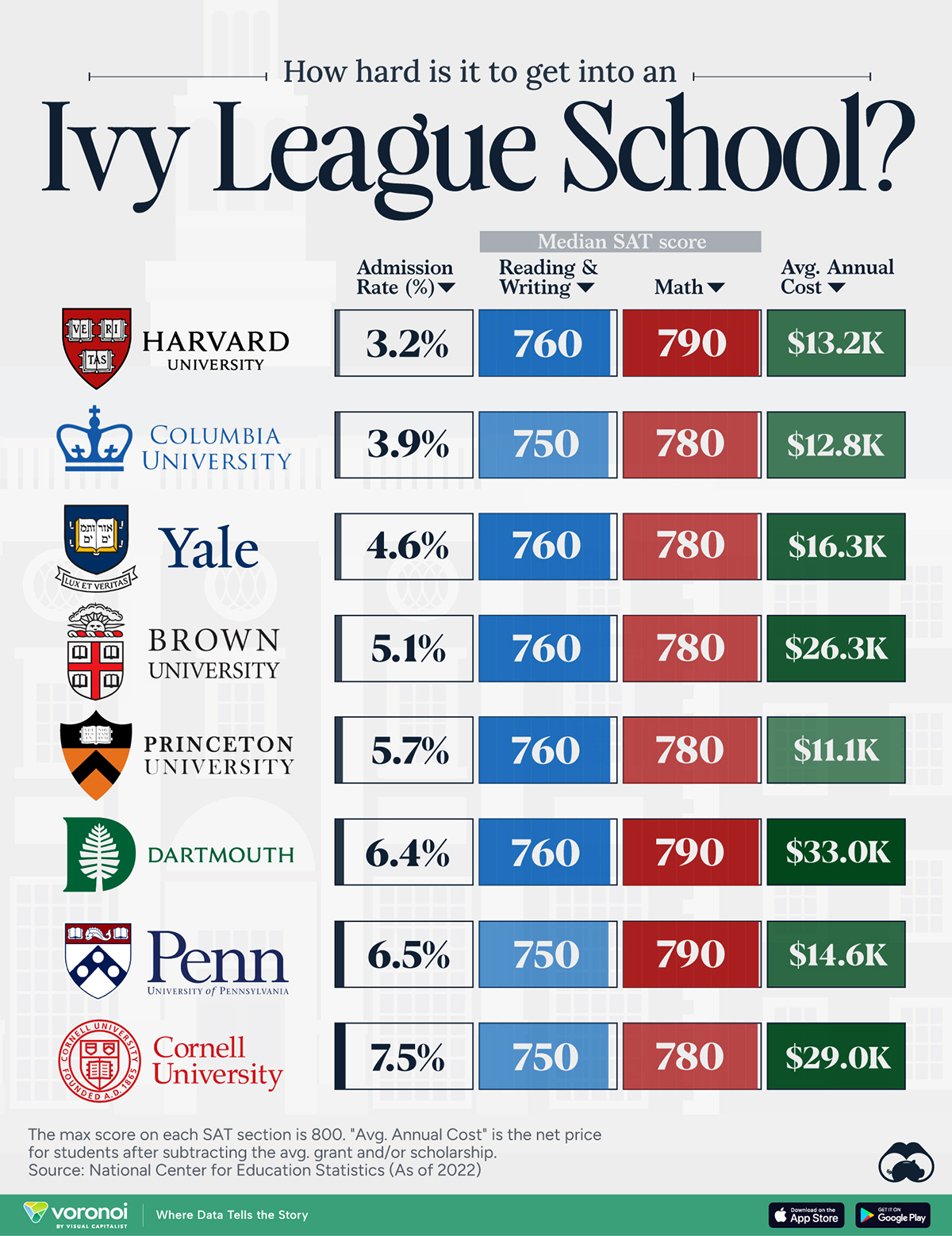
How Hard Is It to Get Into an Ivy League School?
We detail the admission rates and average annual cost for Ivy League schools, as well as the median SAT scores required to be accepted.
How Hard Is It to Get Into an Ivy League School?
This was originally posted on our Voronoi app. Download the app for free on iOS or Android and discover incredible data-driven charts from a variety of trusted sources.
Ivy League institutions are renowned worldwide for their academic excellence and long-standing traditions. But how hard is it to get into one of the top universities in the U.S.?
In this graphic, we detail the admission rates and average annual cost for Ivy League schools, as well as the median SAT scores required to be accepted. The data comes from the National Center for Education Statistics and was compiled by 24/7 Wall St.
Note that “average annual cost” represents the net price a student pays after subtracting the average value of grants and/or scholarships received.
Harvard is the Most Selective
The SAT is a standardized test commonly used for college admissions in the United States. It’s taken by high school juniors and seniors to assess their readiness for college-level academic work.
When comparing SAT scores, Harvard and Dartmouth are among the most challenging universities to gain admission to. The median SAT scores for their students are 760 for reading and writing and 790 for math. Still, Harvard has half the admission rate (3.2%) compared to Dartmouth (6.4%).
| School | Admission rate (%) | SAT Score: Reading & Writing | SAT Score: Math | Avg Annual Cost* |
|---|---|---|---|---|
| Harvard University | 3.2 | 760 | 790 | $13,259 |
| Columbia University | 3.9 | 750 | 780 | $12,836 |
| Yale University | 4.6 | 760 | 780 | $16,341 |
| Brown University | 5.1 | 760 | 780 | $26,308 |
| Princeton University | 5.7 | 760 | 780 | $11,080 |
| Dartmouth College | 6.4 | 760 | 790 | $33,023 |
| University of Pennsylvania | 6.5 | 750 | 790 | $14,851 |
| Cornell University | 7.5 | 750 | 780 | $29,011 |
*Costs after receiving federal financial aid.
Additionally, Dartmouth has the highest average annual cost at $33,000. Princeton has the lowest at $11,100.
While student debt has surged in the United States in recent years, hitting $1.73 trillion in 2023, the worth of obtaining a degree from any of the schools listed surpasses mere academics. This is evidenced by the substantial incomes earned by former students.
Harvard grads, for example, have the highest average starting salary in the country, at $91,700.

-

 Real Estate2 weeks ago
Visualizing America’s Shortage of Affordable Homes
-

 Technology1 week ago
Ranked: Semiconductor Companies by Industry Revenue Share
-

 Money2 weeks ago
Which States Have the Highest Minimum Wage in America?
-

 Real Estate2 weeks ago
Ranked: The Most Valuable Housing Markets in America
-

 Business2 weeks ago
Charted: Big Four Market Share by S&P 500 Audits
-

 AI2 weeks ago
The Stock Performance of U.S. Chipmakers So Far in 2024
-

 Misc2 weeks ago
Almost Every EV Stock is Down After Q1 2024
-

 Money2 weeks ago
Where Does One U.S. Tax Dollar Go?