

Use the powerful infographics, charts, and data visualizations created by Visual Capitalist to anchor your next story, publication, or report.
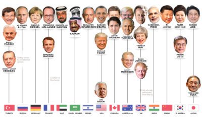

Who has led the world's 15 most powerful countries over the last 50 years? This visual looks at world leaders from 1970 to today.
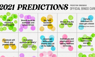

We analyzed 200+ articles, reports, and interviews to answer the question: Is there a consensus on what we can expect in 2021? Here are the results.
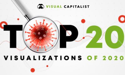

In a complex world, the combined forces of data and visual communication take on new importance. See our top 20 visualizations for 2020.
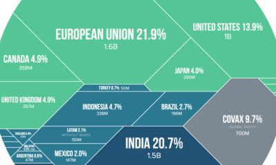

Visualizing the share of COVID-19 vaccines purchased by different countries and the companies that are manufacturing them.
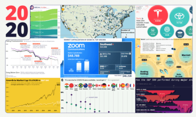

These 20 charts, maps, and visualizations help capture what happened in a tumultuous year around the globe.


In some cases, COVID-19 has sped up societal and economic trends that were already in motion. Here we examine five examples.


We’ve pulled together 6 reasons why our new coffee table style book Signals is the perfect gift to inspire and encourage this holiday season.
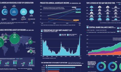

What forces will drive the future of financial markets? We reveal 15 charts from six chapters of our new book to show where the economy is...


What values are the most influential in the world? Across 500,000 surveys in 152 languages, we visualize a rich dataset of human motivations.


