The 12 worst investment funds have destroyed $56 billion in shareholder wealth over the past decade, as of Dec. 2023.


click for more →


Scan with your phone's camera or QR code app to view
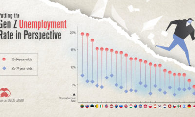

COVID-19 has impacted everyone, but one generation is taking it harder than the others. This graphic reveals the Gen Z unemployment rate.
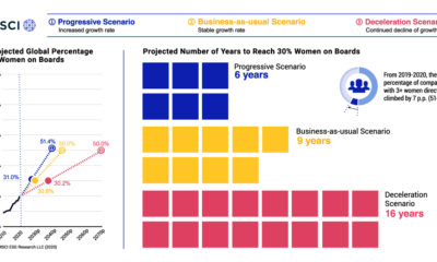

The representation of women on boards of directors a mixed bag. This graphic looks at the 10-year trend of women on corporate boards.
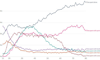

Ever wondered who Americans spend the most time with? This chart assesses how many minutes per day Americans spend with different people.
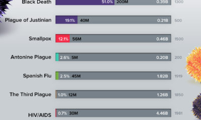

During its heyday, the Black Death wiped out roughly 50% of the world’s population—making it one of the deadliest pandemics to date.
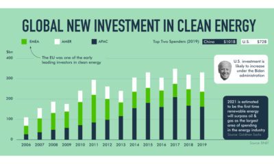

How is the renewable energy shift unfolding? This exploration highlights the market and governmental forces in action.
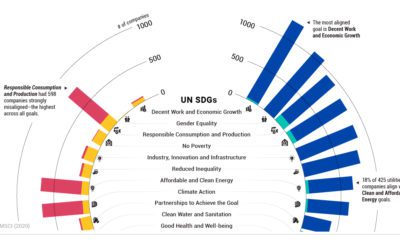

Are companies making progress in meeting the UN Sustainable Development Goals? This tracker shows how companies are measuring up.
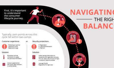

COVID-19 has only accelerated online fraud. Here's a closer look at how your business can prevent future cyber attacks.
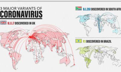

New variants of COVID-19 are spreading fast around the world. Here’s a look at the 3 major ones and how they differ from one another.
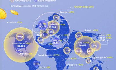

Despite a volatile 2020, the global ultra high net worth (UHNW) population increased by 2.4%, reaching an all-time high of 521,653.
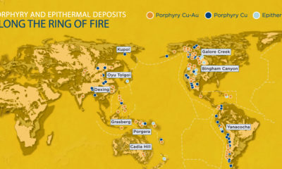

The Pacific Ring of Fire is a 40,000 km long belt of volcanoes, seismic activity, and mineral deposits that surrounds the Pacific Ocean like a necklace...
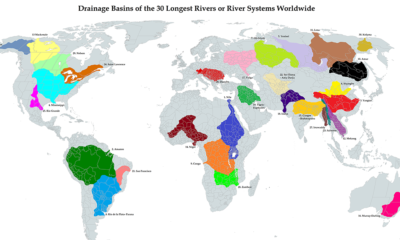

This unique map illustrates the immense size of drainage basins that feed the world's longest river systems
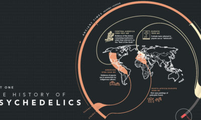

This graphic is part one in a series that showcases the 6,000-year history of psychedelics, from ancient antidote to breakthrough therapies.
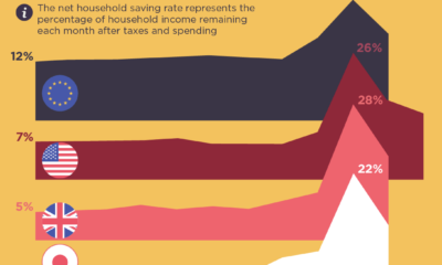

Were people more frugal during the pandemic or did they break the bank? This visual assesses the saving rates across different countries.
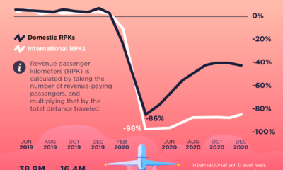

In spring 2020, roughly two-thirds of the world's passenger jets were grounded. Here's how things have rebounded since the onset of the pandemic.
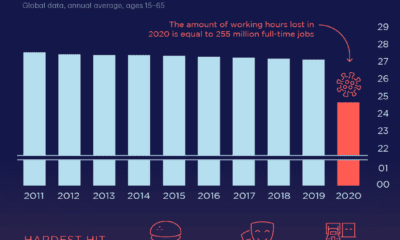

The pandemic has impacted employment greatly. This visual reveals how its effects have led to losses in hours worked by global workers in 2020.


It’s been a long year since the WHO declared the novel coronavirus a global pandemic. This visual looks at key events in the COVID-19 timeline.
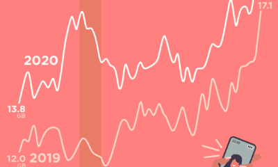

Data usage across America peaked in April 2020, but reached relatively normal levels by the end of the year.