Datastream
One Year In: Data Usage Surged During Pandemic


The Briefing
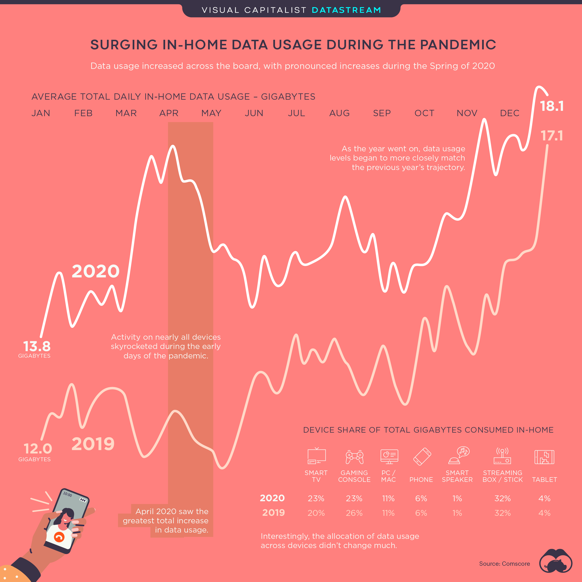
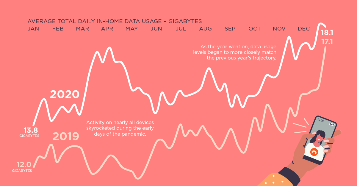
- In 2020, average in-home data usage in the U.S. increased by 18% compared to 2019
- Activity reached its peak in the spring, during the initial stages of the pandemic
- While overall consumption grew in 2020, the share of use across devices remained fairly consistent
One Year In: Data Usage Surged During COVID-19 Pandemic
Americans spent a lot of time at home last year, as offices closed, schools shut down, and cities went into full-blown lockdown in an effort to flatten the curve.
Because of this, in-home data consumption in the U.S. surged. To provide some perspective, this graphic shows the average monthly data usage in 2020 compared to 2019.
Percent Change by Month
At the start of 2020, data consumption was up 16% compared to 2019, driven largely by streaming boxes and smart TVs.
But by March (when the World Health Organization officially declared COVID-19 a pandemic) usage had spiked, with a 28% increase compared to the year prior.
| Month (2020) | YoY Change |
|---|---|
| January | 16% |
| February | 16% |
| March | 28% |
| April | 36% |
| May | 30% |
| June | 14% |
| July | 13% |
| August | 19% |
| September | 14% |
| October | 11% |
| November | 19% |
| December (1-27) | 12% |
Interestingly, March’s increase was largely driven by phones (43%), smart TVs (41%), and streaming boxes (36%), while PC/Mac consumption experienced a low increase in comparison (9%).
However, more Americans started using their PC/Macs from home in April, presumably because of the shift to remote work. From spring onward, desktop usage growth hovered at around 20-25%. And by December, PC/Mac use had grown 34% compared to the year prior.
Usage by Device
It’s worth noting that, while overall data consumption increased in 2020, people’s consumption habits didn’t change all that much.
| Device | Share of Use (2019) | Share of Use (2020) | YoY change |
|---|---|---|---|
| Smart TV | 20% | 23% | 3% |
| Gaming Console | 26% | 23% | -3% |
| PC/Mac | 11% | 11% | -- |
| Phone | 6% | 6% | -- |
| Smart Speaker | 1% | 1% | -- |
| Streaming Box/Stick | 32% | 32% | -- |
| Tablet | 4% | 4% | -- |
In fact, when it came to the share of use across devices, the only ones to see any change were smart TVs and gaming consoles.
At least some things remained relatively normal in 2020.
» Want to learn more? Check out our COVID-19 information hub to help put the past year into perspective
Where does this data come from?
Source: Comscore
Notes: Comscore (NASDAQ: SCOR) is a trusted partner for planning, transacting and evaluating media across platforms. For more information on research and methodology, contact [email protected]


Datastream
Can You Calculate Your Daily Carbon Footprint?
Discover how the average person’s carbon footprint impacts the environment and learn how carbon credits can offset your carbon footprint.
The Briefing
- A person’s carbon footprint is substantial, with activities such as food consumption creating as much as 4,500 g of CO₂ emissions daily.
- By purchasing carbon credits from Carbon Streaming Corporation, you can offset your own emissions and fund positive climate action.
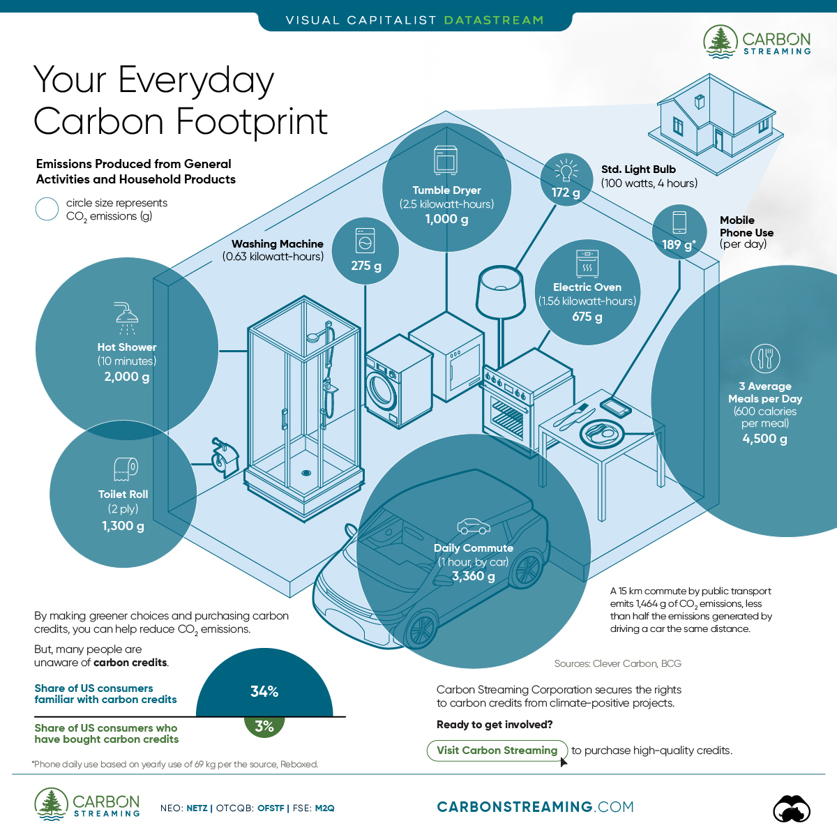
Your Everyday Carbon Footprint
While many large businesses and countries have committed to net-zero goals, it is essential to acknowledge that your everyday activities also contribute to global emissions.
In this graphic, sponsored by Carbon Streaming Corporation, we will explore how the choices we make and the products we use have a profound impact on our carbon footprint.
Carbon Emissions by Activity
Here are some of the daily activities and products of the average person and their carbon footprint, according to Clever Carbon.
| Household Activities & Products | CO2 Emissions (g) |
|---|---|
| 💡 Standard Light Bulb (100 watts, four hours) | 172 g |
| 📱 Mobile Phone Use (195 minutes per day)* | 189 g |
| 👕 Washing Machine (0.63 kWh) | 275 g |
| 🔥 Electric Oven (1.56 kWh) | 675 g |
| ♨️ Tumble Dryer (2.5 kWh) | 1,000 g |
| 🧻 Toilet Roll (2 ply) | 1,300 g |
| 🚿 Hot Shower (10 mins) | 2,000 g |
| 🚙 Daily Commute (one hour, by car) | 3,360 g |
| 🍽️ Average Daily Food Consumption (three meals of 600 calories) | 4,500 g |
| *Phone use based on yearly use of 69kg per the source, Reboxed | |
Your choice of transportation plays a crucial role in determining your carbon footprint. For instance, a 15 km daily commute to work on public transport generates an average of 1,464 g of CO₂ emissions. Compared to 3,360 g—twice the volume for a journey the same length by car.
By opting for more sustainable modes of transport, such as cycling, walking, or public transportation, you can significantly reduce your carbon footprint.
Addressing Your Carbon Footprint
One way to compensate for your emissions is by purchasing high-quality carbon credits.
Carbon credits are used to help fund projects that avoid, reduce or remove CO₂ emissions. This includes nature-based solutions such as reforestation and improved forest management, or technology-based solutions such as the production of biochar and carbon capture and storage (CCS).
While carbon credits offer a potential solution for individuals to help reduce global emissions, public awareness remains a significant challenge. A BCG-Patch survey revealed that only 34% of U.S. consumers are familiar with carbon credits, and only 3% have purchased them in the past.
About Carbon Streaming
By financing the creation or expansion of carbon projects, Carbon Streaming Corporation secures the rights to future carbon credits generated by these sustainable projects. You can then purchase these carbon credits to help fund climate solutions around the world and compensate for your own emissions.
Ready to get involved?
>> Learn more about purchasing carbon credits at Carbon Streaming

-

 Education1 week ago
How Hard Is It to Get Into an Ivy League School?
-

 Technology2 weeks ago
Ranked: Semiconductor Companies by Industry Revenue Share
-

 Markets2 weeks ago
Ranked: The World’s Top Flight Routes, by Revenue
-

 Demographics2 weeks ago
Population Projections: The World’s 6 Largest Countries in 2075
-

 Markets2 weeks ago
The Top 10 States by Real GDP Growth in 2023
-

 Demographics2 weeks ago
The Smallest Gender Wage Gaps in OECD Countries
-

 Economy2 weeks ago
Where U.S. Inflation Hit the Hardest in March 2024
-

 Environment2 weeks ago
Top Countries By Forest Growth Since 2001