Misc
Mercator Misconceptions: Clever Map Shows the True Size of Countries

This Clever Map Shows the True Size of Countries
Maps are hugely important tools in our everyday life, whether it’s guiding our journeys from point A to B, or shaping our big picture perceptions about geopolitics and the environment.
For many people, the Earth as they know it is heavily informed by the Mercator projection—a tool used for nautical navigation that eventually became the world’s most widely recognized map.
Mercator’s Rise to the Top
With any map projection style, the big challenge lies in depicting a spherical object as a 2D graphic. There are various trade-offs with any map style, and those trade-offs can vary depending on how the map is meant to be used.
In 1569, the great cartographer, Gerardus Mercator, created a revolutionary new map based on a cylindrical projection. The new map was well-suited to nautical navigation since every line on the sphere is a constant course, or loxodrome.
Geographic Inflation
The vast majority of us aren’t using paper maps to chart our course across the ocean anymore, so critics of the Mercator projection argue that the continued use of this style of map gives users a warped sense of the true size of countries—particularly in the case of the African continent.
Mercator’s map inadvertently also pumps up the sizes of Europe and North America. Visually speaking, Canada and Russia appear to take up approximately 25% of the Earth’s surface, when in reality they occupy a mere 5%.
As the animated GIF below—created by Reddit user, neilrkaye – demonstrates, northern nations such as Canada and Russia have been artificially “pumped up” in the minds of many people around the world.
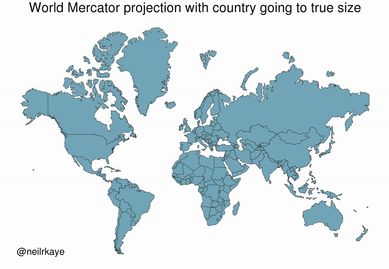
Greenland, which appears as a massive icy landmass in Mercator projection, shrinks way down. The continent of Africa takes a much more prominent position in this new, correctly-scaled map.
This visualization also highlights how distorted neighboring countries can look in Mercator projection. In the GIF above, Scandinavian countries no longer loom imposingly over their European neighbors, and Canada deflates to a size similar to the United States.
Despite inaccurate visual features—or perhaps because of them—the Mercator projection has achieved widespread adoption around the world. This includes in the classroom, where young minds are first learning about geography and forming opinions on the relationships between countries.
Getting Reacquainted with Globes
Google, whose map app is used by approximately 150 million people per month, took the bold step of using different projections for different purposes in 2018.
The Earth is depicted as a globe at further zoom levels, sidestepping map projection issues completely and displaying the world as it actually is: round. The result is a more accurate depiction of countries and landmasses.
With 3D Globe Mode on Google Maps desktop, Greenland's projection is no longer the size of Africa.
Just zoom all the way out at https://t.co/mIZTya01K3 😎🌍 pic.twitter.com/CIkkS7It8d
— Google Maps (@googlemaps) August 2, 2018
At closer zoom levels, users are typically using maps for things like navigation, which the Mercator projection was designed for. The exact angles of roads and borders are preserved in this projection.
In the Right Direction
In a more globally connected world, geographic literacy is more important than ever. As people become more accustomed to equal area maps and seeing the Earth in its spherical form, misconceptions about the size of continents may become a thing of the past.
This post was first published in 2018. We have since updated it, adding in new content for 2021.


Economy
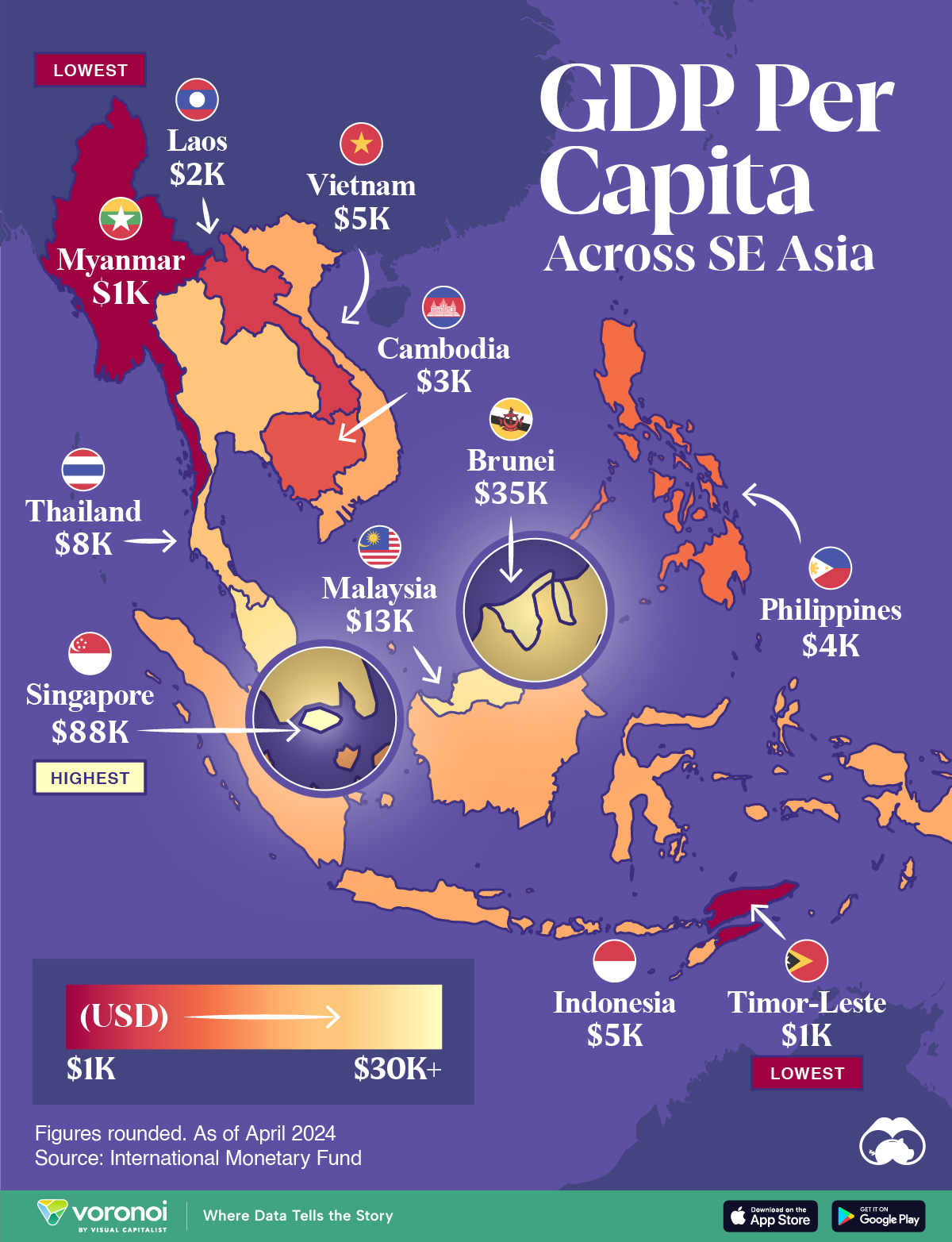
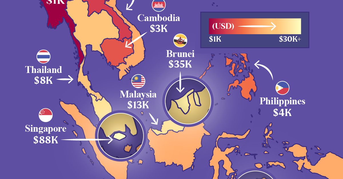
Mapped: Southeast Asia’s GDP Per Capita, by Country
Indonesia, the region’s largest economy, makes the top five in this map exploring Southeast Asia’s GDP per capita levels.
Mapped: Southeast Asia’s GDP Per Capita, by Country
This was originally posted on our Voronoi app. Download the app for free on iOS or Android and discover incredible data-driven charts from a variety of trusted sources.
In 1937, as America navigated the Great Depression, Russian-born economist Simon Kuznets presented a novel idea on measuring a country’s economy. And thus, gross domestic product (GDP) was born.
Nearly eight decades later, measuring GDP, and GDP per capita—which helps make data comparable between populations—has become a benchmark statistic to compare and contrast countries’ economies and productivity.
In this map, we compare Southeast Asia’s GDP per capita levels. Data is in current U.S. dollars, sourced from the International Monetary Fund’s DataMapper tool, last updated April 2024.
Ranked: Southeast Asian Countries by GDP Per Capita
Singapore stands head-and-shoulders above the rest of the region with a per capita GDP past $88,000. It is also, incidentally, one of the richest nations in the world by this metric.
The 734 km² country has only 5.6 million residents and very few natural resources. However the country’s strategic location makes it a center for trade and commerce.
| Country | GDP Per Capita |
|---|---|
| 🇸🇬 Singapore | $88,450 |
| 🇧🇳 Brunei | $35,110 |
| 🇲🇾 Malaysia | $13,310 |
| 🇹🇭 Thailand | $7,810 |
| 🇮🇩 Indonesia | $5,270 |
| 🇻🇳 Vietnam | $4,620 |
| 🇵🇭 Philippines | $4,130 |
| 🇰🇭 Cambodia | $2,630 |
| 🇱🇦 Laos | $1,980 |
| 🇹🇱 Timor-Leste | $1,450 |
| 🇲🇲 Myanmar | $1,250 |
Note: Figures are rounded.
This is in sharp contrast to Brunei, Southeast Asia’s next richest country, with a per capita GDP of $35,110.
Oil is a critical part of Brunei’s economy, making it both very wealthy, but landing it in a vulnerable, resource-dependent position. Oil and gas revenues contribute half the country’s entire revenue receipts.
Two countries known for their large tourism sectors, Malaysia and Thailand rank third and fourth, at $13,310 and $7,810 respectively.
Finally, Southeast Asia’s largest economy, and the world’s fourth-most populous country Indonesia, rounds out the top five with a GDP per capita of $5,270.

-
 Brands5 days ago
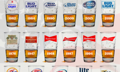
The Evolution of U.S. Beer Logos
-

 Culture2 weeks ago
The World’s Top Media Franchises by All-Time Revenue
-

 voronoi2 weeks ago
Best Visualizations of April on the Voronoi App
-

 Wealth2 weeks ago
Charted: Which Country Has the Most Billionaires in 2024?
-

 Business1 week ago
The Top Private Equity Firms by Country
-

 Markets1 week ago
The Best U.S. Companies to Work for According to LinkedIn
-

 Economy1 week ago
Ranked: The Top 20 Countries in Debt to China
-

 Politics1 week ago
Charted: Trust in Government Institutions by G7 Countries