Misc
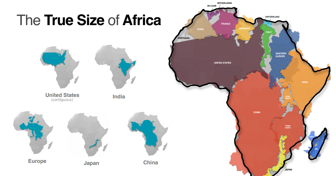
Mapped: Visualizing the True Size of Africa
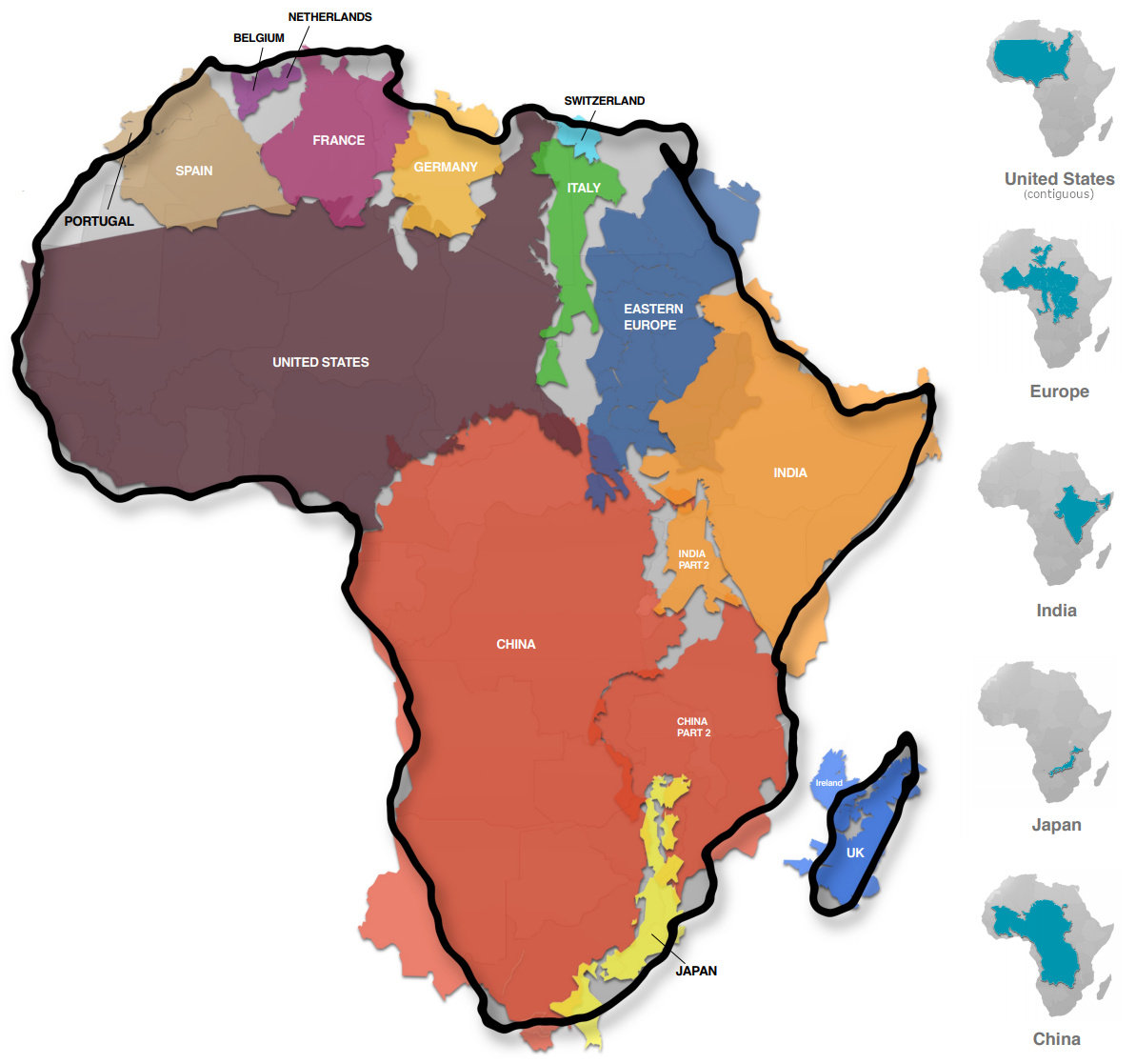
Mapped: The True Size of Africa
Take a look at any map, and it’s clear that the African continent is a big place.
However, despite the common perception that Africa is a large landmass, it’s still one that is vastly underestimated by most casual map viewers.
The reason for this is that the familiar Mercator map projection tends to distort our geographical view of the world in a crucial way — one that often leads to misconceptions about the relative sizes of both countries and continents.
A Geographical Jigsaw
Today’s infographic comes from Kai Krause and it shows the true size of Africa, as revealed by the borders of the countries that can fit within the continent’s shape.
The African continent has a land area of 30.37 million sq km (11.7 million sq mi) — enough to fit in the U.S., China, India, Japan, Mexico, and many European nations, combined.
| Country | Land Area (sq. km) | Land Area (sq. mi) | % of Africa |
|---|---|---|---|
| 🇺🇸 United States | 9.83 million | 3.80 million | 32.4% |
| 🇨🇳 China | 9.60 million | 3.71 million | 31.6% |
| 🇮🇳 India | 3.29 million | 1.27 million | 10.8% |
| 🇲🇽 Mexico | 1.96 million | 0.76 million | 6.5% |
| 🇵🇪 Peru | 1.29 million | 0.50 million | 4.2% |
| 🇫🇷 France | 0.64 million | 0.25 million | 2.1% |
| 🇪🇸 Spain | 0.51 million | 0.20 million | 1.7% |
| 🇵🇬 Papua New Guinea | 0.46 million | 0.18 million | 1.5% |
| 🇸🇪 Sweden | 0.45 million | 0.17 million | 1.5% |
| 🇯🇵 Japan | 0.38 million | 0.15 million | 1.3% |
| 🇩🇪 Germany | 0.36 million | 0.14 million | 1.2% |
| 🇳🇴 Norway | 0.32 million | 0.13 million | 1.1% |
| 🇮🇹 Italy | 0.30 million | 0.12 million | 1.0% |
| 🇳🇿 New Zealand | 0.27 million | 0.10 million | 0.9% |
| 🇬🇧 United Kingdom | 0.24 million | 0.09 million | 0.8% |
| 🇳🇵 Nepal | 0.15 million | 0.06 million | 0.5% |
| 🇧🇩 Bangladesh | 0.15 million | 0.06 million | 0.5% |
| 🇬🇷 Greece | 0.13 million | 0.05 million | 0.4% |
| Total | 30.33 million sq. km | 11.71 million sq. mi | 99.9% |
You could add together all of the landmasses above and they would not equate to the geographical footprint of Africa, which itself is home to 54 countries and 1.2 billion people.
Editor’s note: The above table is slightly different from the countries shown in the visualization, which focuses more on fitting recognizable country shapes into the geographical shape of Africa.
Why the Misconception?
Interestingly, the problem with maps is not that Africa is sized incorrectly.
Using the animation below, you’ll see that Africa is actually the most accurately sized continent using the common Mercator map projection:
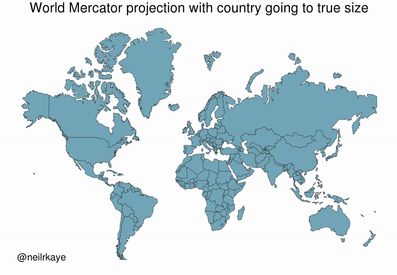
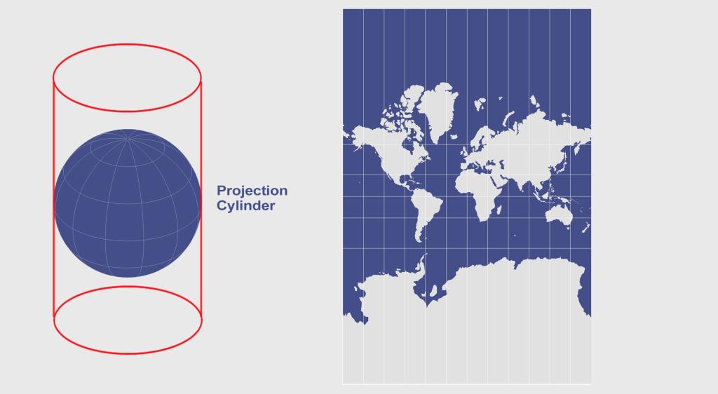
The Mercator projection attempts to place the spherical shape of the world onto a cylinder, causing areas closest to the poles to be “stretched”.
Africa, which straddles the Equator, barely changes in size — meanwhile, the countries furthest from the Equator become inflated from their true sizes on this type of map.
For those of us living in Western countries, this is an interesting dilemma to consider.
This means that the sizes of European and North American countries are distorted, giving us an inaccurate mental “measuring stick” for judging the relative sizes of other countries.
This has implications not only for Africa, but for the whole Southern Hemisphere: South America, India, the Middle East, and even Australia are “bigger” than they may initially appear on a map.


VC+
VC+: Get Our Key Takeaways From the IMF’s World Economic Outlook
A sneak preview of the exclusive VC+ Special Dispatch—your shortcut to understanding IMF’s World Economic Outlook report.

Have you read IMF’s latest World Economic Outlook yet? At a daunting 202 pages, we don’t blame you if it’s still on your to-do list.
But don’t worry, you don’t need to read the whole April release, because we’ve already done the hard work for you.
To save you time and effort, the Visual Capitalist team has compiled a visual analysis of everything you need to know from the report—and our VC+ Special Dispatch is available exclusively to VC+ members. All you need to do is log into the VC+ Archive.
If you’re not already subscribed to VC+, make sure you sign up now to access the full analysis of the IMF report, and more (we release similar deep dives every week).
For now, here’s what VC+ members get to see.
Your Shortcut to Understanding IMF’s World Economic Outlook
With long and short-term growth prospects declining for many countries around the world, this Special Dispatch offers a visual analysis of the key figures and takeaways from the IMF’s report including:
- The global decline in economic growth forecasts
- Real GDP growth and inflation forecasts for major nations in 2024
- When interest rate cuts will happen and interest rate forecasts
- How debt-to-GDP ratios have changed since 2000
- And much more!

Get the Full Breakdown in the Next VC+ Special Dispatch
VC+ members can access the full Special Dispatch by logging into the VC+ Archive, where you can also check out previous releases.
Make sure you join VC+ now to see exclusive charts and the full analysis of key takeaways from IMF’s World Economic Outlook.
Don’t miss out. Become a VC+ member today.
What You Get When You Become a VC+ Member
VC+ is Visual Capitalist’s premium subscription. As a member, you’ll get the following:
- Special Dispatches: Deep dive visual briefings on crucial reports and global trends
- Markets This Month: A snappy summary of the state of the markets and what to look out for
- The Trendline: Weekly curation of the best visualizations from across the globe
- Global Forecast Series: Our flagship annual report that covers everything you need to know related to the economy, markets, geopolitics, and the latest tech trends
- VC+ Archive: Hundreds of previously released VC+ briefings and reports that you’ve been missing out on, all in one dedicated hub
You can get all of the above, and more, by joining VC+ today.

-

 Education1 week ago
How Hard Is It to Get Into an Ivy League School?
-

 Technology2 weeks ago
Ranked: Semiconductor Companies by Industry Revenue Share
-

 Markets2 weeks ago
Ranked: The World’s Top Flight Routes, by Revenue
-

 Demographics2 weeks ago
Population Projections: The World’s 6 Largest Countries in 2075
-

 Markets2 weeks ago
The Top 10 States by Real GDP Growth in 2023
-

 Demographics2 weeks ago
The Smallest Gender Wage Gaps in OECD Countries
-

 Economy2 weeks ago
Where U.S. Inflation Hit the Hardest in March 2024
-

 Environment2 weeks ago
Top Countries By Forest Growth Since 2001