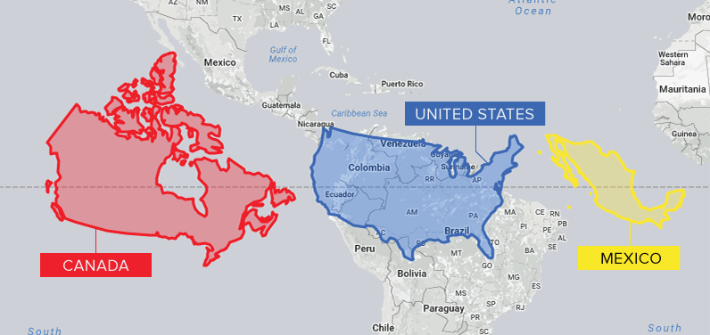
Conventional cartographic techniques have caused many to have a skewed perception of the true size of countries. Can an equal-area map provide clarity?

The world map you know is totally wrong. Check out this clever graphic, which helps put into perspective the true size of countries.
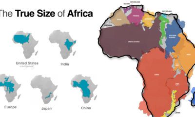

Common map projections warp our view of the globe. This graphic reveals the true size of Africa, which could fit the U.S., China, India, and more.


