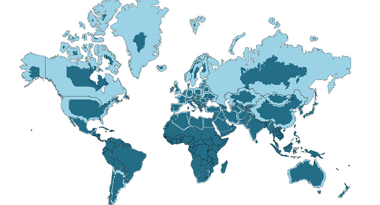
The world map you know is totally wrong. Check out this clever graphic, which helps put into perspective the true size of countries.


We’ve come a long way since Pangea. This short video examines the area, population, and GDP of our continents as a share of the world's total.