Misc
Global COVID-19 Containment: Confirmed Cases, Updated Daily
Global COVID Containment: Confirmed Cases, Updated Daily
Sometimes, it helps to gain a fresh perspective.
Since the pandemic began, there have been innumerable tracking resources made available online, but rarely do they paint a complete picture of a country’s containment progress.
How Much Progress Is Really Being Made
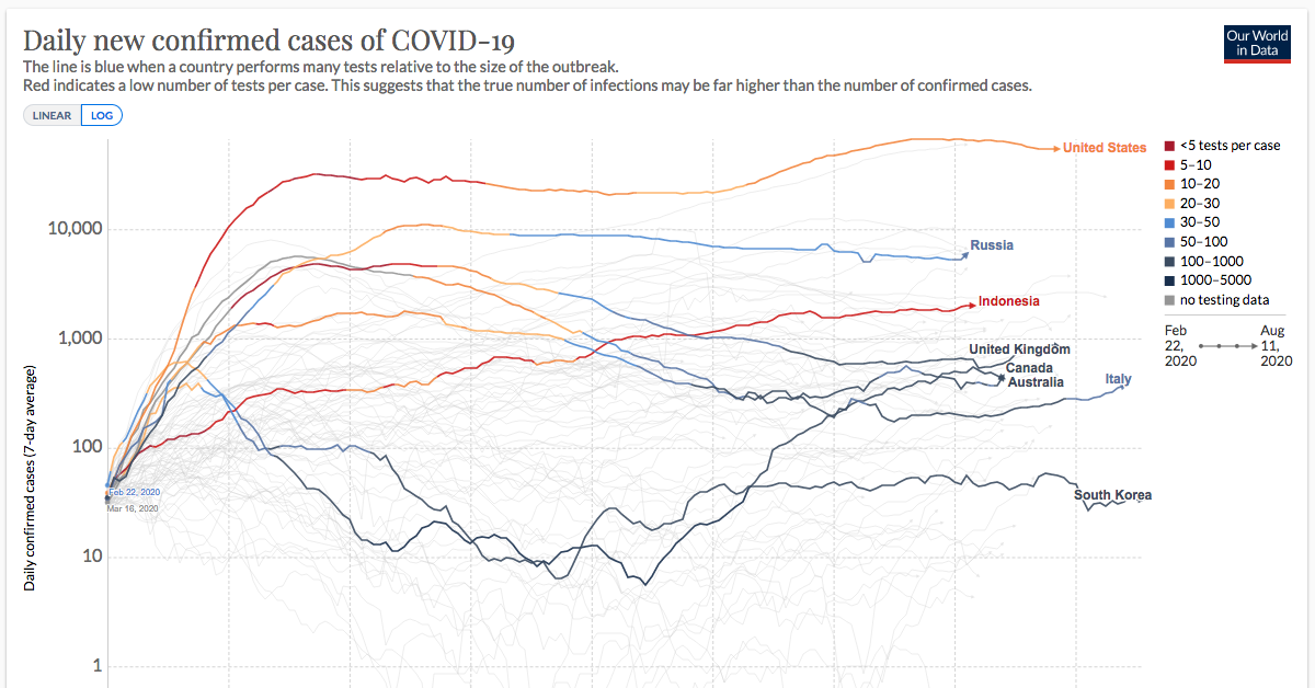
Featured above, this continuously updated chart from Our World in Data provides a more complete look at the efficacy of COVID-19 containment strategies, sorted by country.
It is a variation of the Epidemic Curve (or “epi curve”), showing confirmed COVID-19 cases per country in relation to their testing rates—what’s revealed is the strength of each country’s containment strategy.
Only a fraction of total cases–those confirmed by a test–is known. This is why we spent recent months building the database and the visualization tool to make this variation of the epidemic curve possible.
— Our World in Data
Why Look at it This Way? Adequate Benchmarking
Countries vary widely in how they monitor and report on COVID-19. Cases in this particular chart were confirmed via laboratory testing, and the data covers 66% of the globe’s population.
Depending on a country’s containment efforts, confirmed cases can differ dramatically from total cases. To get a better idea of that difference, Our World in Data looked closer at the extent of testing. As they report, the World Health Organization considers an adequate benchmark to be 10-30 tests per confirmed case. And for those countries that experience larger outbreaks, there must be more tests conducted per confirmed case.
What the COVID Test-to-Case Ratio Tells Us
- Line Trajectory: In this chart, rising lines show that the average number of laboratory-confirmed cases has increased over time, and vice versa for falling lines. Beyond flattening the curve, the end game is to have all of those lines reach zero.
- Blue Lines: The darker the blue line, the more likely that the line is an accurate indicator, as thousands of tests have been administered per confirmed case. The more blue lines this chart shows over time, the better for us all.
- Red Lines: By contrast, the warmer the color of the line, the fewer tests are being administered per confirmed case, and it is less likely to be an accurate measure of COVID-19 cases. Red lines, for example, indicate that only five tests are conducted for every confirmed case, suggesting that the count is not accurate and that many cases are going unreported.
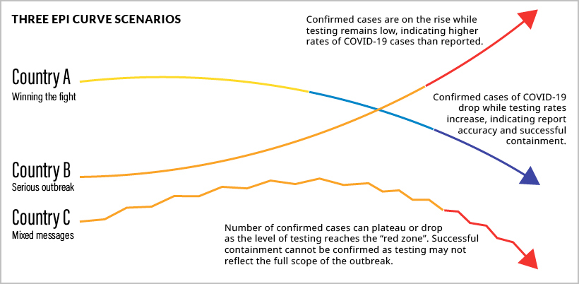
Consider these three scenarios in the diagram above, and hover over countries in the main visualization to compare:
- Country A: Winning the fight against COVID-19.
These countries, like New Zealand, have steadily increased the number of tests per confirmed case. Country A administers hundreds or thousands of tests per confirmed case. The likelihood of missed cases is far lower, most cases are accounted for, and they can confidently state they are winning the fight against COVID-19. - Country B: A severe, prolonged outbreak.
In comparison, countries like the U.S. have experienced a steady rise in confirmed cases. They also have lower rates of testing—only five tests per confirmed case. Country B cases are likely to be higher than the number reported, a fact that is especially concerning given that the U.S. has already surpassed the rest of the world’s countries in confirmed cases. - Country C: A volatile scenario.
While confirmed cases decrease, there is much room for doubt. In Country C (South Africa for instance), confirmed cases are decreasing, but very few tests are administered. Unfortunately, this indicates there are many unrepresented cases. Country C probably has a larger problem than its downward trajectory would indicate.
Cases Per Million People
From a different angle, we can see daily new COVID-19 cases per capita. This gives us a better sense of how countries compare in terms of confirmed cases.
Countries like Thailand, New Zealand, and South Korea all show relatively low rates of COVID-19 per capita, as well as high levels of testing. Conversely, countries like Spain and Kuwait reveal high levels of confirmed cases per capita and extremely low testing rates.
Another Perspective for Good Measure
For a holistic view of testing, the map below shows us the daily number of tests for each newly confirmed COVID-19 case, based on a rolling 7-day average.
Countries like Norway, Australia, and Canada reveal strong testing-to-confirmed-case ratios. In contrast, countries like Bolivia and the Philippines reveal the probability of out-of-control outbreaks.
Due to lower levels of testing in relation to confirmed cases, countries in red are more likely to leave cases unreported.
Making Sense of the Unknown
Although charts like these allow us to look at relationships between critical variables, there are no guarantees of what will come of this outbreak or any second waves.
The only certainty right now, is uncertainty. But with visualizations like this one—updated daily—we can at least stay up-to-speed with the knowledge curve.


VC+
VC+: Get Our Key Takeaways From the IMF’s World Economic Outlook
A sneak preview of the exclusive VC+ Special Dispatch—your shortcut to understanding IMF’s World Economic Outlook report.

Have you read IMF’s latest World Economic Outlook yet? At a daunting 202 pages, we don’t blame you if it’s still on your to-do list.
But don’t worry, you don’t need to read the whole April release, because we’ve already done the hard work for you.
To save you time and effort, the Visual Capitalist team has compiled a visual analysis of everything you need to know from the report—and our VC+ Special Dispatch is available exclusively to VC+ members. All you need to do is log into the VC+ Archive.
If you’re not already subscribed to VC+, make sure you sign up now to access the full analysis of the IMF report, and more (we release similar deep dives every week).
For now, here’s what VC+ members get to see.
Your Shortcut to Understanding IMF’s World Economic Outlook
With long and short-term growth prospects declining for many countries around the world, this Special Dispatch offers a visual analysis of the key figures and takeaways from the IMF’s report including:
- The global decline in economic growth forecasts
- Real GDP growth and inflation forecasts for major nations in 2024
- When interest rate cuts will happen and interest rate forecasts
- How debt-to-GDP ratios have changed since 2000
- And much more!

Get the Full Breakdown in the Next VC+ Special Dispatch
VC+ members can access the full Special Dispatch by logging into the VC+ Archive, where you can also check out previous releases.
Make sure you join VC+ now to see exclusive charts and the full analysis of key takeaways from IMF’s World Economic Outlook.
Don’t miss out. Become a VC+ member today.
What You Get When You Become a VC+ Member
VC+ is Visual Capitalist’s premium subscription. As a member, you’ll get the following:
- Special Dispatches: Deep dive visual briefings on crucial reports and global trends
- Markets This Month: A snappy summary of the state of the markets and what to look out for
- The Trendline: Weekly curation of the best visualizations from across the globe
- Global Forecast Series: Our flagship annual report that covers everything you need to know related to the economy, markets, geopolitics, and the latest tech trends
- VC+ Archive: Hundreds of previously released VC+ briefings and reports that you’ve been missing out on, all in one dedicated hub
You can get all of the above, and more, by joining VC+ today.

-

 Debt1 week ago
How Debt-to-GDP Ratios Have Changed Since 2000
-

 Markets2 weeks ago
Ranked: The World’s Top Flight Routes, by Revenue
-

 Countries2 weeks ago
Population Projections: The World’s 6 Largest Countries in 2075
-

 Markets2 weeks ago
The Top 10 States by Real GDP Growth in 2023
-

 Demographics2 weeks ago
The Smallest Gender Wage Gaps in OECD Countries
-

 United States2 weeks ago
Where U.S. Inflation Hit the Hardest in March 2024
-

 Green2 weeks ago
Top Countries By Forest Growth Since 2001
-

 United States2 weeks ago
Ranked: The Largest U.S. Corporations by Number of Employees