

How much do you trust the government and its various institutions? We look at data for G7 countries for the...
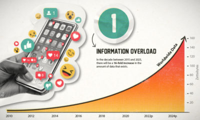

This era of data abundance should be propelling humankind forward, but valuable insights are often lost in the noise. Data storytelling holds the key.
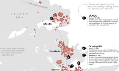

Each year, thousands of migrants take the journey along the Eastern Mediterranean to get to the EU. Some never make it to their destination.
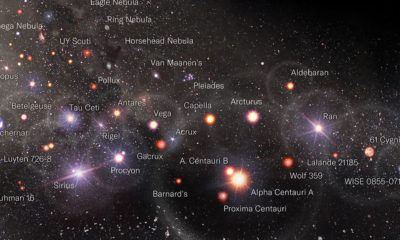

Scientists believe we've only discovered about 5% of the universe. Here's a map of what we've found so far, visualized using a log scale.
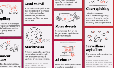

In this infographic, we catalog 33 problems with the social and mass media ecosystem.
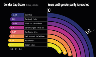

At our current rate of change, it will take up to 136 years to close the global gender gap. Here's a look at gender inequality across...
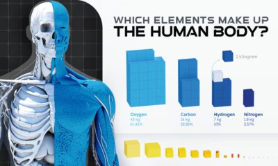

Of the 118 chemical elements found on Earth, only 21 make up the human body. Here we break down the elemental composition of the average human.
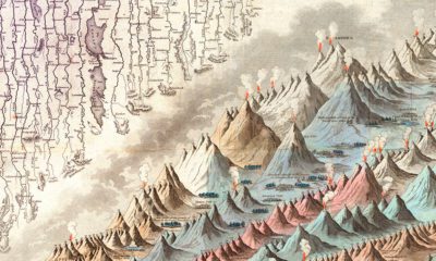

This iconic infographic map is an early and ambitious attempt to compare the world's tallest mountains and longest rivers.
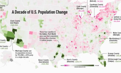

This map shows which counties in the U.S. have seen the most growth, and which places have seen their populations dwindle in the last 10 years.
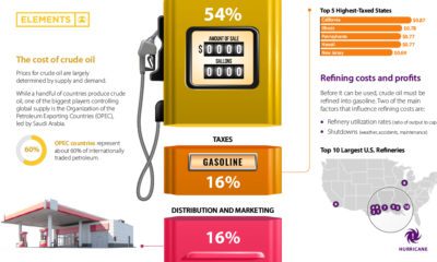

Gasoline prices across the U.S. have reached record-highs. Why? This graphic helps explain what factors influence the cost of gasoline.
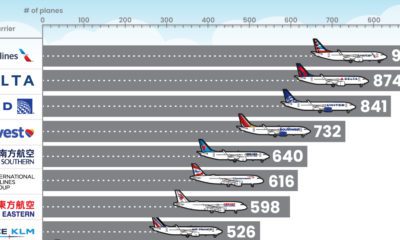

What type of aircraft do the world’s largest airlines use? This infographic breaks down the airline fleets of major carriers


 Creator Program