Demographics
Mapped: A Decade of Population Growth and Decline in U.S. Counties


A Decade of Population Growth and Decline in U.S. Counties
There are a number of factors that determine how much a region’s population changes.
If an area sees a high number of migrants, along with a strong birth rate and low death rate, then its population is bound to increase over time. On the flip side, if more people are leaving the area than coming in, and the region’s birth rate is low, then its population will likely decline.
Which areas in the United States are seeing the most growth, and which places are seeing their populations dwindle?
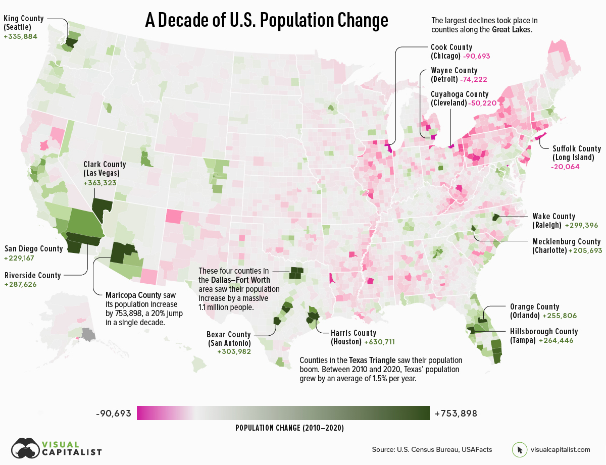
This map, using data from the U.S. Census Bureau, shows a decade of population movement across U.S. counties, painting a detailed picture of U.S. population growth between 2010 and 2020.
Counties With The Biggest Population Growth from 2010-2020
To calculate population estimates for each county, the U.S. Census Bureau does the following calculations:
From 2010 to 2020, Maricopa County in Arizona saw the highest increase in its population estimate. Over a decade, the county gained 753,898 residents. Below are the counties that saw the biggest increases in population:
| Rank | County | Point of Reference | State | Pop. Growth (2010–2020) |
|---|---|---|---|---|
| #1 | Maricopa County | Phoenix, Scottsdale | Arizona | +753,898 |
| #2 | Harris County | Houston | Texas | +630,711 |
| #3 | Clark County | Las Vegas | Nevada | +363,323 |
| #4 | King County | Seattle | Washington | +335,884 |
| #5 | Tarrant County | Fort Worth, Arlington | Texas | +305,180 |
| #6 | Bexar County | San Antonio | Texas | +303,982 |
| #7 | Riverside County | Riverside, Palm Springs | California | +287,626 |
| #8 | Collin County | Plano | Texas | +284,967 |
| #9 | Travis County | Austin | Texas | +270,111 |
| #10 | Hillsborough County | Tampa | Florida | +264,446 |
Phoenix and surrounding areas grew faster than any other major city in the country. The region’s sunny climate and amenities are popular with retirees, but another draw is housing affordability. Families from more expensive markets—California in particular—are moving to the city in droves. This is a trend that spilled over into the pandemic era as more people moved into remote and hybrid work situations.
Texas counties saw a lot of growth as well, with five of the top 10 gainers located in the state of Texas. A big draw for Texas is its relatively affordable housing market. In 2021, average home prices in the state stood at $172,500—$53,310 below the national average.
Counties With The Biggest Population Drops from 2010-2020
On the opposite end of the spectrum, here’s a look at the top 10 counties that saw the biggest declines in their populations over the decade:
| Rank | County | Point of Reference | State | Pop. Growth (2010–2020) |
|---|---|---|---|---|
| #1 | Cook County | Chicago | Illinois | -90,693 |
| #2 | Wayne County | Detroit | Michigan | -74,224 |
| #3 | Cuyahoga County | Cleveland | Ohio | -50,220 |
| #4 | Genesee County | Flint | Michigan | -20,165 |
| #5 | Suffolk County | Long Island | New York | -20,064 |
| #6 | Caddo Parish | Shreveport | Louisiana | -18,173 |
| #7 | Westmoreland County | Murrysville | Pennsylvania | -17,942 |
| #8 | Hinds County | Jackson | Mississippi | -17,751 |
| #9 | Kanawha County | Charleston | West Virginia | -16,672 |
| #10 | Cambria County | Johnstown | Pennsylvania | -14,786 |
The largest drops happened in counties along the Great Lakes, including Cook County (which includes the city of Chicago) and Wayne County (which includes the city of Detroit).
For many of these counties, particularly those in America’s “Rust Belt”, population drops over this period were a continuation of decades-long trends. Wayne County is an extreme example of this trend. From 1970 to 2020, the area lost one-third of its population.
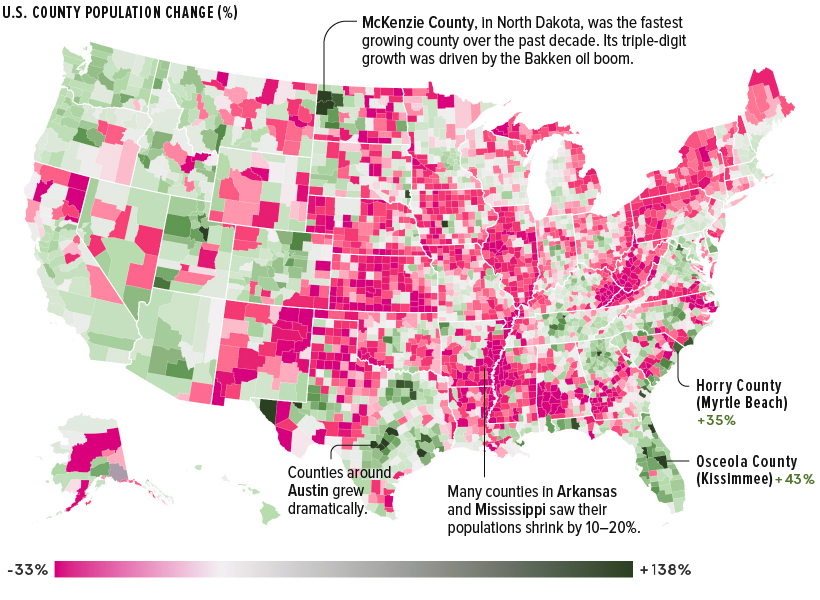
U.S. Population Growth in Percentage Terms (2010-2020)
While the map above is great at showing where the greatest number of Americans migrated, it downplays big changes in counties with smaller populations.
For example, McKenzie County in North Dakota, with a 2020 population of just 15,242, was the fastest-growing U.S. county over the past decade. The county’s 138% increase was driven primarily by the Bakken oil boom in the area. High-growth counties in Texas also grew as new sources of energy were extracted in rural areas.
The nation’s counties are evenly divided between population increase and decline, and clear patterns emerge.
Pandemic Population Changes
More recent population changes reflect longer-term trends. During the COVID-19 pandemic, many of the counties that saw the strongest population increases were located in high-growth states like Florida and Texas.
Below are the 20 counties that grew the most from 2020 to 2021.
| Rank | County | Point of Reference | State | Pop. Growth (2020–2021) |
|---|---|---|---|---|
| #1 | Maricopa County | Phoenix | Arizona | +58,246 |
| #2 | Collin County | Plano | Texas | +36,313 |
| #3 | Riverside County | Riverside, Palm Springs | California | +35,631 |
| #4 | Fort Bend County | Sugar Land | Texas | +29,895 |
| #5 | Williamson County | Georgetown | Texas | +27,760 |
| #6 | Denton County | Denton | Texas | +27,747 |
| #7 | Polk County | Lakeland | Florida | +24,287 |
| #8 | Montgomery County | The Woodlands | Texas | +23,948 |
| #9 | Lee County | Fort Myers | Florida | +23,297 |
| #10 | Utah County | Provo | Utah | +21,843 |
| #11 | Pinal County | San Tan Valley | Arizona | +19,974 |
| #12 | Clark County | Las Vegas | Nevada | +19,090 |
| #13 | Pasco County | New Port Richey | Florida | +18,322 |
| #14 | Wake County | Raleigh | North Carolina | +16,651 |
| #15 | St. Johns County | St. Augustine | Florida | +15,550 |
| #16 | Hillsborough County | Tampa | Florida | +14,814 |
| #17 | Bexar County | San Antonio | Texas | +14,184 |
| #18 | Ada County | Boise | Idaho | +13,947 |
| #19 | Osceola County | Kissimmee | Florida | +12,427 |
| #20 | St. Lucie County | Fort Pierce | Florida | +12,304 |
Many of these counties are located next to large cities, reflecting a shift to the suburbs and larger living spaces. However, as COVID-19 restrictions ease, and the pandemic housing boom tapers off due to rising interest rates, it remains to be seen whether the suburban shift will continue, or if people begin to migrate back to city centers.


Demographics
The Countries That Have Become Sadder Since 2010
Tracking Gallup survey data for more than a decade reveals some countries are witnessing big happiness declines, reflecting their shifting socio-economic conditions.


The Countries That Have Become Sadder Since 2010
This was originally posted on our Voronoi app. Download the app for free on iOS or Android and discover incredible data-driven charts from a variety of trusted sources.
Can happiness be quantified?
Some approaches that try to answer this question make a distinction between two differing components of happiness: a daily experience part, and a more general life evaluation (which includes how people think about their life as a whole).
The World Happiness Report—first launched in 2012—has been making a serious go at quantifying happiness, by examining Gallup poll data that asks respondents in nearly every country to evaluate their life on a 0–10 scale. From this they extrapolate a single “happiness score” out of 10 to compare how happy (or unhappy) countries are.
More than a decade later, the 2024 World Happiness Report continues the mission. Its latest findings also include how some countries have become sadder in the intervening years.
Which Countries Have Become Unhappier Since 2010?
Afghanistan is the unhappiest country in the world right now, and is also 60% unhappier than over a decade ago, indicating how much life has worsened since 2010.
In 2021, the Taliban officially returned to power in Afghanistan, after nearly two decades of American occupation in the country. The Islamic fundamentalist group has made life harder, especially for women, who are restricted from pursuing higher education, travel, and work.
On a broader scale, the Afghan economy has suffered post-Taliban takeover, with various consequent effects: mass unemployment, a drop in income, malnutrition, and a crumbling healthcare system.
| Rank | Country | Happiness Score Loss (2010–24) | 2024 Happiness Score (out of 10) |
|---|---|---|---|
| 1 | 🇦🇫 Afghanistan | -2.6 | 1.7 |
| 2 | 🇱🇧 Lebanon | -2.3 | 2.7 |
| 3 | 🇯🇴 Jordan | -1.5 | 4.2 |
| 4 | 🇻🇪 Venezuela | -1.3 | 5.6 |
| 5 | 🇲🇼 Malawi | -1.2 | 3.4 |
| 6 | 🇿🇲 Zambia | -1.2 | 3.5 |
| 7 | 🇧🇼 Botswana | -1.2 | 3.4 |
| 8 | 🇾🇪 Yemen | -1.0 | 3.6 |
| 9 | 🇪🇬 Egypt | -1.0 | 4.0 |
| 10 | 🇮🇳 India | -0.9 | 4.1 |
| 11 | 🇧🇩 Bangladesh | -0.9 | 3.9 |
| 12 | 🇨🇩 DRC | -0.7 | 3.3 |
| 13 | 🇹🇳 Tunisia | -0.7 | 4.4 |
| 14 | 🇨🇦 Canada | -0.6 | 6.9 |
| 15 | 🇺🇸 U.S. | -0.6 | 6.7 |
| 16 | 🇨🇴 Colombia | -0.5 | 5.7 |
| 17 | 🇵🇦 Panama | -0.5 | 6.4 |
| 18 | 🇵🇰 Pakistan | -0.5 | 4.7 |
| 19 | 🇿🇼 Zimbabwe | -0.5 | 3.3 |
| 20 | 🇮🇪 Ireland | -0.5 | 6.8 |
| N/A | 🌍 World | +0.1 | 5.5 |
Nine countries in total saw their happiness score drop by a full point or more, on the 0–10 scale.
Noticeably, many of them have seen years of social and economic upheaval. Lebanon, for example, has been grappling with decades of corruption, and a severe liquidity crisis since 2019 that has resulted in a banking system collapse, sending poverty levels skyrocketing.
In Jordan, unprecedented population growth—from refugees leaving Iraq and Syria—has aggravated unemployment rates. A somewhat abrupt change in the line of succession has also raised concerns about political stability in the country.

-

 Science1 week ago
Visualizing the Average Lifespans of Mammals
-

 Markets2 weeks ago
The Top 10 States by Real GDP Growth in 2023
-

 Demographics2 weeks ago
The Smallest Gender Wage Gaps in OECD Countries
-

 United States2 weeks ago
Where U.S. Inflation Hit the Hardest in March 2024
-

 Green2 weeks ago
Top Countries By Forest Growth Since 2001
-

 United States2 weeks ago
Ranked: The Largest U.S. Corporations by Number of Employees
-

 Maps2 weeks ago
The Largest Earthquakes in the New York Area (1970-2024)
-

 Green2 weeks ago
Ranked: The Countries With the Most Air Pollution in 2023