Demographics
Visualized: Why Do People Immigrate to the U.S.?


Why Do People Immigrate to the U.S.?
The U.S. is a country created and built by immigrants from all over the world. As a result, it’s home to more immigrants than any other country.
As of 2021, more than 45.3 million people living in the U.S. were foreign-born, accounting for about one-fifth of the world’s migrants. But while some come to reunite with family, others are seeking work or escaping dangerous situations.
So why do people immigrate to the U.S.? This visual uses U.S. Department of State data compiled by USAFacts to show the different reasons cited by new arrivals to America in 2021.
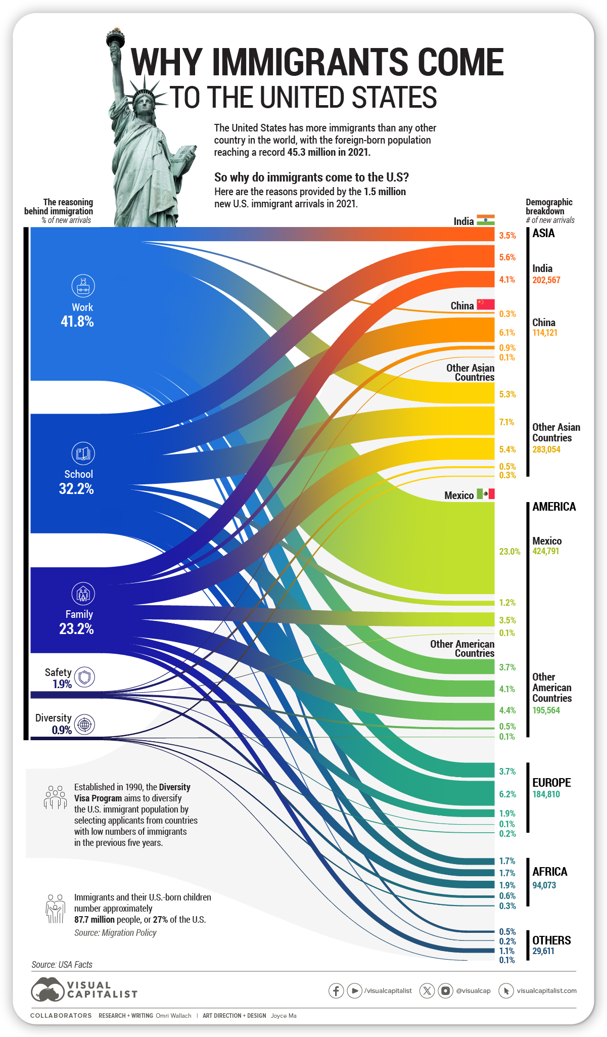
Why Immigrants Came to the U.S. in 2021
New arrival data in a given year includes non-tourist visas, new arrival green cards, refugees, and asylees.
Each arrival falls under a broad class of admission:
- Work: Includes visas for specialty occupations or temporary agricultural work, as well as new arrival green cards issued for employment.
- School: Includes student visas and families of student visa recipients.
- Family: Includes immigrant visas and new arrival green cards issued for relatives of American citizens.
- Safety: Includes refugees and asylees, as well as immigrant visas and new arrival green cards issued for fears of safety or persecution.
- Diversity: Entry through the Diversity Visa Program—also known as the “green card lottery”—which accepts applicants from countries with low numbers of immigrants in the previous five years.
In 2021, the United States saw 1.53 million new arrivals. Here’s how the arrivals break down by class and origin:
| U.S. Immigrant Origin | Work | School | Family | Safety | Diversity |
|---|---|---|---|---|---|
| 🇮🇳 India | 3.5% | 5.6% | 4.1% | 0.0% | 0.0% |
| 🇨🇳 China | 0.3% | 6.1% | 0.9% | 0.1% | 0.0% |
| 🇲🇽 Mexico | 23.0% | 1.2% | 3.5% | 0.1% | 0.0% |
| 🌍 Europe | 3.7% | 6.2% | 1.9% | 0.1% | 0.2% |
| 🌍 Africa | 1.7% | 1.7% | 1.9% | 0.6% | 0.3% |
| 🌏 Other Asia | 5.3% | 7.1% | 5.4% | 0.5% | 0.3% |
| 🌎 Other Americas | 3.7% | 4.1% | 4.4% | 0.5% | 0.1% |
| All Others | 0.5% | 0.2% | 1.1% | 0.0% | 0.1% |
| Total | 41.8% | 32.2% | 23.2% | 1.9% | 0.9% |
New arrivals for work were the largest cohort of entries to America, totaling 638,551 people or 41.8% of new arrivals. The majority came from neighboring Mexico, which accounted for 55% of incoming workers and was the largest single country of origin.
School and education saw 492,153 people 32.2% of new U.S. arrivals, with the majority coming from Asian countries. China had the most school-related entries into the U.S. out of individual countries, accounting for 19.0% of total school-related entries, followed by India at 17.4%.
Family entries to the U.S. comprised just 23.2% or under a quarter of incoming new arrivals. In these instances, the largest cohorts came from India (17.6% of family entrants) and Mexico (15.2% of family entrants).
Compared to the larger classifications above, safety (1.9% of total entrants) and diversity (0.9% of total entrants) accounted for significantly fewer U.S. arrivals. The countries with the most citizens seeking refuge or asylum were the Democratic Republic of the Congo (4,876 refugees) and Venezuela (1,596 asylees) respectively.
Growth of U.S. Immigration
Though 2021 saw less entrants than before 2020 as a prolonged result of the COVID-19 pandemic, it still tracks with increased immigration to the U.S. in the long term.
In 1965, the U.S. updated its immigration laws, removing a national origins quota system with regional caps and preferences “emphasizing family reunification and skilled immigrants.”
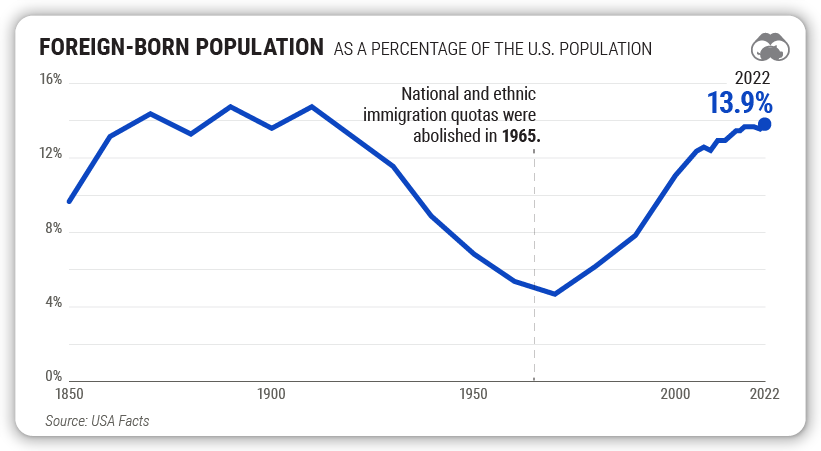
Since then, the number of immigrants living in the U.S. has more than quadrupled. As of 2022, immigrants accounted for 13.9% of the U.S. population, or nearly 1 in 7 people.
U.S. Immigration from Global Perspective
The U.S population contains a high level of immigrants, though immigration is an even more pronounced factor in some other countries in the world. For example, Canada’s foreign-born population accounted for 23% of the country’s total population in 2021.
Some countries actually have immigrants constitute the majority of their populations. In the Persian Gulf, the United Arab Emirates saw 88% of its population in 2020 come from foreign countries, while Qatar saw 75%.
Immigration levels have waxed and waned over time, but remains a vital part of the American story today.


Demographics
The Countries That Have Become Sadder Since 2010
Tracking Gallup survey data for more than a decade reveals some countries are witnessing big happiness declines, reflecting their shifting socio-economic conditions.


The Countries That Have Become Sadder Since 2010
This was originally posted on our Voronoi app. Download the app for free on iOS or Android and discover incredible data-driven charts from a variety of trusted sources.
Can happiness be quantified?
Some approaches that try to answer this question make a distinction between two differing components of happiness: a daily experience part, and a more general life evaluation (which includes how people think about their life as a whole).
The World Happiness Report—first launched in 2012—has been making a serious go at quantifying happiness, by examining Gallup poll data that asks respondents in nearly every country to evaluate their life on a 0–10 scale. From this they extrapolate a single “happiness score” out of 10 to compare how happy (or unhappy) countries are.
More than a decade later, the 2024 World Happiness Report continues the mission. Its latest findings also include how some countries have become sadder in the intervening years.
Which Countries Have Become Unhappier Since 2010?
Afghanistan is the unhappiest country in the world right now, and is also 60% unhappier than over a decade ago, indicating how much life has worsened since 2010.
In 2021, the Taliban officially returned to power in Afghanistan, after nearly two decades of American occupation in the country. The Islamic fundamentalist group has made life harder, especially for women, who are restricted from pursuing higher education, travel, and work.
On a broader scale, the Afghan economy has suffered post-Taliban takeover, with various consequent effects: mass unemployment, a drop in income, malnutrition, and a crumbling healthcare system.
| Rank | Country | Happiness Score Loss (2010–24) | 2024 Happiness Score (out of 10) |
|---|---|---|---|
| 1 | 🇦🇫 Afghanistan | -2.6 | 1.7 |
| 2 | 🇱🇧 Lebanon | -2.3 | 2.7 |
| 3 | 🇯🇴 Jordan | -1.5 | 4.2 |
| 4 | 🇻🇪 Venezuela | -1.3 | 5.6 |
| 5 | 🇲🇼 Malawi | -1.2 | 3.4 |
| 6 | 🇿🇲 Zambia | -1.2 | 3.5 |
| 7 | 🇧🇼 Botswana | -1.2 | 3.4 |
| 8 | 🇾🇪 Yemen | -1.0 | 3.6 |
| 9 | 🇪🇬 Egypt | -1.0 | 4.0 |
| 10 | 🇮🇳 India | -0.9 | 4.1 |
| 11 | 🇧🇩 Bangladesh | -0.9 | 3.9 |
| 12 | 🇨🇩 DRC | -0.7 | 3.3 |
| 13 | 🇹🇳 Tunisia | -0.7 | 4.4 |
| 14 | 🇨🇦 Canada | -0.6 | 6.9 |
| 15 | 🇺🇸 U.S. | -0.6 | 6.7 |
| 16 | 🇨🇴 Colombia | -0.5 | 5.7 |
| 17 | 🇵🇦 Panama | -0.5 | 6.4 |
| 18 | 🇵🇰 Pakistan | -0.5 | 4.7 |
| 19 | 🇿🇼 Zimbabwe | -0.5 | 3.3 |
| 20 | 🇮🇪 Ireland | -0.5 | 6.8 |
| N/A | 🌍 World | +0.1 | 5.5 |
Nine countries in total saw their happiness score drop by a full point or more, on the 0–10 scale.
Noticeably, many of them have seen years of social and economic upheaval. Lebanon, for example, has been grappling with decades of corruption, and a severe liquidity crisis since 2019 that has resulted in a banking system collapse, sending poverty levels skyrocketing.
In Jordan, unprecedented population growth—from refugees leaving Iraq and Syria—has aggravated unemployment rates. A somewhat abrupt change in the line of succession has also raised concerns about political stability in the country.

-

 Education1 week ago
How Hard Is It to Get Into an Ivy League School?
-

 Technology2 weeks ago
Ranked: Semiconductor Companies by Industry Revenue Share
-

 Markets2 weeks ago
Ranked: The World’s Top Flight Routes, by Revenue
-

 Demographics2 weeks ago
Population Projections: The World’s 6 Largest Countries in 2075
-

 Markets2 weeks ago
The Top 10 States by Real GDP Growth in 2023
-

 Demographics2 weeks ago
The Smallest Gender Wage Gaps in OECD Countries
-

 Economy2 weeks ago
Where U.S. Inflation Hit the Hardest in March 2024
-

 Green2 weeks ago
Top Countries By Forest Growth Since 2001