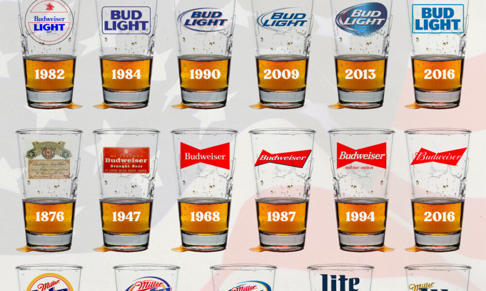
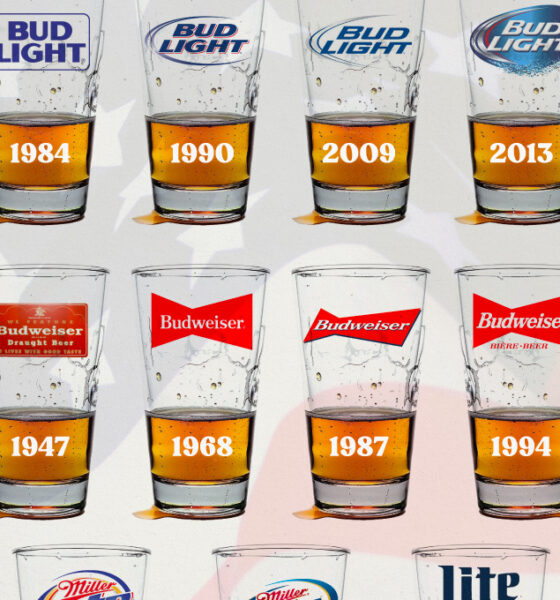
In this graphic, we analyze the evolution of popular U.S. beer logos like Budweiser, Coors Light, Bud Light, and more.
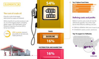

Gasoline prices across the U.S. have reached record-highs. Why? This graphic helps explain what factors influence the cost of gasoline.
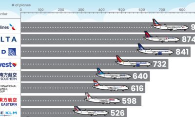

What type of aircraft do the world’s largest airlines use? This infographic breaks down the airline fleets of major carriers
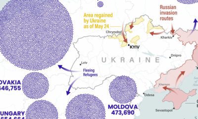

Russia’s invasion of Ukraine has sparked the largest European refugee crisis since WWII. See where refugees are fleeing to on this map.
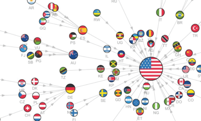

This series of visualizations uses Google trends search data to show the most googled countries around the world, from 2004 to 2022.
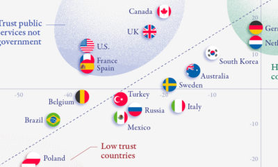

There is a clear correlation between trust in government and trust in public institutions, but a few countries buck the trend.
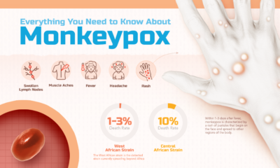

What is monkeypox, and what risk does it pose to the public? This infographic breaks down the symptoms, transmission, and more.
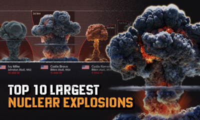

Just how powerful are nuclear bombs? Here's a look at the top 10 largest nuclear explosions.
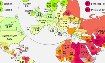

We map the state of global democracy, as the Democracy Index hits its lowest point since the inception of the index in 2006.
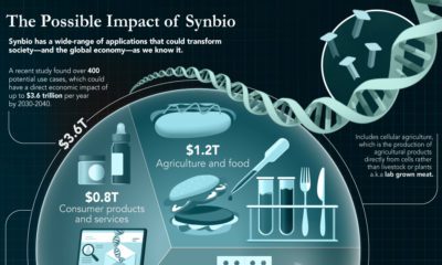

The field of synthetic biology could solve problems in a wide range of industries, from medicine to agriculture—here’s how.
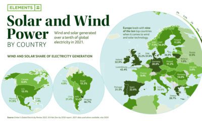

Wind and solar make up 10% of the world’s electricity. Combined, they are the fourth-largest source of electricity after coal, gas, and hydro.


 Creator Program