

Lions, tigers, and bears, oh my!—these animals do not feature on this list of popular American household pets.
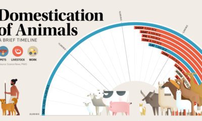

This graphic shows a timeline of when 15 different animals became domesticated, based on archaeological findings.
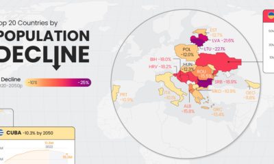

Population decline is a rising issue for many countries in Eastern Europe, as well as outliers like Japan and Cuba.
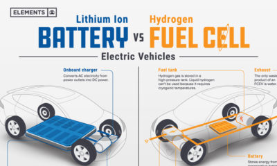

Understand the science behind hydrogen fuel cell vehicles, and how they differ from traditional EVs.
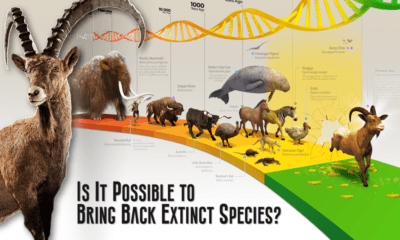

This graphic provides an introduction to de-extinction, a field of biology focused on reviving extinct animal species.
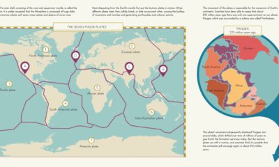

This graphic provides an explanation of plate tectonics and highlights the seven major tectonic plates that make up Earth’s outer crust.
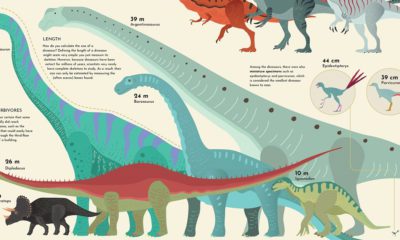

The largest dinosaur that ever lived was as long as a 13-story building. We show how the sizes of dinosaurs measured up.
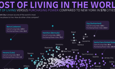

This graphic compares the cost of living and purchasing power of 578 cities worldwide, using New York City as a benchmark for comparison.


Wind is a great renewable energy source, but the spread of potential power is uneven. This graphic maps the average wind speed of the continental U.S.


Which countries dominate outer space? This visual displays the number of objects every country has launched into space over time.
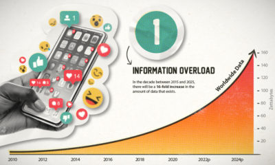

This era of data abundance should be propelling humankind forward, but valuable insights are often lost in the noise. Data storytelling holds the key.


 Creator Program