Misc
Explainer: What to Know About Monkeypox
The COVID-19 pandemic is still fresh in the minds of the people around the world, so it comes as no surprise that recent outbreaks of another virus are grabbing headlines.
Monkeypox outbreaks have now been reported in multiple countries, and it has scientists paying close attention. For everyone else, numerous questions come to the surface:
- How serious is this virus?
- How contagious is it?
- Could monkeypox develop into a new pandemic?
Below, we answer these questions and more.
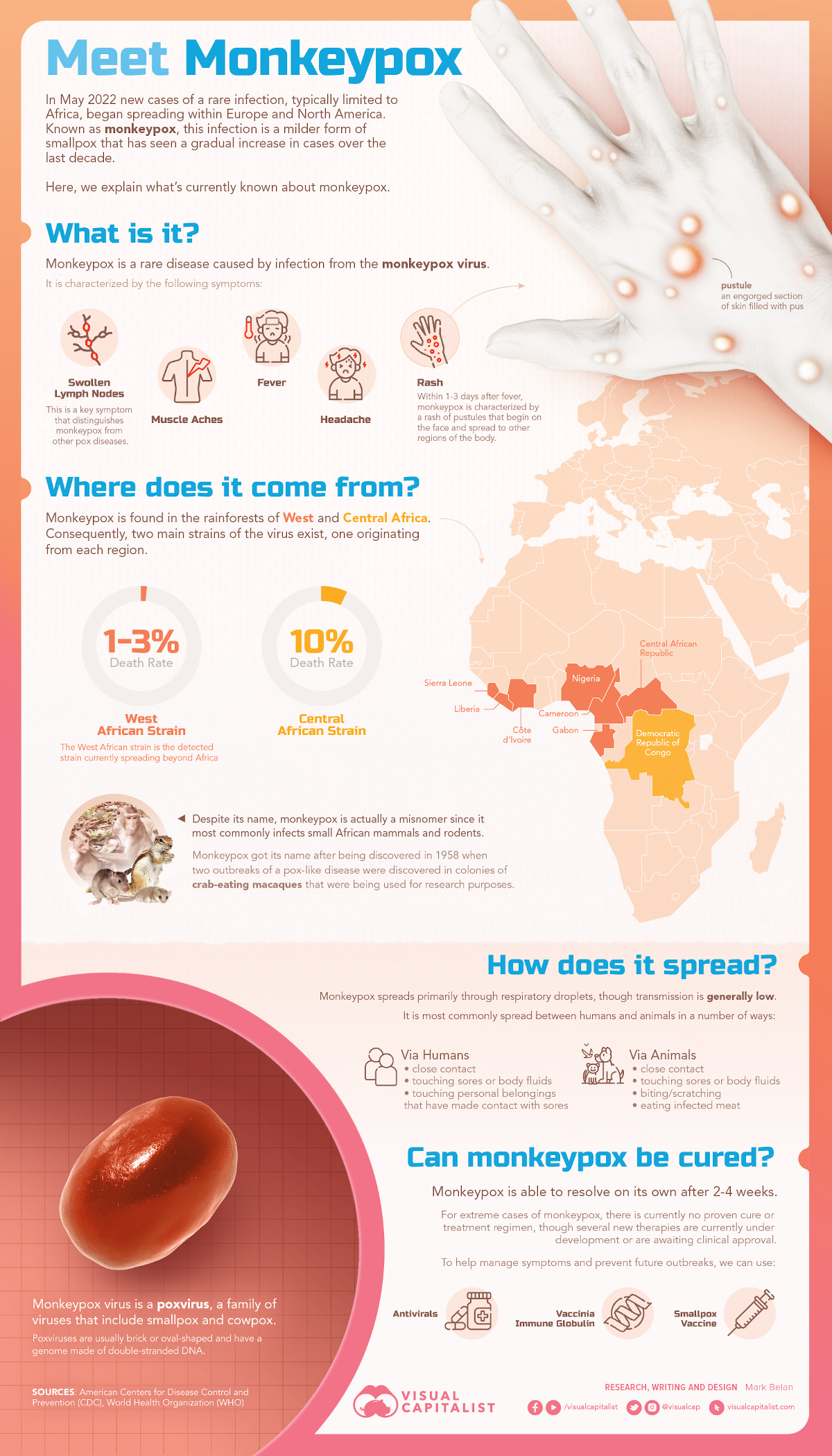
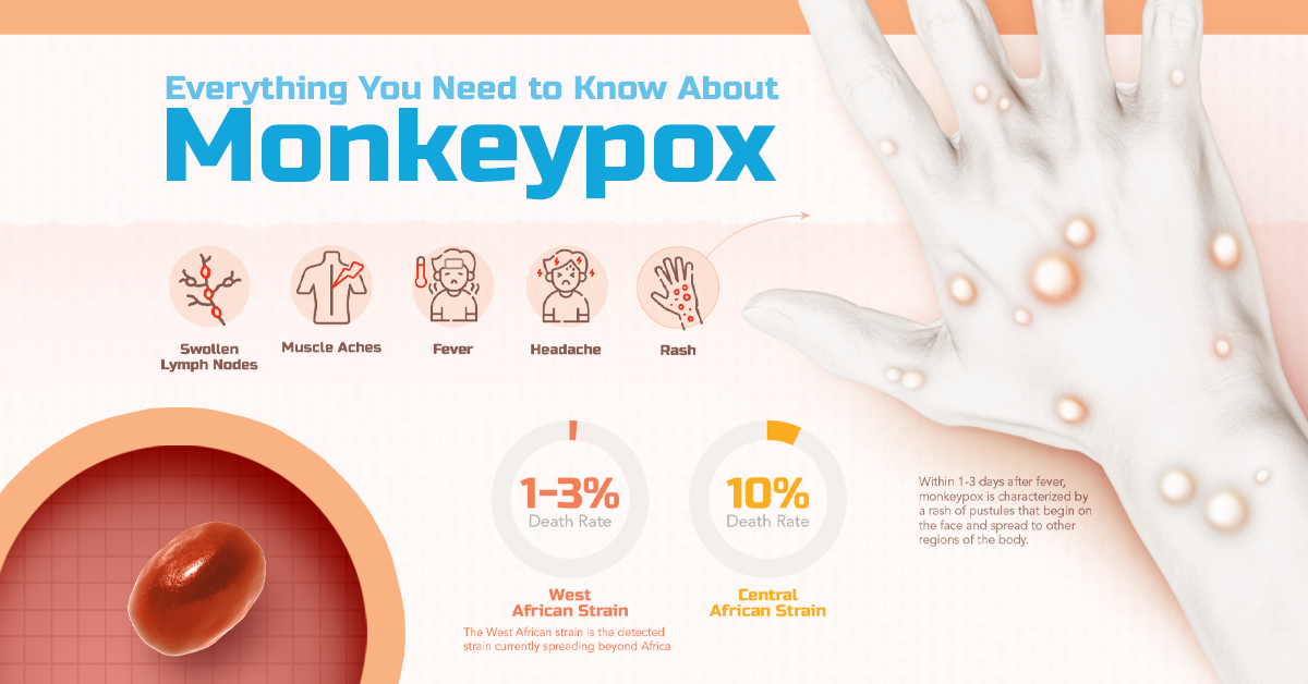
What is Monkeypox?
Monkeypox is a virus in the Orthopoxvirus genus which also includes the variola virus (which causes smallpox) and the cowpox virus. The primary symptoms include fever, swollen lymph nodes, and a distinctive bumpy rash.
There are two major strains of the virus that pose very different risks:
- Congo Basin strain: 1 in 10 people infected with this strain have died
- West African strain: Approximately 1 in 100 people infected with this strain died
At the moment, health authorities in the UK have indicated they’re seeing the milder strain in patients there.
Where did Monkeypox Originate From?
The virus was originally discovered in the Democratic Republic of Congo in monkeys kept for research purposes (hence the name). Eventually, the virus made the jump to humans more than a decade after its discovery in 1958.
It is widely assumed that vaccination against another similar virus, smallpox, helped keep monkeypox outbreaks from occurring in human populations. Ironically, the successful eradication of smallpox, and eventual winding down of that vaccine program, has opened the door to a new viral threat. There is now a growing population of people who no longer have immunity against the virus.
Now that travel restrictions are lifting in many parts of the world, viruses are now able to hop between nations again. As of the publishing of this article, a handful of cases have now been reported in the U.S., Canada, the UK, and a number of European countries.
On the upside, contact tracing has helped authorities piece together the transmission of the virus. While cases are rare in Europe and North America, it is considered endemic in parts of West Africa. For example, the World Health Organization reports that Nigeria has experienced over 550 reported monkeypox cases from 2017 to today. The current UK outbreak originated from an individual who returned from a trip to Nigeria.
Could Monkeypox become a new pandemic?
Monkeypox, which primarily spreads through animal-to-human interaction, is not known to spread easily between humans. Most individuals infected with monkeypox pass the virus to between zero and one person, so outbreaks typically fizzle out. For this reason, the fact that outbreaks are occurring in several countries simultaneously is concerning for health authorities and organizations that monitor viral transmission. Experts are entertaining the possibility that the virus’ rate of transmission has increased.
Images of people covered in monkeypox lesions are shocking, and people are understandably concerned by this virus, but the good news is that members of the general public have little to fear at this stage.
I think the risk to the general public at this point, from the information we have, is very, very low.
–Tom Inglesby, Director, Johns Hopkins Center for Health Security
» For up-to-date information on monkeypox cases, check out Global.Health’s tracking spreadsheet
Support the Future of Data Storytelling
Sorry to interrupt your reading, but we have a favor to ask. At Visual Capitalist we believe in a world where data can be understood by everyone. That’s why we want to build the VC App - the first app of its kind combining verifiable and transparent data with beautiful, memorable visuals. All available for free.
As a small, independent media company we don’t have the expertise in-house or the funds to build an app like this. So we’re asking our community to help us raise funds on Kickstarter.
If you believe in data-driven storytelling, join the movement and back us on Kickstarter!
Thank you.

Misc
Iconic Infographic Map Compares the World’s Mountains and Rivers
This iconic infographic map is an early and ambitious attempt to compare the world’s tallest mountains and longest rivers.

Today, highly detailed maps of our planet’s surface are just a click away.
In times past, however, access to information was much more limited. It wasn’t until the 1800s that comparison diagrams and maps became widely accessible, and people found new ways to learn about the world around them.
The image above, published by J.H. Colton in 1849, is believed to be the first edition of the iconic mountains and rivers infographic map. This comparison chart concept would see a number of iterations over the years as it appeared in Colton’s world atlases.
Inspiring a Classic Infographic Map
A seminal example of this style of infographic was produced by Alexander von Humboldt in 1805. The diagram below is packed with information and shows geographical features in a way that was extremely novel at the time.
In 1817, the brothers William and Daniel Lizars produced the first comparative chart of the world’s mountains and rivers. Breaking up individual natural features into components for comparison was a very innovative approach at that time, and it was this early French language prototype that lead to the Colton’s versions we’re familiar with today.
Digging into the Details
As is obvious, even at first glance, there is a ton of detail packed into this infographic map.
Firstly, rivers are artificially straightened and neatly arranged in rows for easy comparison. Lakes, mountain ranges, and cities are all labeled along the way. This unique comparison brings cities like New Orleans and Cairo side by side.
Of course, this visualization was based on the best available data at the time. Today, the Nile is widely considered to be the world’s longest river, followed by the Amazon and Yangtze.
Over on the mountain side, there are more details to take in. The visualization includes volcanic activity, notes on vegetation, and even the altitude of selected cities and towns.
Above are a few of South America’s high-altitude population centers, including La Paz, which is the highest-elevation capital city in the world.
In the legend, many of the mountains are simply named “peak”. While this generic labeling might seem like a throwback to a time when the world was still being explored, it’s worth noting that today’s second tallest mountain is still simply referred to as K2.
What details do you notice while exploring this iconic infographic map?
Demographics
Mapped: A Decade of Population Growth and Decline in U.S. Counties
This map shows which counties in the U.S. have seen the most growth, and which places have seen their populations dwindle in the last 10 years.

A Decade of Population Growth and Decline in U.S. Counties
There are a number of factors that determine how much a region’s population changes.
If an area sees a high number of migrants, along with a strong birth rate and low death rate, then its population is bound to increase over time. On the flip side, if more people are leaving the area than coming in, and the region’s birth rate is low, then its population will likely decline.
Which areas in the United States are seeing the most growth, and which places are seeing their populations dwindle?
This map, using data from the U.S. Census Bureau, shows a decade of population movement across U.S. counties, painting a detailed picture of U.S. population growth between 2010 and 2020.
Counties With The Biggest Population Growth from 2010-2020
To calculate population estimates for each county, the U.S. Census Bureau does the following calculations:
From 2010 to 2020, Maricopa County in Arizona saw the highest increase in its population estimate. Over a decade, the county gained 753,898 residents. Below are the counties that saw the biggest increases in population:
Rank | County | Point of Reference | State | Pop. Growth (2010–2020) |
---|---|---|---|---|
#1 | Maricopa County | Phoenix, Scottsdale | Arizona | +753,898 |
#2 | Harris County | Houston | Texas | +630,711 |
#3 | Clark County | Las Vegas | Nevada | +363,323 |
#4 | King County | Seattle | Washington | +335,884 |
#5 | Tarrant County | Fort Worth, Arlington | Texas | +305,180 |
#6 | Bexar County | San Antonio | Texas | +303,982 |
#7 | Riverside County | Riverside, Palm Springs | California | +287,626 |
#8 | Collin County | Plano | Texas | +284,967 |
#9 | Travis County | Austin | Texas | +270,111 |
#10 | Hillsborough County | Tampa | Florida | +264,446 |
Phoenix and surrounding areas grew faster than any other major city in the country. The region’s sunny climate and amenities are popular with retirees, but another draw is housing affordability. Families from more expensive markets—California in particular—are moving to the city in droves. This is a trend that spilled over into the pandemic era as more people moved into remote and hybrid work situations.
Texas counties saw a lot of growth as well, with five of the top 10 gainers located in the state of Texas. A big draw for Texas is its relatively affordable housing market. In 2021, average home prices in the state stood at $172,500—$53,310 below the national average.
Counties With The Biggest Population Drops from 2010-2020
On the opposite end of the spectrum, here’s a look at the top 10 counties that saw the biggest declines in their populations over the decade:
Rank | County | Point of Reference | State | Pop. Growth (2010–2020) |
---|---|---|---|---|
#1 | Cook County | Chicago | Illinois | -90,693 |
#2 | Wayne County | Detroit | Michigan | -74,224 |
#3 | Cuyahoga County | Cleveland | Ohio | -50,220 |
#4 | Genesee County | Flint | Michigan | -20,165 |
#5 | Suffolk County | Long Island | New York | -20,064 |
#6 | Caddo Parish | Shreveport | Louisiana | -18,173 |
#7 | Westmoreland County | Murrysville | Pennsylvania | -17,942 |
#8 | Hinds County | Jackson | Mississippi | -17,751 |
#9 | Kanawha County | Charleston | West Virginia | -16,672 |
#10 | Cambria County | Johnstown | Pennsylvania | -14,786 |
The largest drops happened in counties along the Great Lakes, including Cook County (which includes the city of Chicago) and Wayne County (which includes the city of Detroit).
For many of these counties, particularly those in America’s “Rust Belt”, population drops over this period were a continuation of decades-long trends. Wayne County is an extreme example of this trend. From 1970 to 2020, the area lost one-third of its population.
U.S. Population Growth in Percentage Terms (2010-2020)
While the map above is great at showing where the greatest number of Americans migrated, it downplays big changes in counties with smaller populations.
For example, McKenzie County in North Dakota, with a 2020 population of just 15,242, was the fastest-growing U.S. county over the past decade. The county’s 138% increase was driven primarily by the Bakken oil boom in the area. High-growth counties in Texas also grew as new sources of energy were extracted in rural areas.
The nation’s counties are evenly divided between population increase and decline, and clear patterns emerge.
Pandemic Population Changes
More recent population changes reflect longer-term trends. During the COVID-19 pandemic, many of the counties that saw the strongest population increases were located in high-growth states like Florida and Texas.
Below are the 20 counties that grew the most from 2020 to 2021.
Rank | County | Point of Reference | State | Pop. Growth (2020–2021) |
---|---|---|---|---|
#1 | Maricopa County | Phoenix | Arizona | +58,246 |
#2 | Collin County | Plano | Texas | +36,313 |
#3 | Riverside County | Riverside, Palm Springs | California | +35,631 |
#4 | Fort Bend County | Sugar Land | Texas | +29,895 |
#5 | Williamson County | Georgetown | Texas | +27,760 |
#6 | Denton County | Denton | Texas | +27,747 |
#7 | Polk County | Lakeland | Florida | +24,287 |
#8 | Montgomery County | The Woodlands | Texas | +23,948 |
#9 | Lee County | Fort Myers | Florida | +23,297 |
#10 | Utah County | Provo | Utah | +21,843 |
#11 | Pinal County | San Tan Valley | Arizona | +19,974 |
#12 | Clark County | Las Vegas | Nevada | +19,090 |
#13 | Pasco County | New Port Richey | Florida | +18,322 |
#14 | Wake County | Raleigh | North Carolina | +16,651 |
#15 | St. Johns County | St. Augustine | Florida | +15,550 |
#16 | Hillsborough County | Tampa | Florida | +14,814 |
#17 | Bexar County | San Antonio | Texas | +14,184 |
#18 | Ada County | Boise | Idaho | +13,947 |
#19 | Osceola County | Kissimmee | Florida | +12,427 |
#20 | St. Lucie County | Fort Pierce | Florida | +12,304 |
Many of these counties are located next to large cities, reflecting a shift to the suburbs and larger living spaces. However, as COVID-19 restrictions ease, and the pandemic housing boom tapers off due to rising interest rates, it remains to be seen whether the suburban shift will continue, or if people begin to migrate back to city centers.
-
Money1 week ago
Mapping the Migration of the World’s Millionaires
-
Markets2 weeks ago
Visualizing the Coming Shift in Global Economic Power (2006-2036p)
-
Datastream3 weeks ago
Ranked: These Are 10 of the World’s Least Affordable Housing Markets
-
Demographics1 week ago
Mapped: A Decade of Population Growth and Decline in U.S. Counties
-
Misc2 weeks ago
Visualizing Well-Known Airlines by Fleet Composition
-
Politics4 weeks ago
Which Countries Trust Their Government, and Which Ones Don’t?
-
Markets4 weeks ago
Ranked: Visualizing the Largest Trading Partners of the U.S.
-
Misc7 days ago
Iconic Infographic Map Compares the World’s Mountains and Rivers