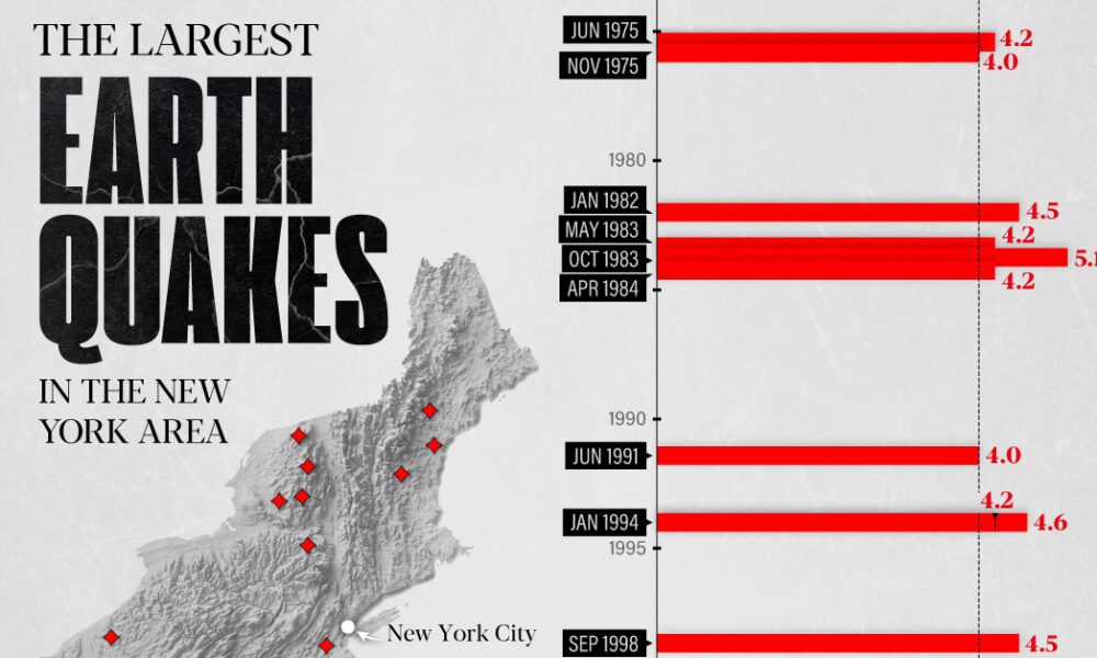
The earthquake that shook buildings across New York in April 2024 was the third-largest quake in the Northeast U.S. over...
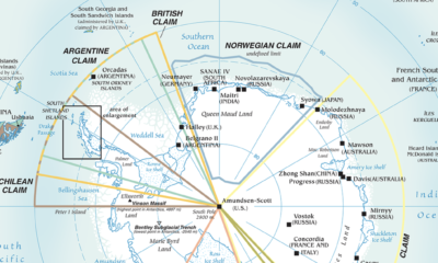

Antarctica is the most inhospitable region on Earth, but that hasn't stopped countries from making territorial claims. This maps shows them all.
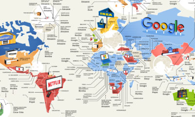

From Apple to Zara, this unique map showcases which popular consumer brands were searched for the most around the world.
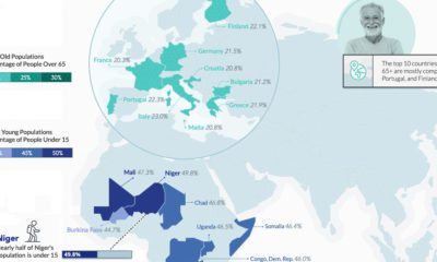

Higher life expectancies and lower fertility rates are reshaping global demographics, but vast regional differences remain. Where are the youngest and oldest countries in the world?
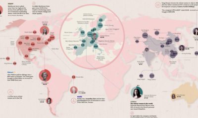

Fewer than 12% of global billionaires are women, but they still hold massive amounts of wealth. Who are the 50 richest women in the world?

By 2025, the global commercial drone market could reach $42.8 billion. With such diverse uses, how do countries navigate drone privacy laws?
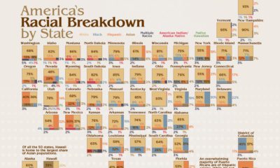

America is a cultural mosaic—nearly 40% identify as a visible minority today. Here we break down the U.S. population by race by state.
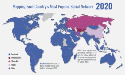

Mapping the rapid expansion of Facebook into the world’s dominant social network, and the countries and platforms resisting its growth
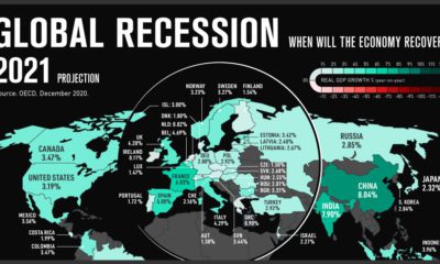

The global recession of 2020 will cause overall GDP to fall by 4.2% this year. Which countries are forecast to recover the fastest?
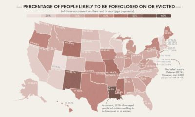

Which U.S. states are most at risk of experiencing mass evictions and foreclosures in the next two months?
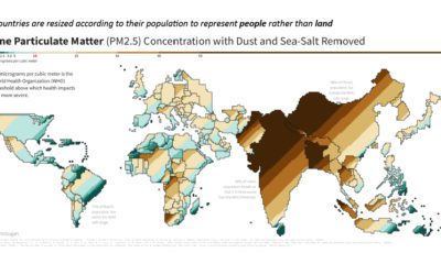

This population-weighted cartogram shows the countries with the worst air pollution, based on fine particulate matter (PM2.5) concentration.


