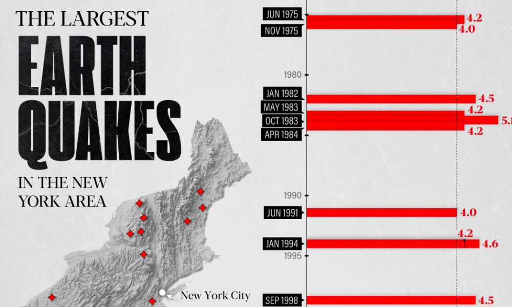
The earthquake that shook buildings across New York in April 2024 was the third-largest quake in the Northeast U.S. over...
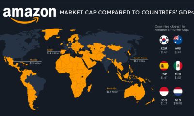

How do the big tech giants compare to entire countries? Here's how Apple, Microsoft, and Amazon's market caps stack up against national GDP.
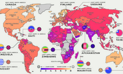

Global happiness levels are determined by many diverse factors. These maps look at the happiest and unhappiest countries in every region.
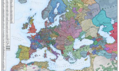

What did Europe look like in the Middle Ages? This map is a snapshot of medieval Europe back in 1444, during the rise of the Ottoman...
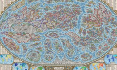

This unique map provides an in-depth snapshot of the state of the world wide web, highlighting the most popular websites on the internet.
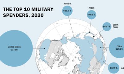

Global military spending is now at a 32-year high. We show countries' military spending by dollars and as a portion of GDP.
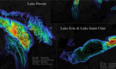

The five Great Lakes account for 21% of the world's total freshwater. This bathymetric visualization dives into just how deep they are.
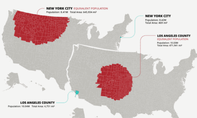

The U.S. population is spread across a huge amount of land, but its distribution is far from equal. These maps are a unique look at population...
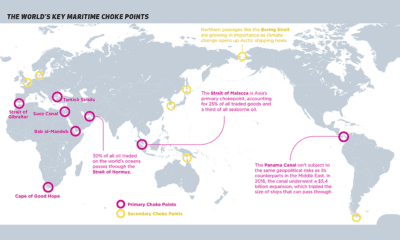

Ocean shipping is the primary mode of international trade. This map identifies maritime choke points that pose a risk to this complex logistic network.
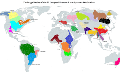

This unique map illustrates the immense size of drainage basins that feed the world's longest river systems
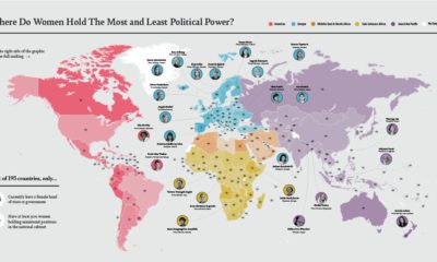

Where do women hold the most ministerial positions? In this map, we look at women's political power by country, and key positions held by women.


