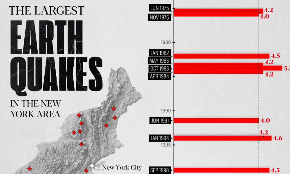
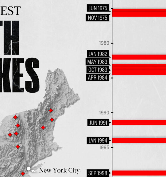
The earthquake that shook buildings across New York in April 2024 was the third-largest quake in the Northeast U.S. over...
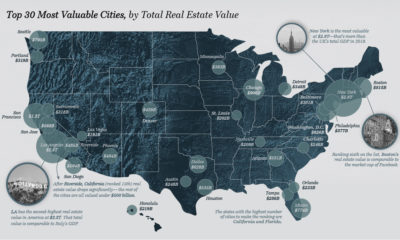

U.S. real estate value is concentrated in a handful of urban centers. Here's a look at the top 30 most valuable cities.
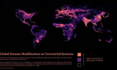

Nearly 95% of the Earth’s surface shows some form of human modification, with 85% bearing evidence of multiple forms of human impact.
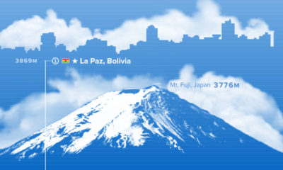

Where are the world’s highest cities? This graphic ranks the world’s major urban centers by altitude above sea level.


The cocoa supply chain is a bittersweet one. While chocolate is a beloved sweet treat globally, many cocoa farmers are living a bitter reality.
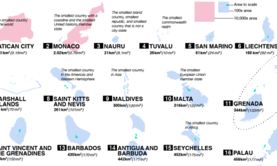

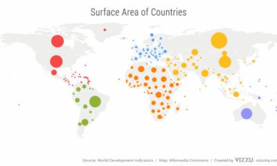
From Vatican City to Fiji, take a closer look at the world’s 100 smallest countries and their spheres of influence.
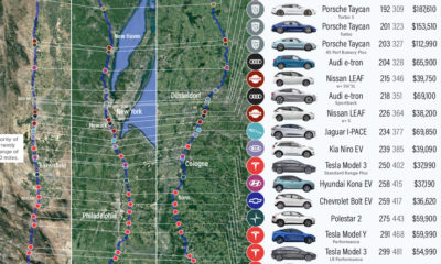

We visualize how far popular EV models will take you on real-world routes between major cities, and which are the most cost effective.
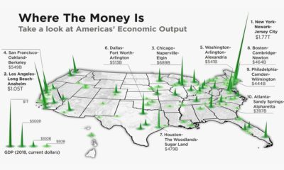

The total U.S. GDP stands at a whopping $21 trillion, but which metro areas contribute to the most in terms of economic output?

We’ve come a long way since Pangea. This short video examines the area, population, and GDP of our continents as a share of the world's total.
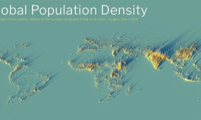

What does population density look like on a global scale? These detailed 3D renders illustrate our biggest urban areas and highlight population trends.
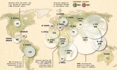

When it comes to worldwide internet use, which regions are the most disconnected? And which regions have the most opportunity for growth?


